 Inspiration from Italian Futurists
 First logo proposal
 First logo proposal and graphic imagery
 Final logo, reflecting the choice of the Regulator Nova typeface
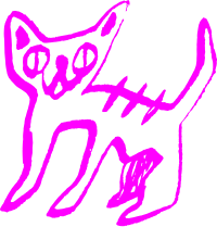
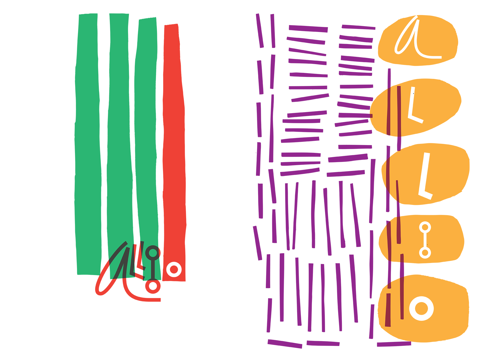
 Illustrations for signage and decoration project
 Final pictogram panel
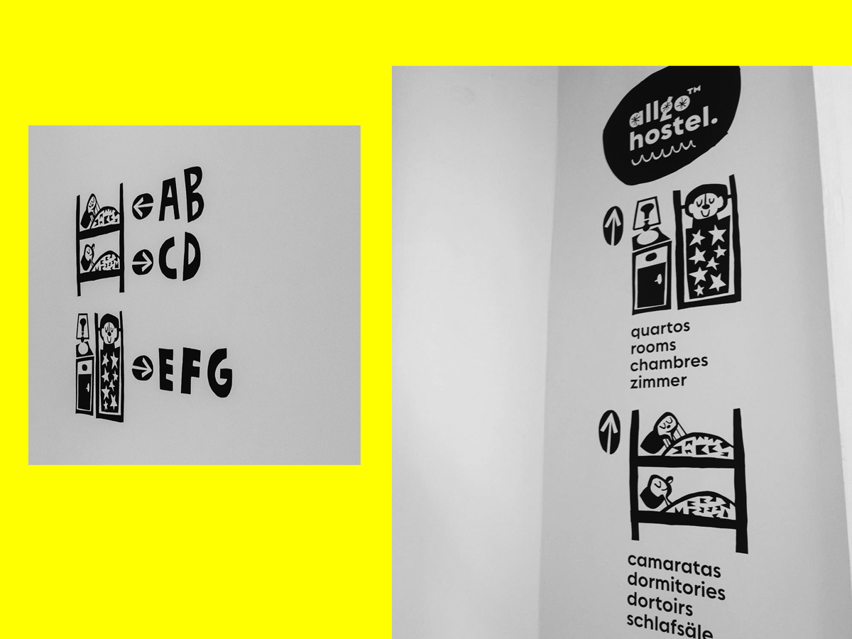
 Signage project
 Application
Allgo Hostel
2018
2018




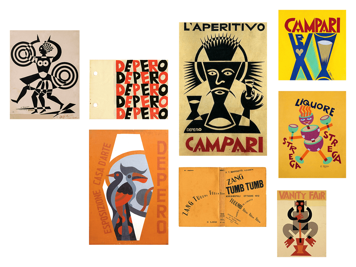
 Moodboard
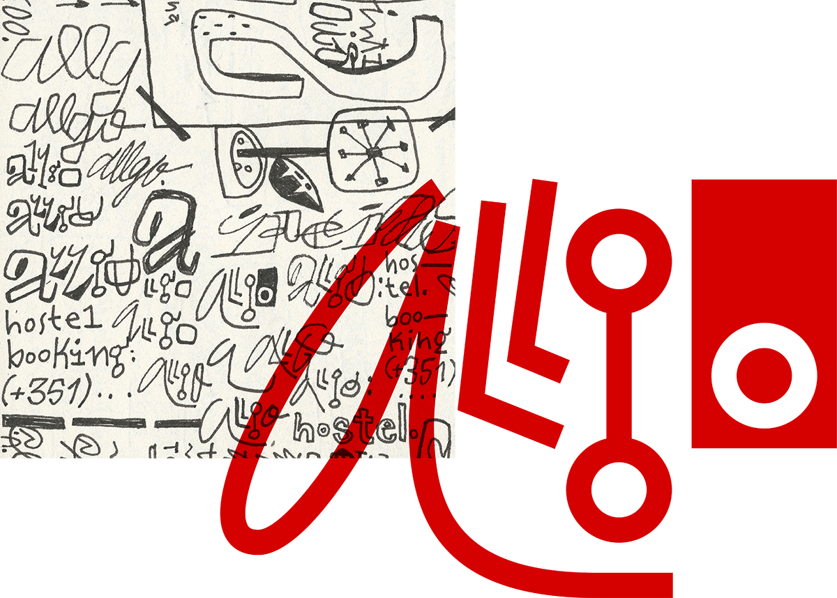
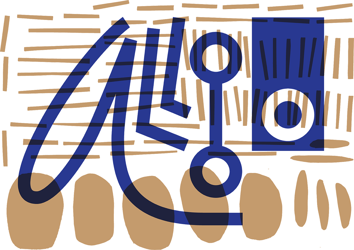

 First logo proposal and graphic imagery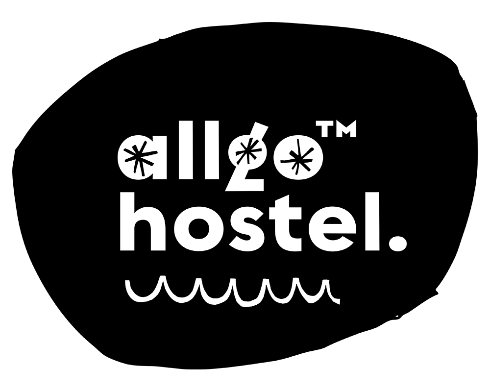
 Final logo, reflecting the choice of the Regulator Nova typeface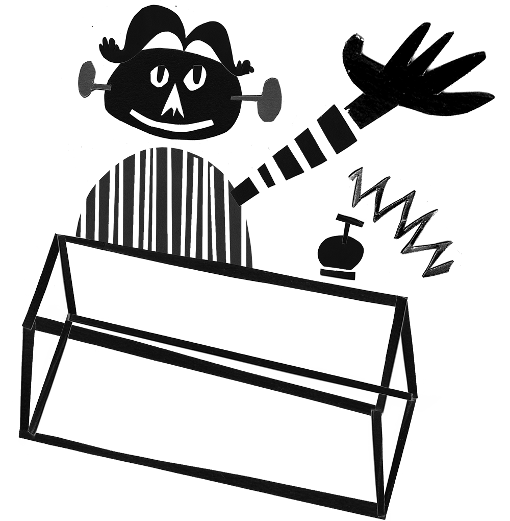
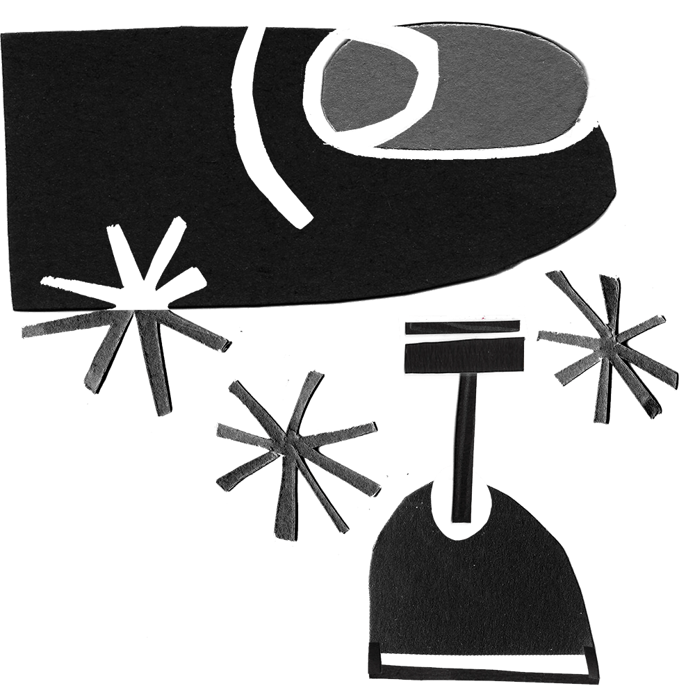
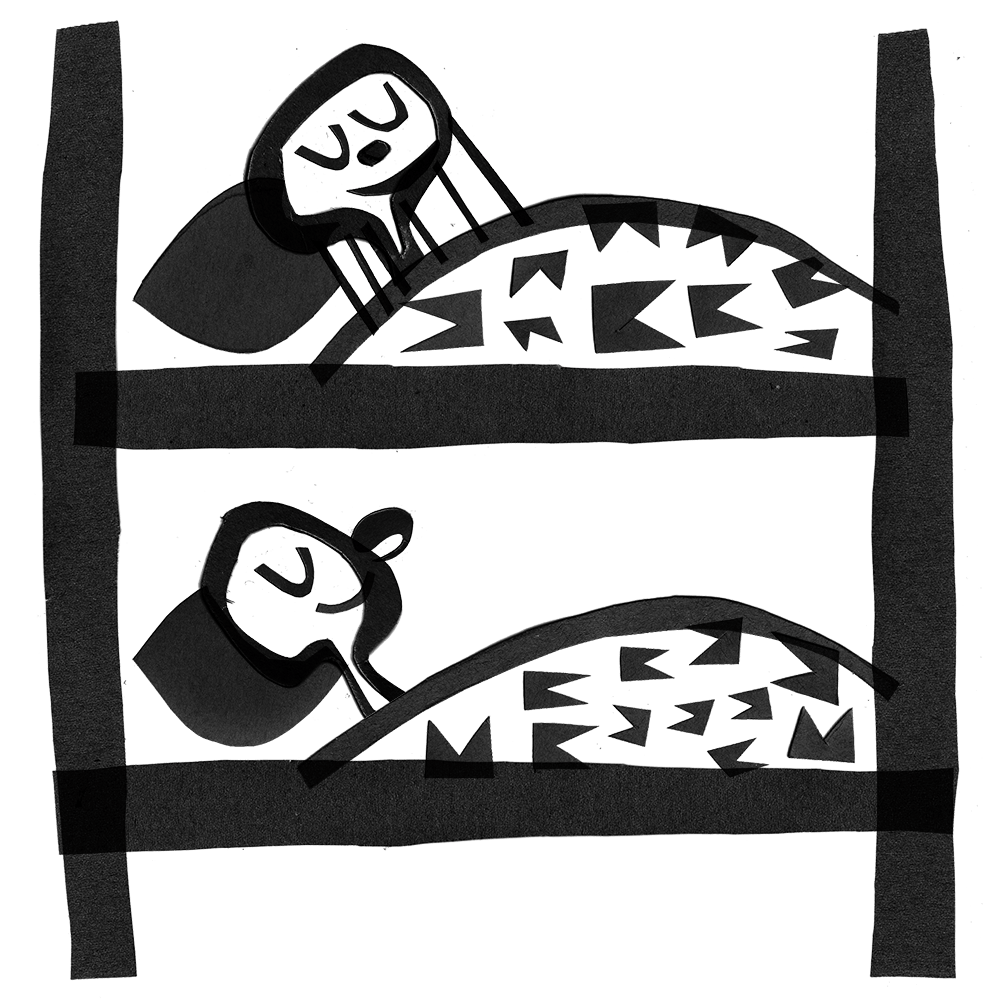
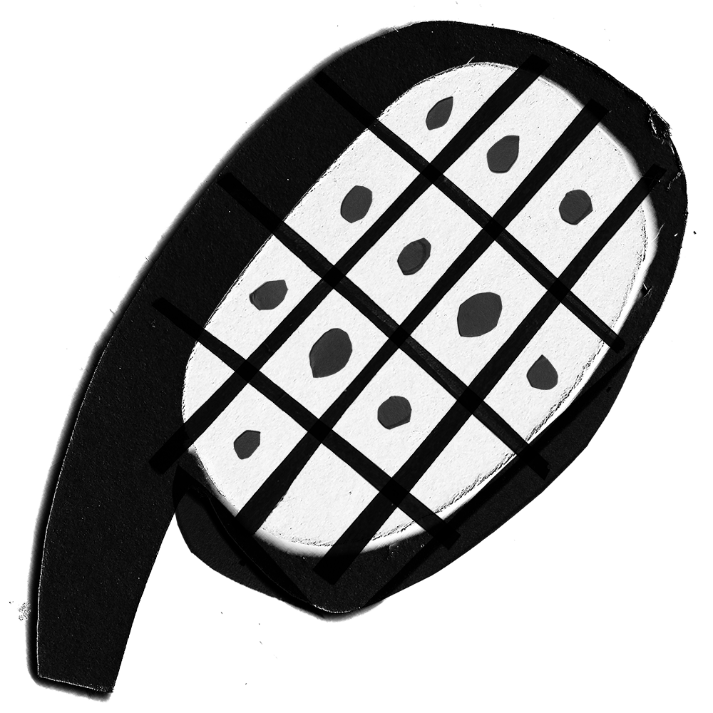
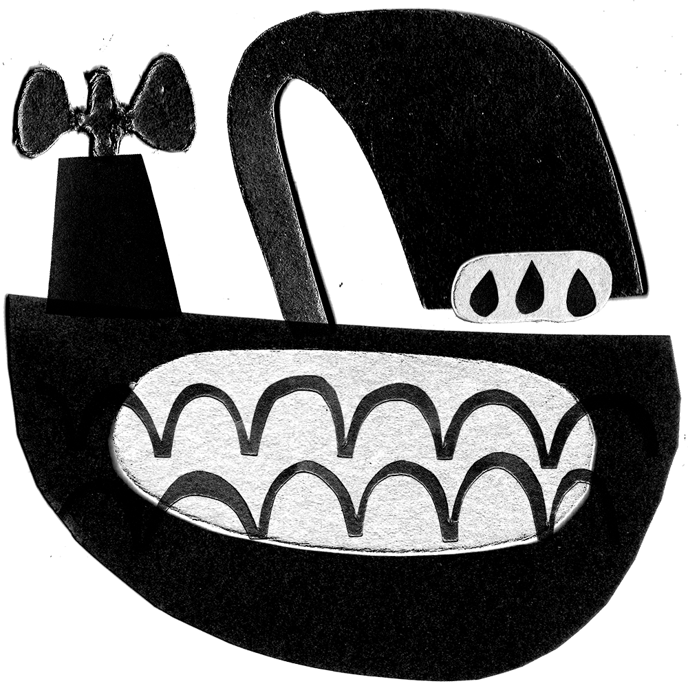
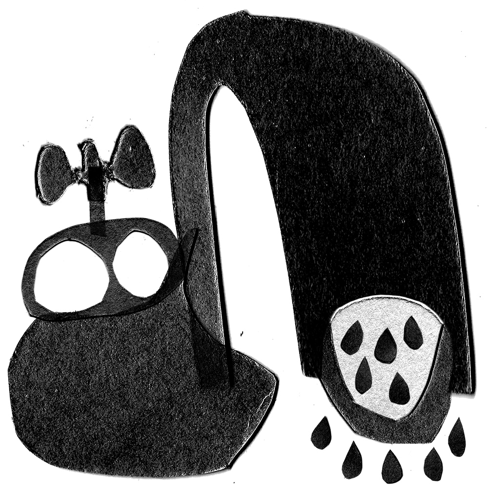
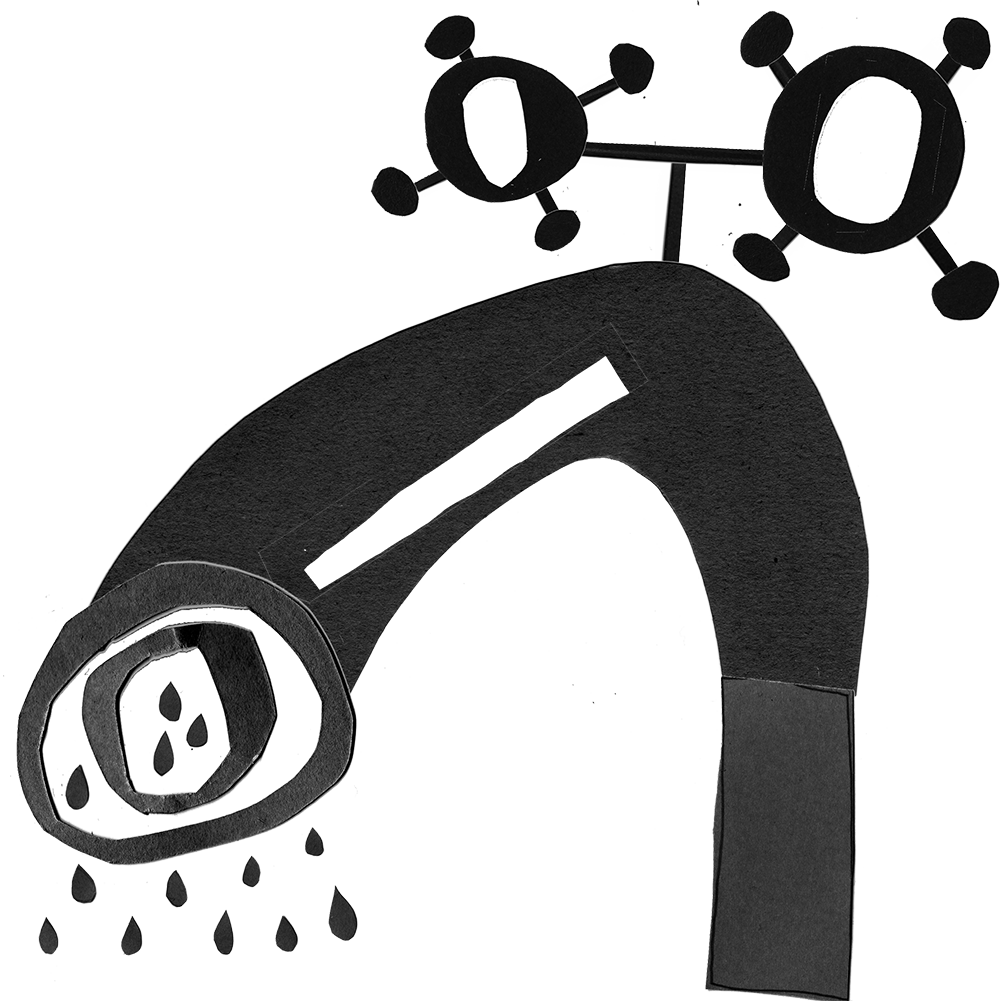
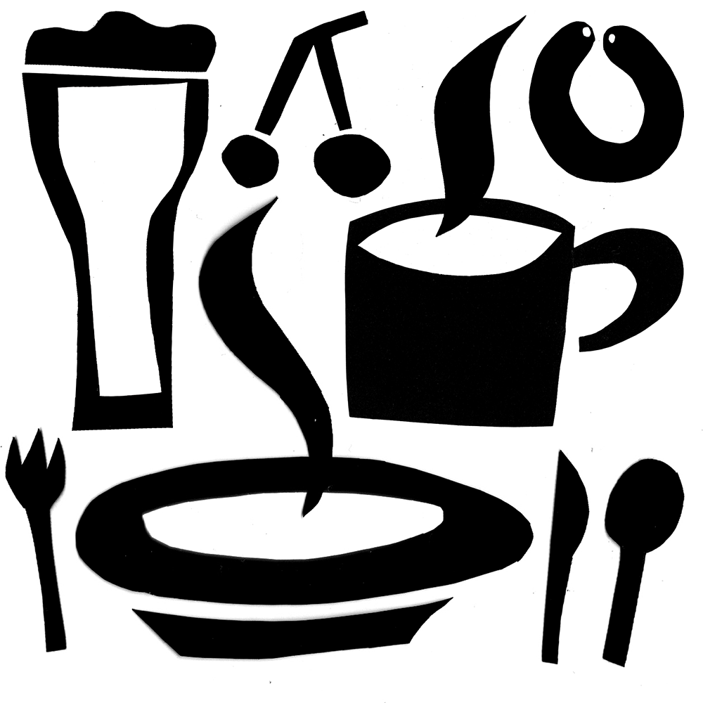
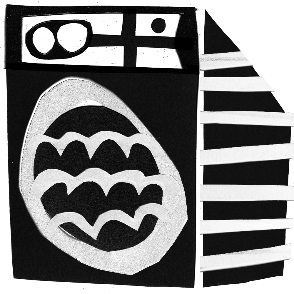
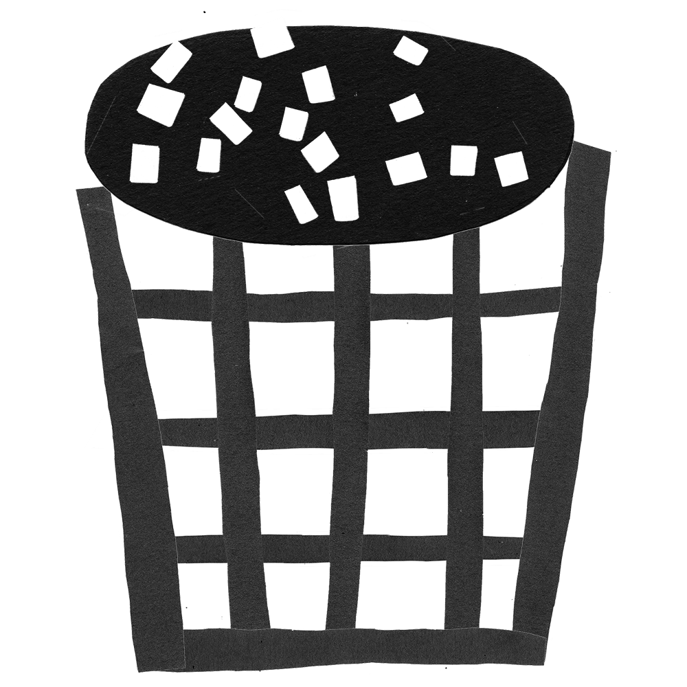
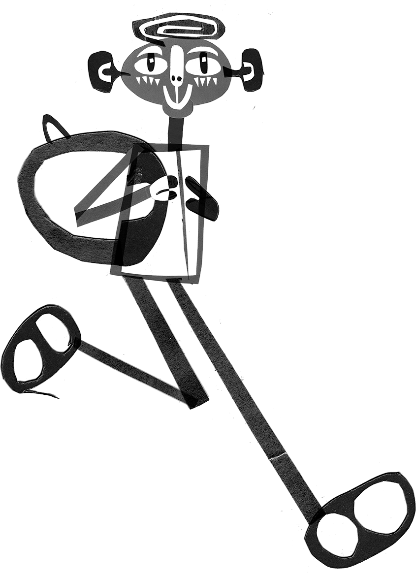
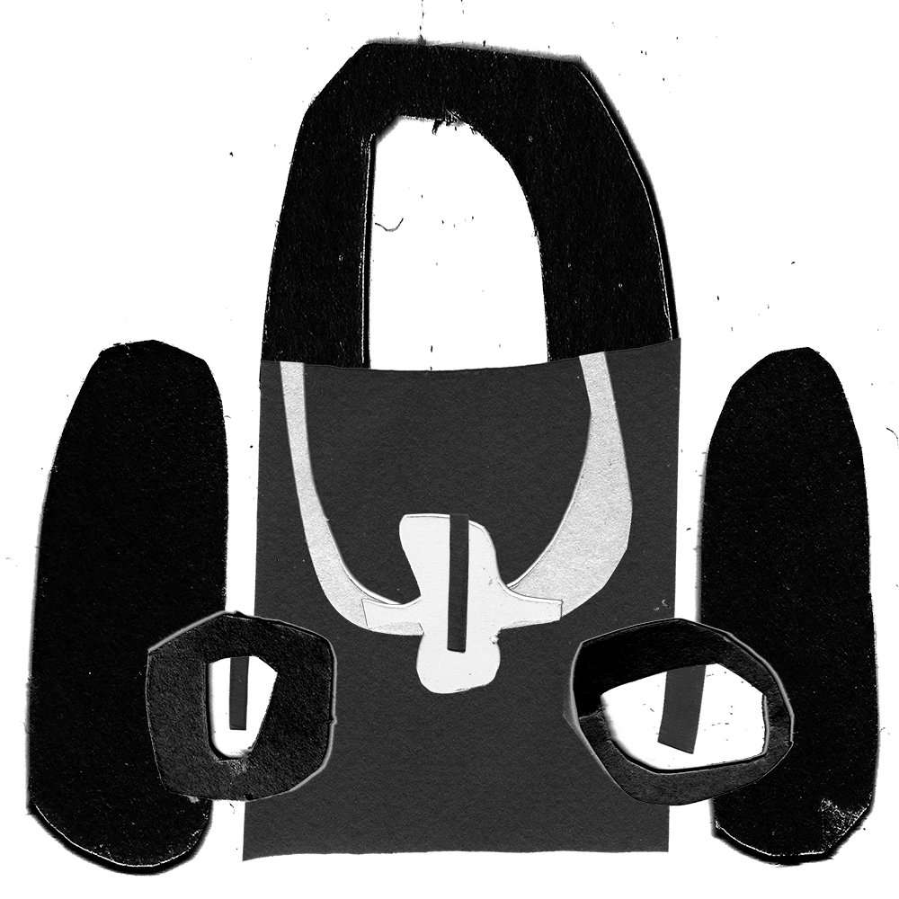
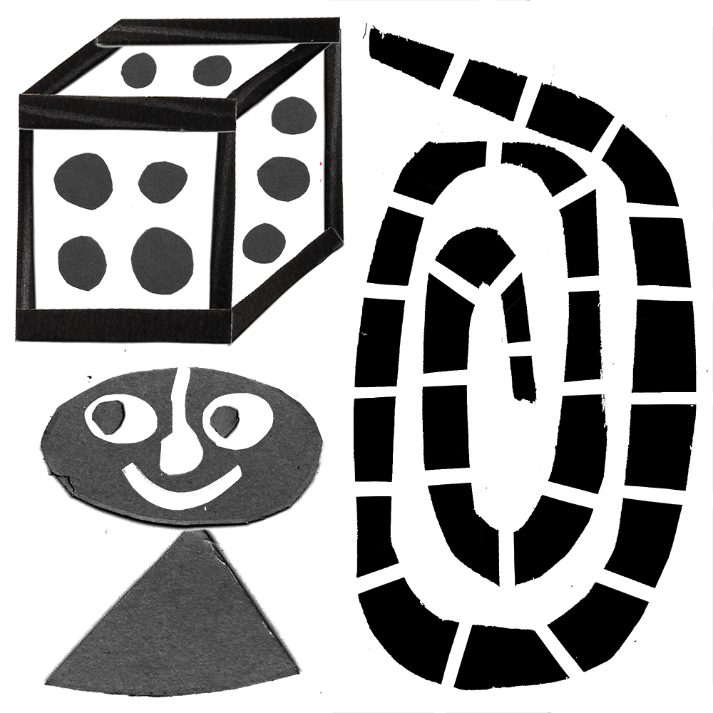

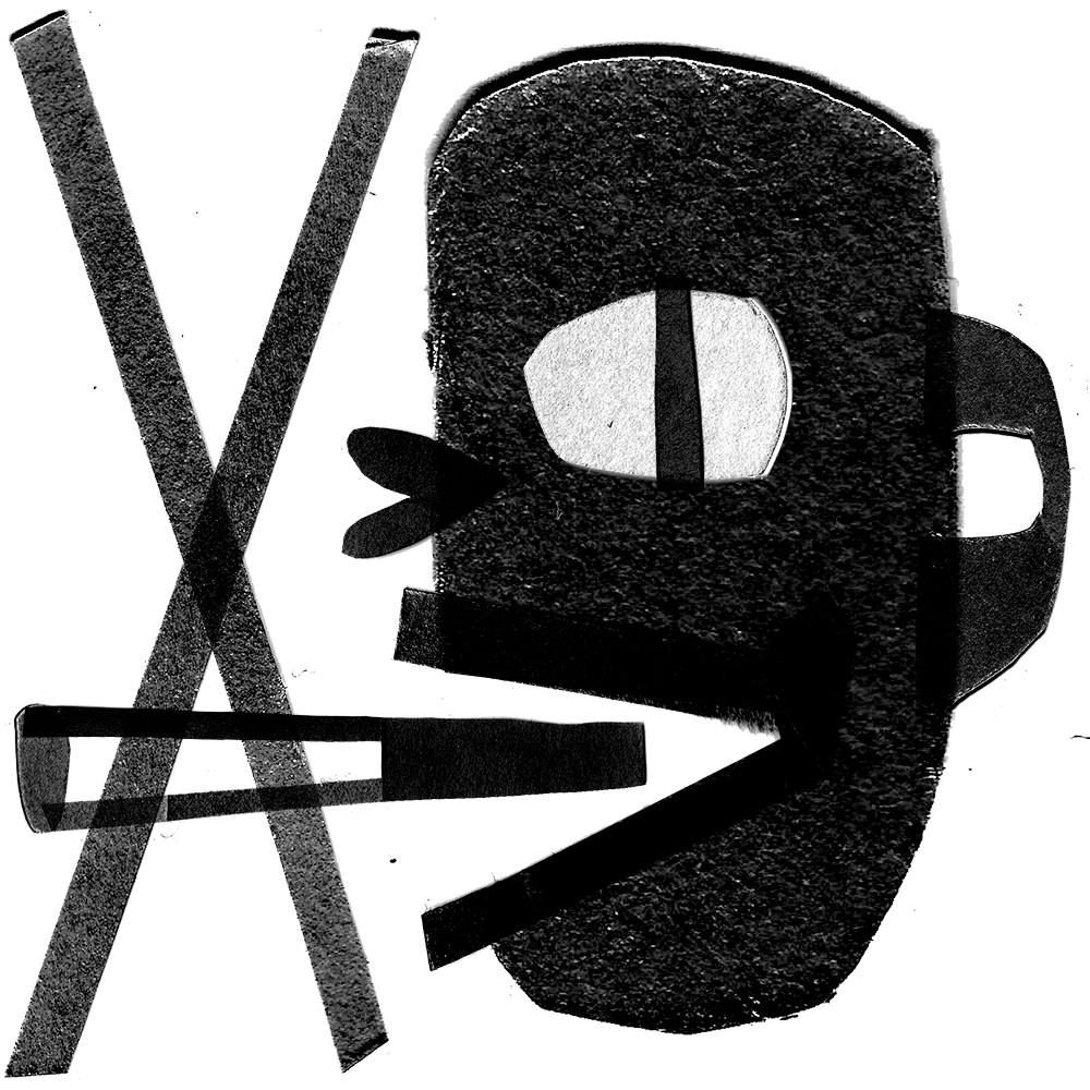
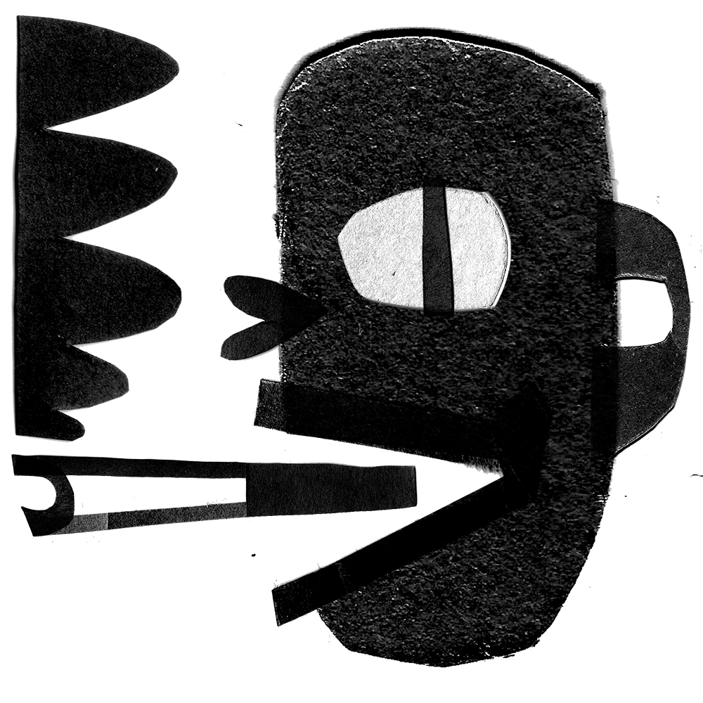
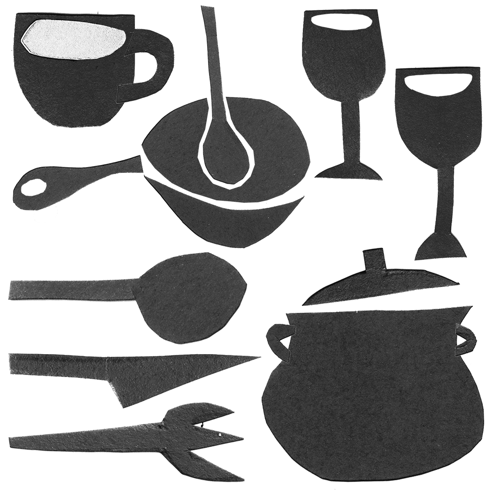
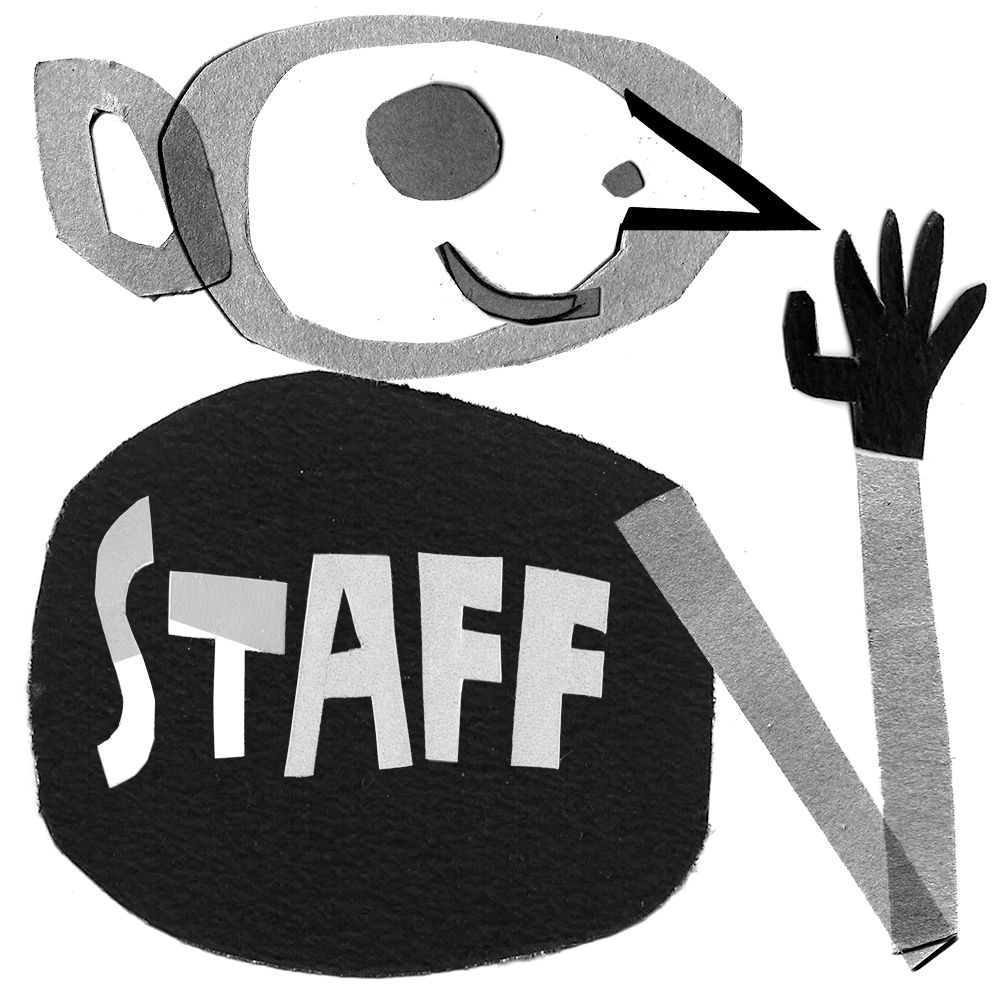
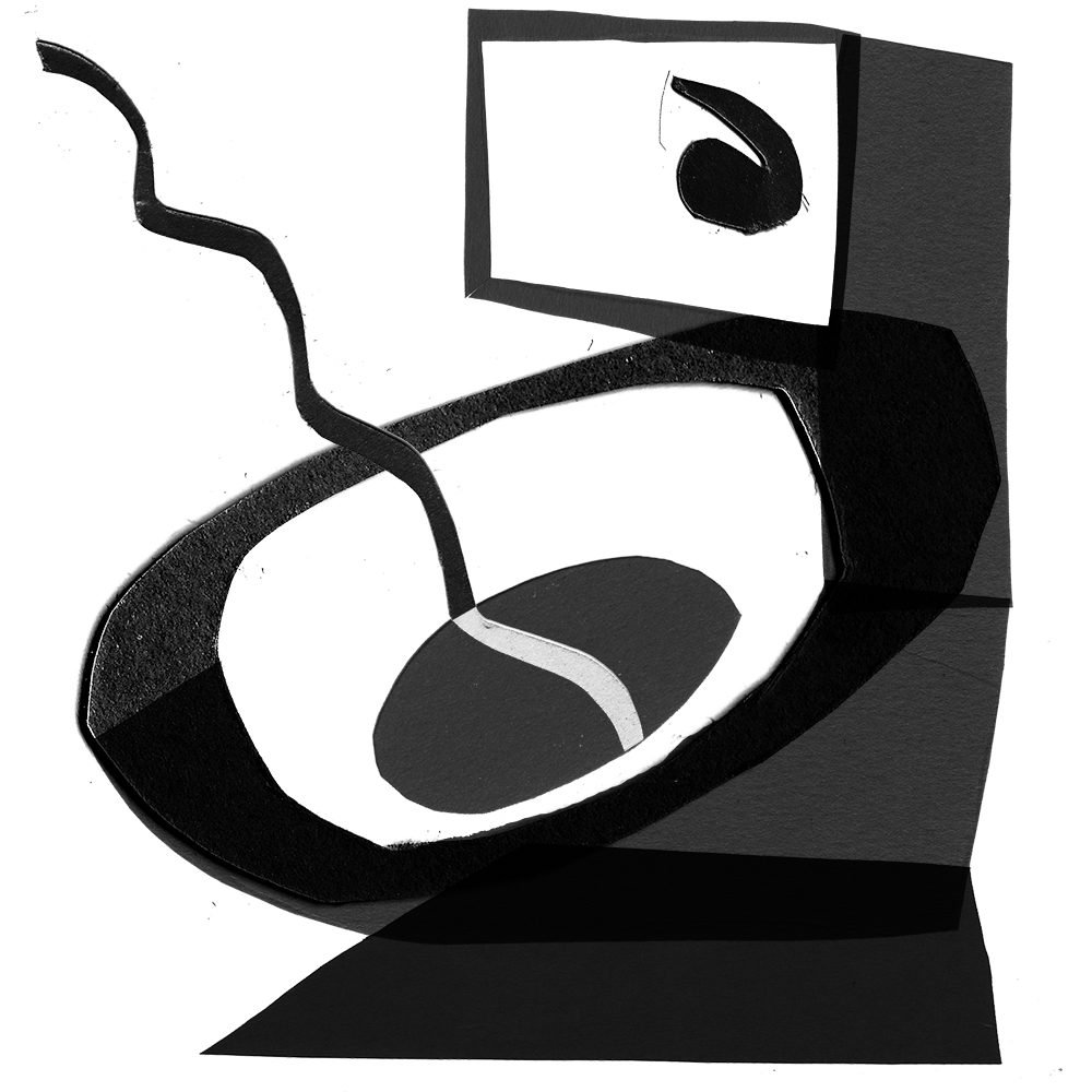
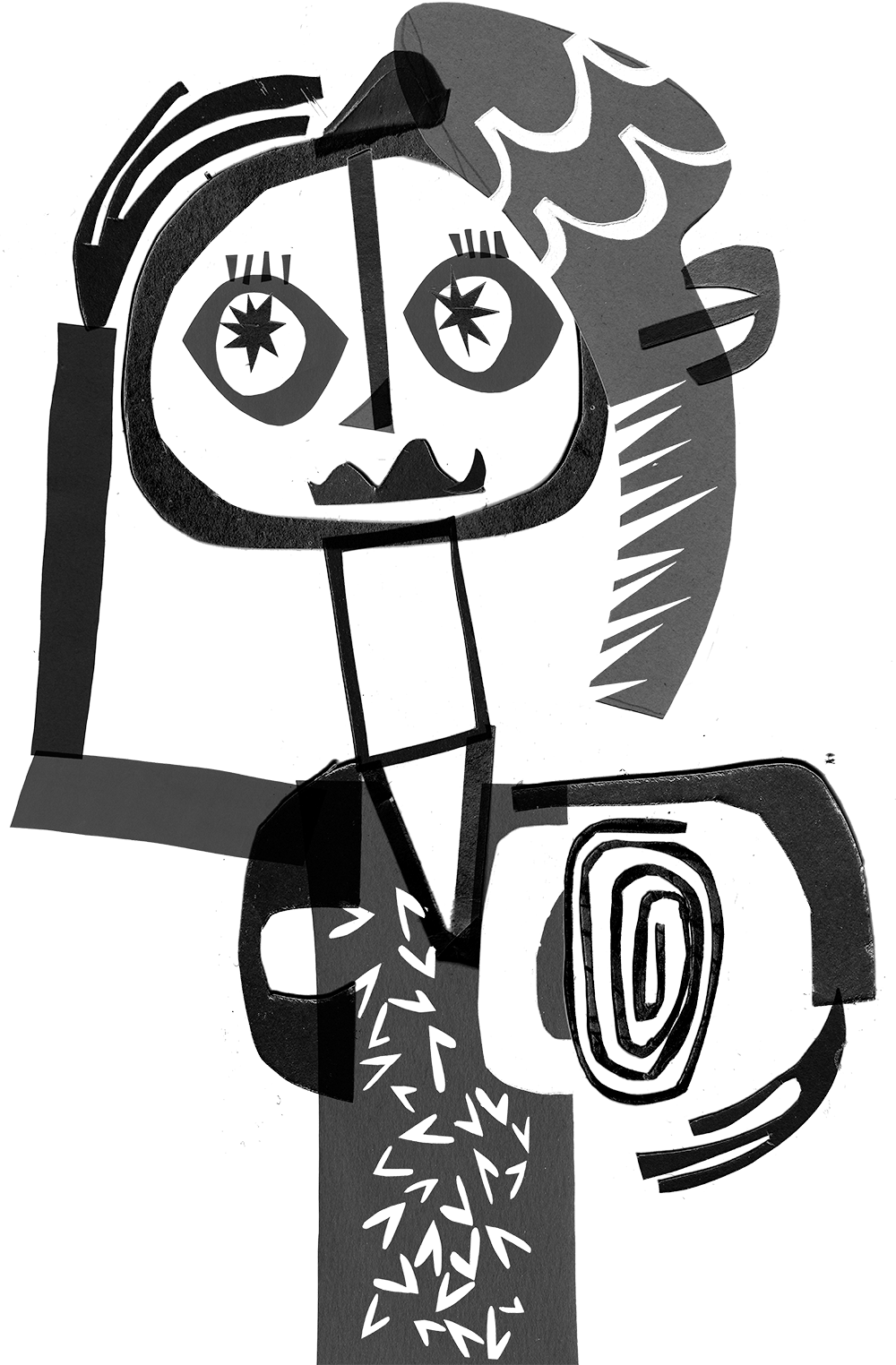
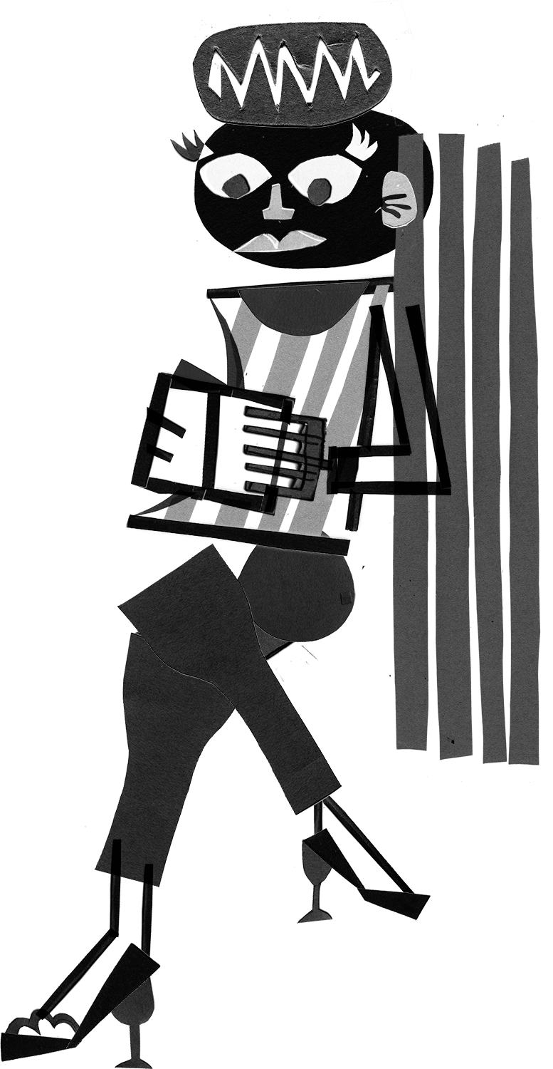

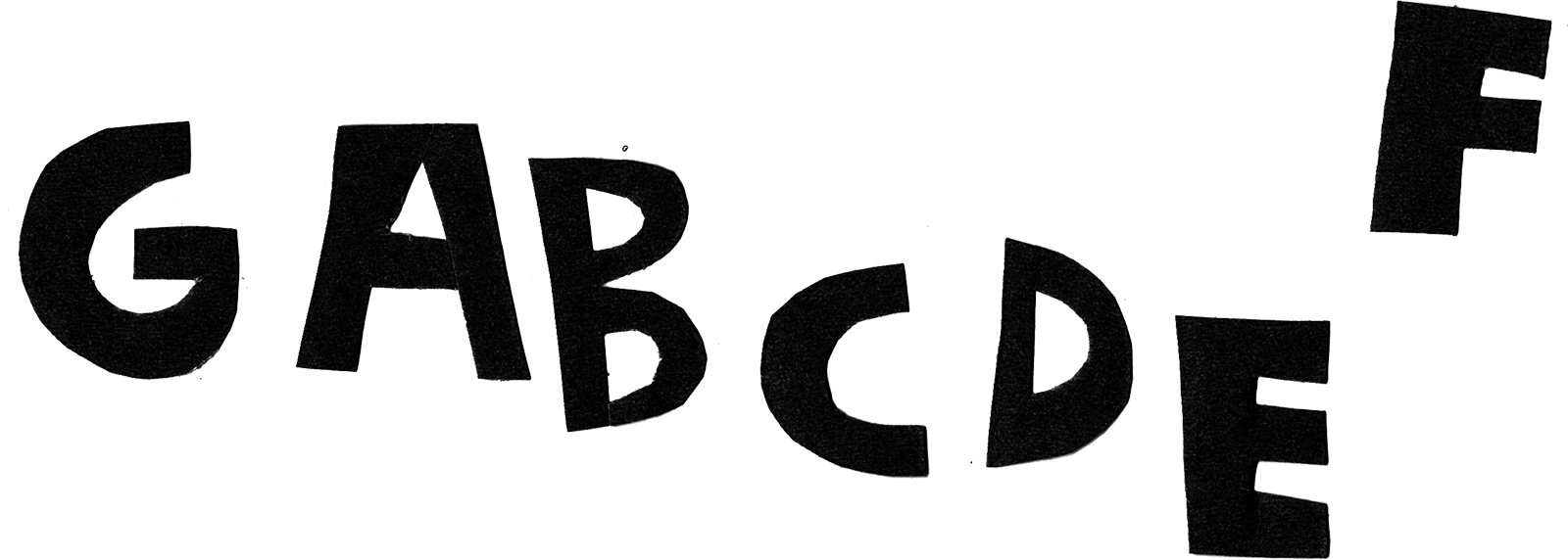
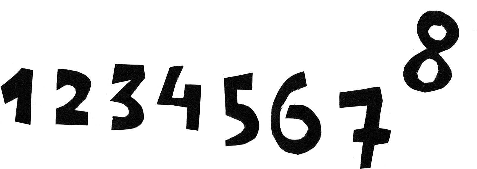
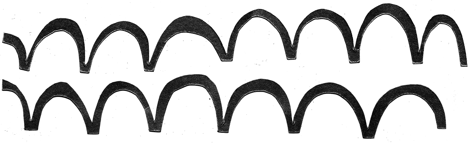
 Illustrations for signage and decoration project
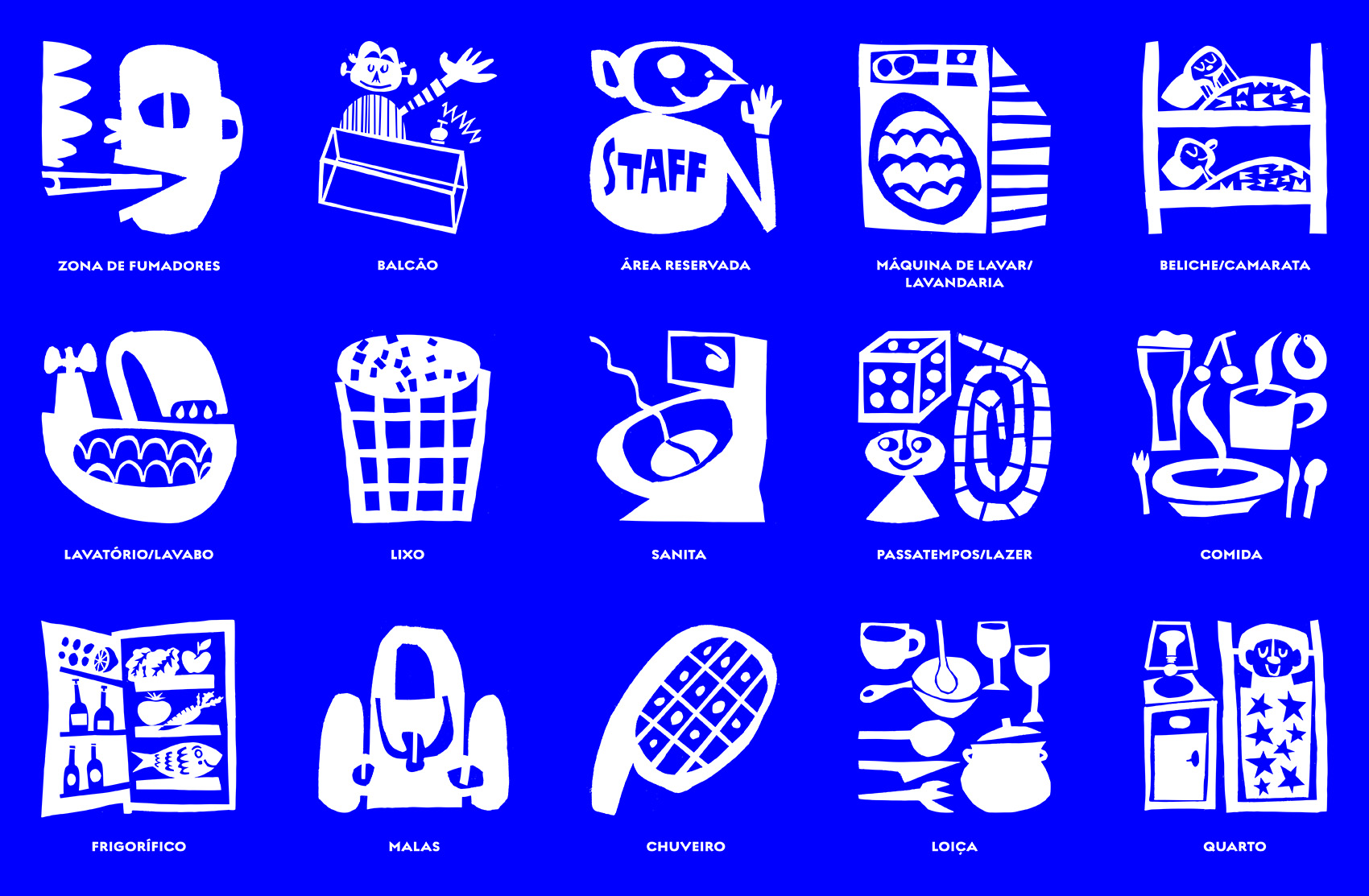
 Final pictogram panel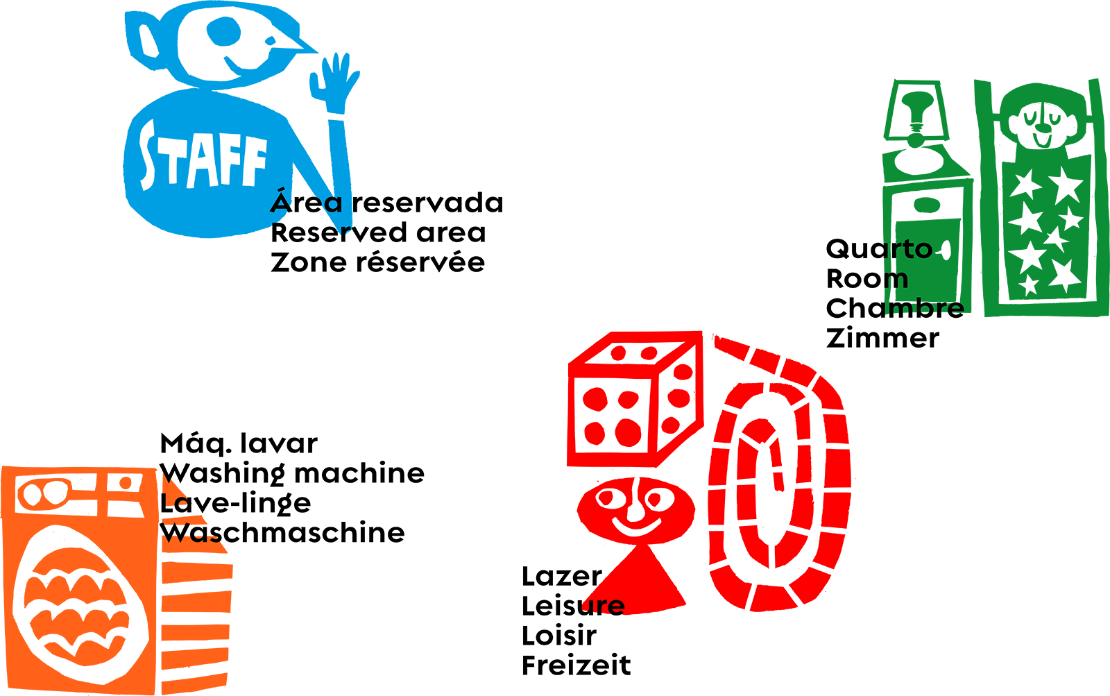
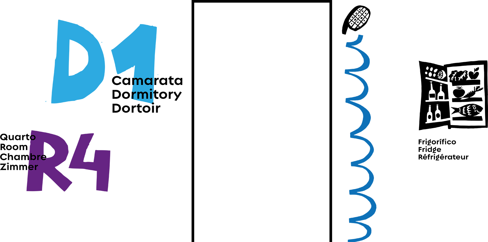
 Signage project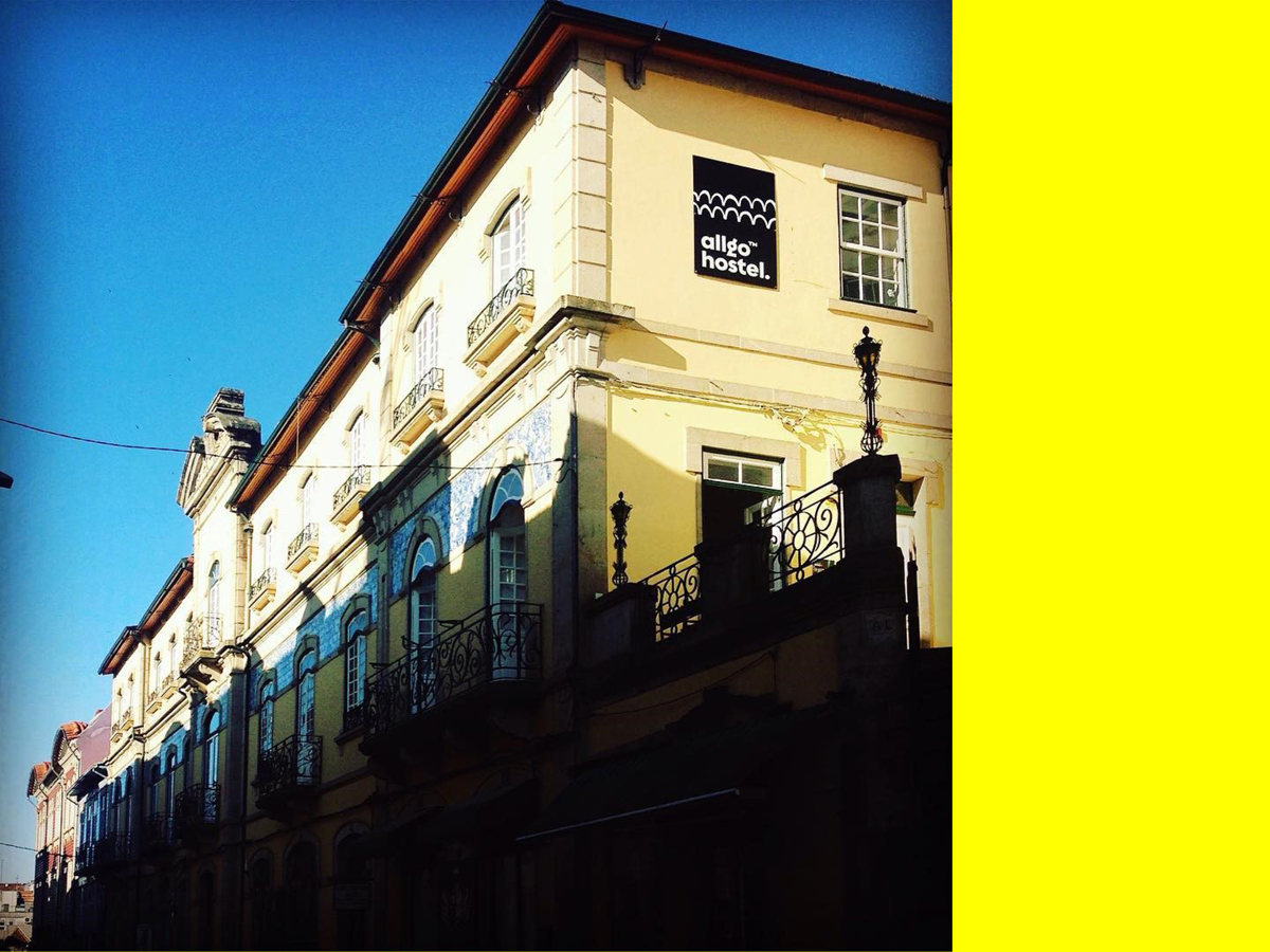
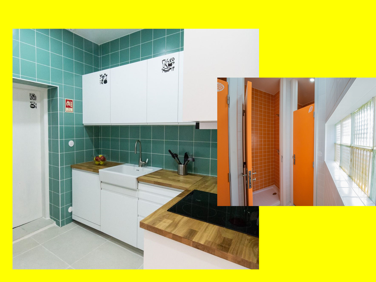
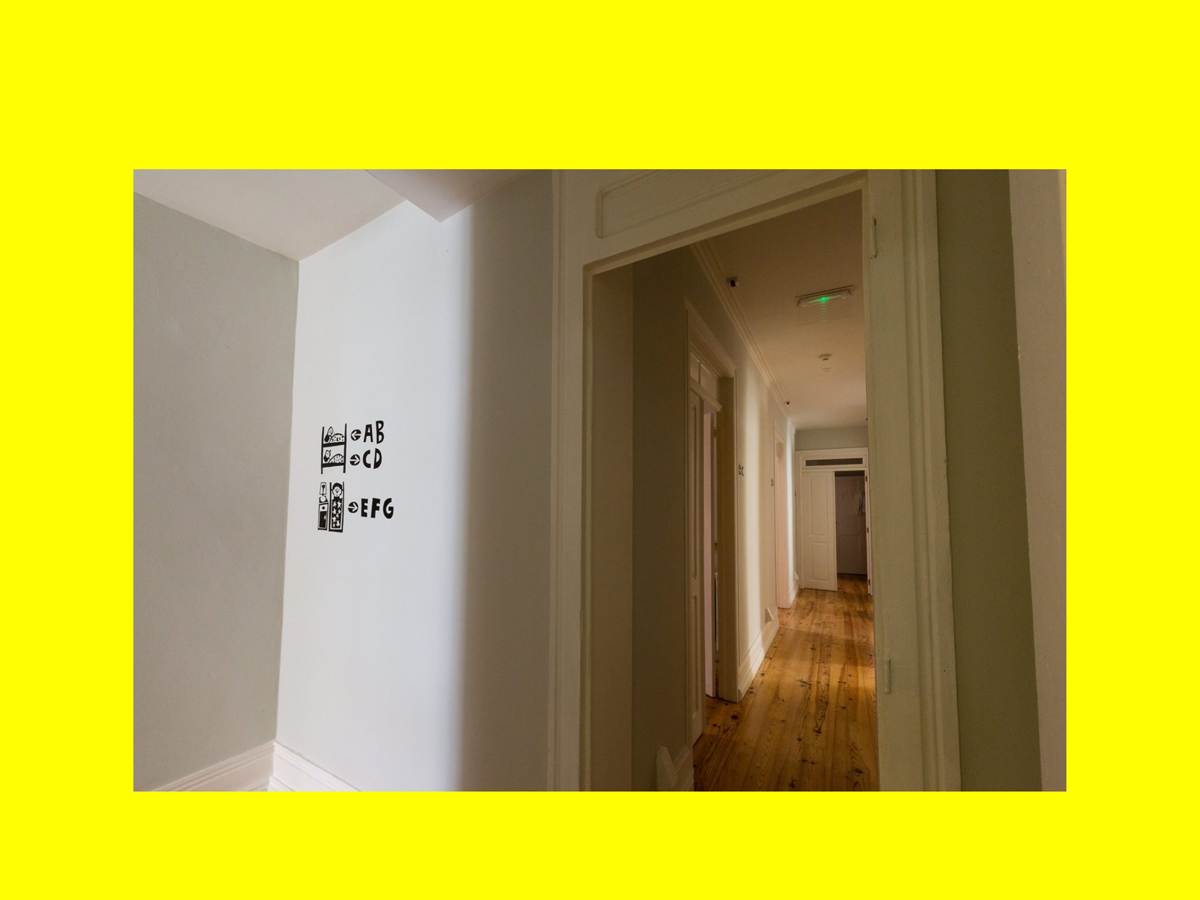
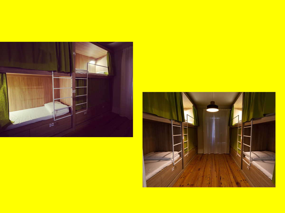
 Application