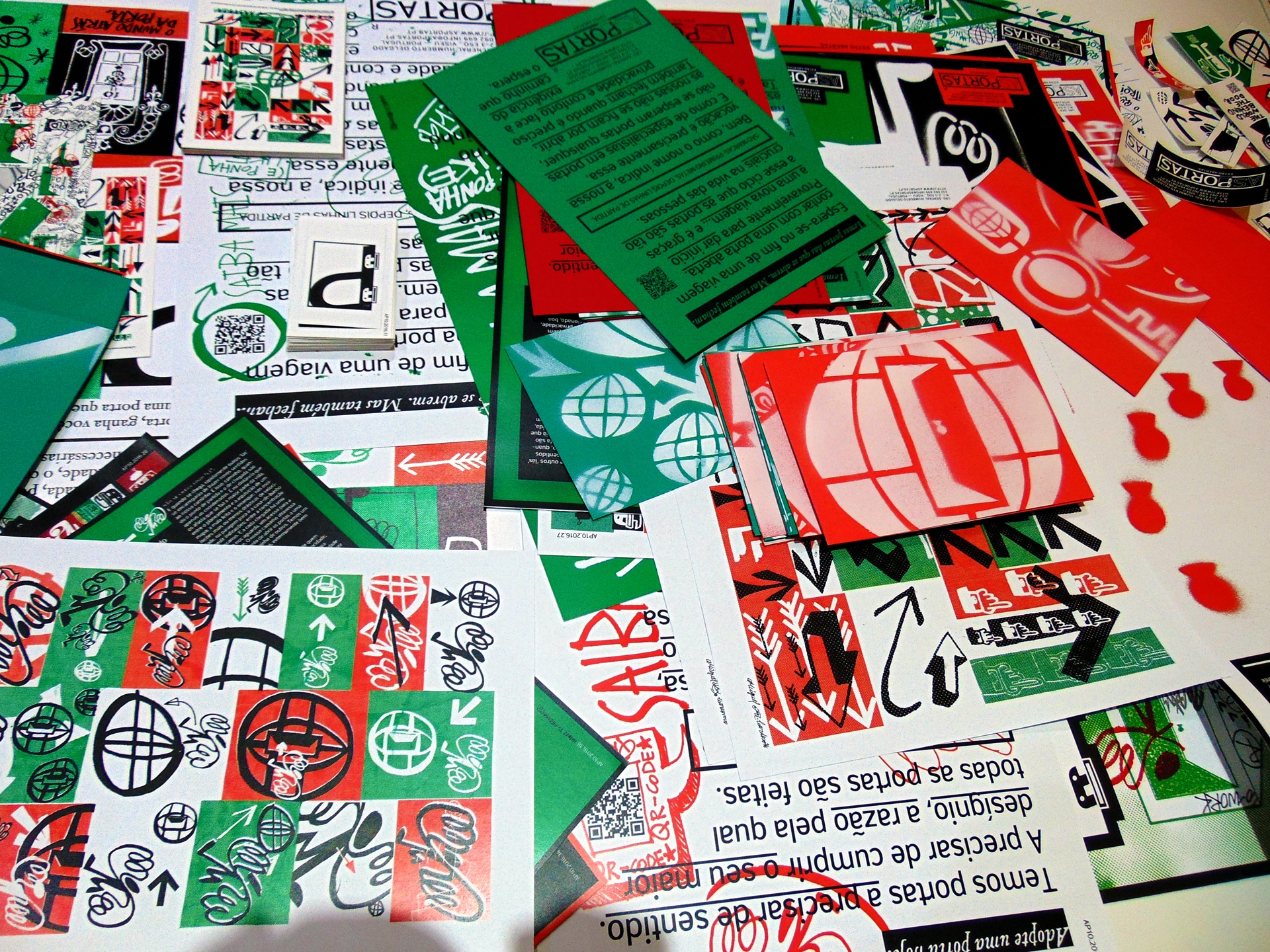
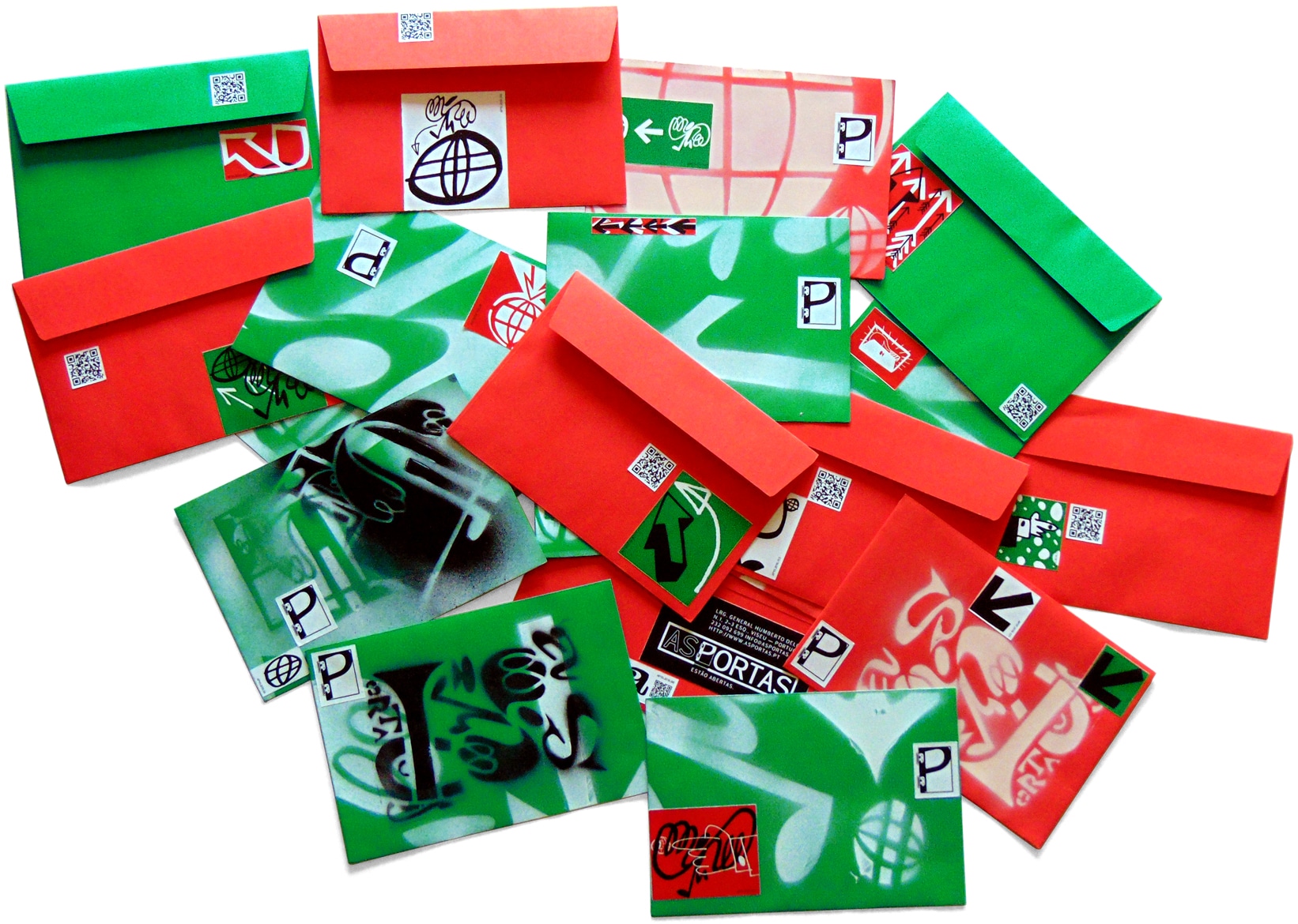
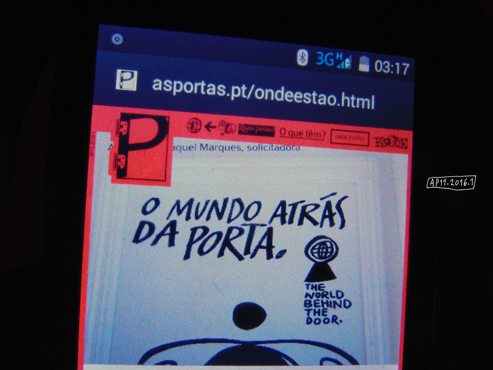
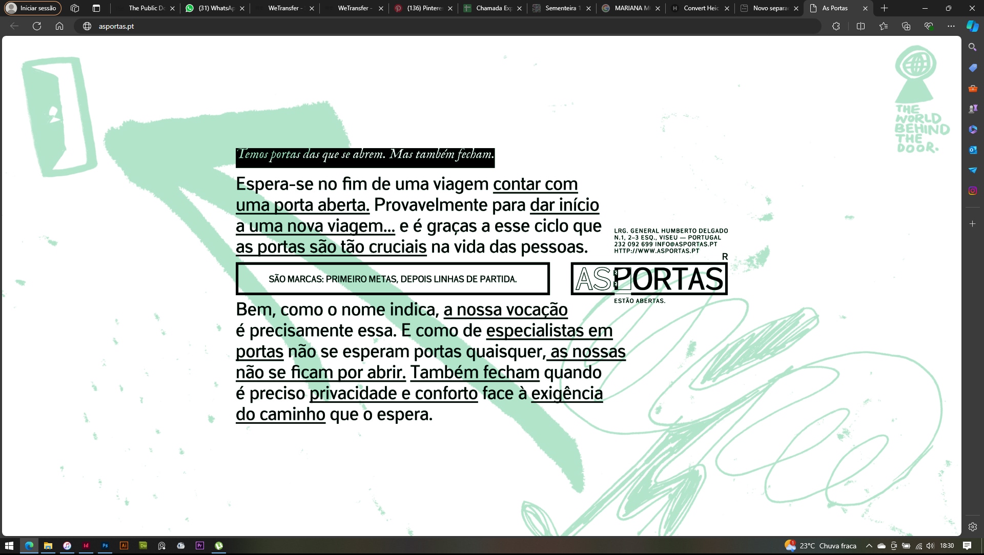
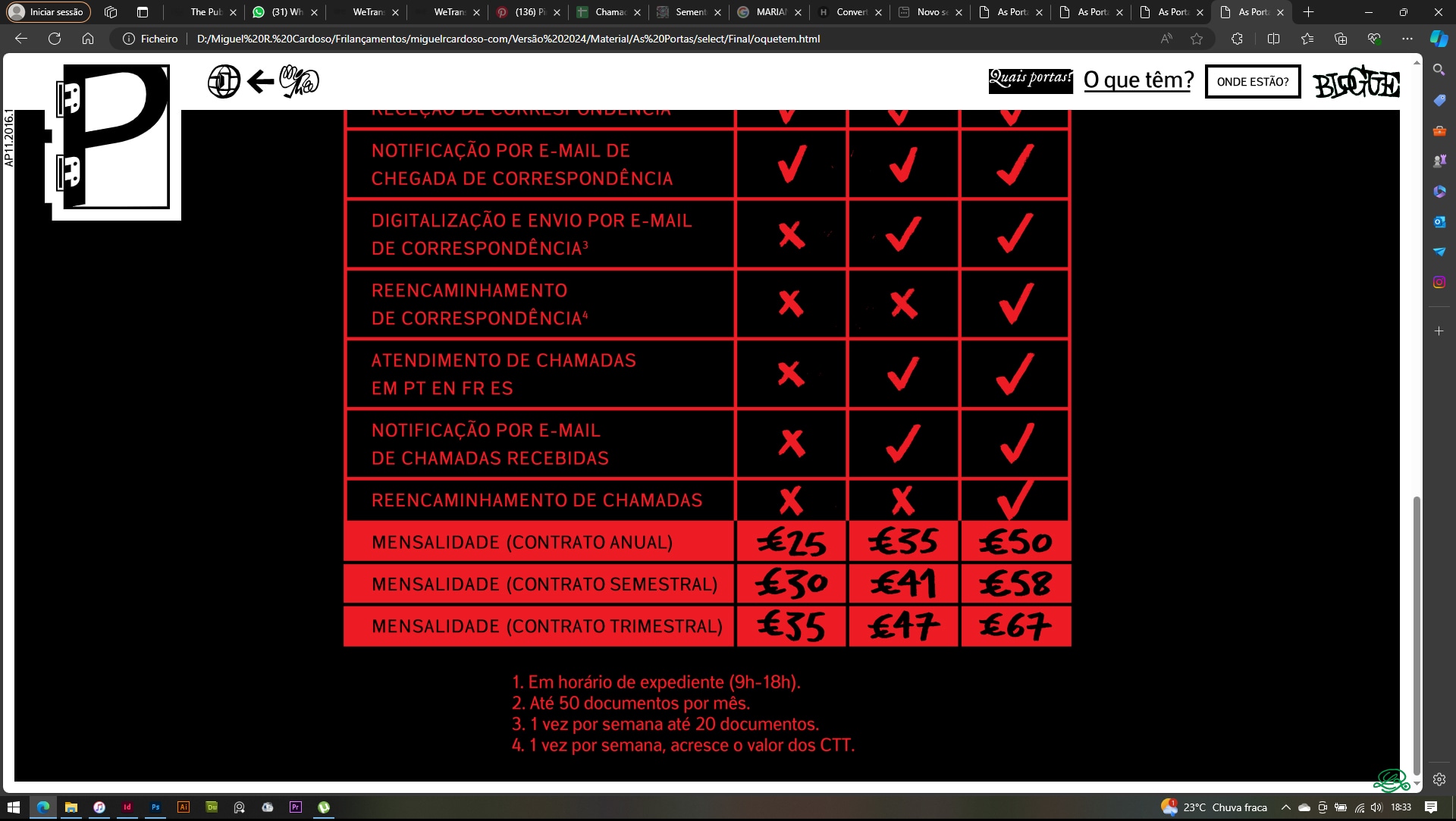
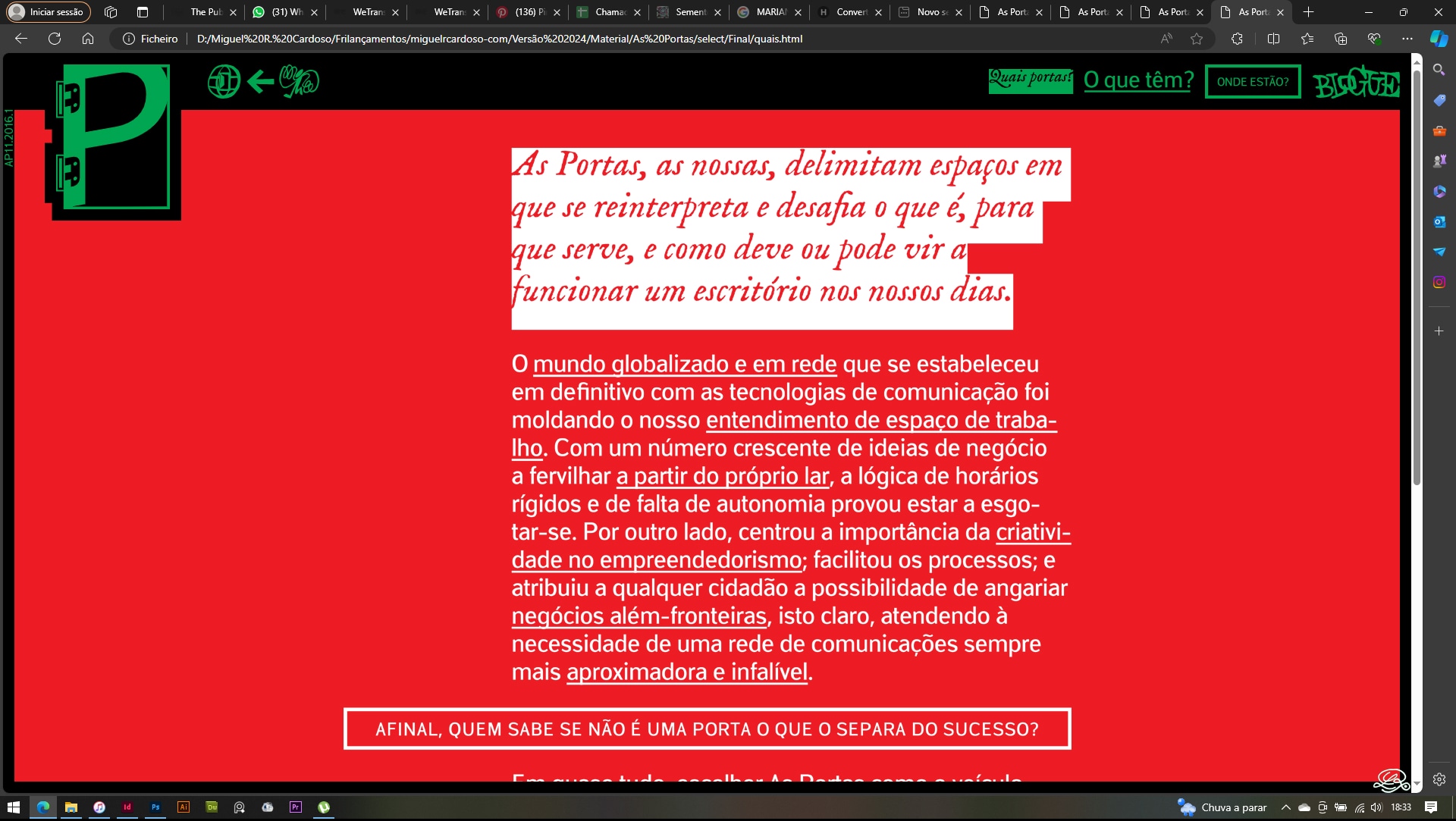
● (The ones that open.) The challenge: fifteen white doors across two refurbished apartments for office rental in a historic building in Viseu. The modernized space had ended up with a cold, «clinical» feel. The graphic mission was to bring it to life — while keeping its appeal to traditional professions (lawyers, solicitors, seamstresses...) but also attracting new creatives and entrepreneurs. The folks at Elipse Binária (the client) gave us complete freedom. The project grew naturally from decoration into branding and almost into graphic research — always with the shared desire to do something unprecedented and identity-driven.
● NAMING: The object named itself: As Portas (The Doors). Thatʼs what I used to say: «Iʼm going to as portas (the doors).» The best names are these — the ones the object itself chooses, the ones we canʼt stray from without feeling like weʼre betraying it.
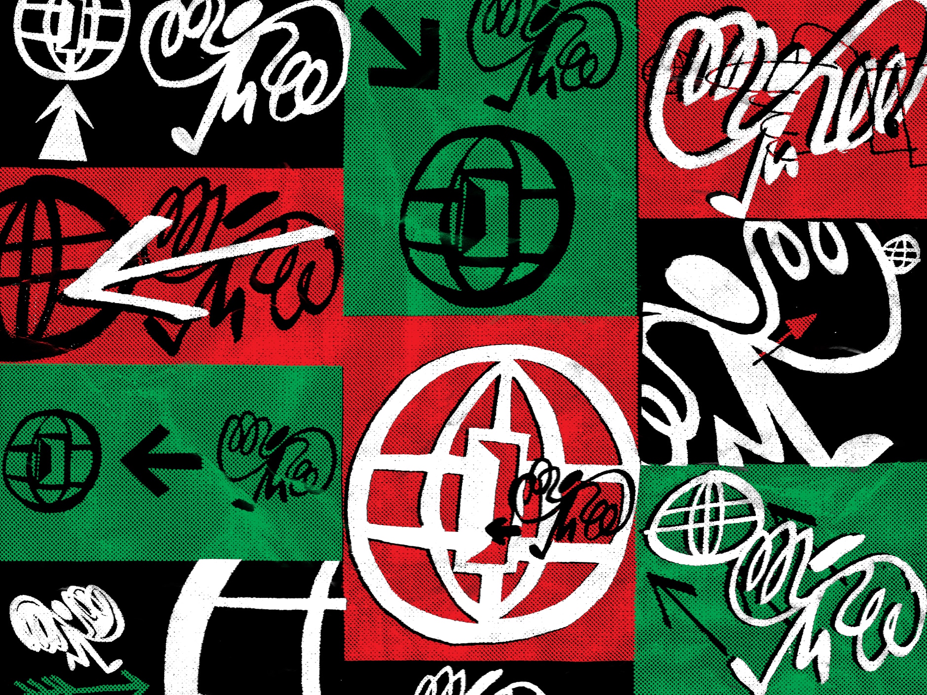
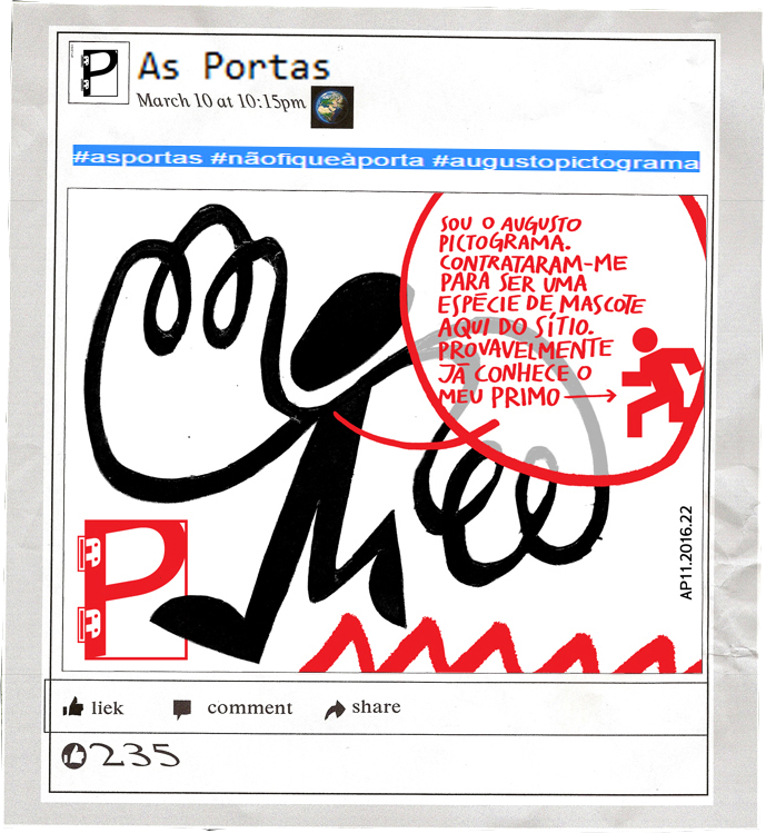
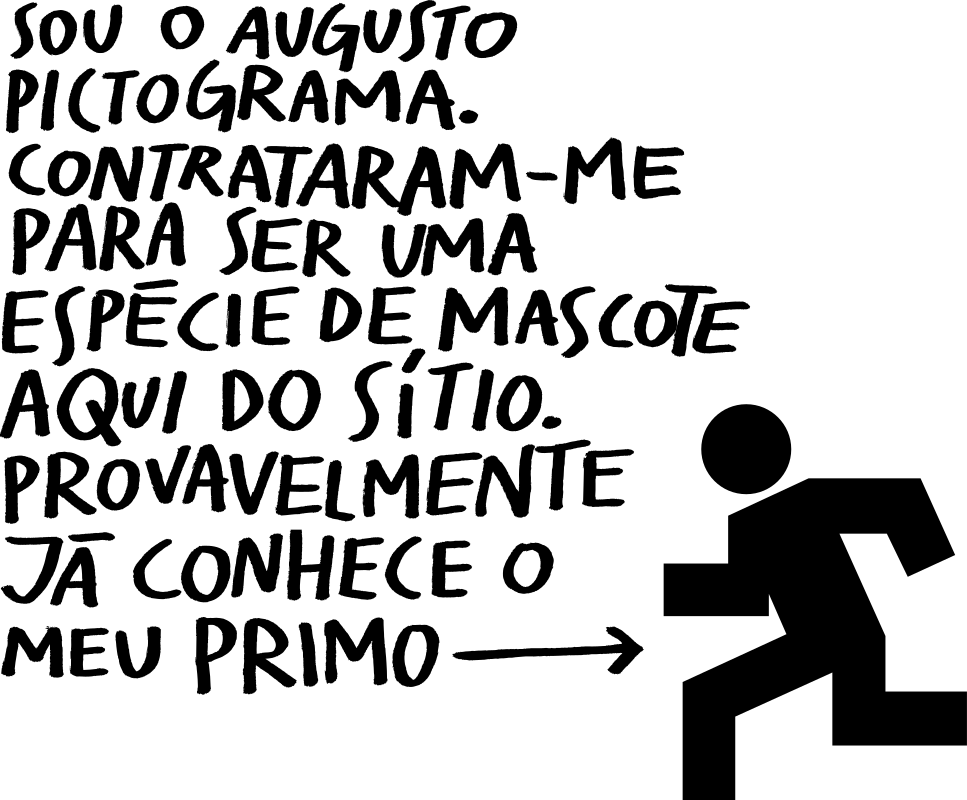
● GRAPHIC VOCABULARY: We shared a fascination with signage and pictograms. Crossing that with the lexicon of doors led us to emergency exit light boxes. The hurried figure walking through a door was the starting point. From there, Augusto Pictograma was born. Instead of fleeing, heʼs in a hurry to enter. The disproportionate hands, half-wings, speak of a proactive, creative type. Entering there isnʼt closing yourself off — itʼs connecting to the world (with high-speed Wi-Fi and air conditioning) and finding the focus to see projects through to the end.

 Graphic vocabulary: locks
 Studies for symbol/logo
 Logo: symbol
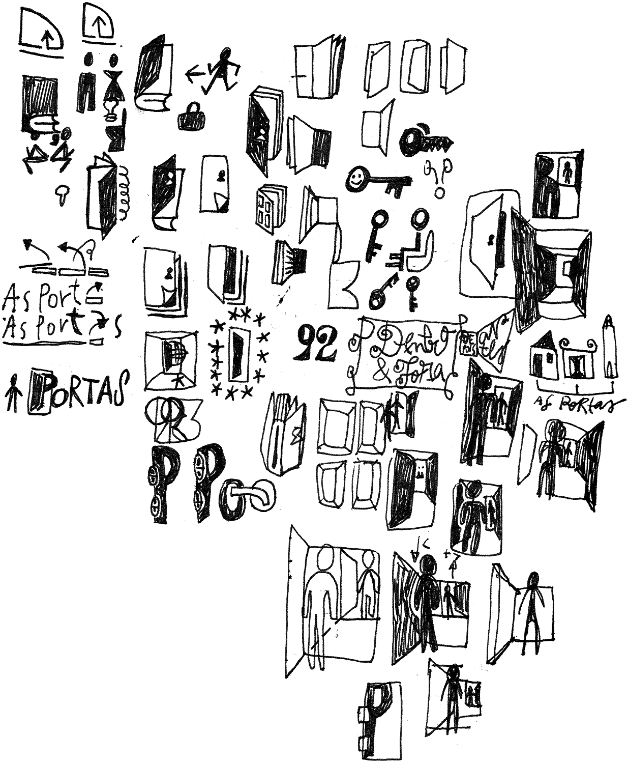
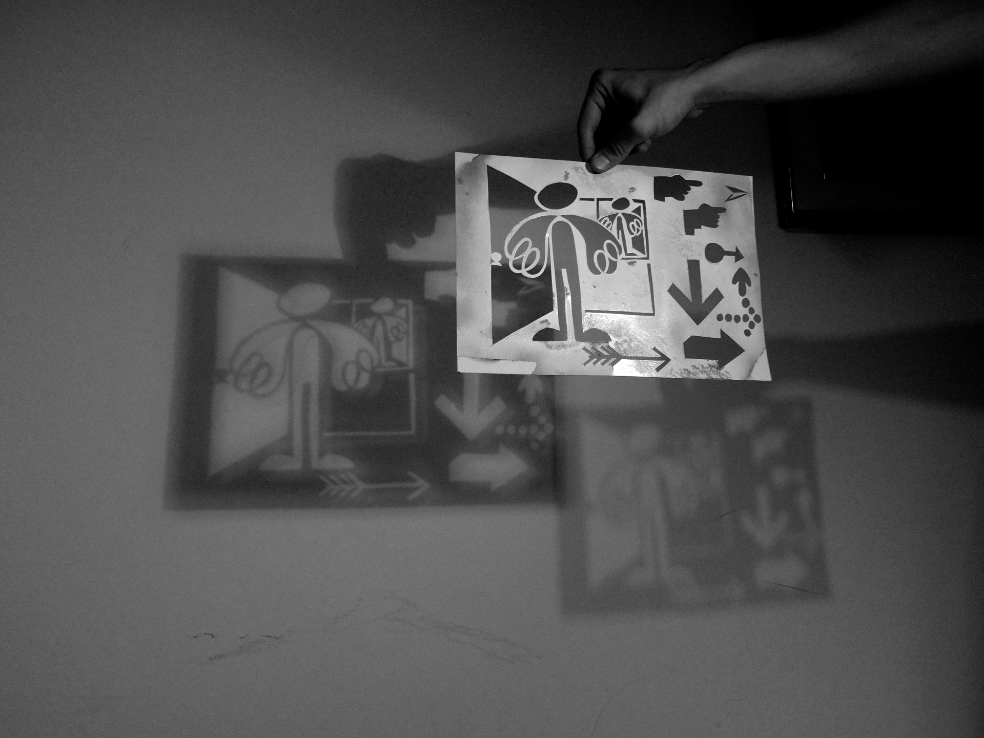
 Research/process: cutouts, signage, doodles
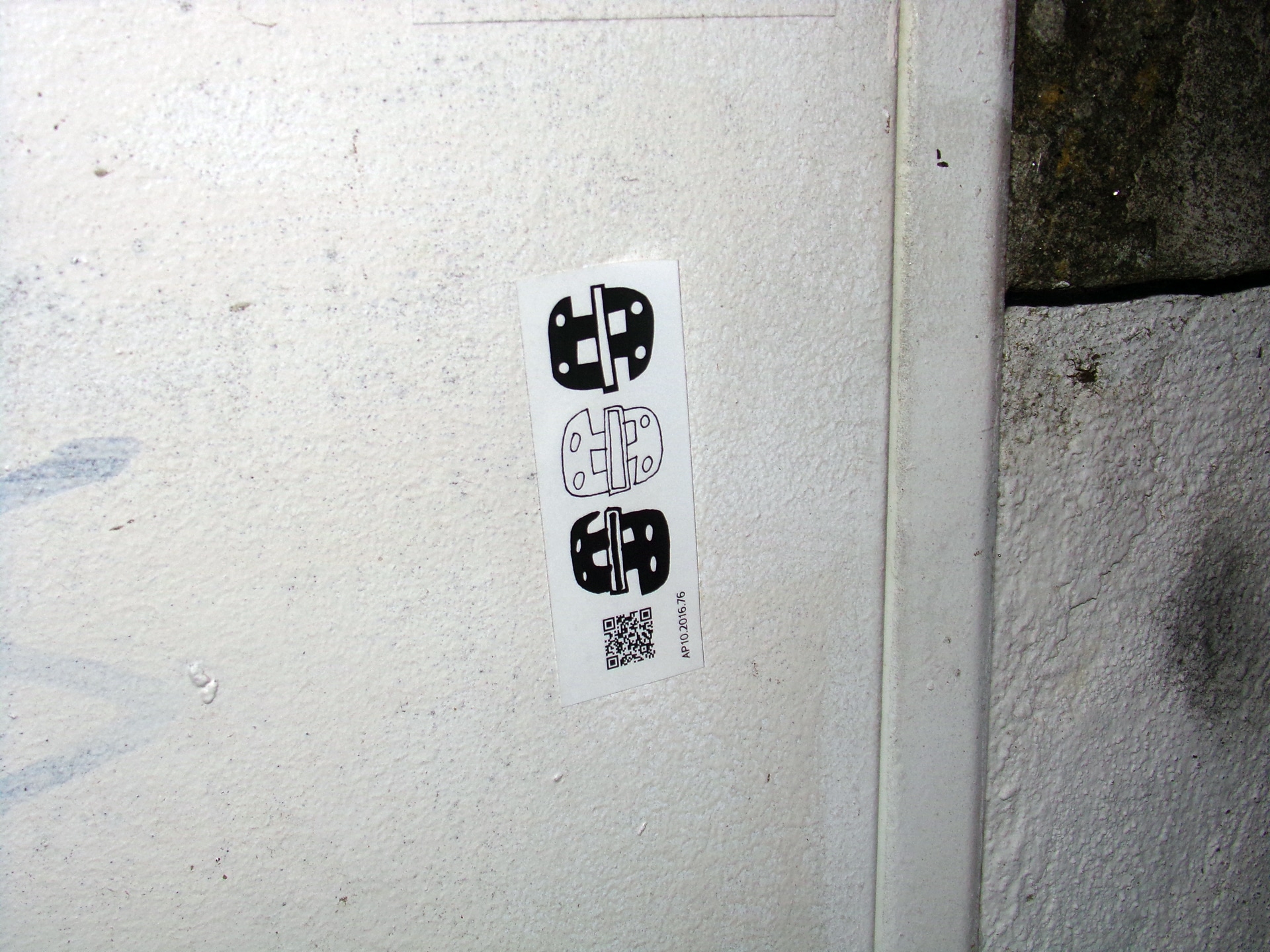
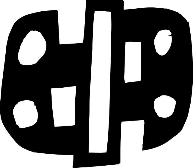
 Graphic vocabulary: hinges
 Who is Augusto Pictograma?
 Augusto Pictograma
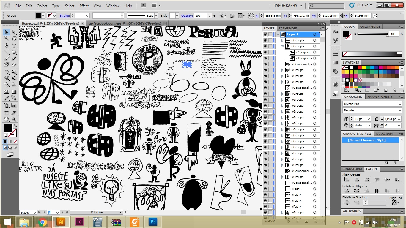
 Graphic universe
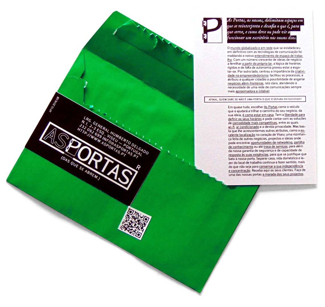
 Final logo with address and signature
 Business card





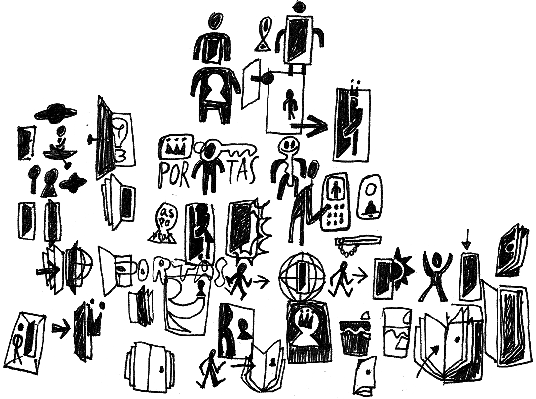
 Studies for symbol/logo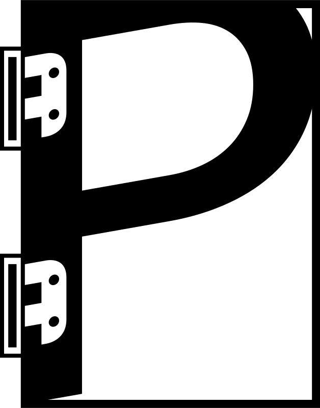
 Final logo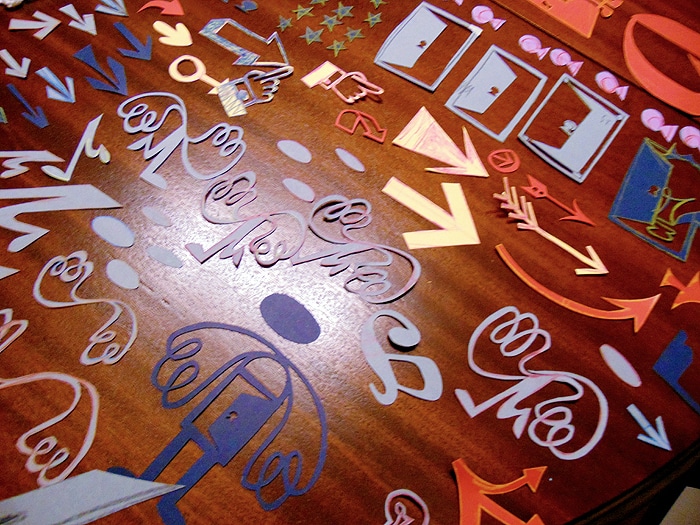
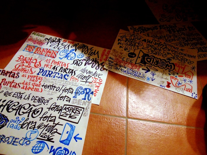
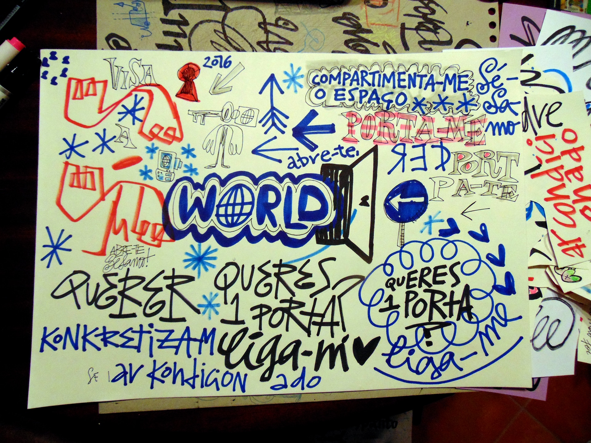
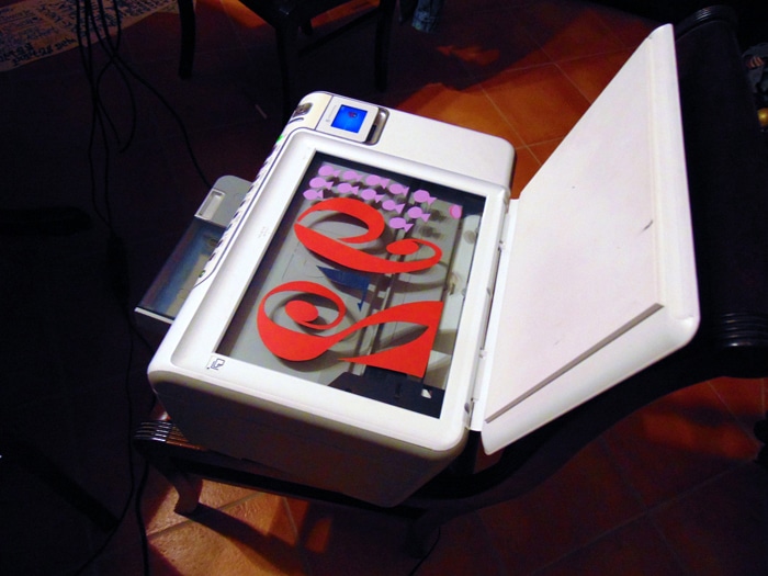
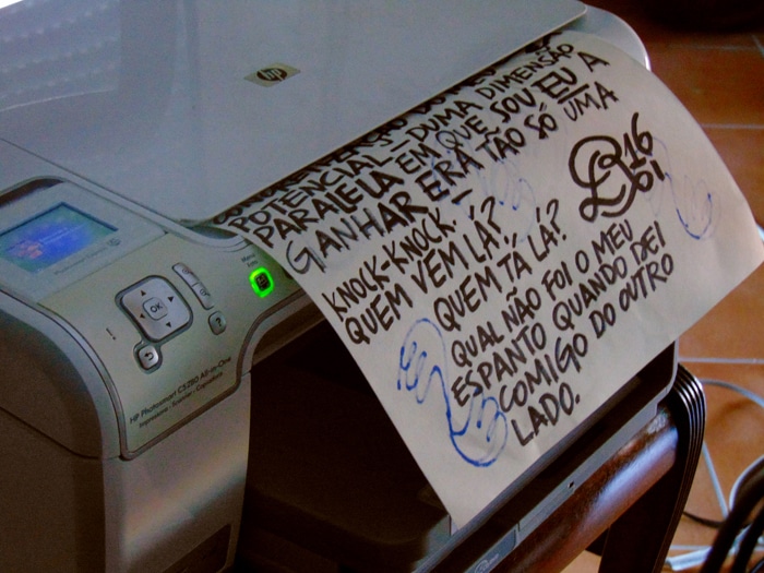
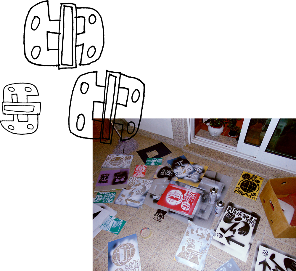
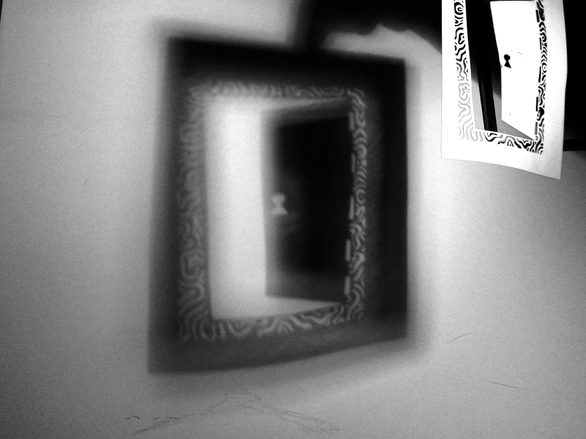
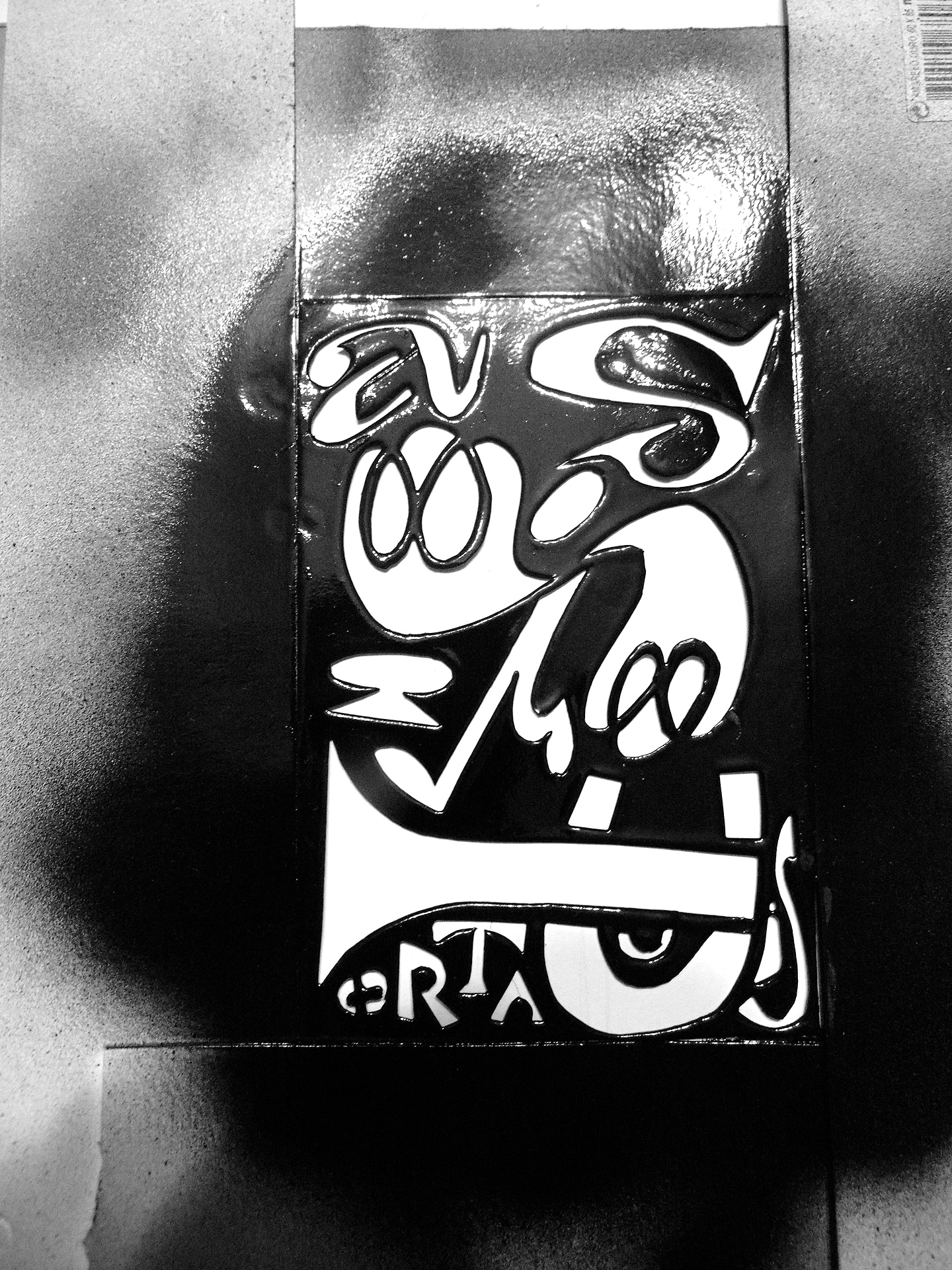
 Process: cutouts, signage, doodles...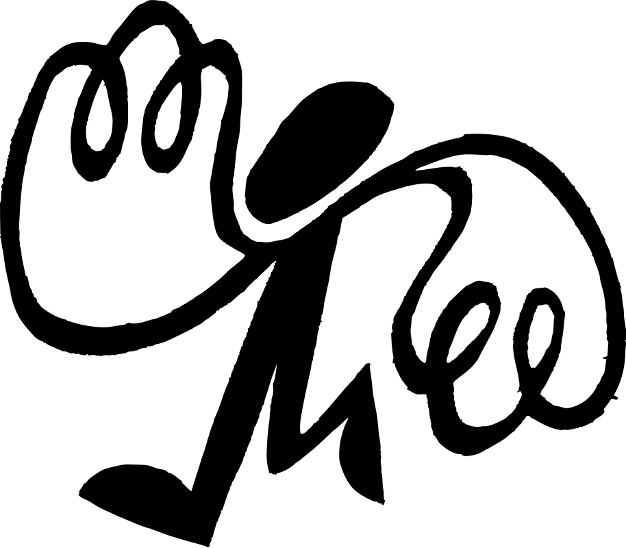
 "Augusto Pictograma"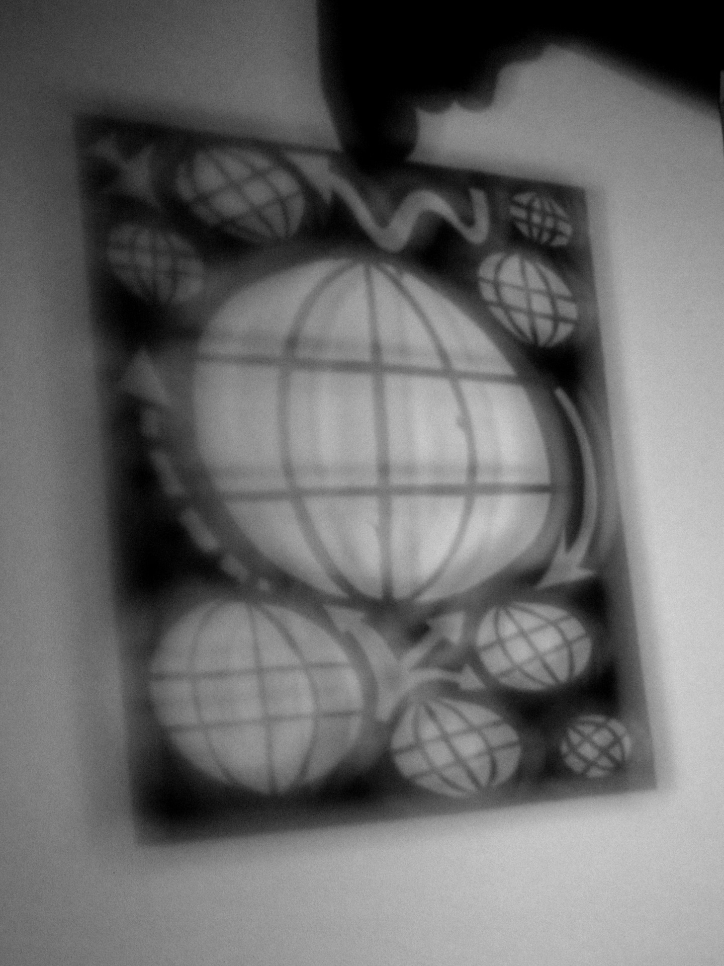
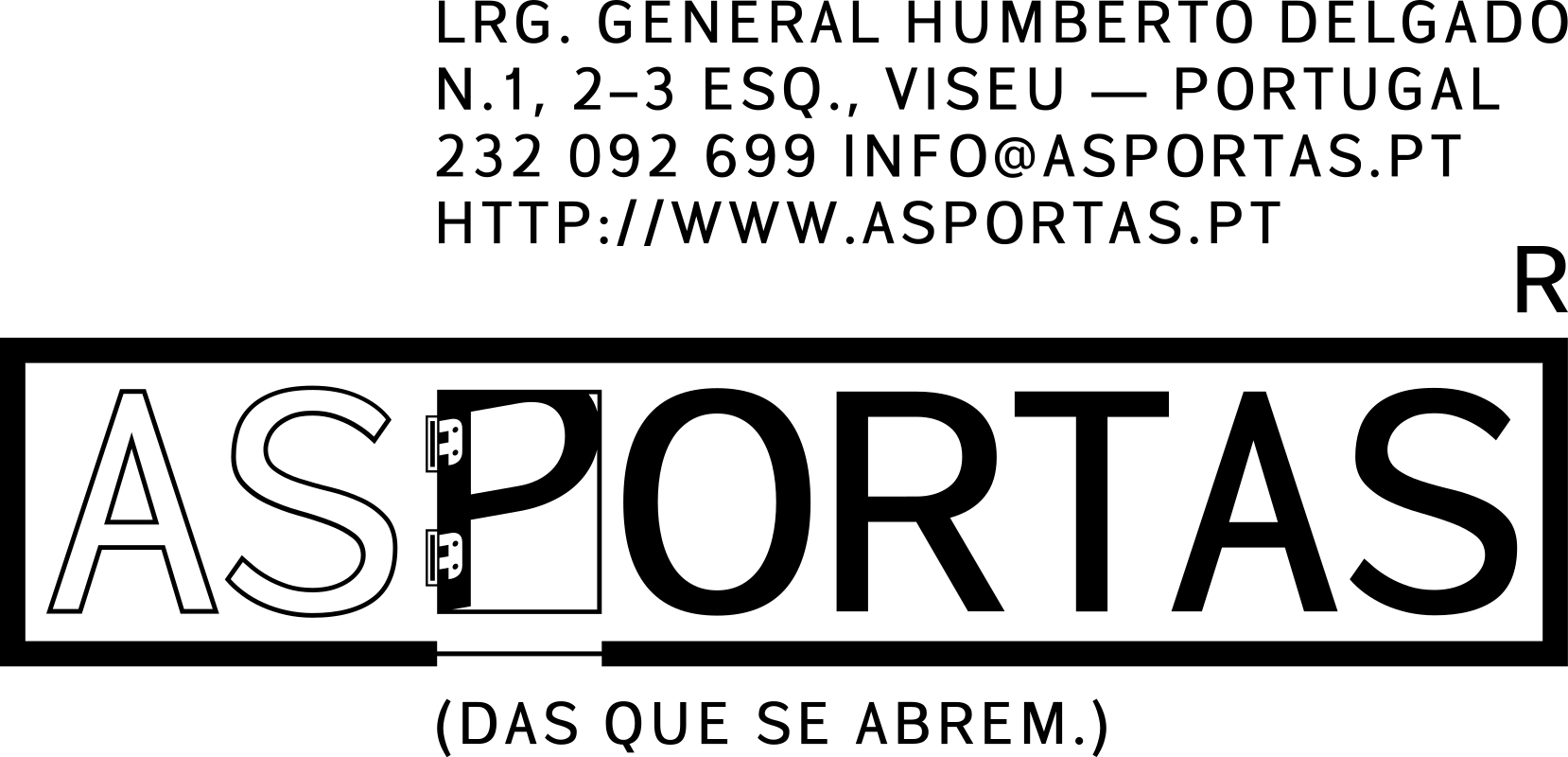
 Full logo, with address and signature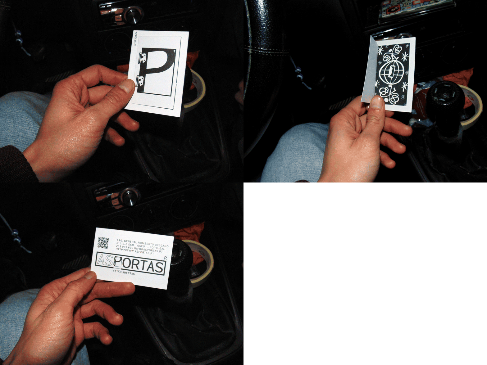
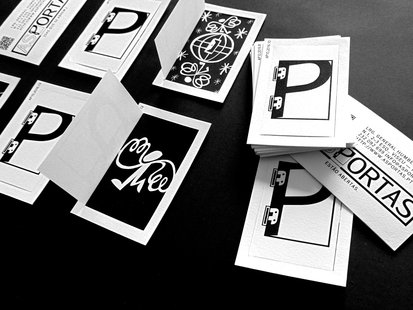
 Business card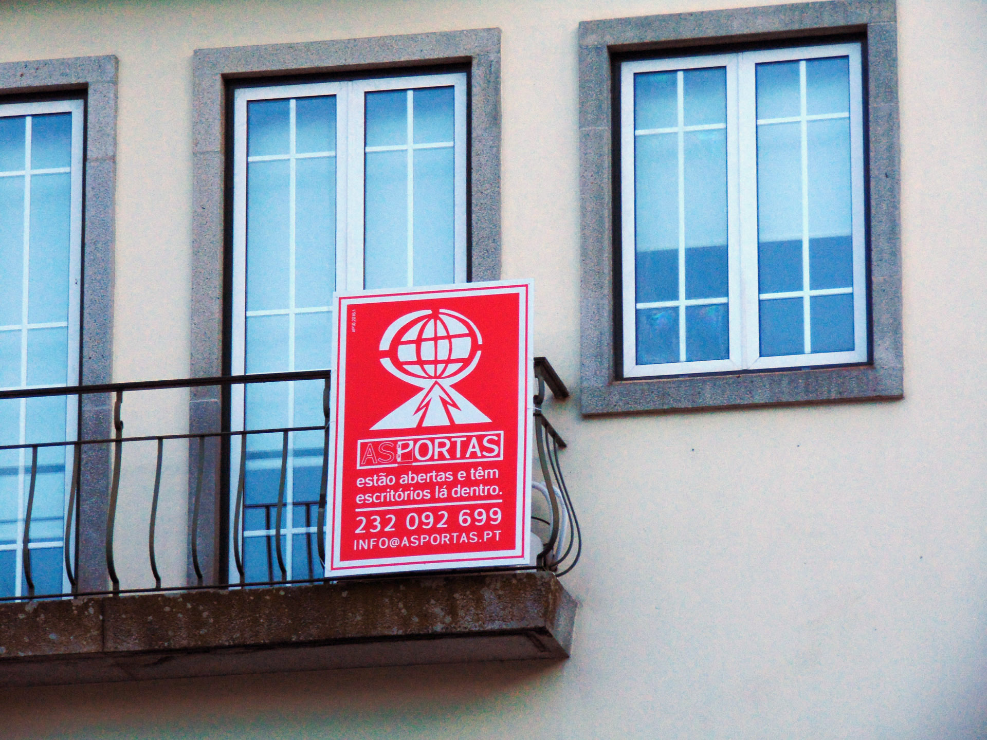
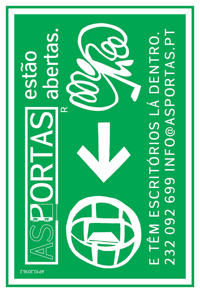
 Advertising boards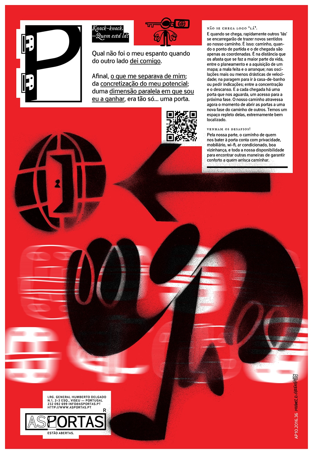
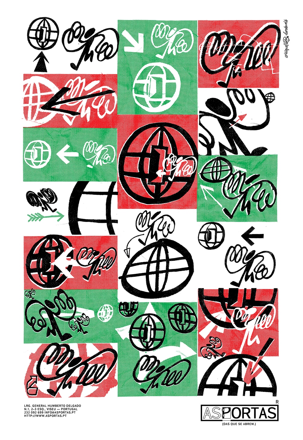
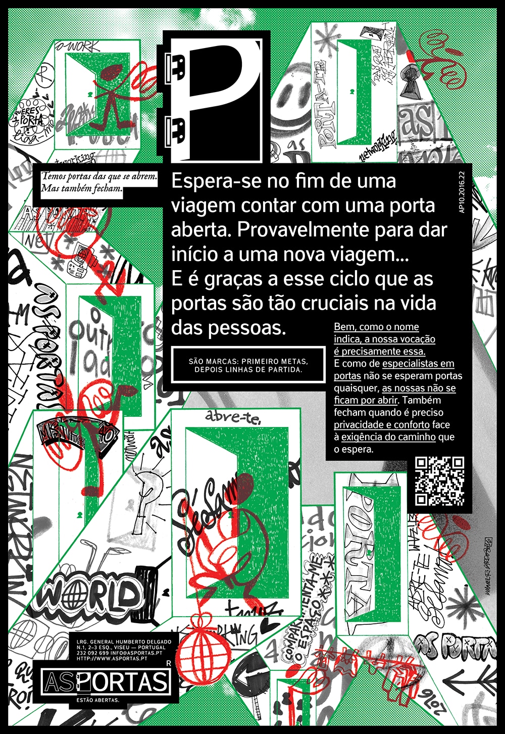
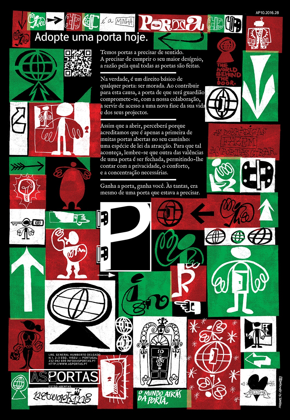
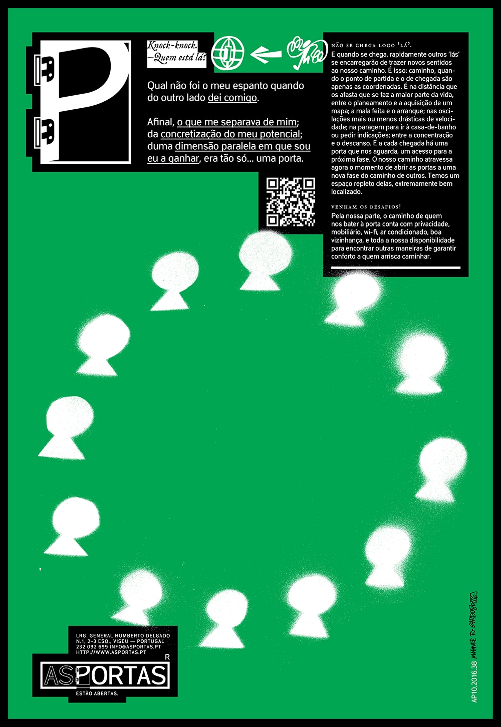
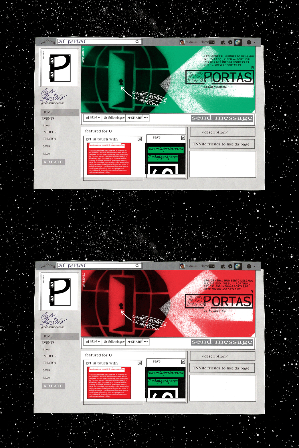
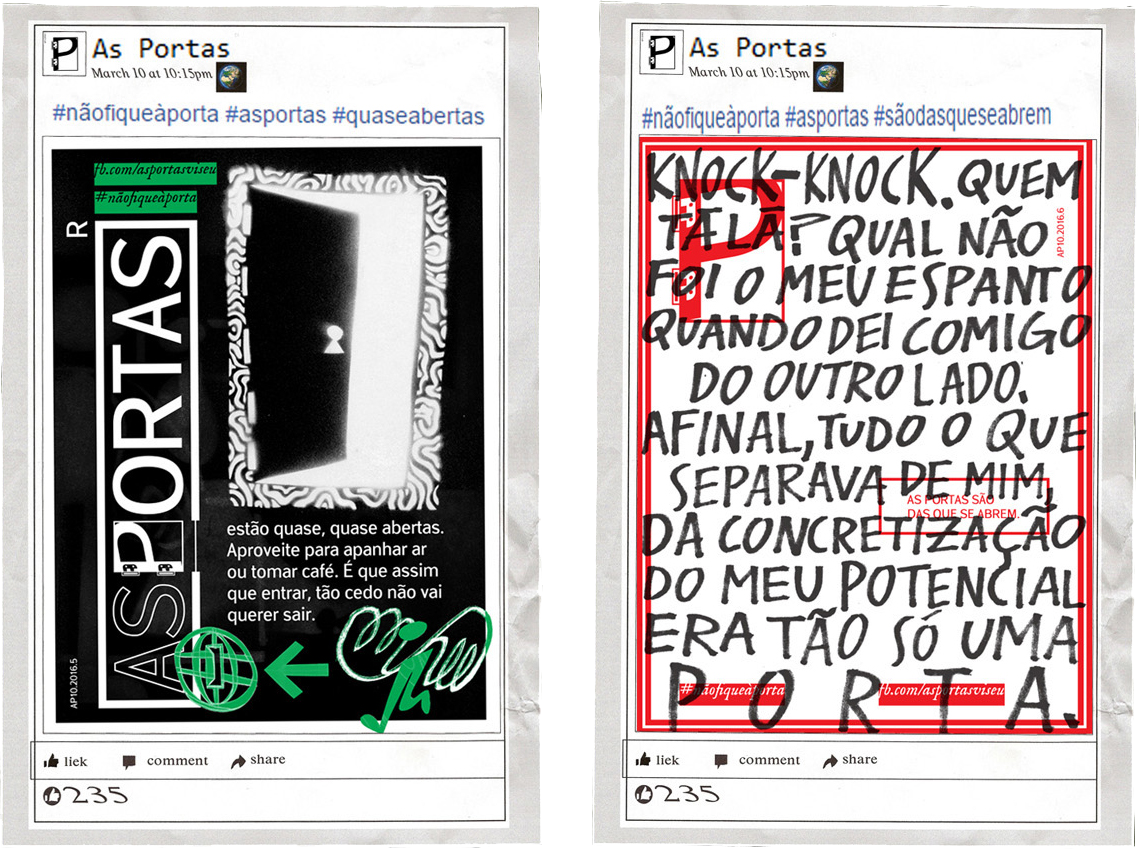
 Advertising posters/pages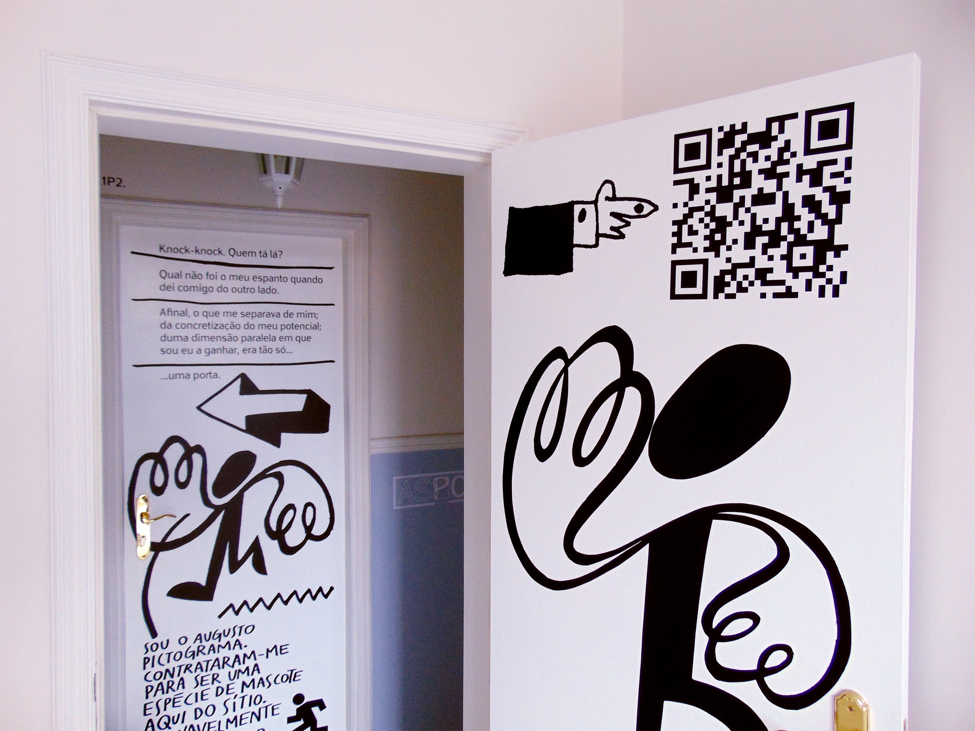
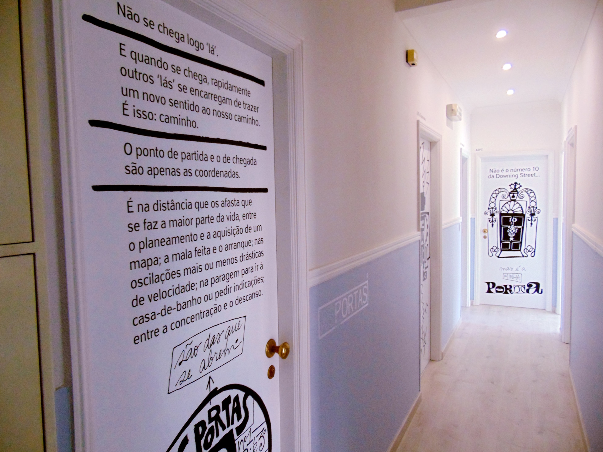
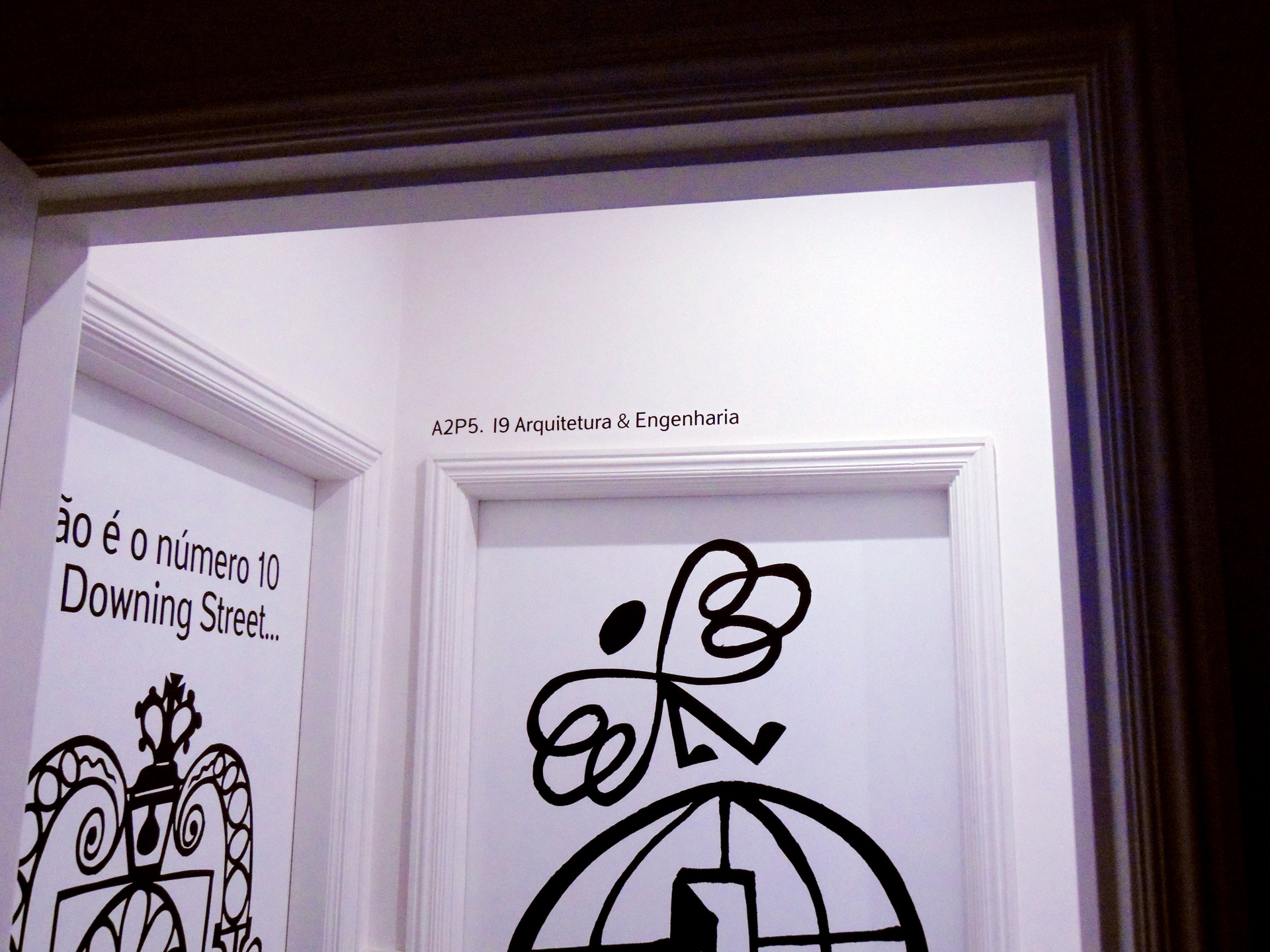
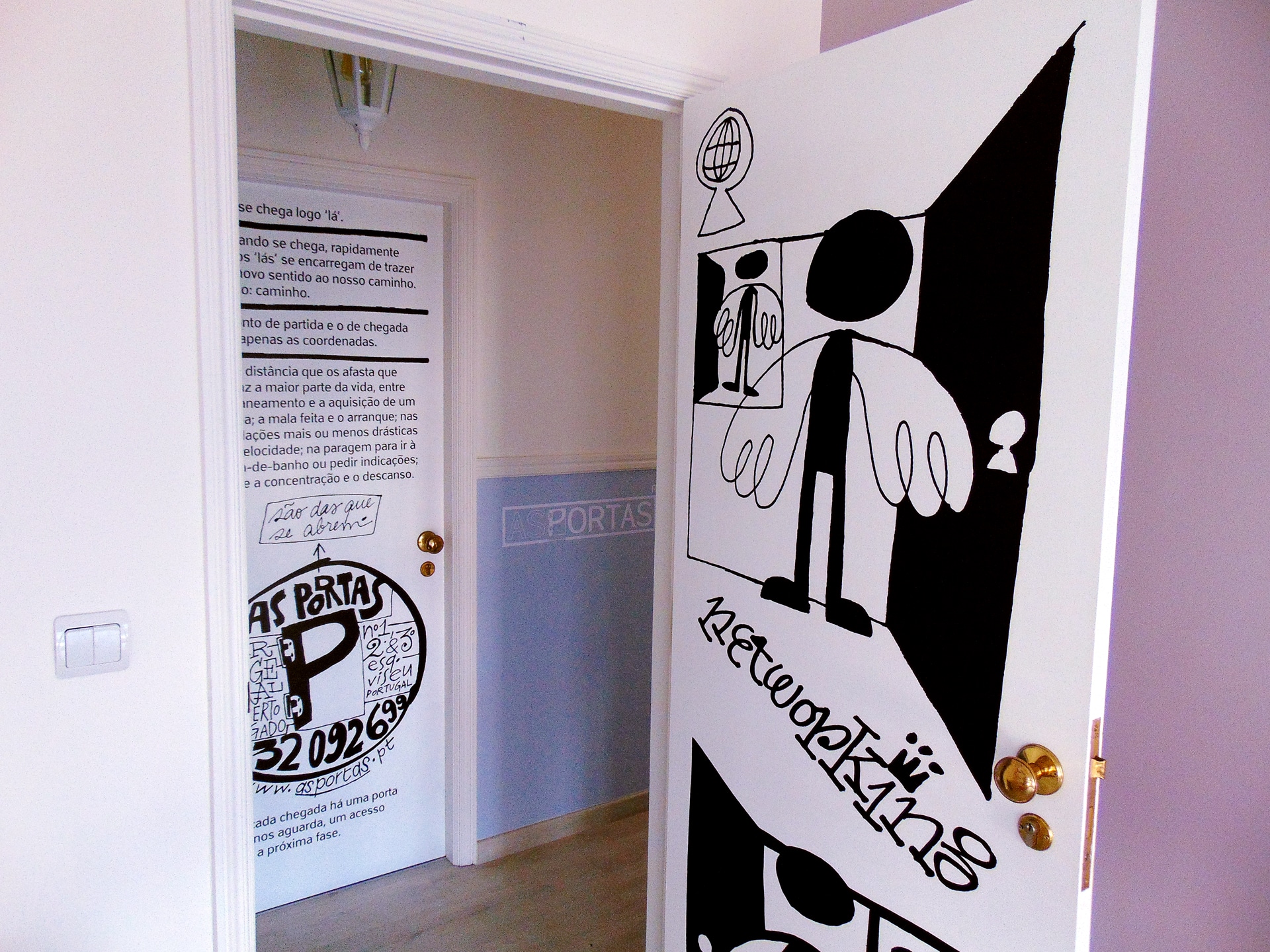
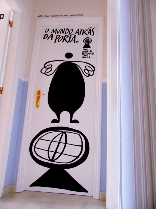
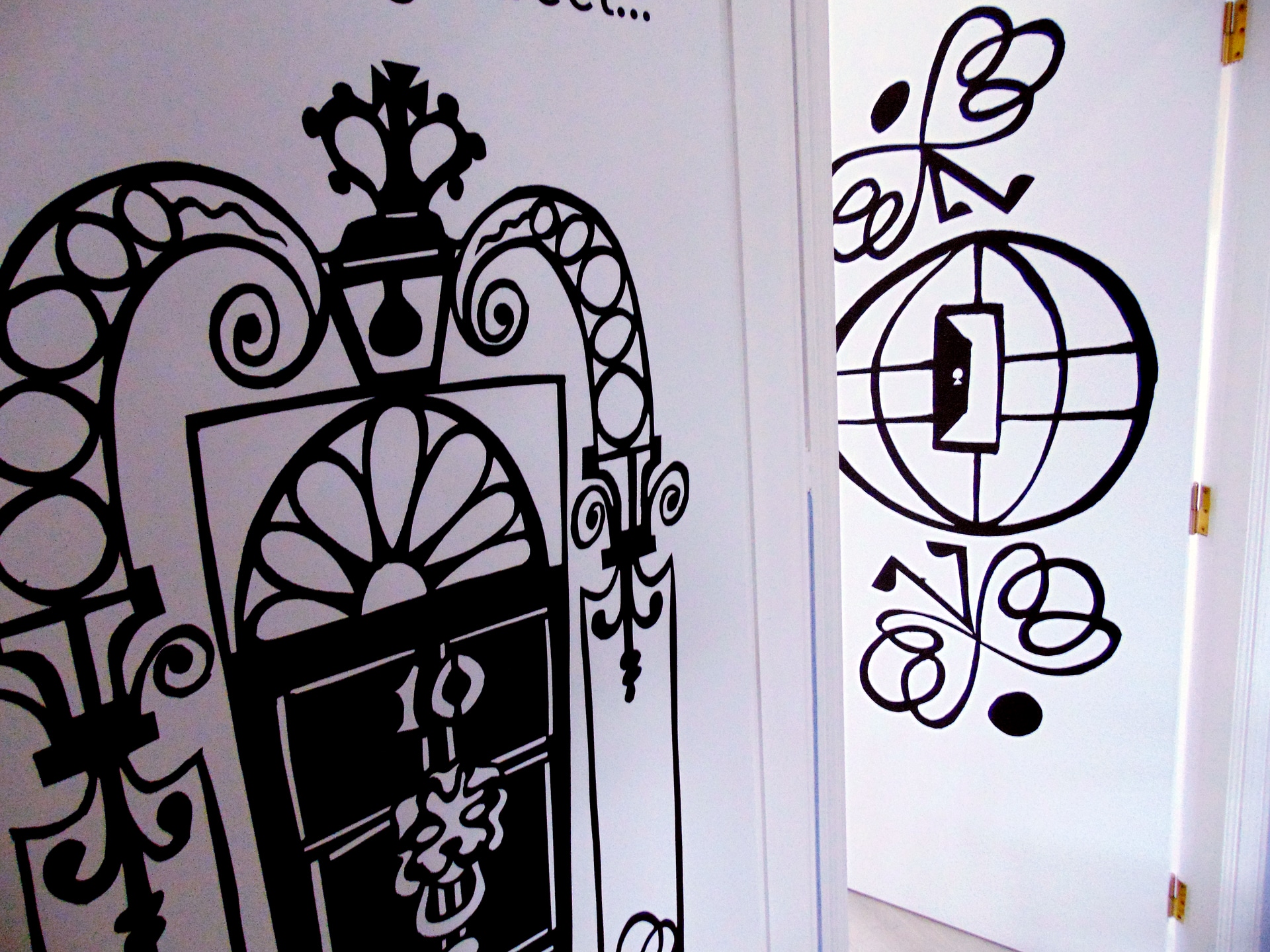
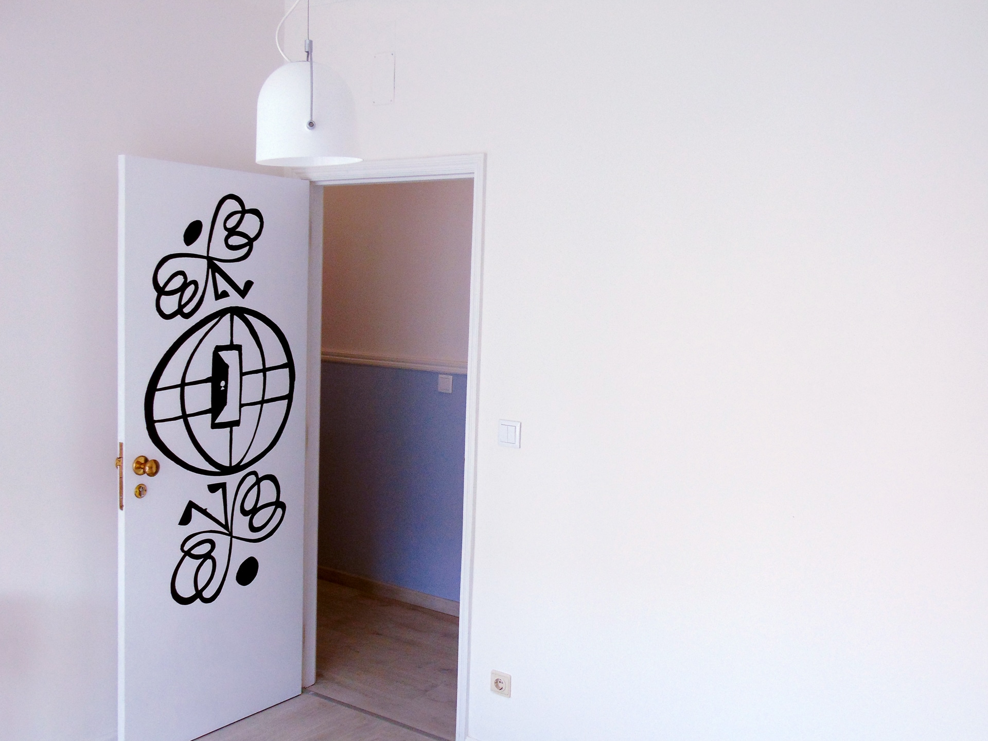
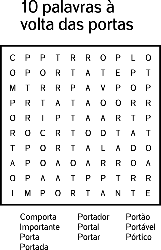
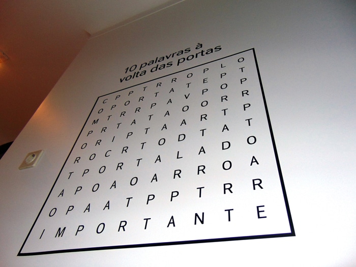
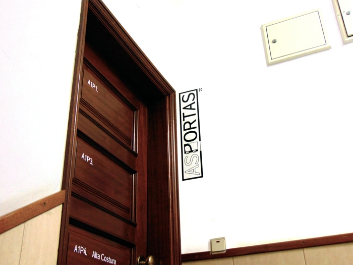
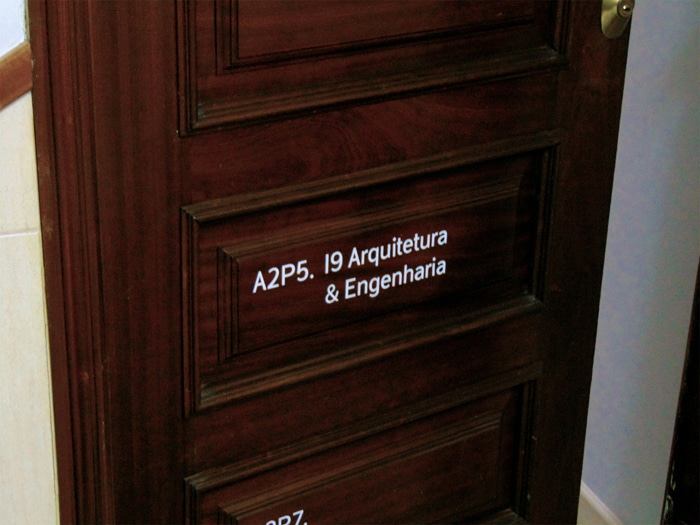
 Decoration and signage for "as portas" (= the doors)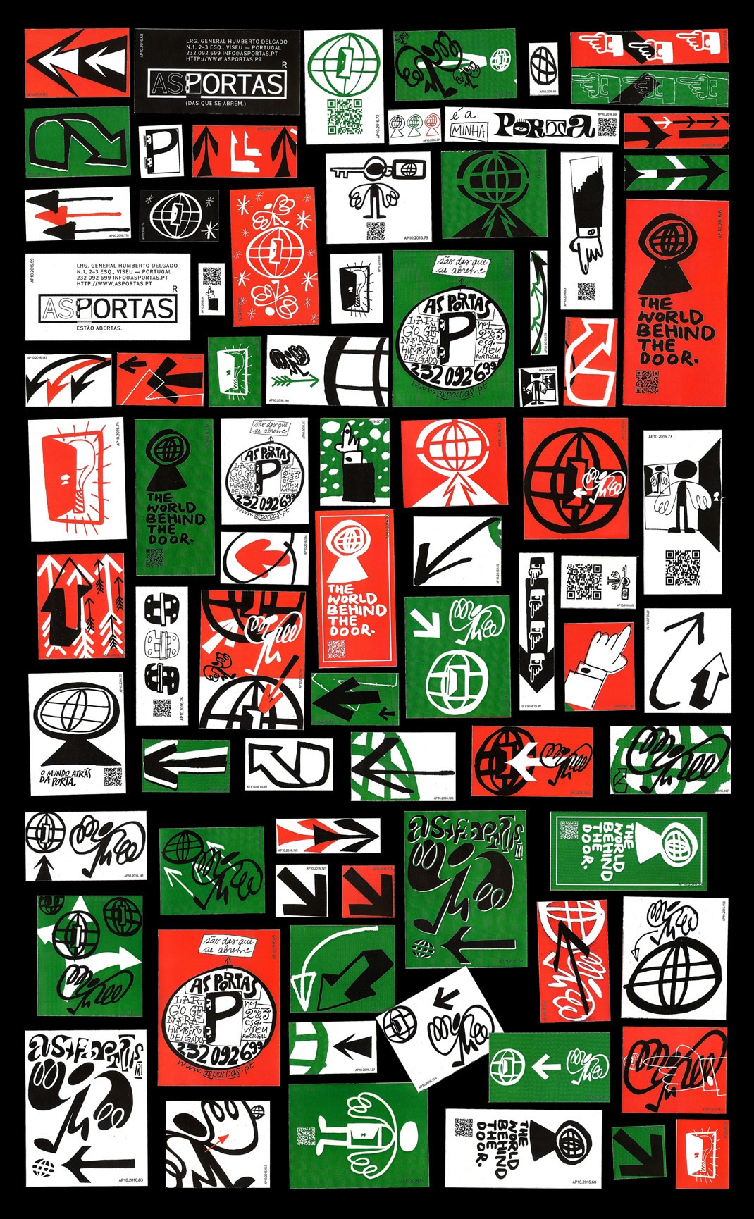
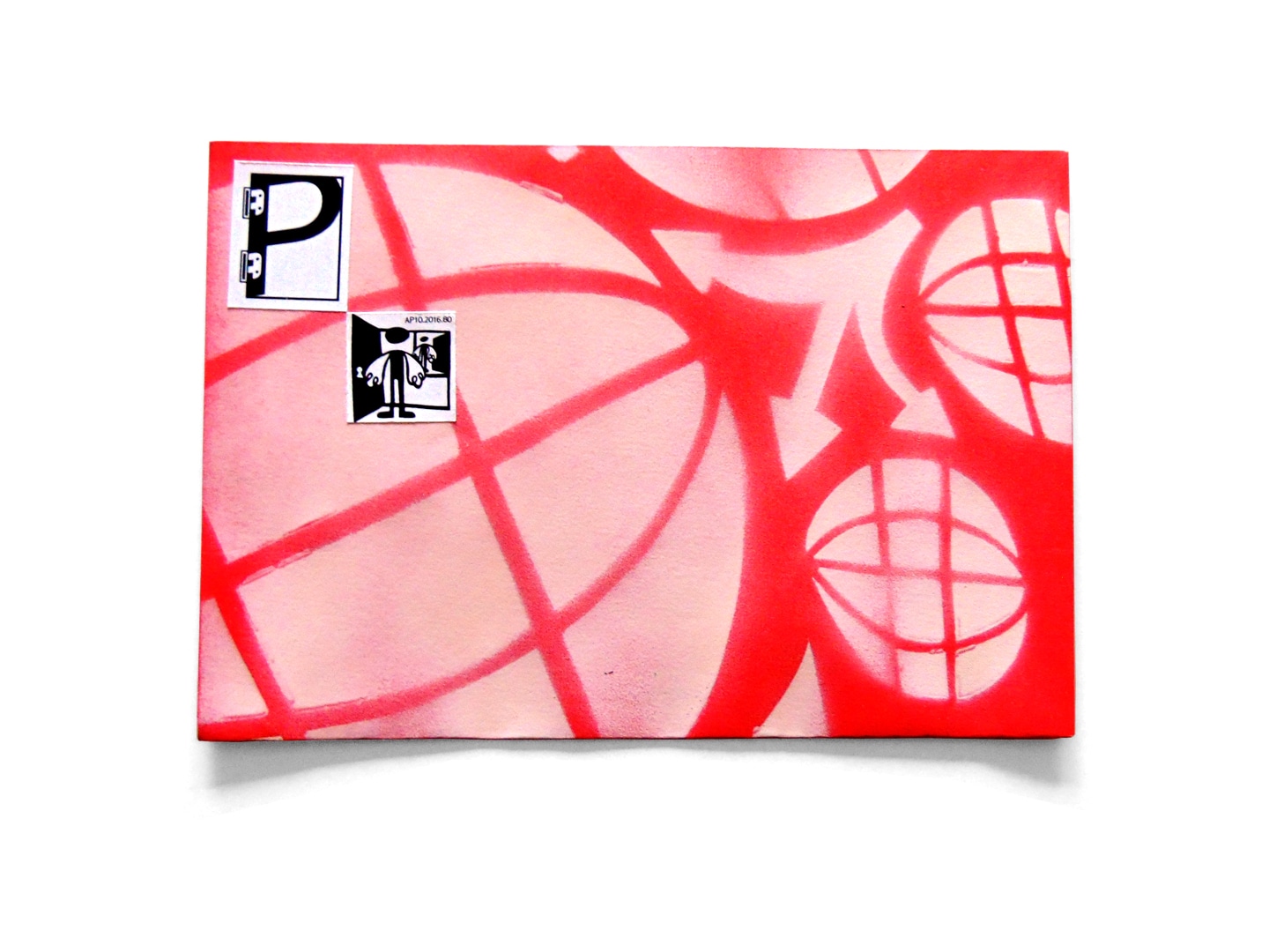
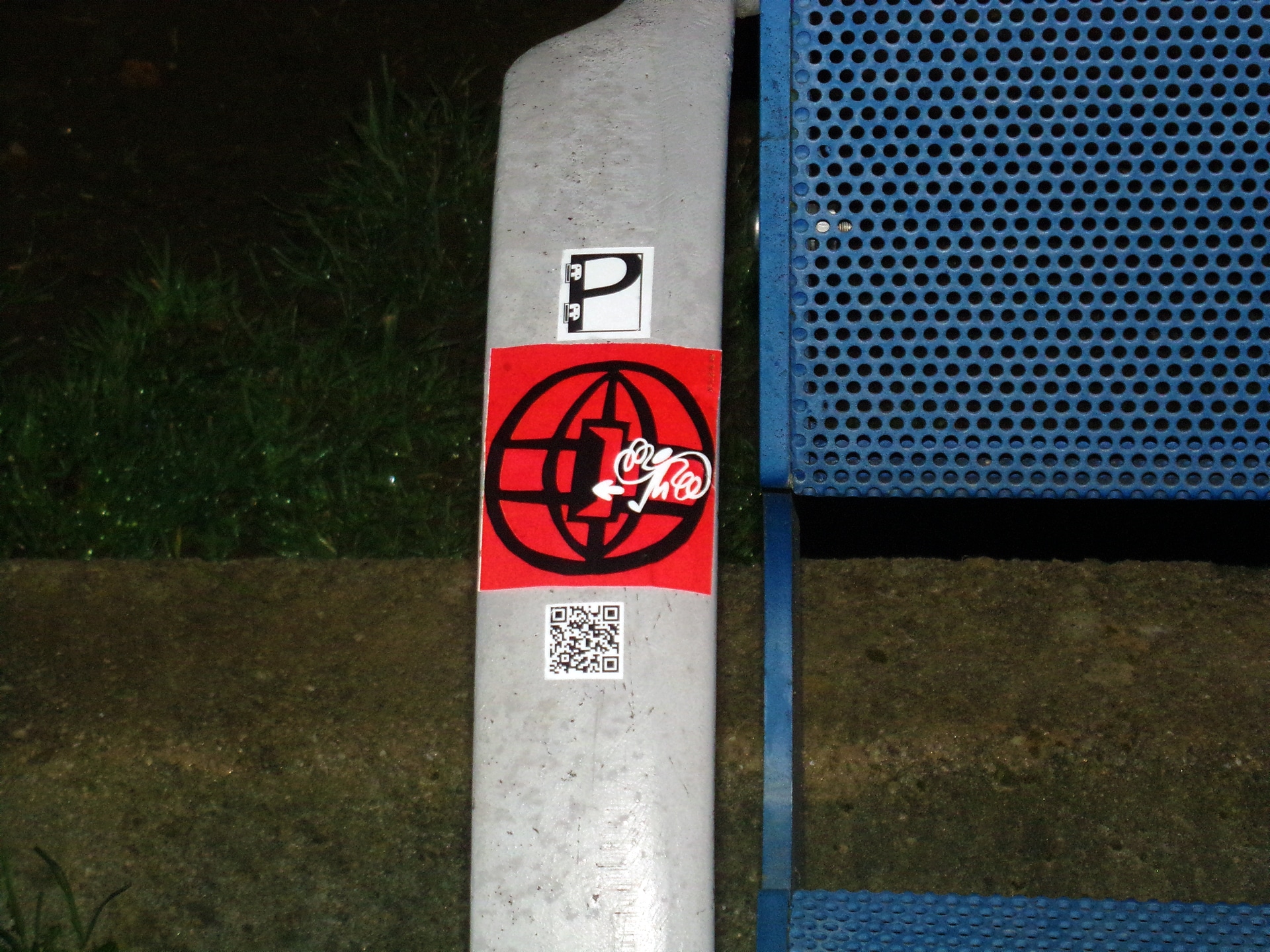
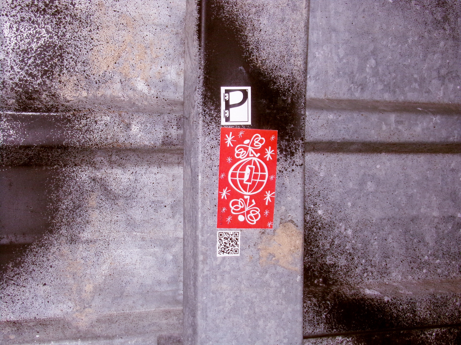
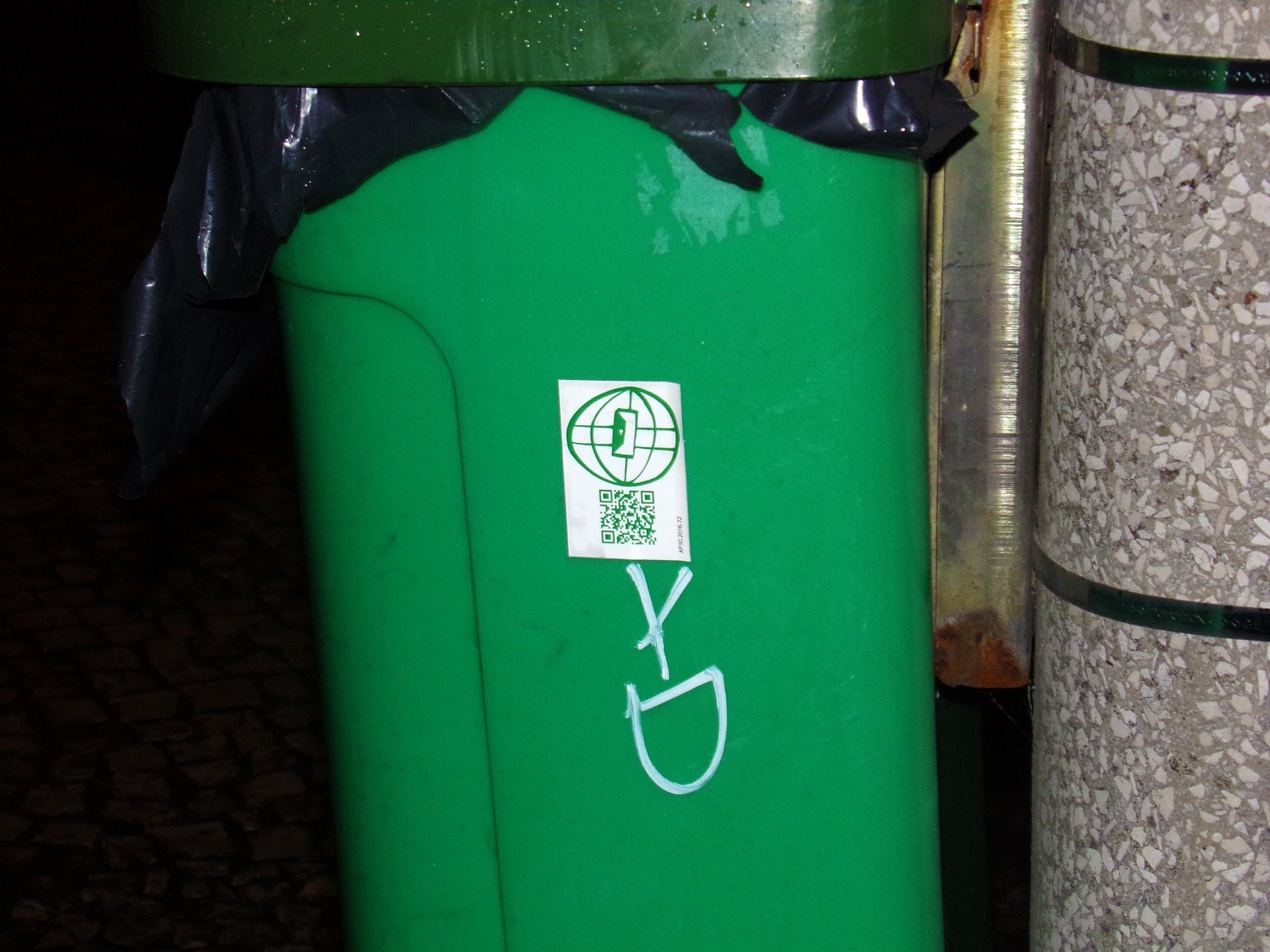
 Stickers