to the top!
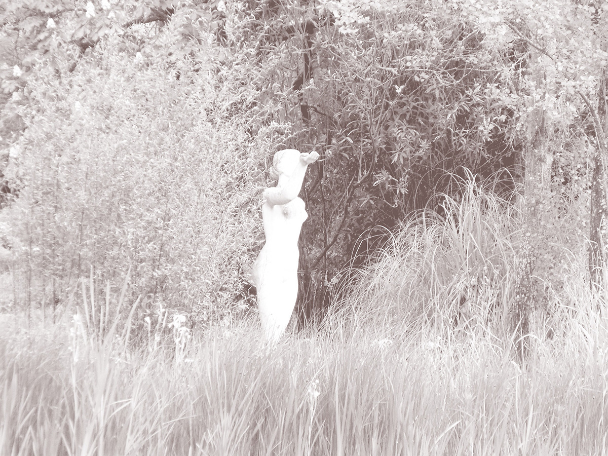
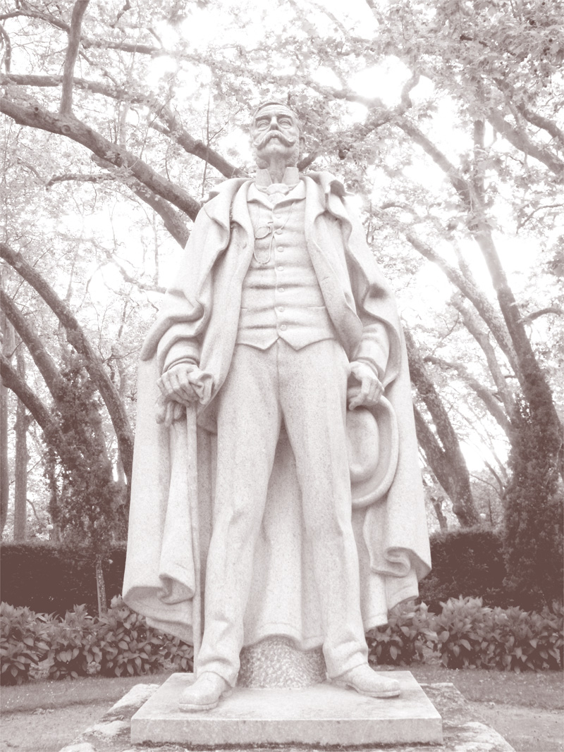
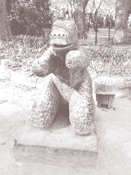
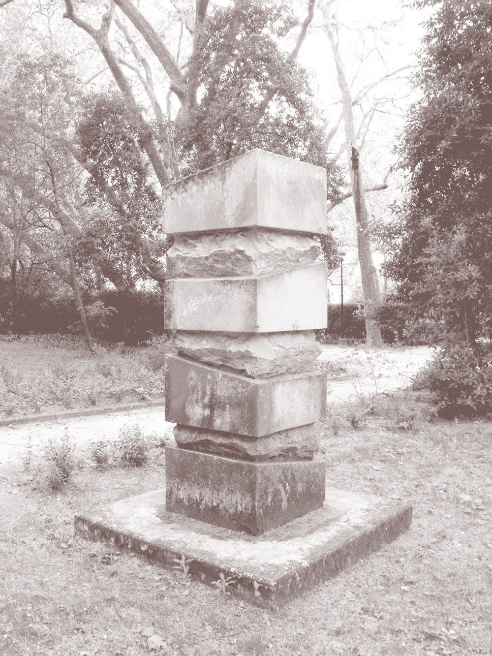
Collection: the diverse statuary of D. Carlos I Park
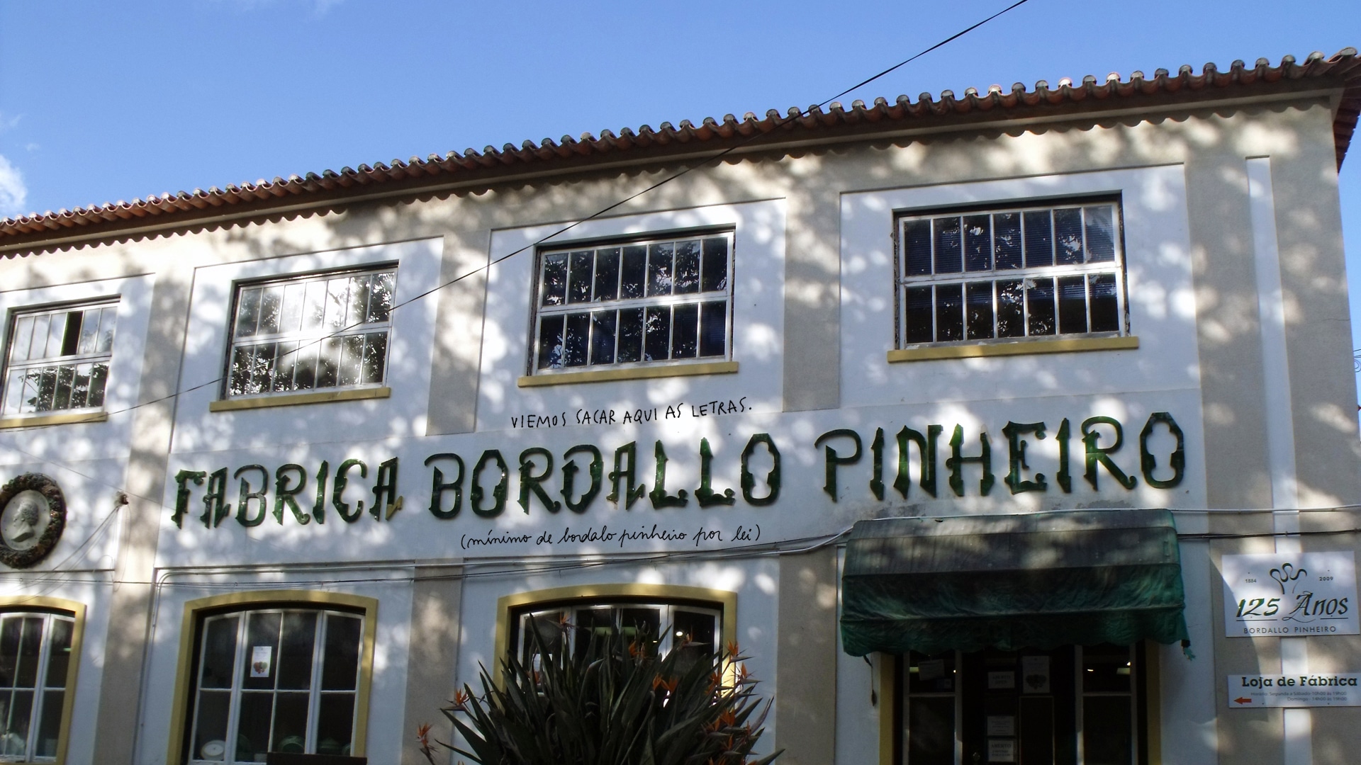
Façade lettering of the Bordallo Pinheiro Factory, designed from modular tile pieces
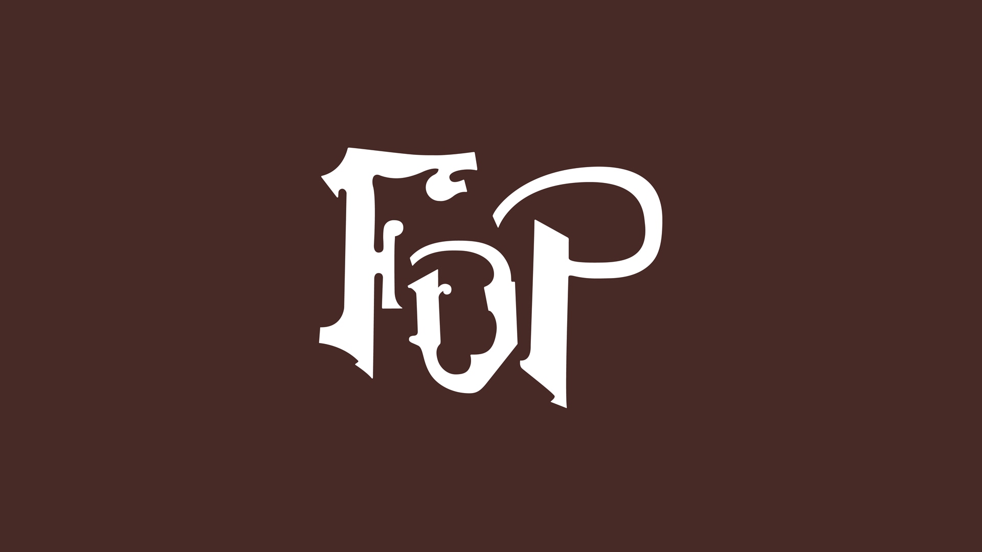
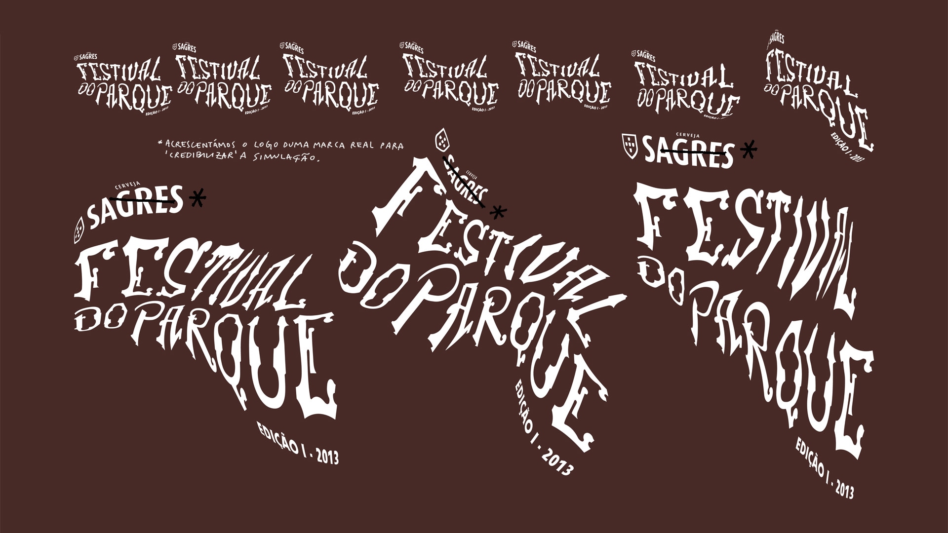
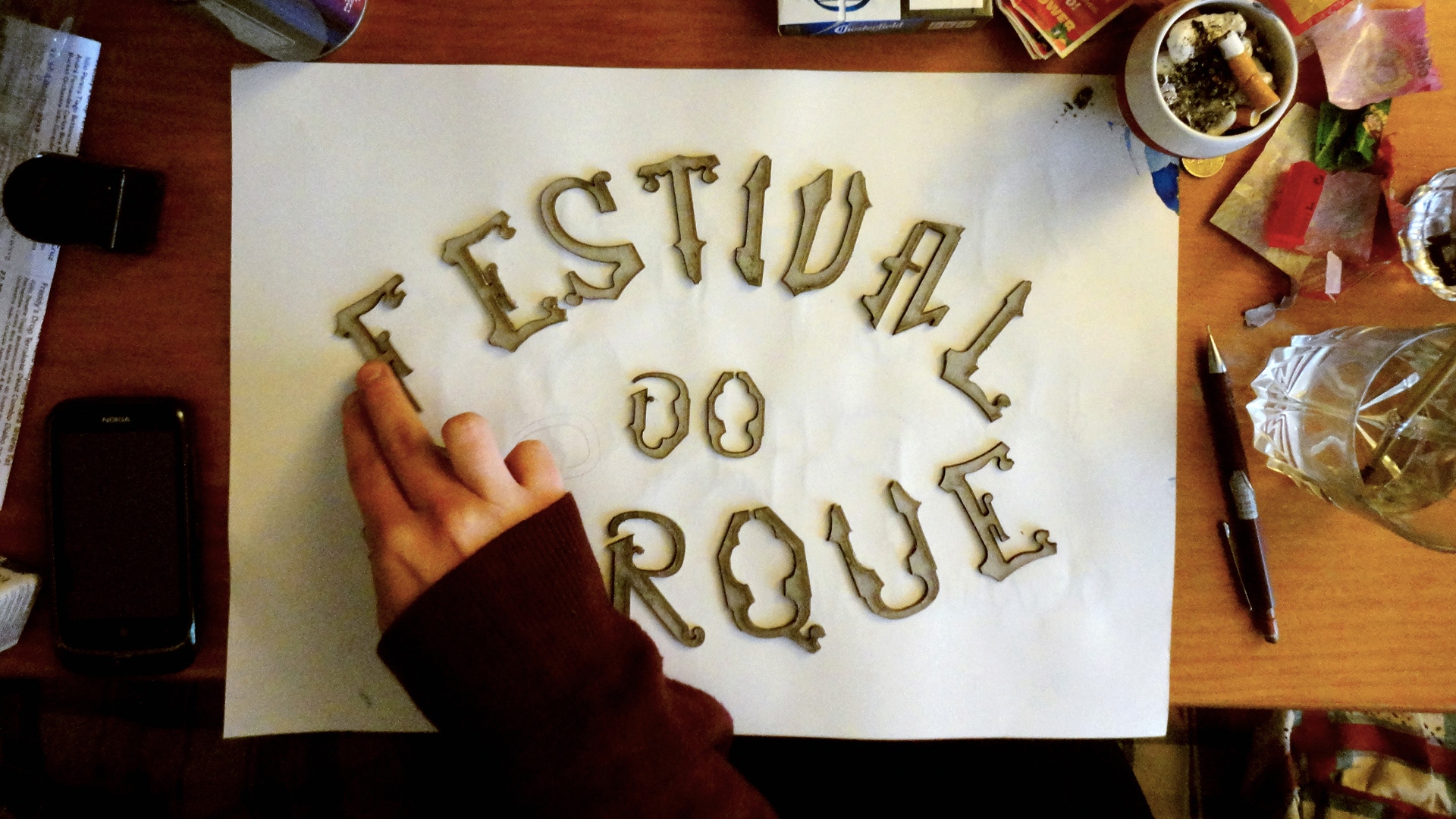
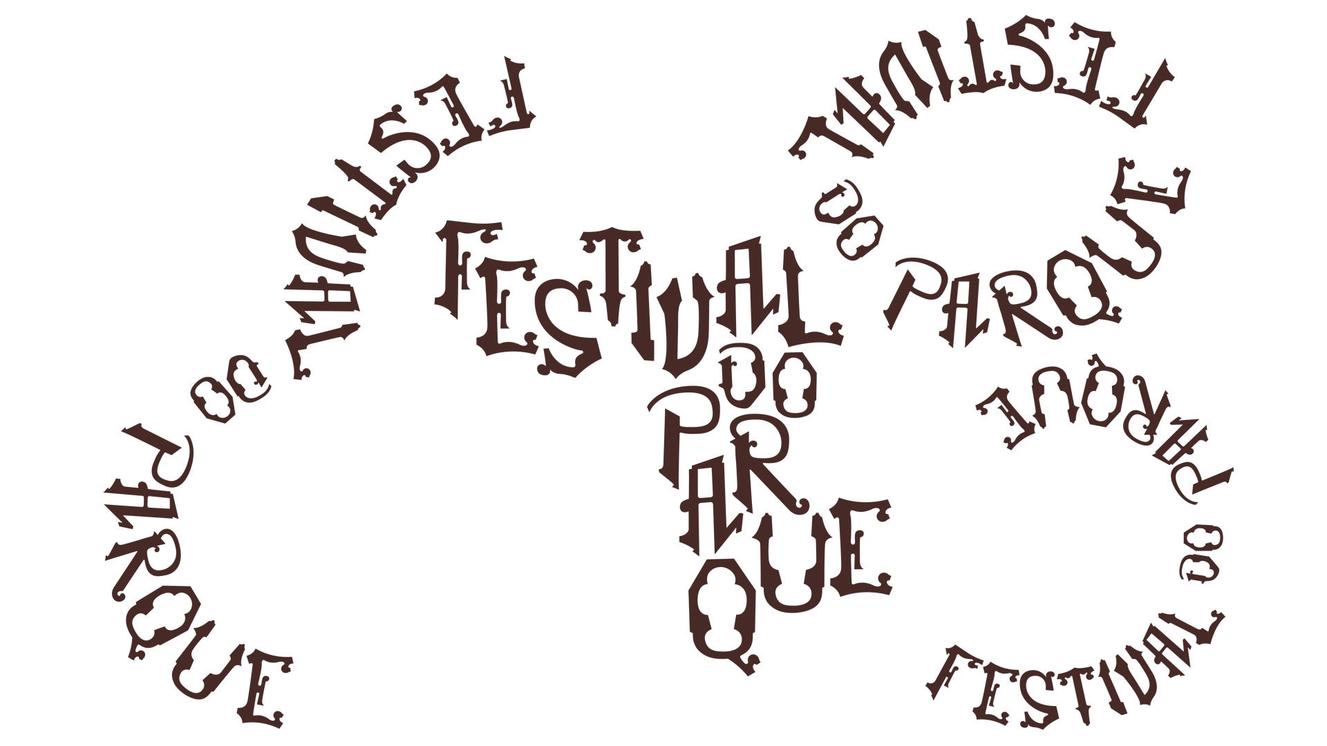
Logo construction, explorations
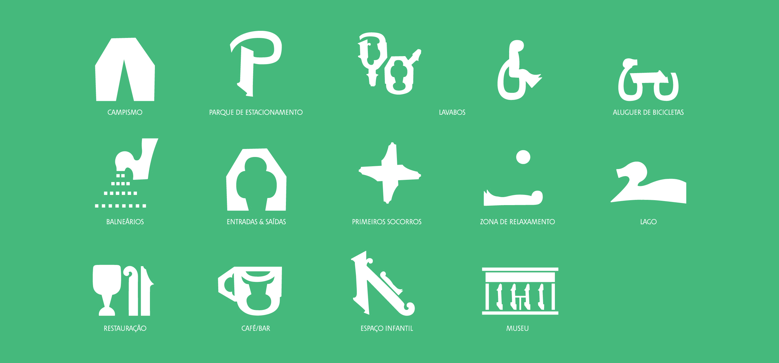
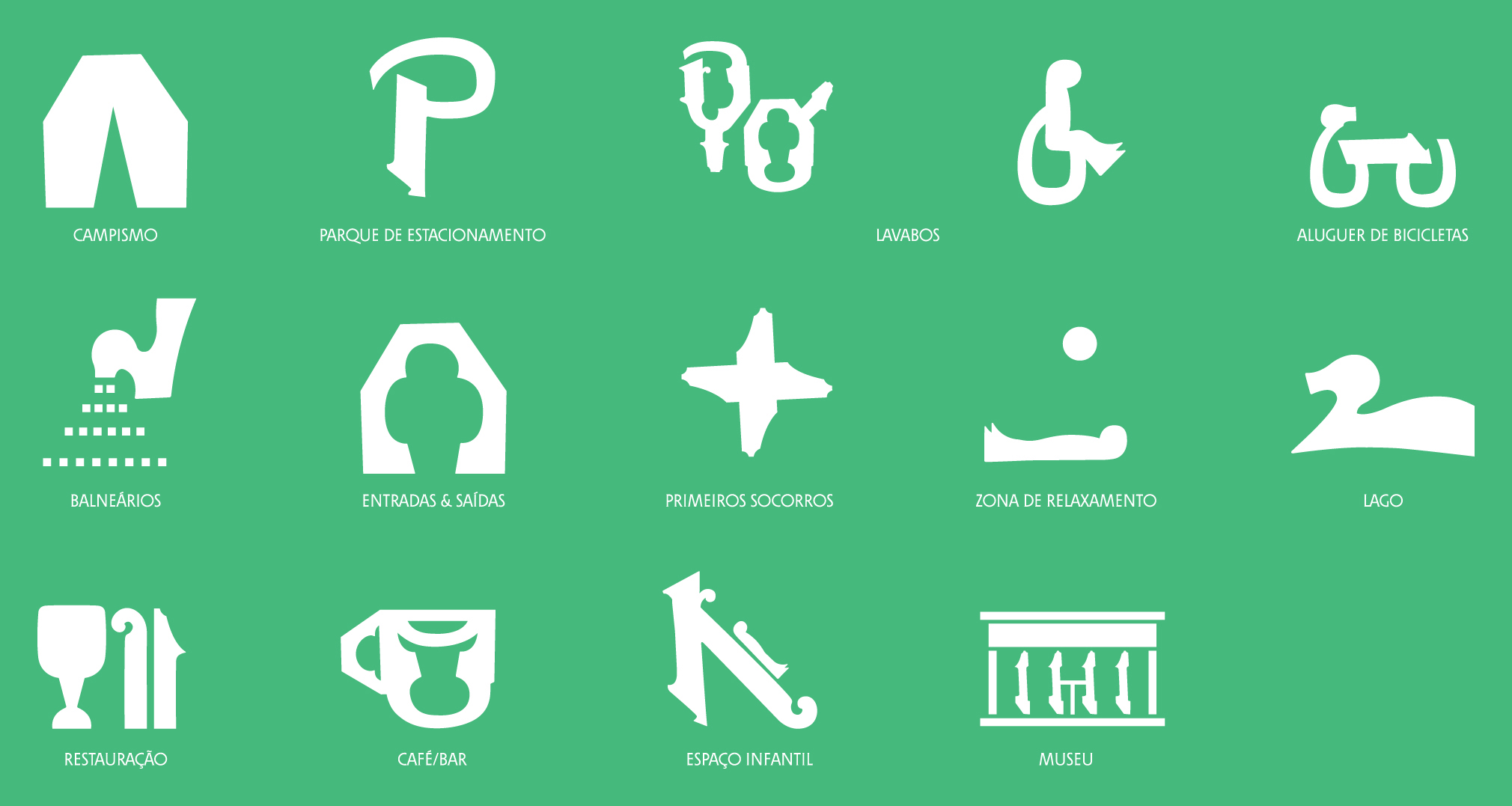
Pictograms for signage, based on Bordallo characters
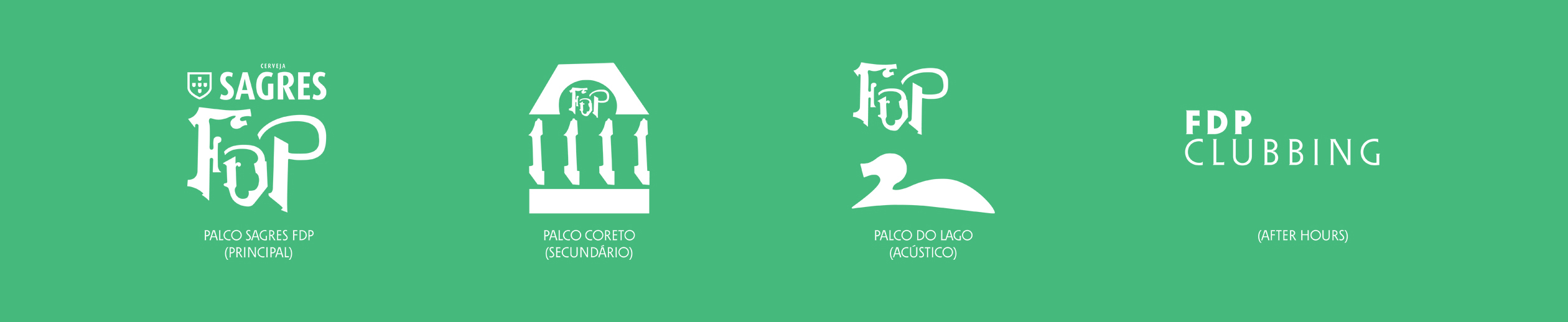
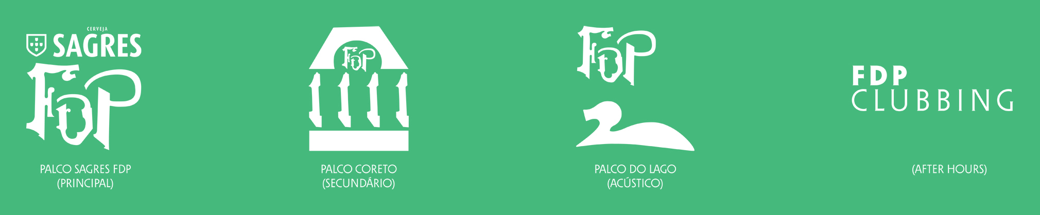
Pictograms identifying each stage
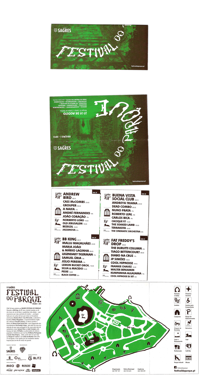
Folded leaflet with programme and venue map
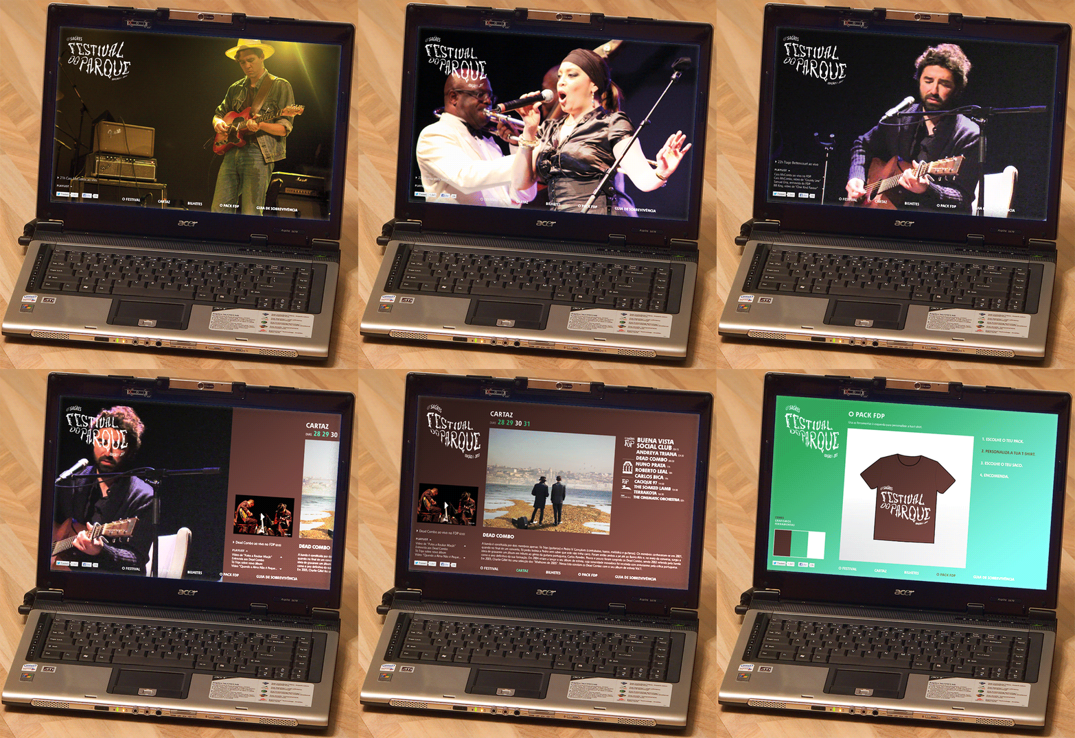
Website
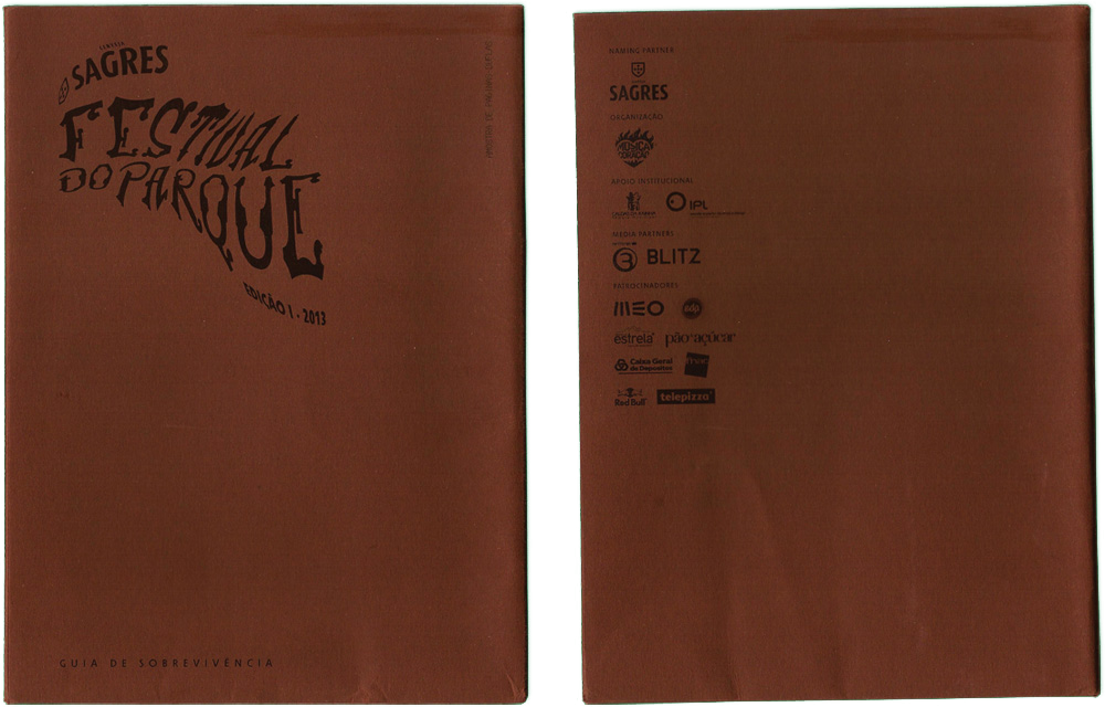
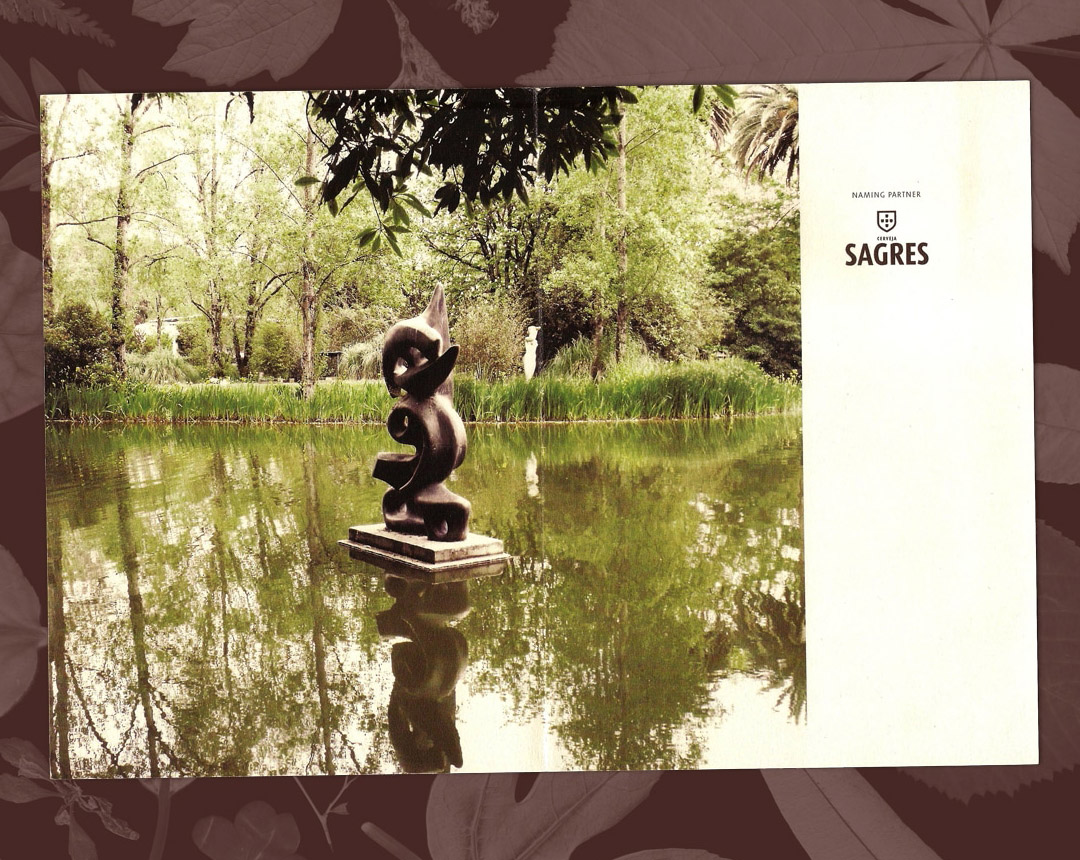
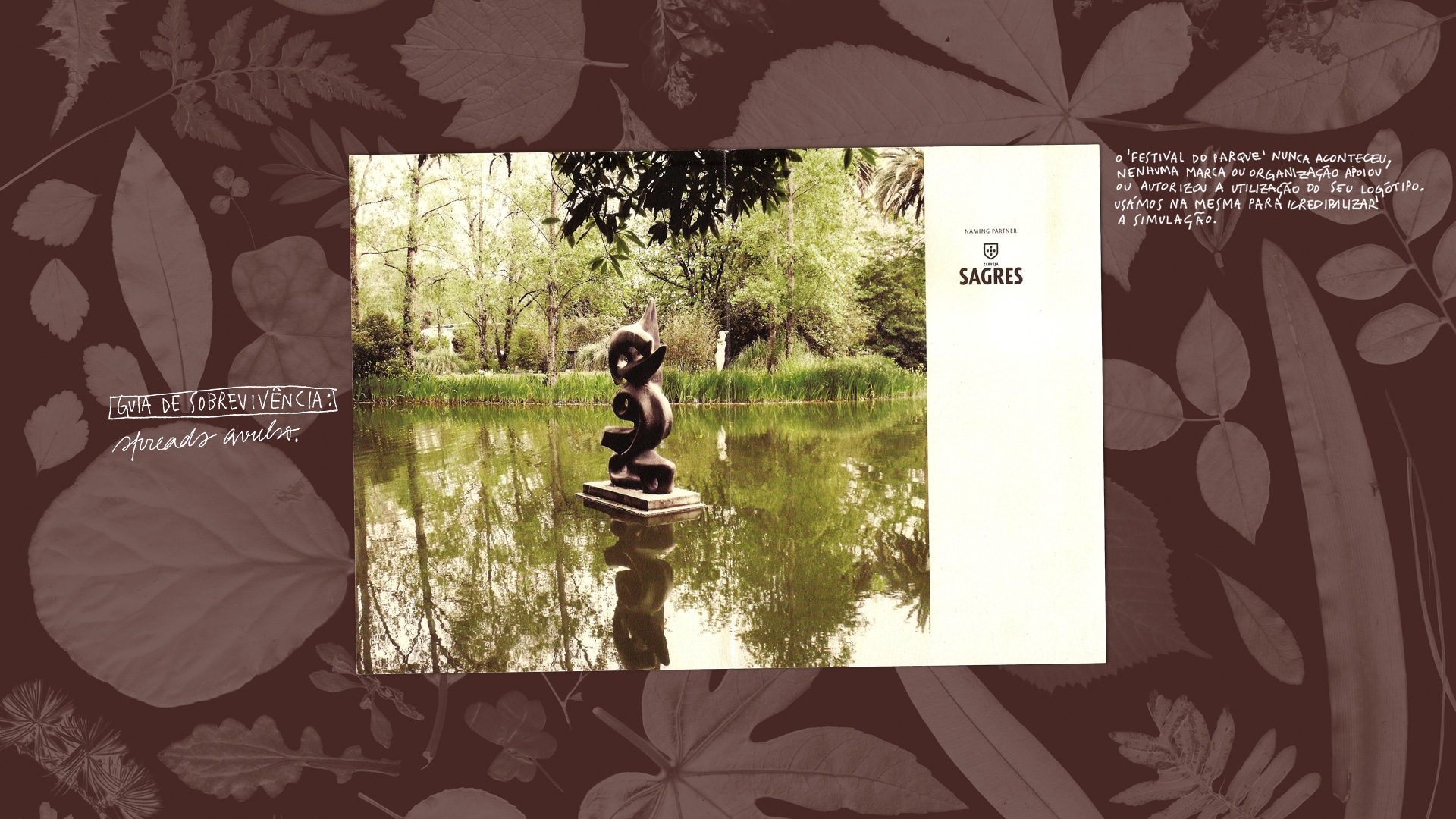
Brochure/survival guide
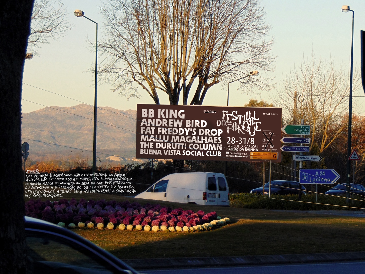
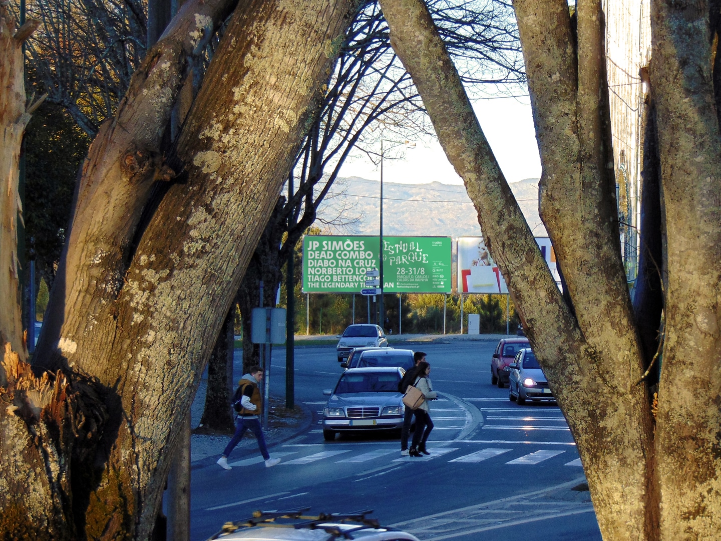
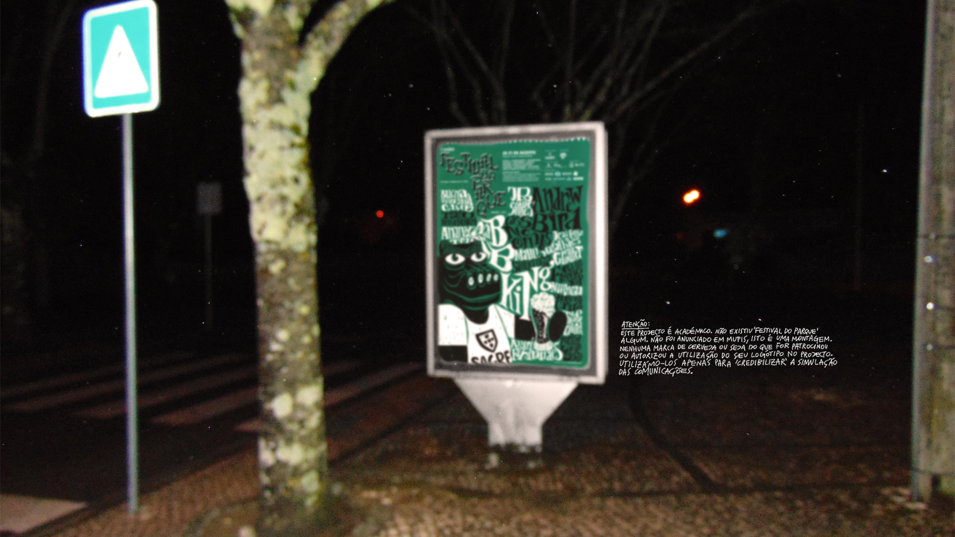
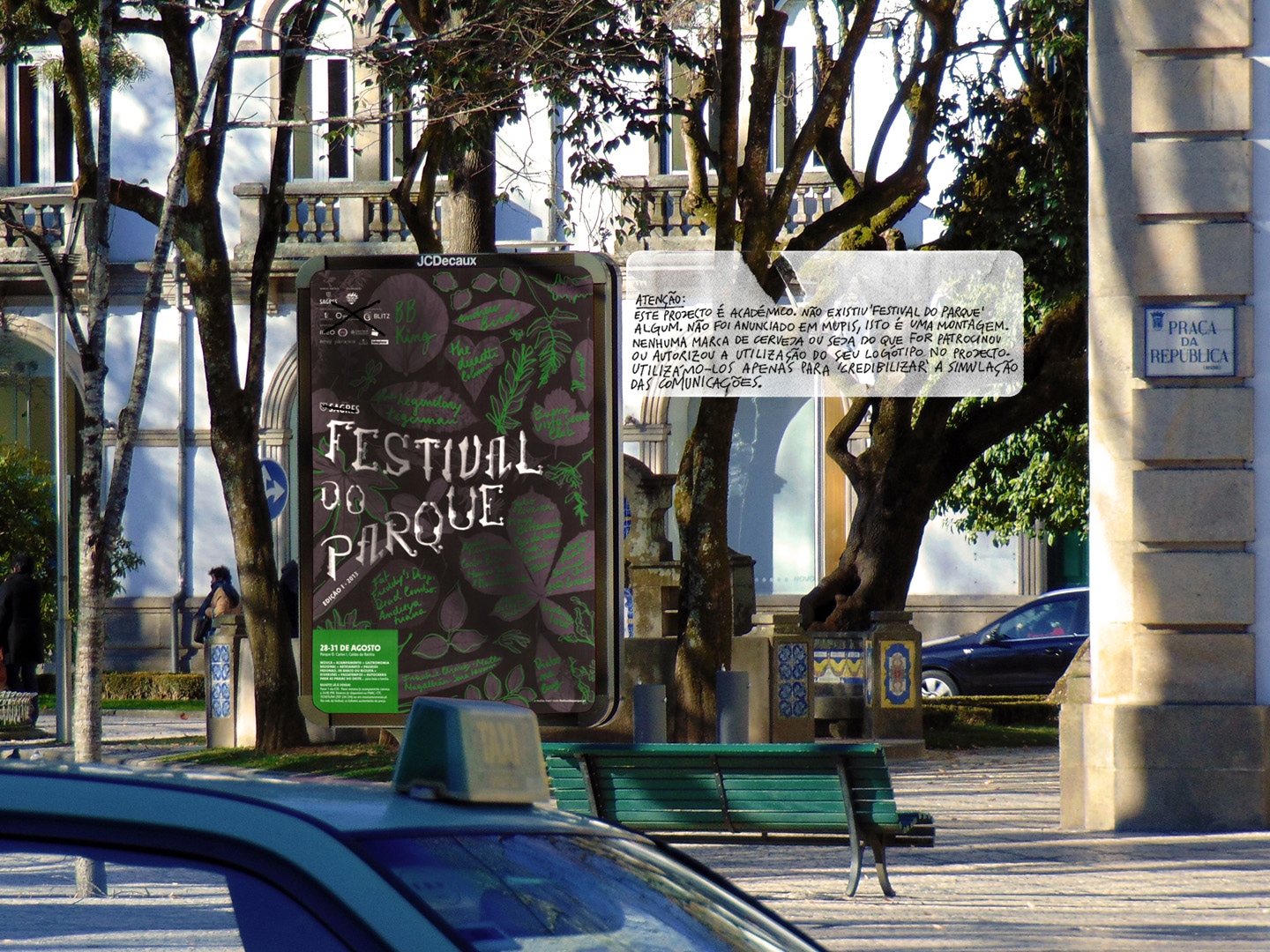
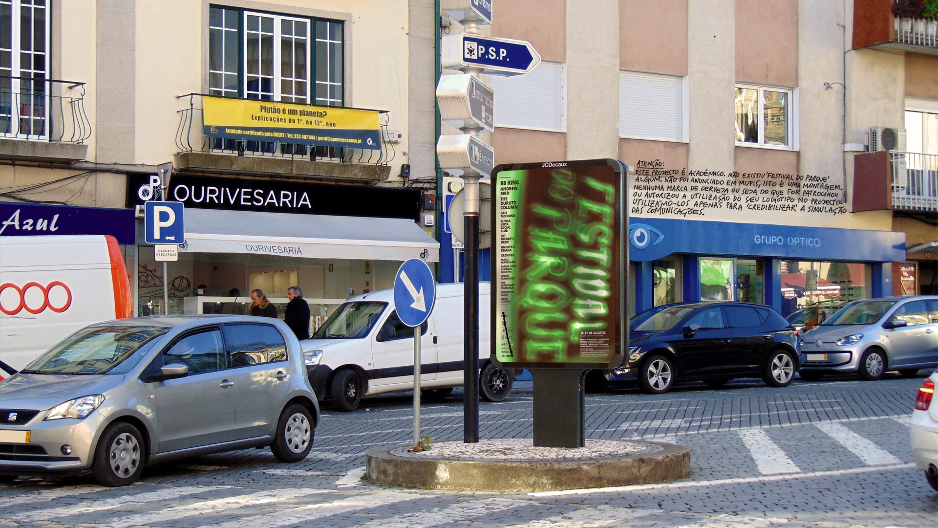
Billboard
Teaser, with a little help from comrade Ricardo de Sousa
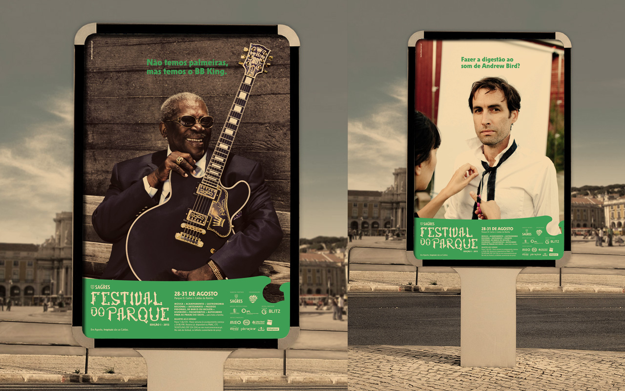
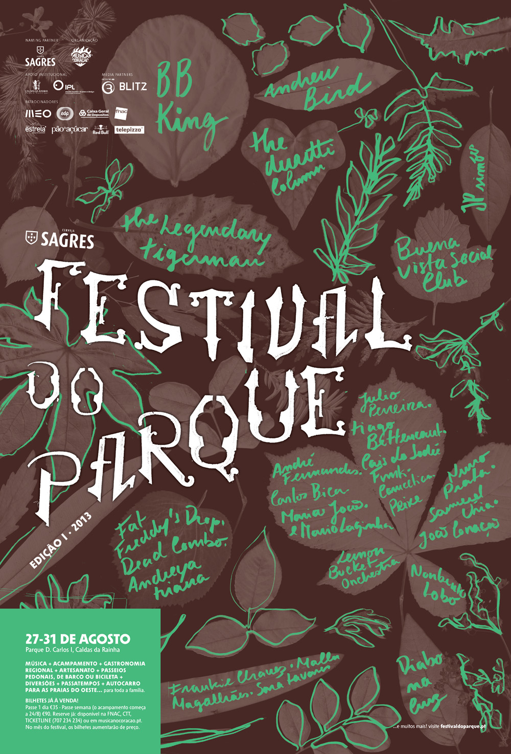
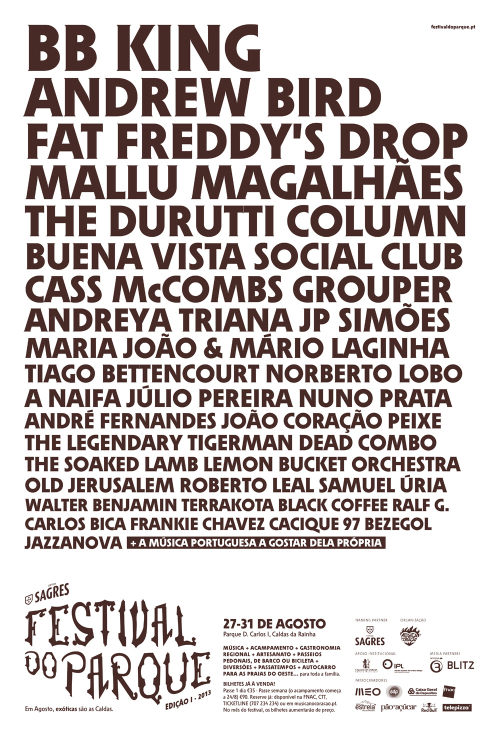
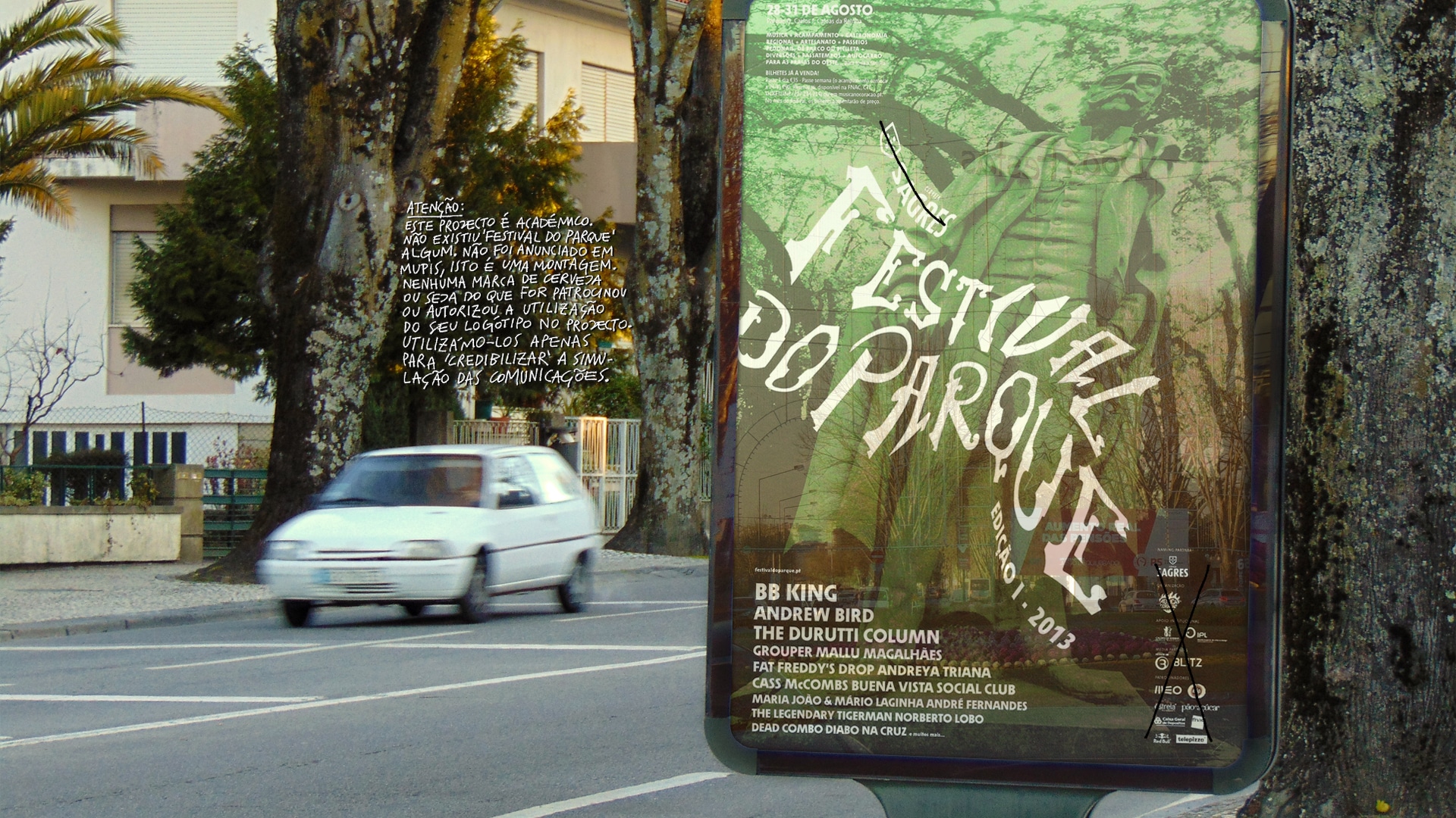
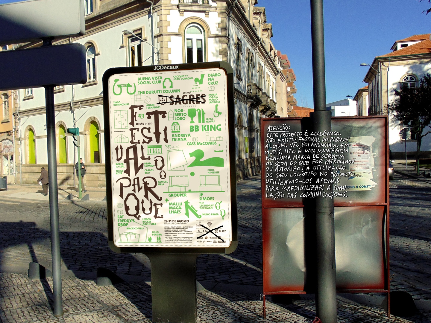
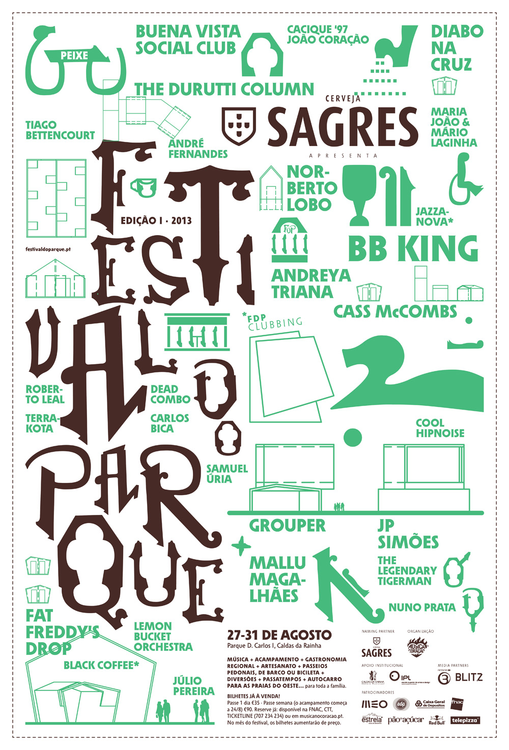
Campaign, pt.1: posters
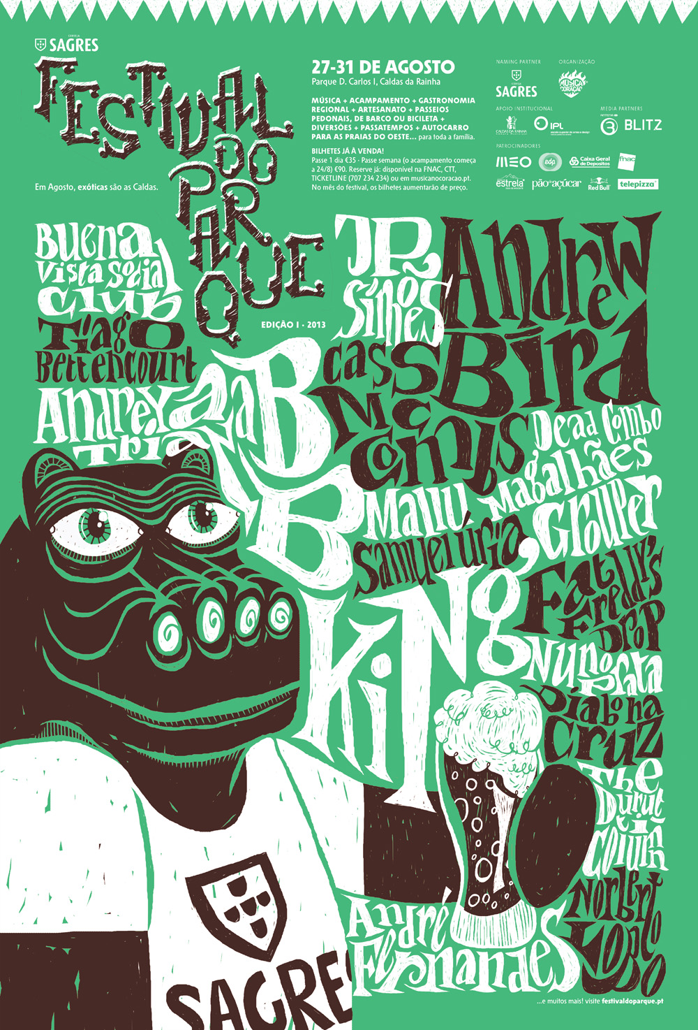
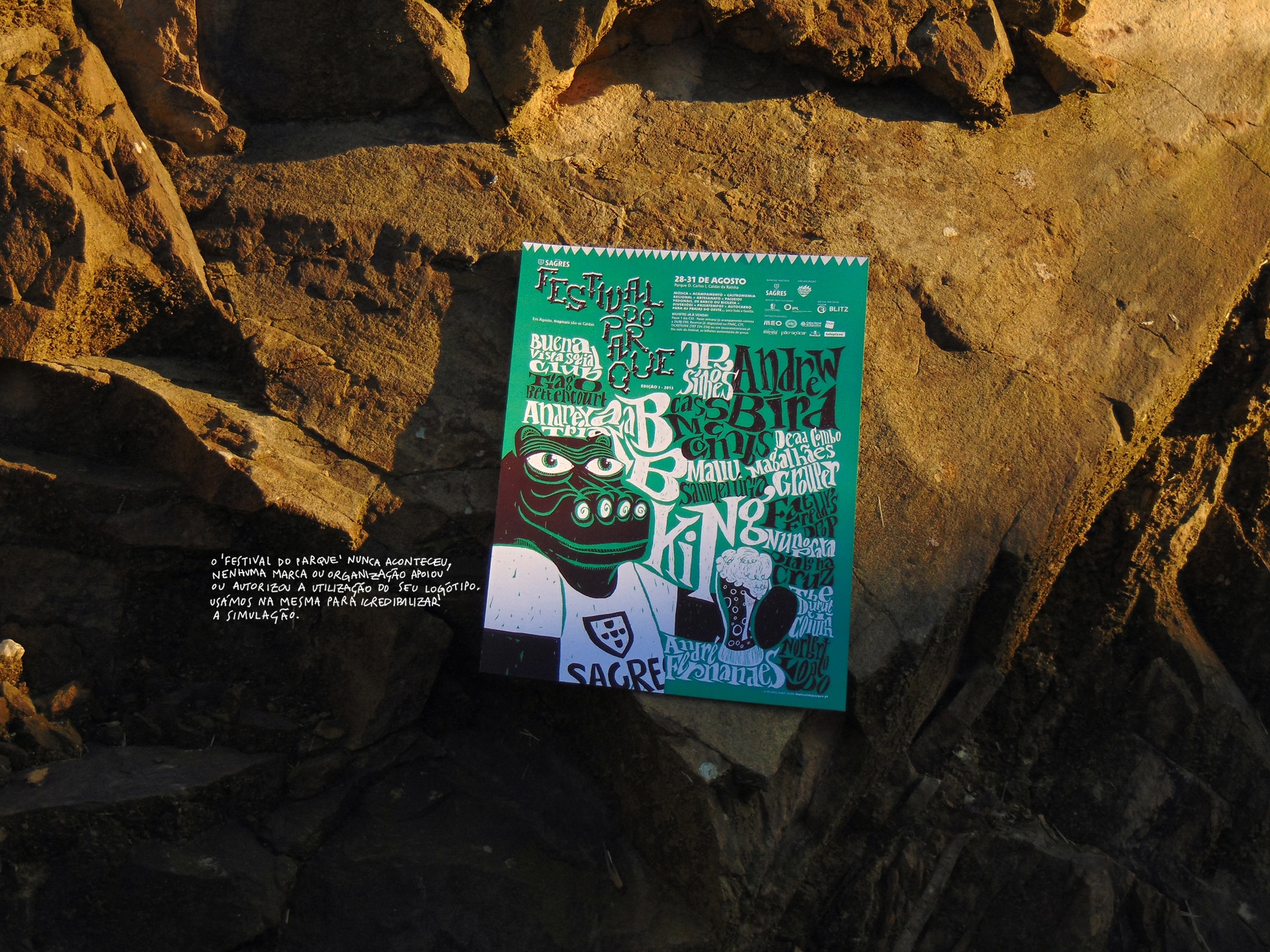
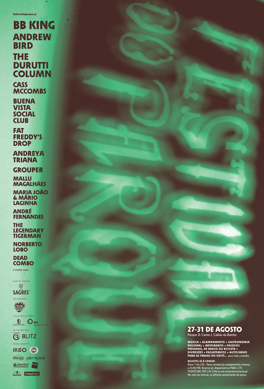
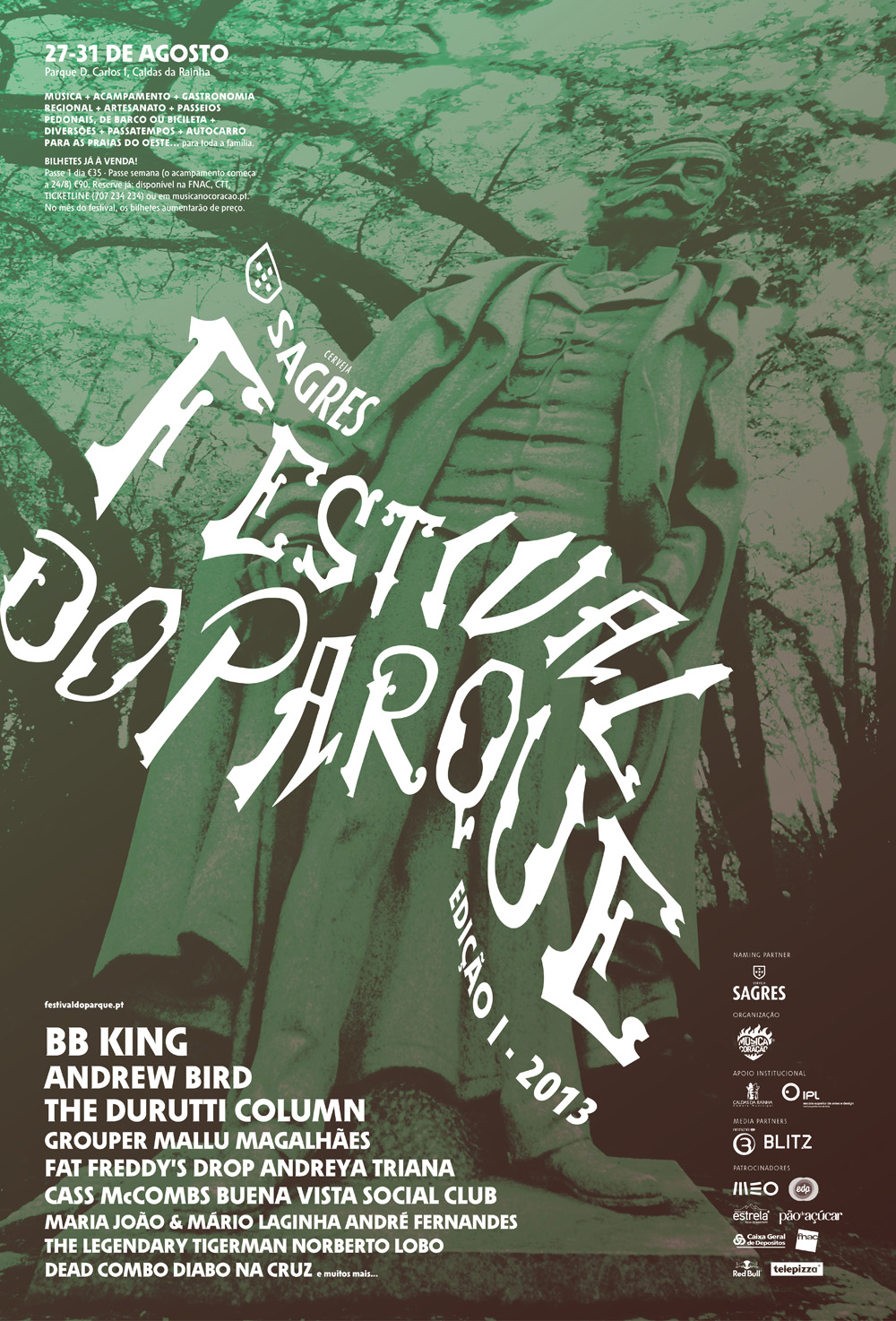
Campaign, pt.2: variants of the generic poster, adapted to different styles
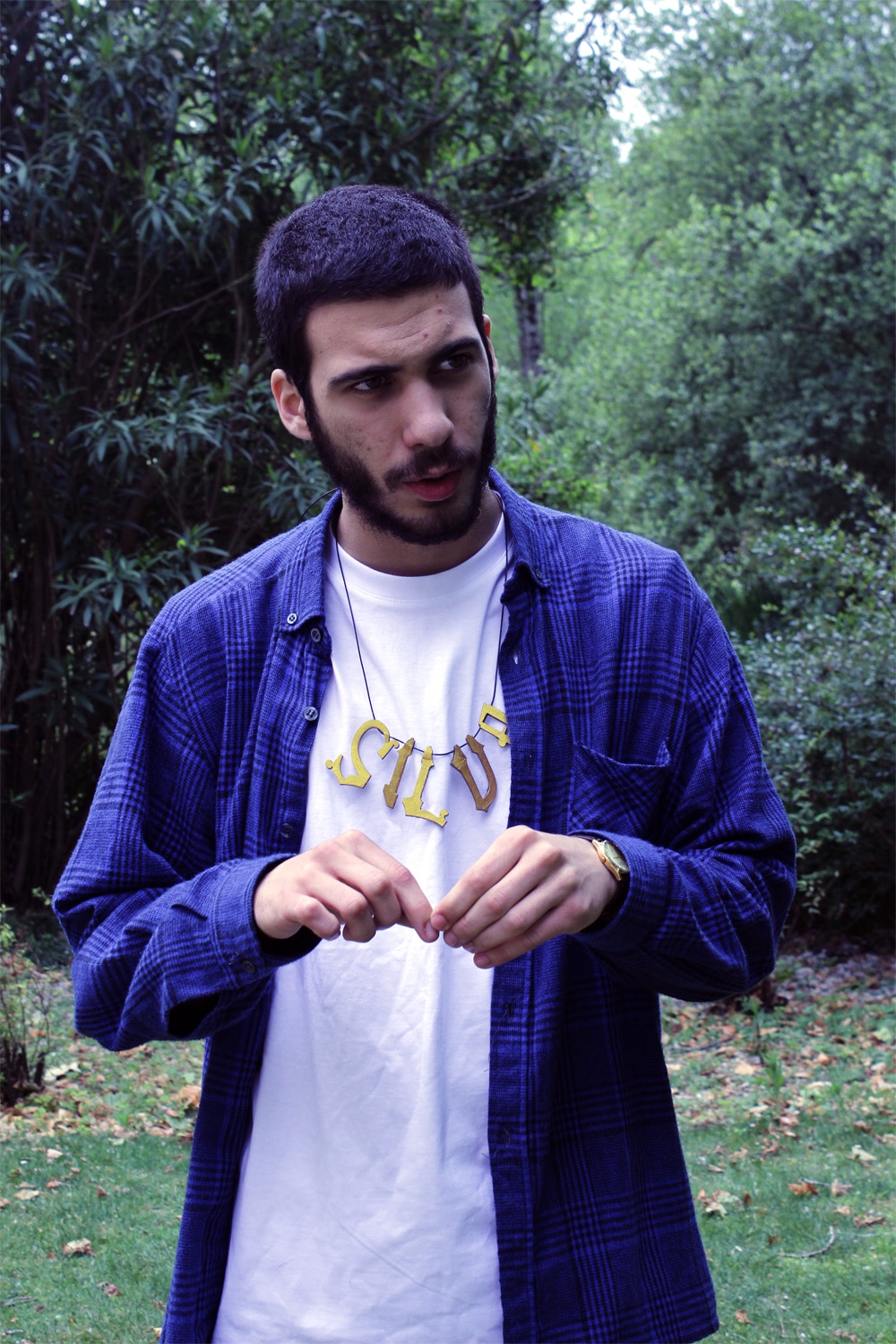
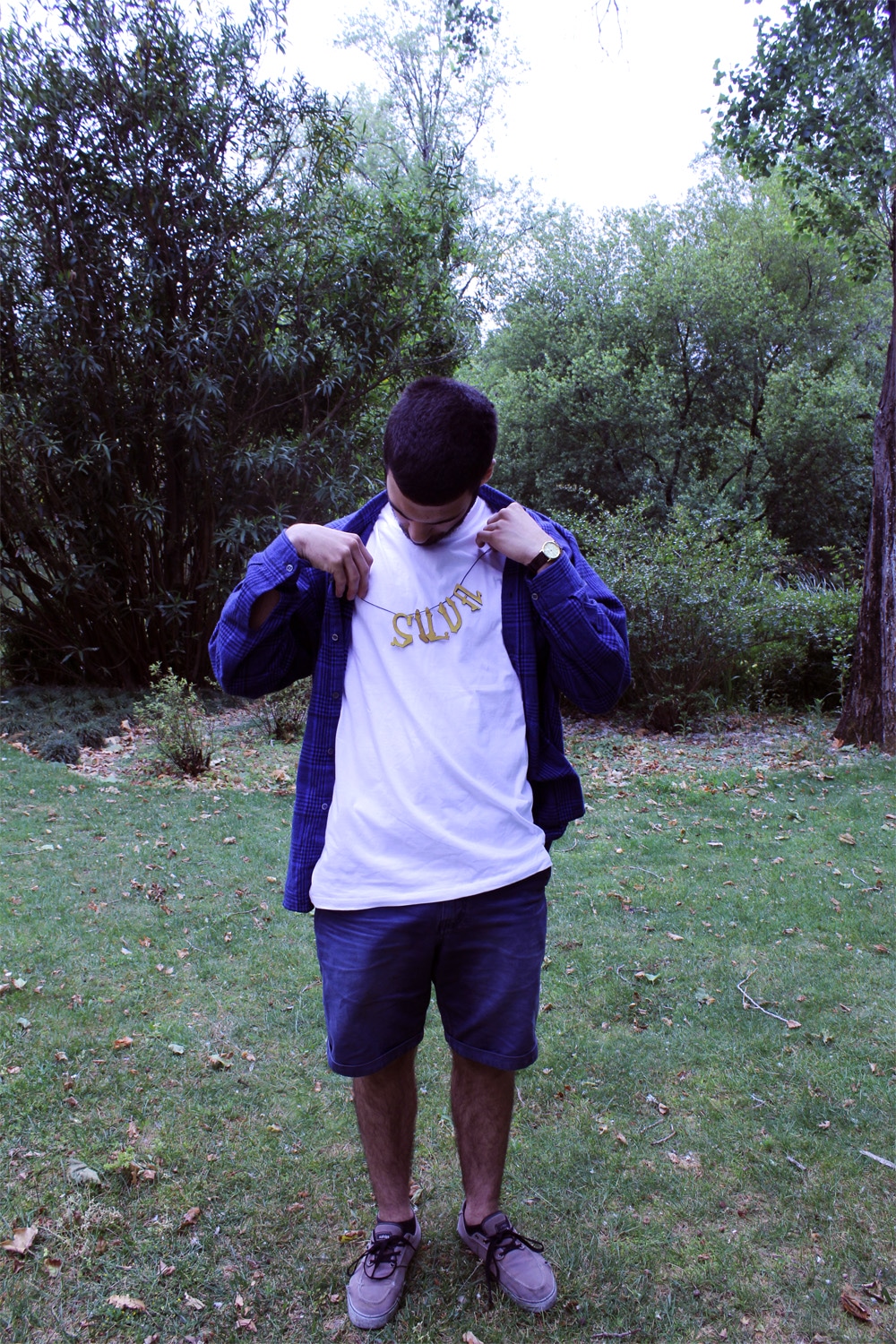
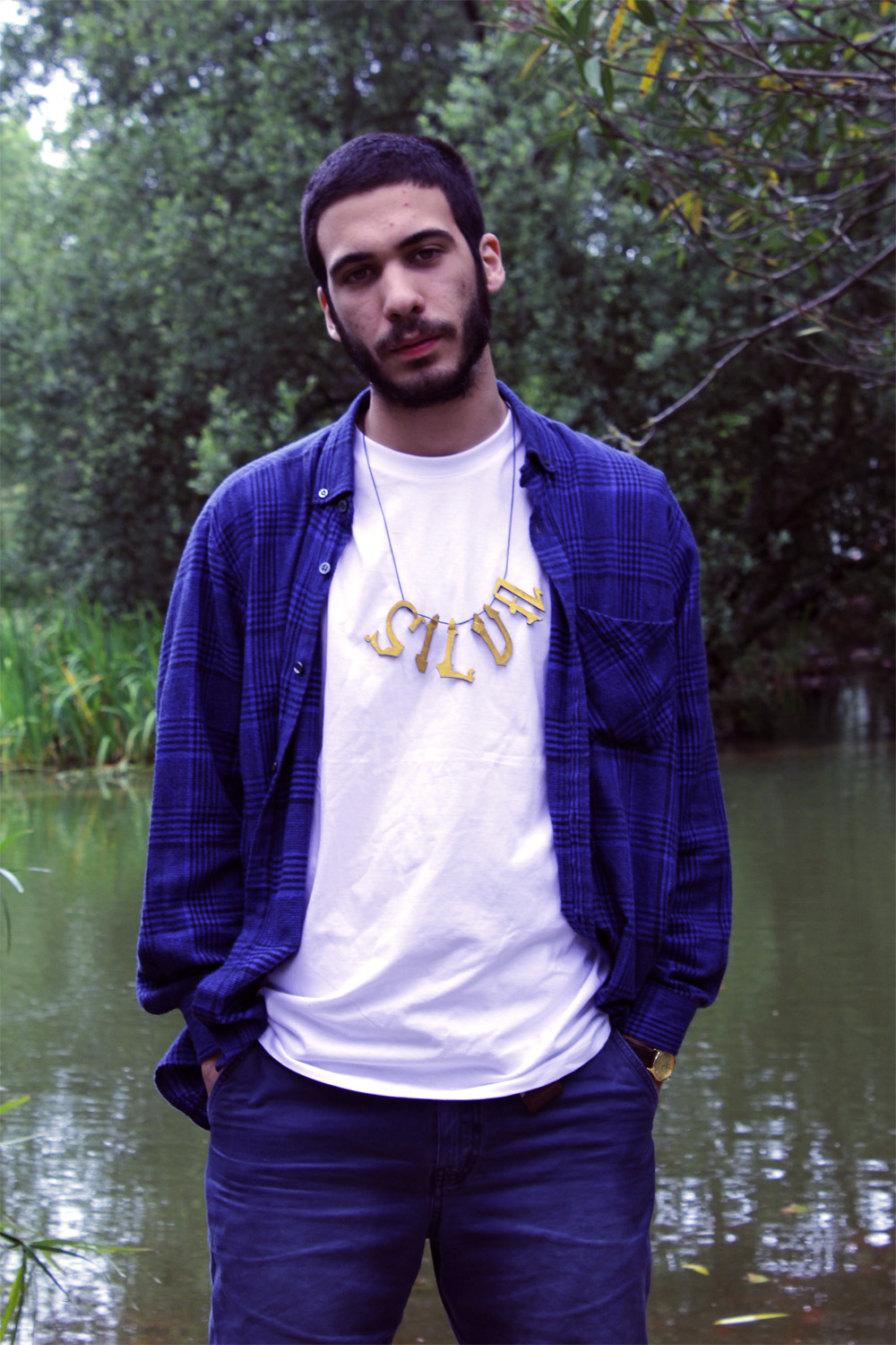
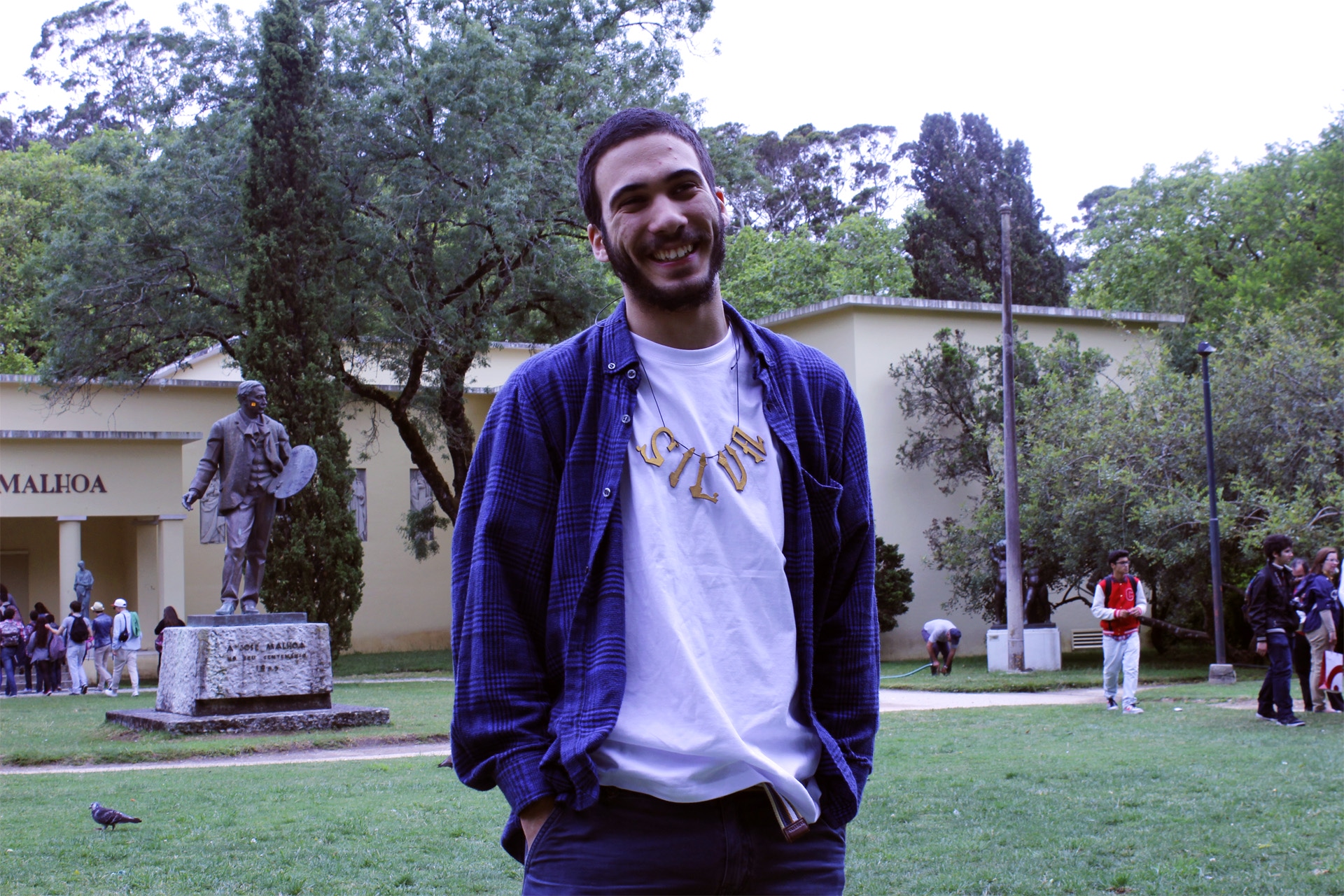
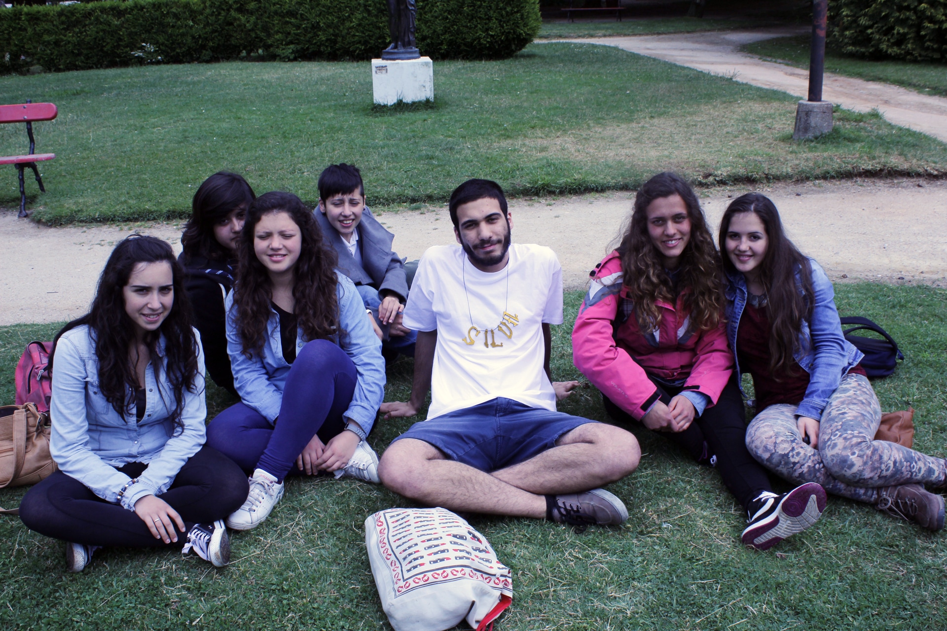
The FDP bling‑bling, in a photo shoot with Tiago
School work
2013
get back
last updated last updated

Festival do Parque

School work
2013

Event
Concept and graphics for a prospective music festival

Collaborative work with Marta Almeida

          The challenge of this project, to be developed by an environmental designer and two graphic designers, was to come up with an idea for a summer music festival to take place in D. Carlos I Park in Caldas da Rainha. In other words: to create a brand and plan its first edition graphically and spatially. In our understanding, the response should be as specific as possible — unique to this park and irreproducible anywhere else.

          After years living in Caldas and passing by D. Carlos I Park every day, this was the moment of our first attentive observation of the grounds. We were immediately drawn to the wonderful, even contradictory, variety of the parkʼs parts, and of the elements within each part: vegetation, leisure spaces and experiential suggestions, statues, vases, and a range of other artefacts — clearly indicators of decades and decades of history, and of the more or less deliberate contributions of many people. It is a romantic park, once well frequented by the chic bourgeoisie who flocked to the thermal baths.

1. Naming

Festival do Parque (Park Festival) is entirely descriptive, hence neither pretentious nor partisan. We believe that, when it comes to naming, the way to embrace the festival's diversity of registers is through simplicity. It is straightforward: a festival that takes place in a park.

With the aim of competing directly with other major summer festivals, its renown can bring to D. Carlos I Park the connotation of the park of Portugal. Memorable — both the festival and the park.

Park itself already implies contact with nature, strolling, leisure; it can also suggest a space for entertainment, amusements. Park is understood as a venue intended for a wide variety of activities.

2. Graphic references

Throughout the park, a valuable collection of sculpture is distributed. The pieces belong to very different moments in art history, as do the styles of figuration, and they confer upon the park a kind of humanist, poetic, almost bohemian aura — a little as if each work held a part of the park's soul, or as if the entire collection were a club of haunted mascots. We recorded them all.

And, of course, a generously varied flora, which resulted in a herbarium.

On the other hand, the cultural heritage of Caldas da Rainha is, even internationally, too important. (And to me, Rafael Bordalo Pinheiro is God.) Indeed, Bordalo: does it matter? how to escape the cliché? where does the festival's identity intersect with the bordalada? Perhaps it would be unrealistic to think of the project without passing through here.

3. Lettering/logotype

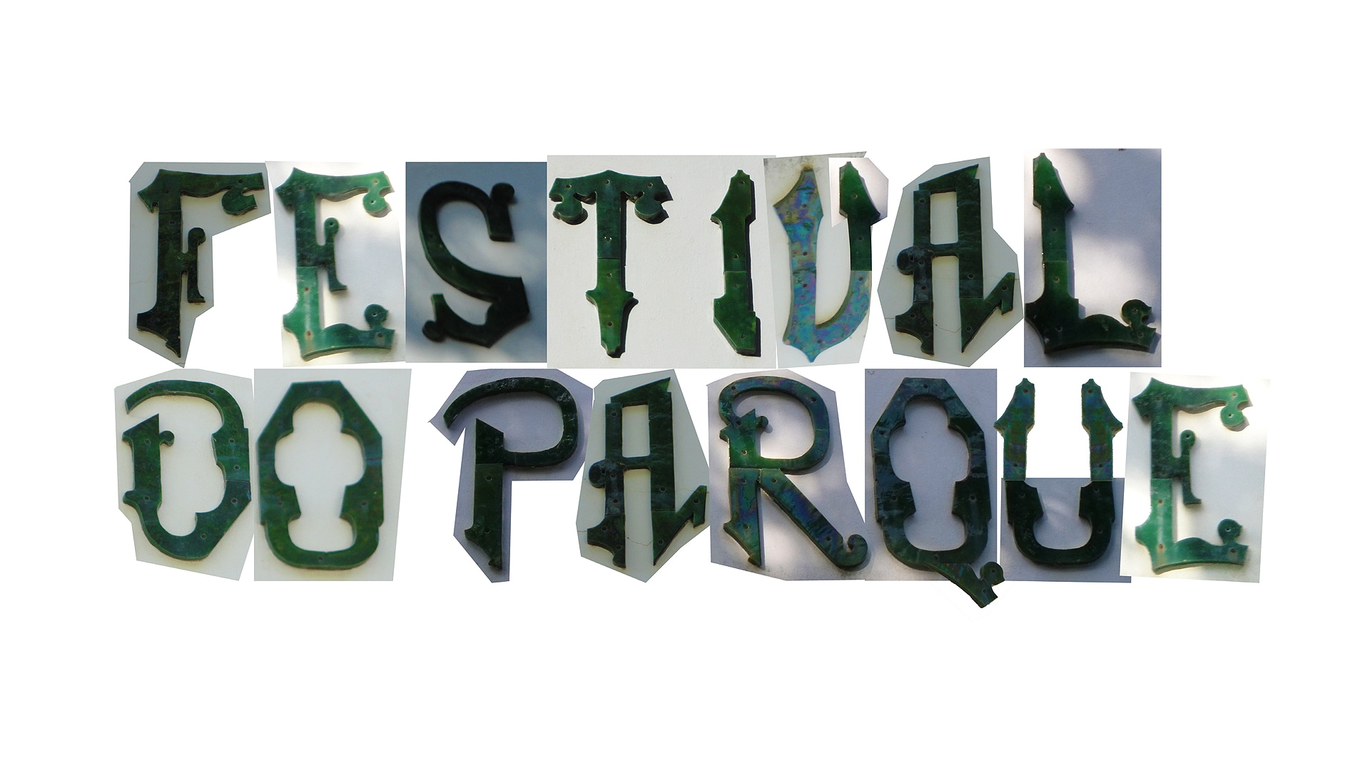
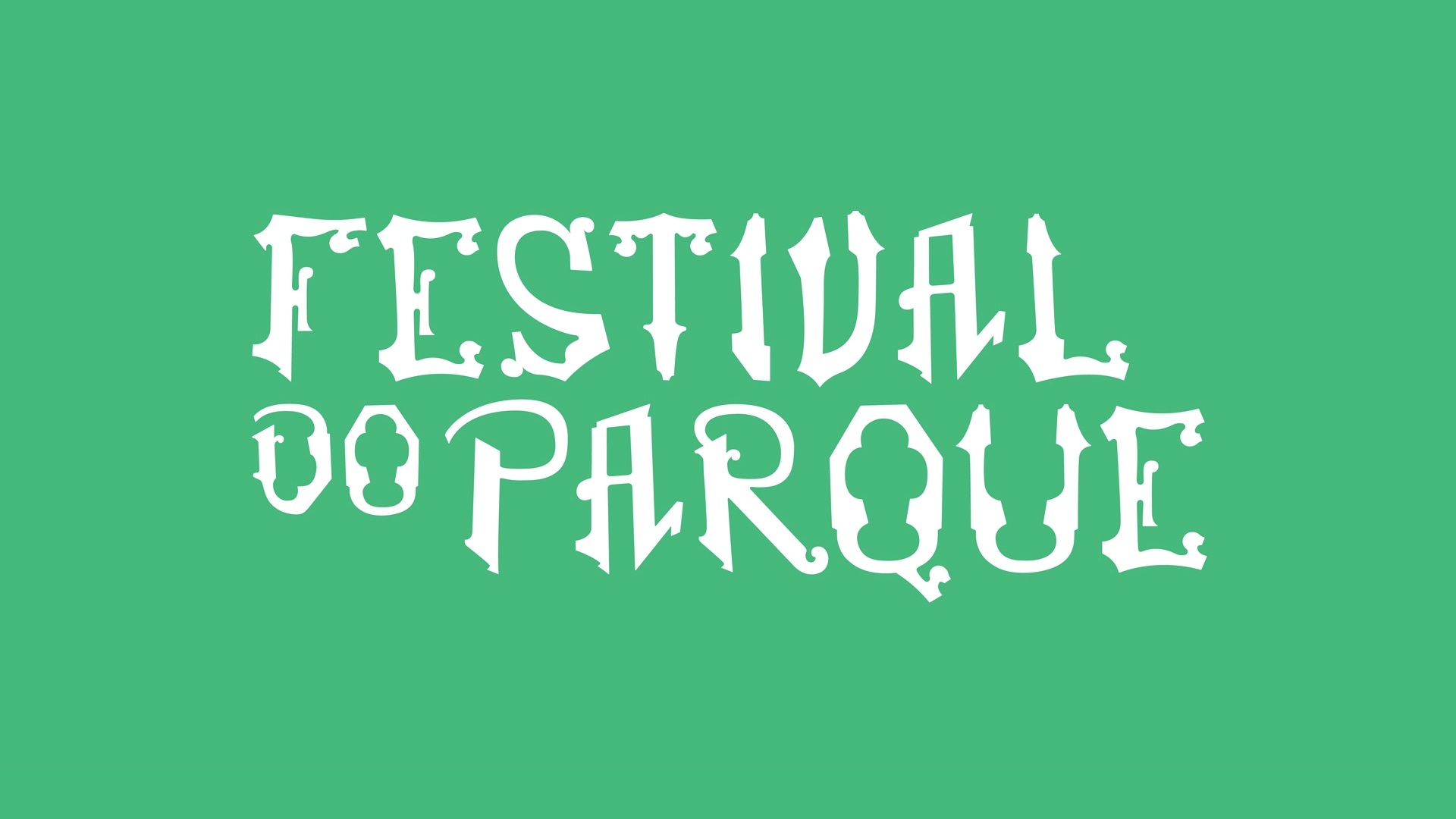
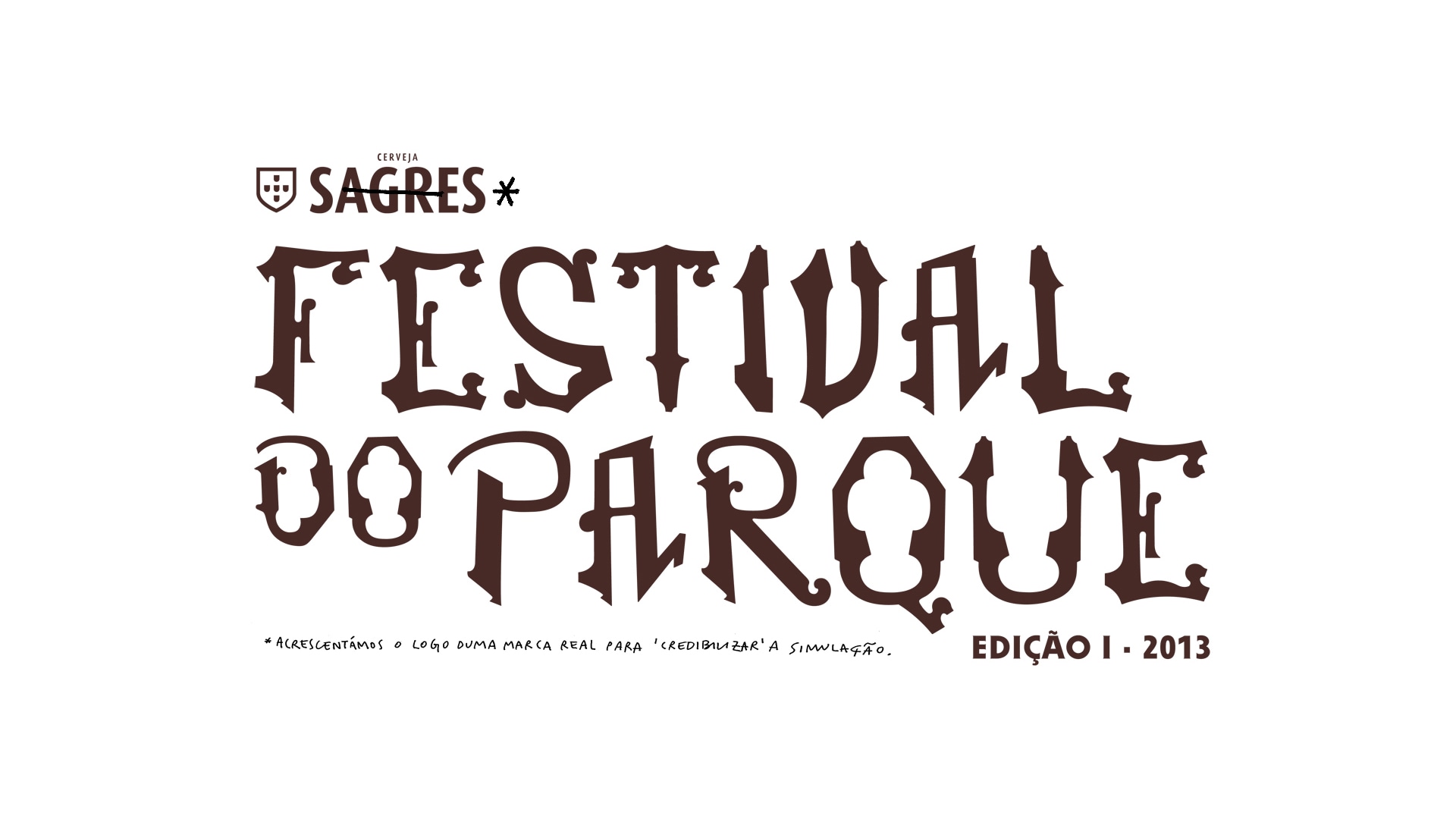
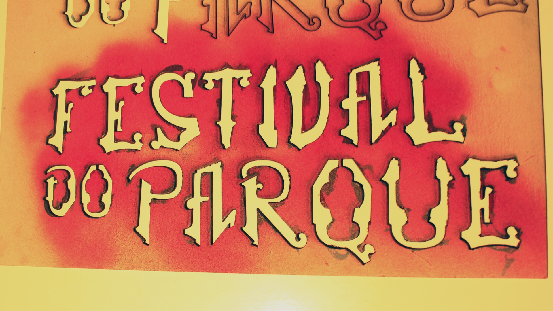
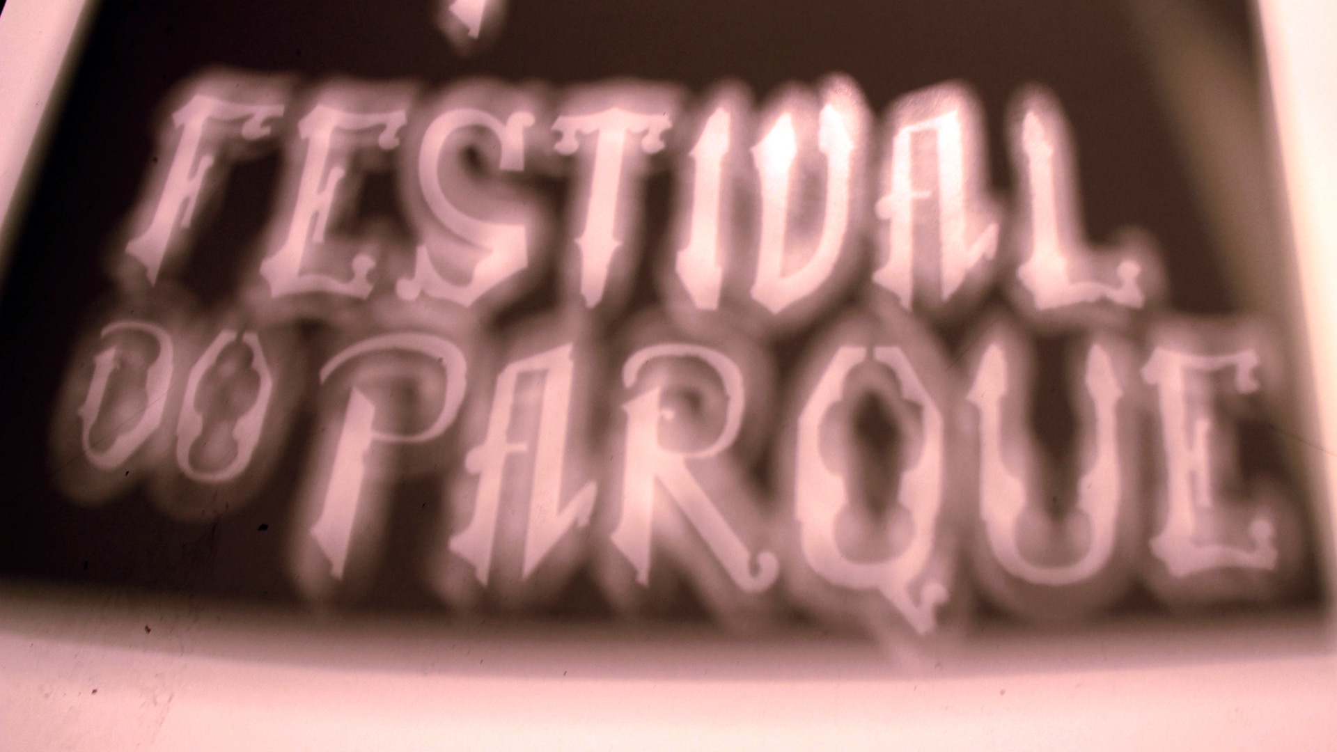
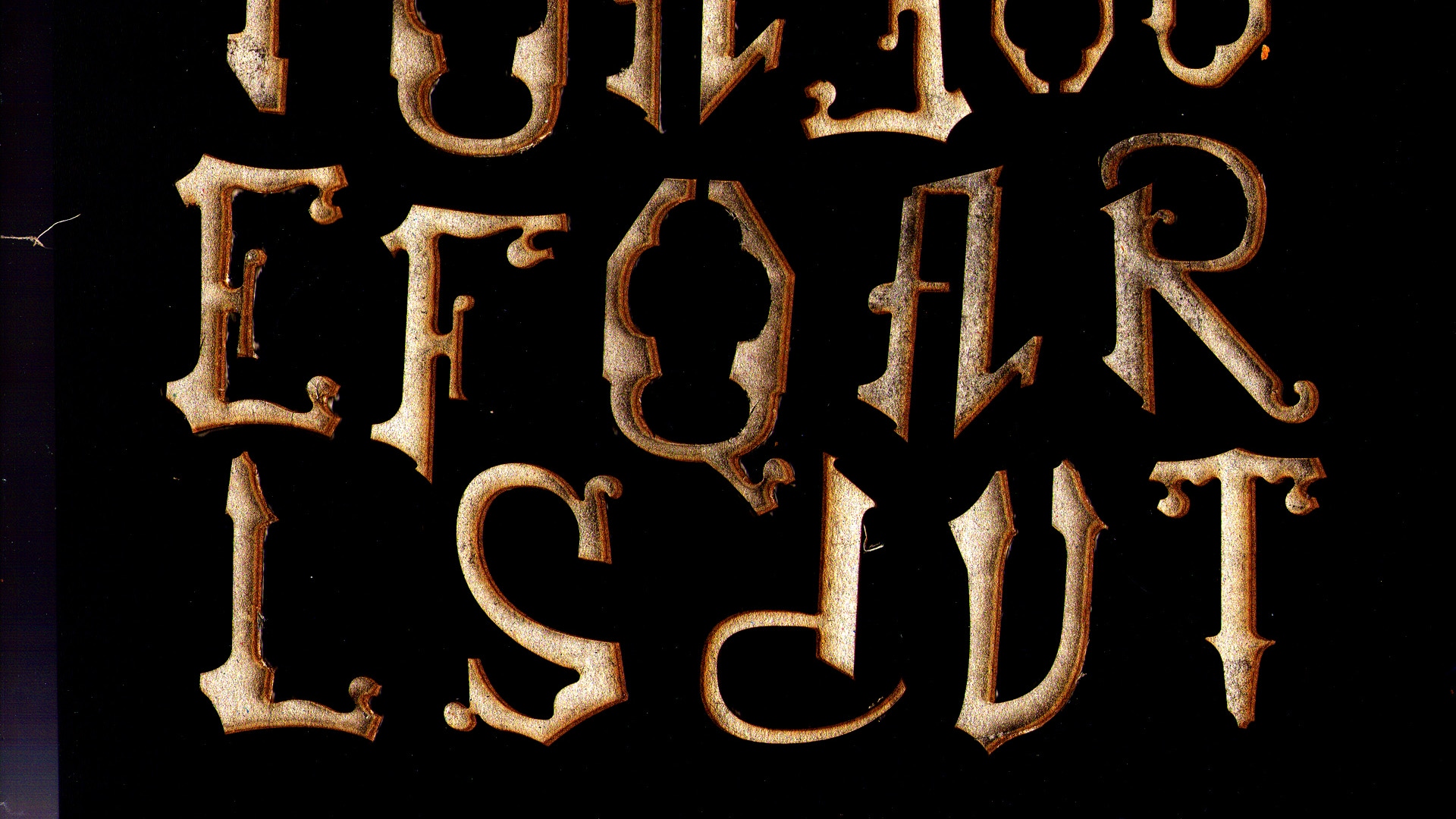
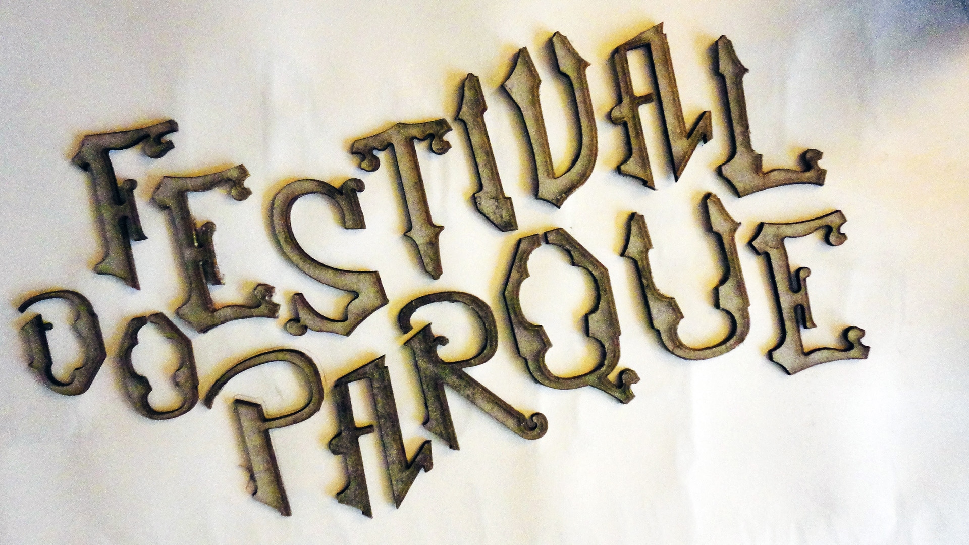
Even though it is right next to the park, the building bearing the inscription FAIANÇAS ARTISTICAS – FABRICA BORDALLO PINHEIRO on its façade remains quite hidden. We confirmed with the art director that the lettering on her esteemed factory was designed by Bordalo Pinheiro himself. We were not provided with the mould for the letters (most likely because it does not exist, but they were not clear with us on that), constructed through the joining of modular ceramic pieces, which gives the unusual lettering a certain rigour. Well, we photographed it in such a way as to understand enough about the pieces to, following the same logic, draw them digitally and develop the missing letters for the words FESTIVAL DO PARQUE.

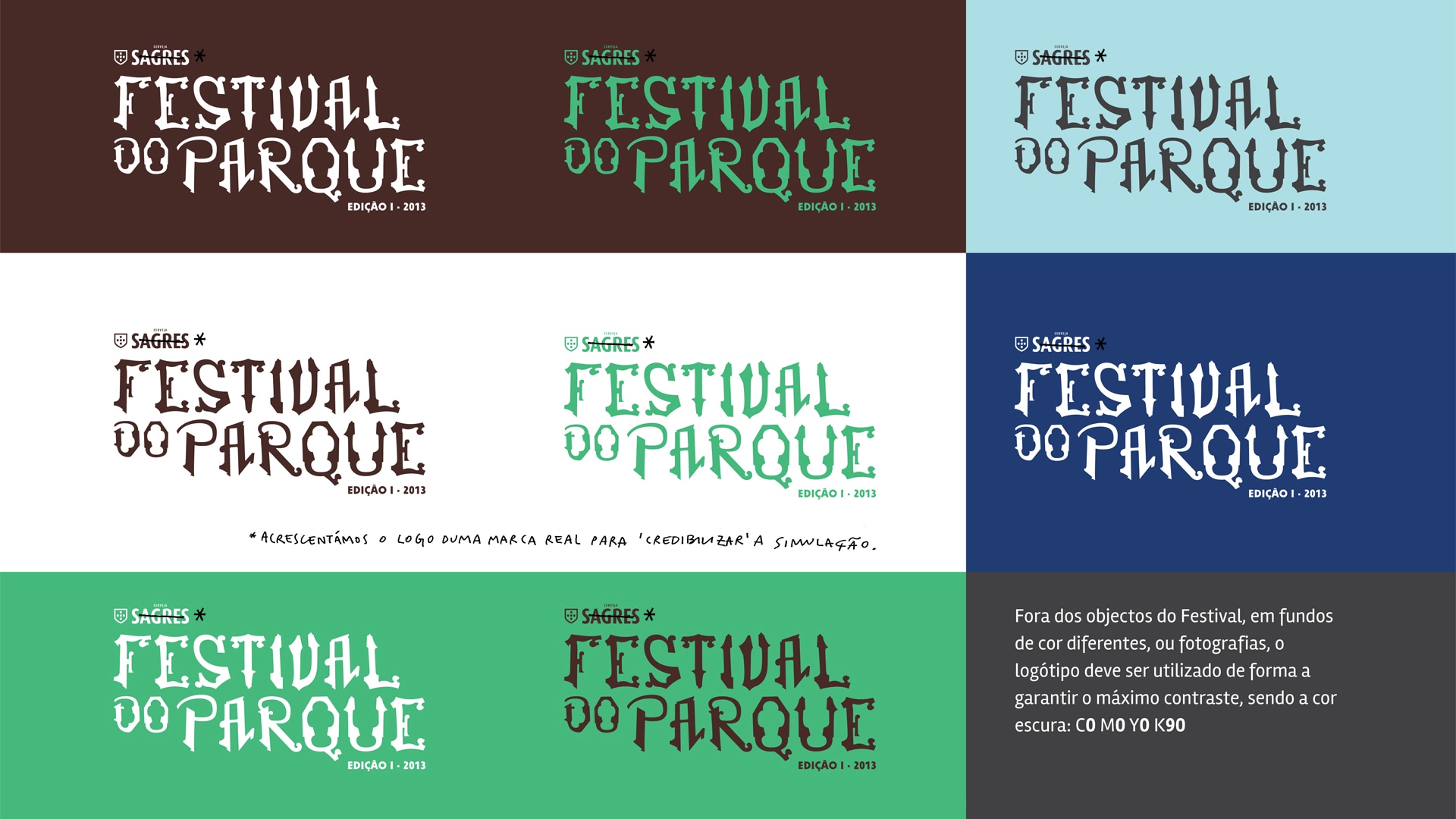
Now we have the minimum Bordalo level allowed by law! We added the Sagres brand logo to the lettering in order to simulate the realism of the proposal (we chose the version prior to the contemporary 2013 one), so that it would function as a naming partner.

4. Pictograms

The pictograms were built entirely from Bordalo Pinheiro's letters, with their piece weight then adjusted to ensure some uniformity.

5. Various communication materials

6.1 Campaign, Part I

The FESTIVAL DO PARQUE advertising campaign comprises two moments. The first aims to initiate contact between the brand and the public. If we imagine the event taking place in August, the first phase begins at the end of the previous year to catch Christmas, and can last until May. It consists mainly of the occasional appearance of adverts with confirmations of the lineup as they are received by the event's production team.

6.2 Campaign, Part II

The appeal of FESTIVAL DO PARQUE does not aim to reach just one type of audience. Its programme is stylistically varied, the venue likewise, and to celebrate diversity and communicate with each 'tribe', we designed versions of the poster with different graphic styles that should work simultaneously. We are not afraid of the festival's image being confused, or of people wondering whether BB King will come to Portugal twice in the same year. We do not believe that our image loses strength through its inability to become fixed, because — above all — it is that very variety that is the mother concept of the festival's entire brand.

7. The FDP's bling-bling

Tiago's look was just what we needed to give the festival a face. We did a photo shoot with FESTIVAL DO PARQUE's customisable bling-bling. We never got around to making the whole alphabet — which is why Tiago was renamed Silva around here.

get back

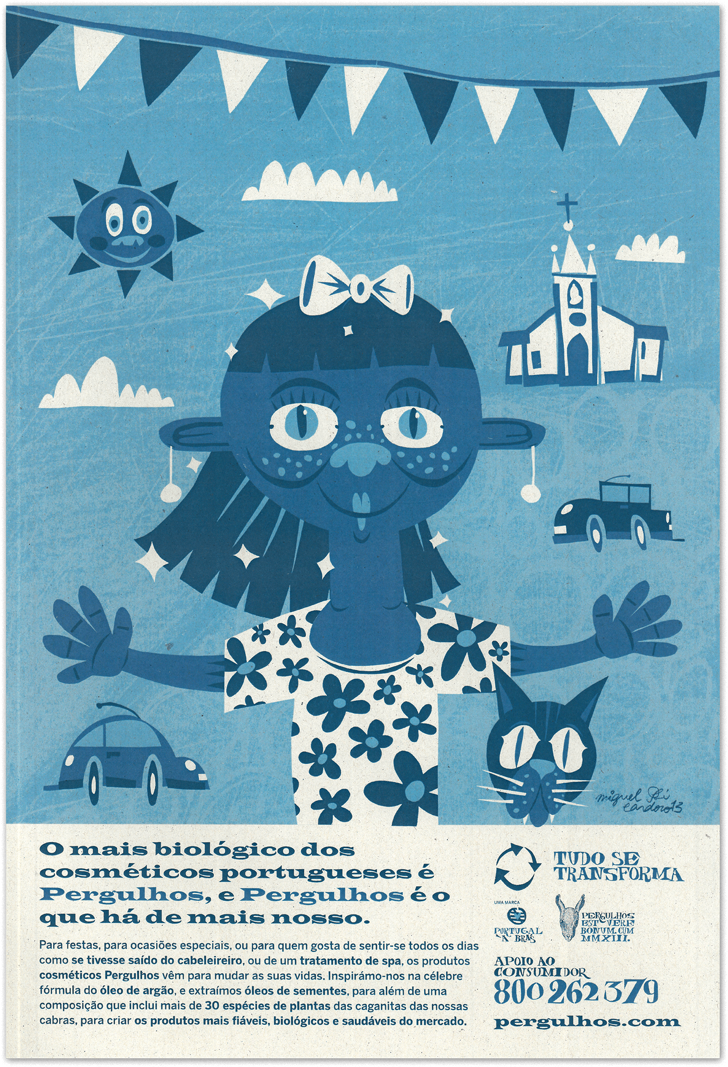
● Pergulhos

Branding
Personal/school work,
2013

previous Pergulhos

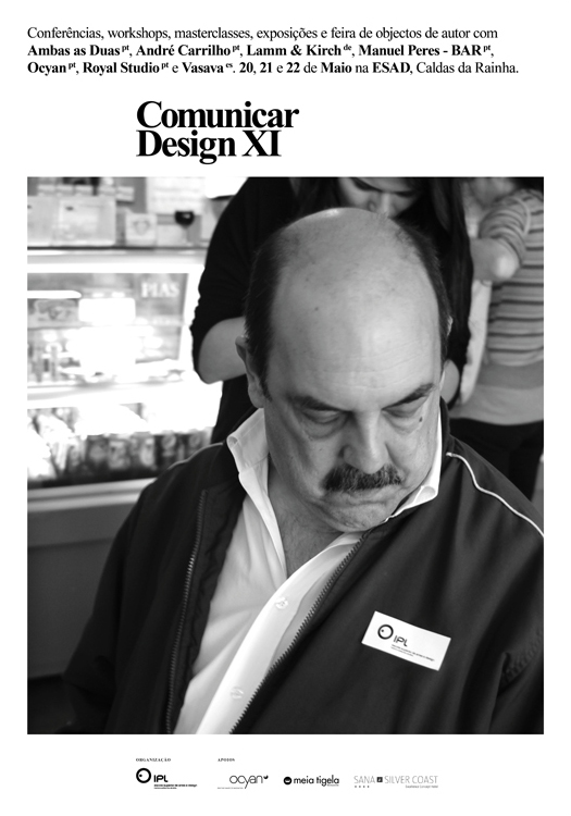
● Comunicar Design XI

ESAD.CR
School work with real‑world application, 2013-14

next Comunicar Design XI