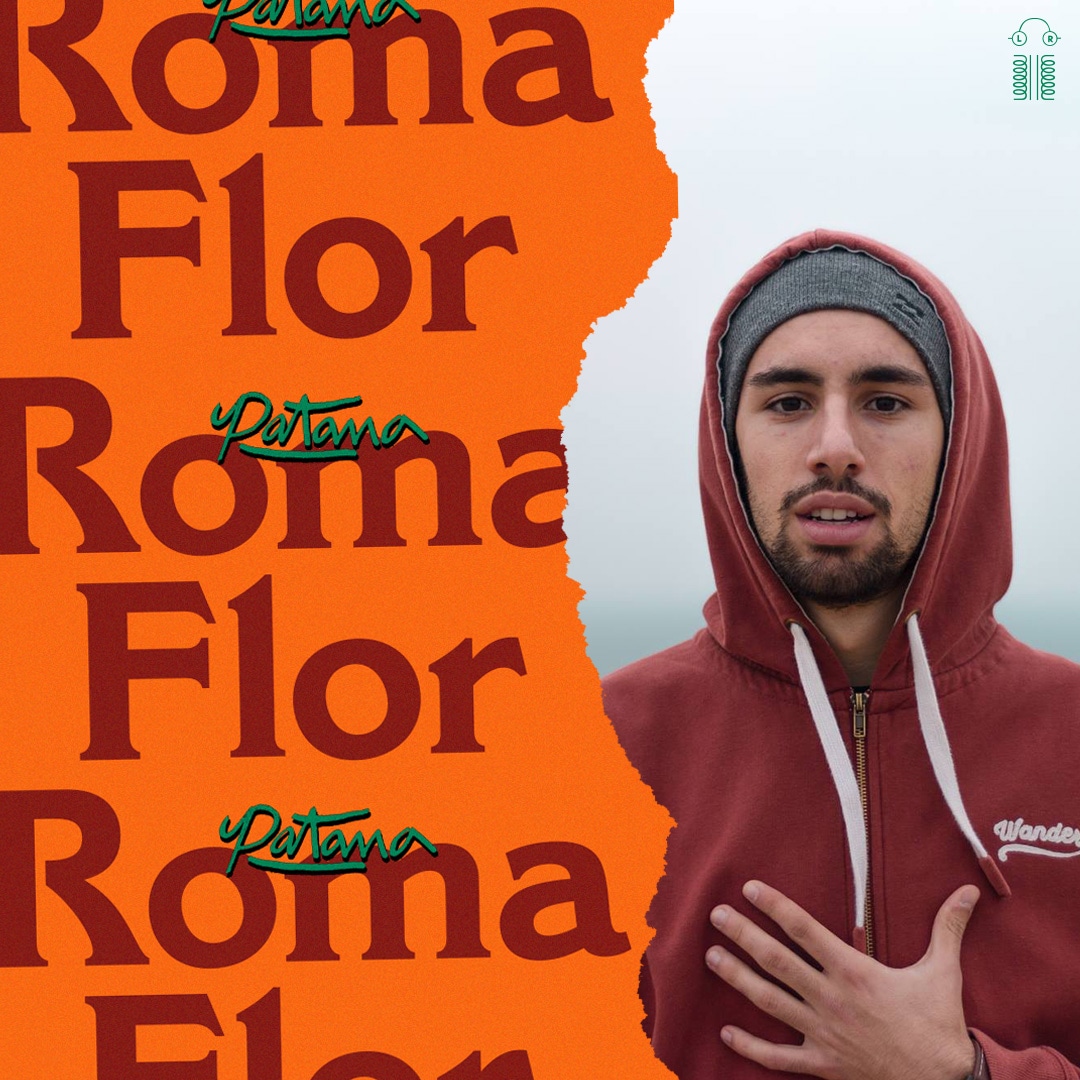
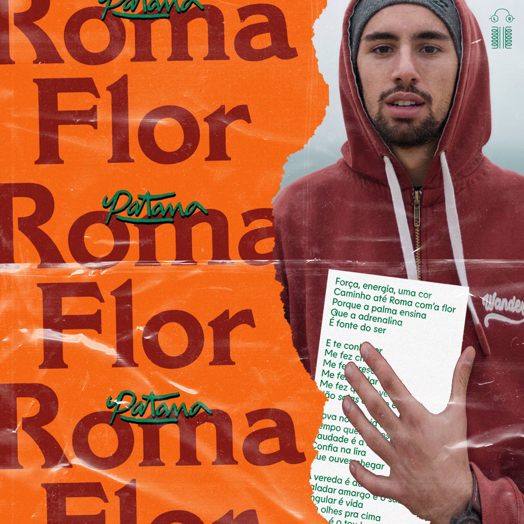
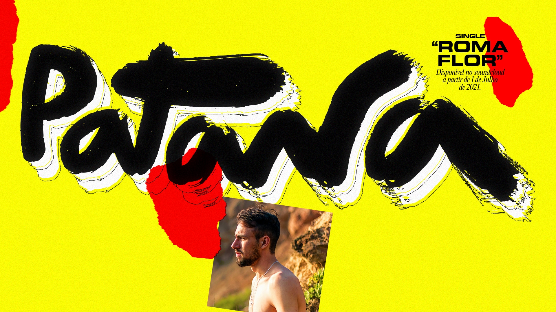
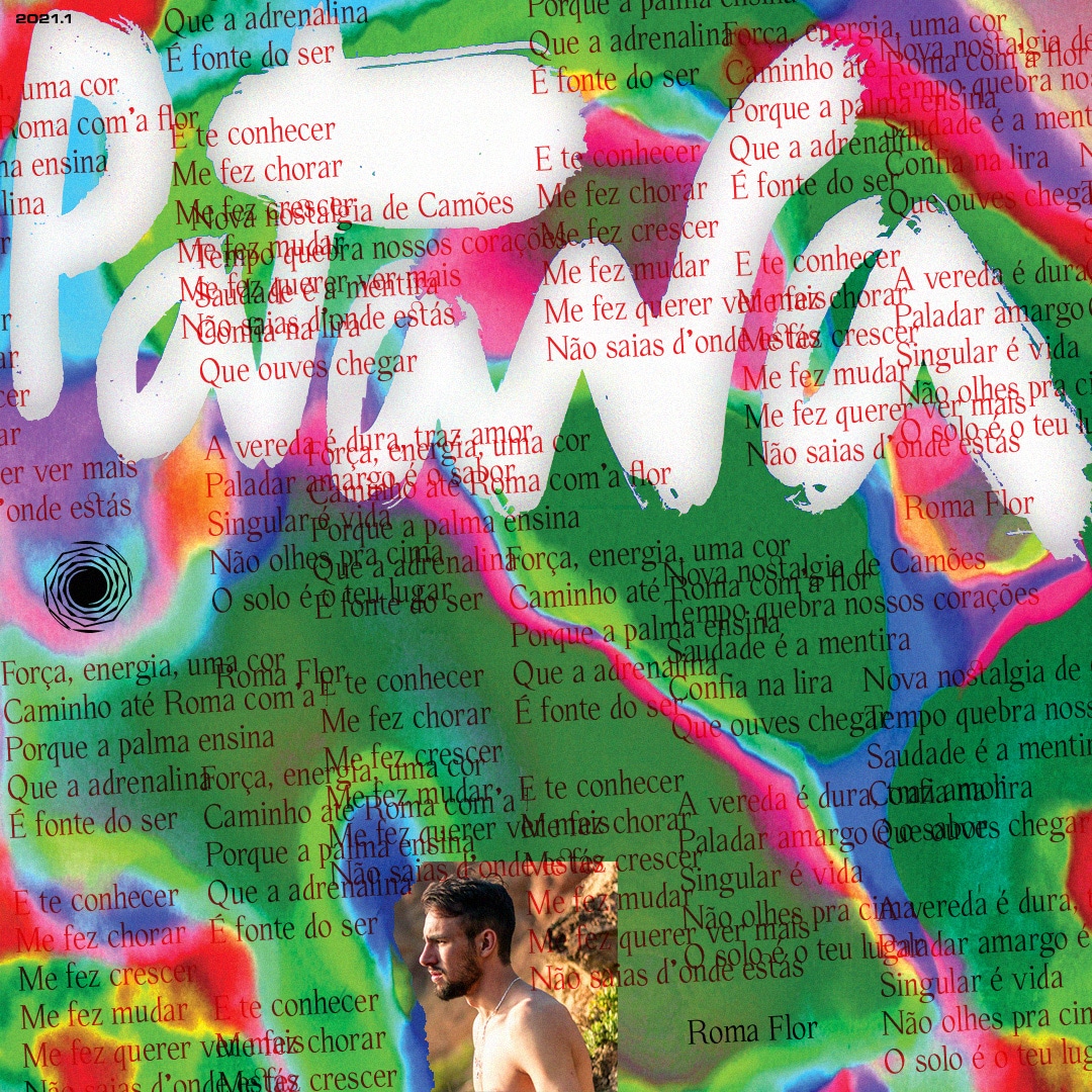
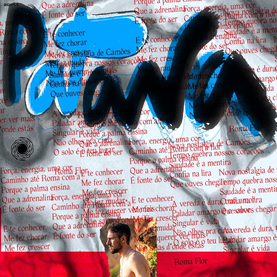
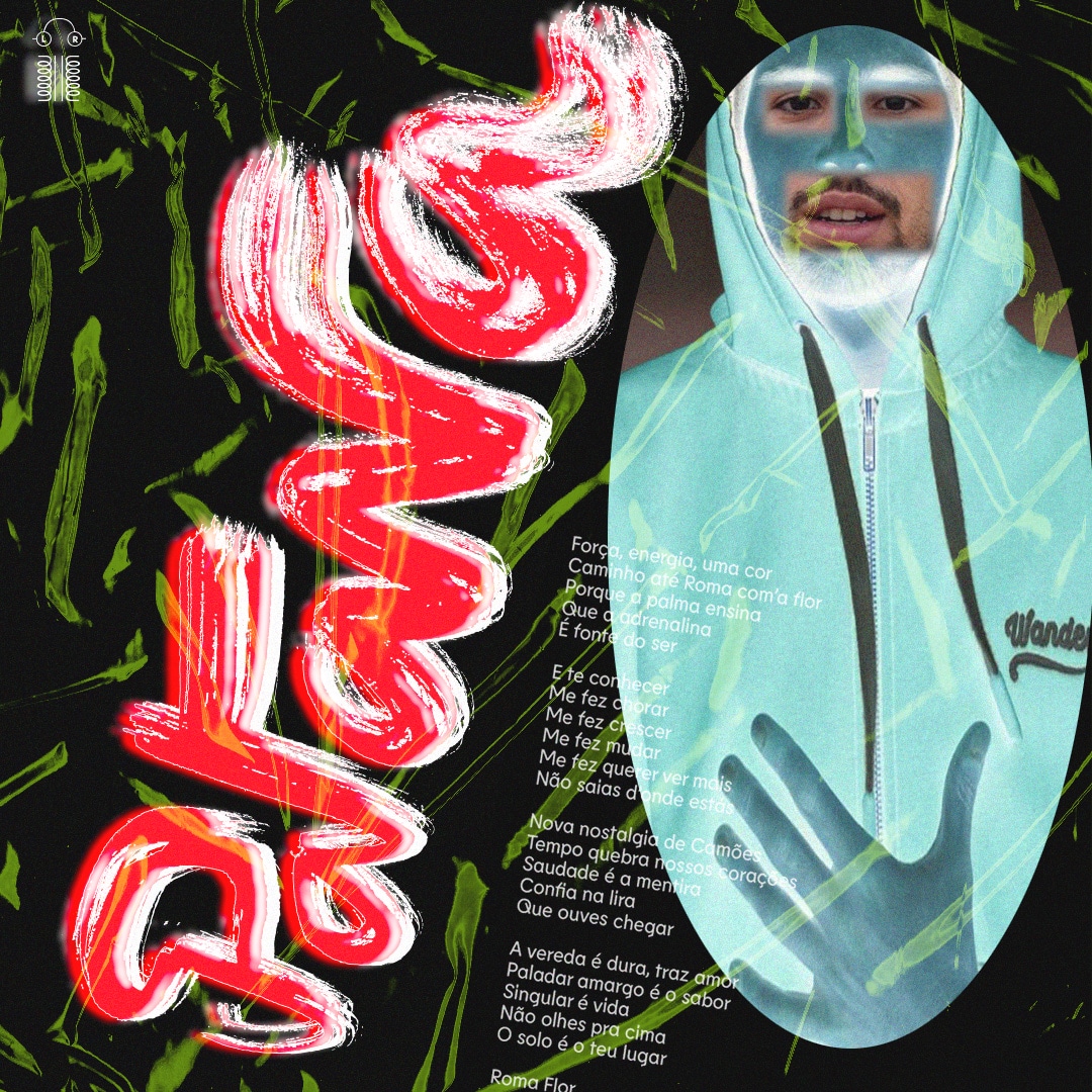
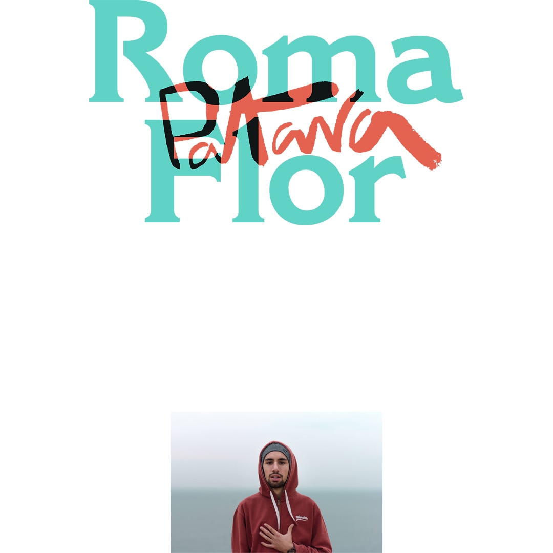
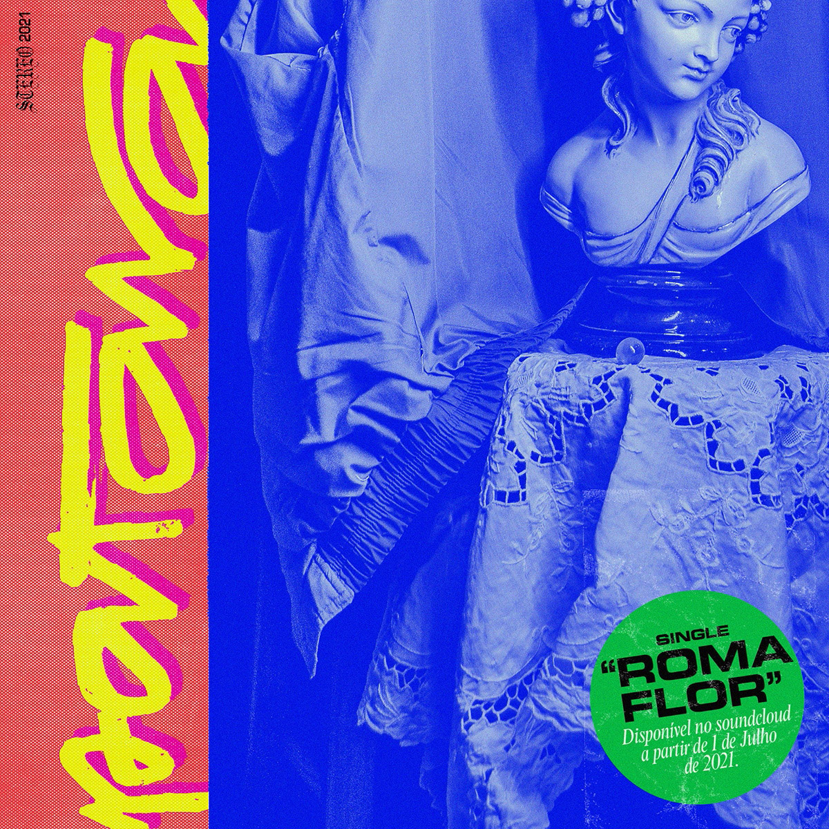
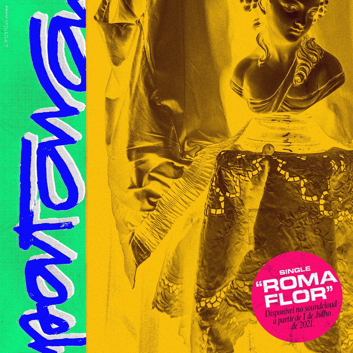
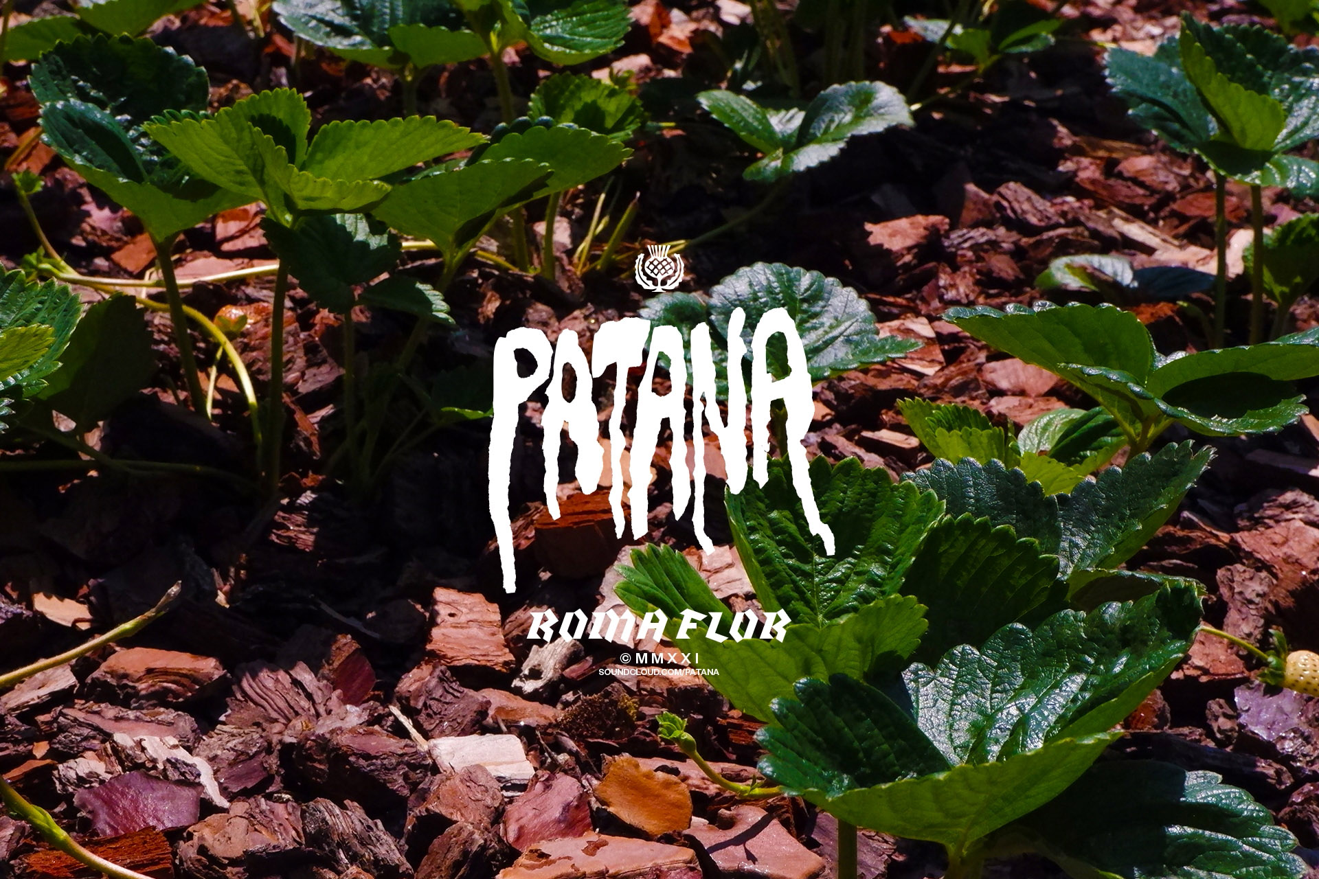
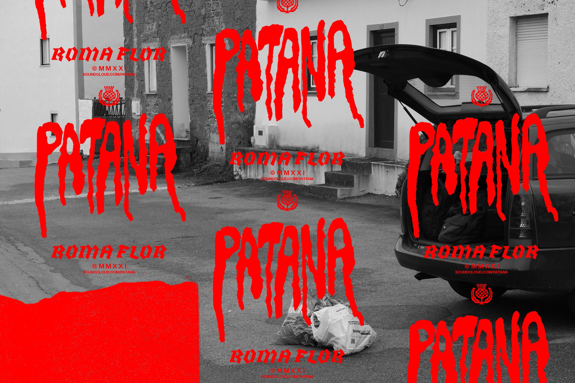
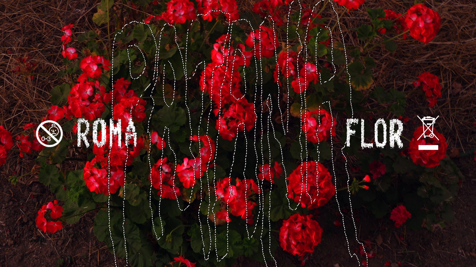
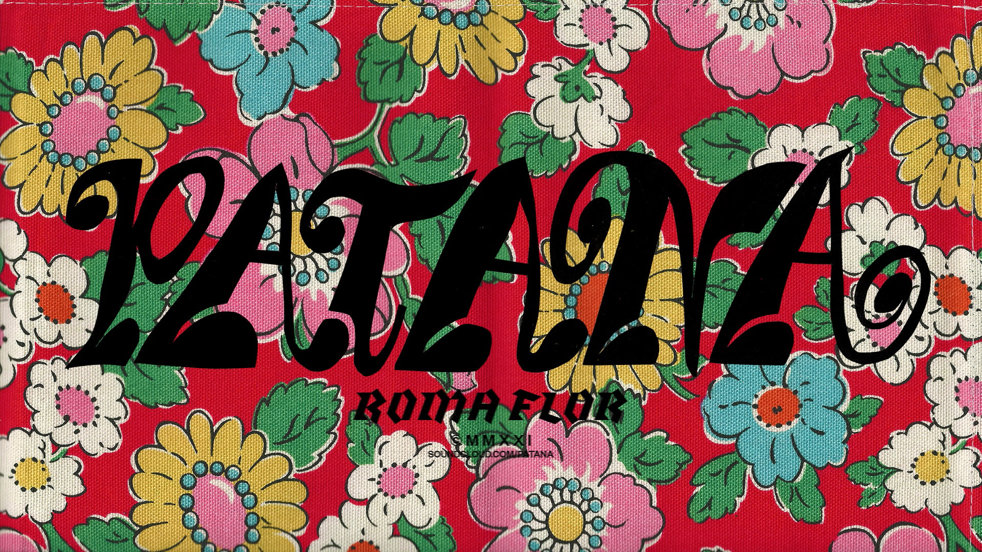
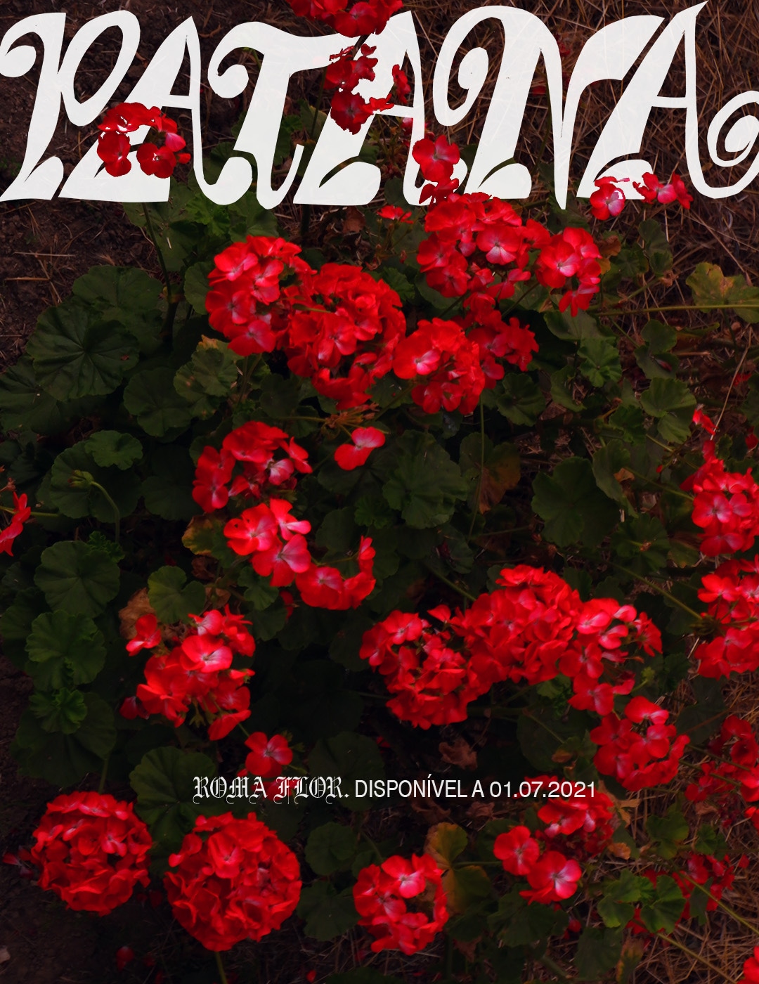
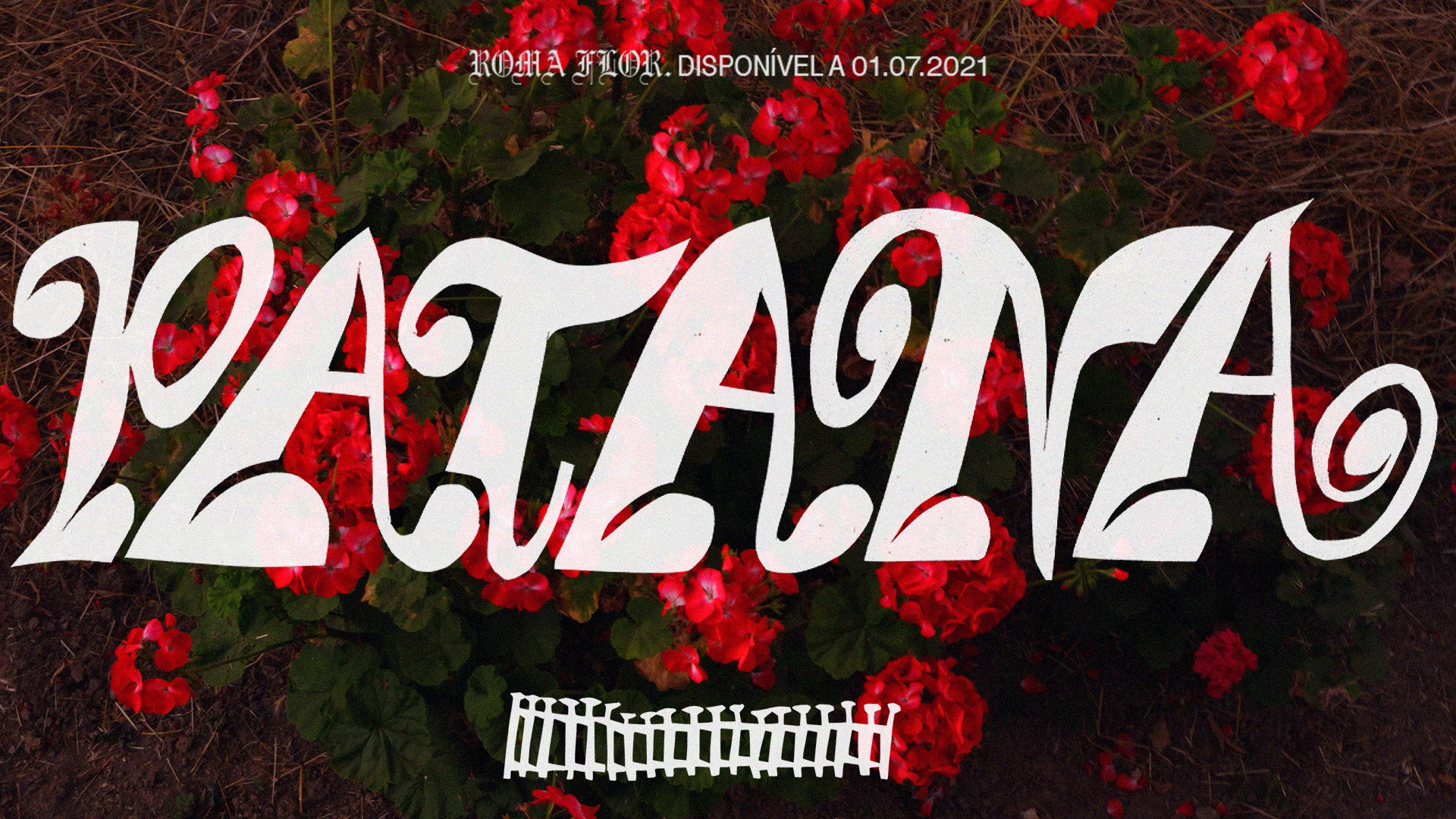
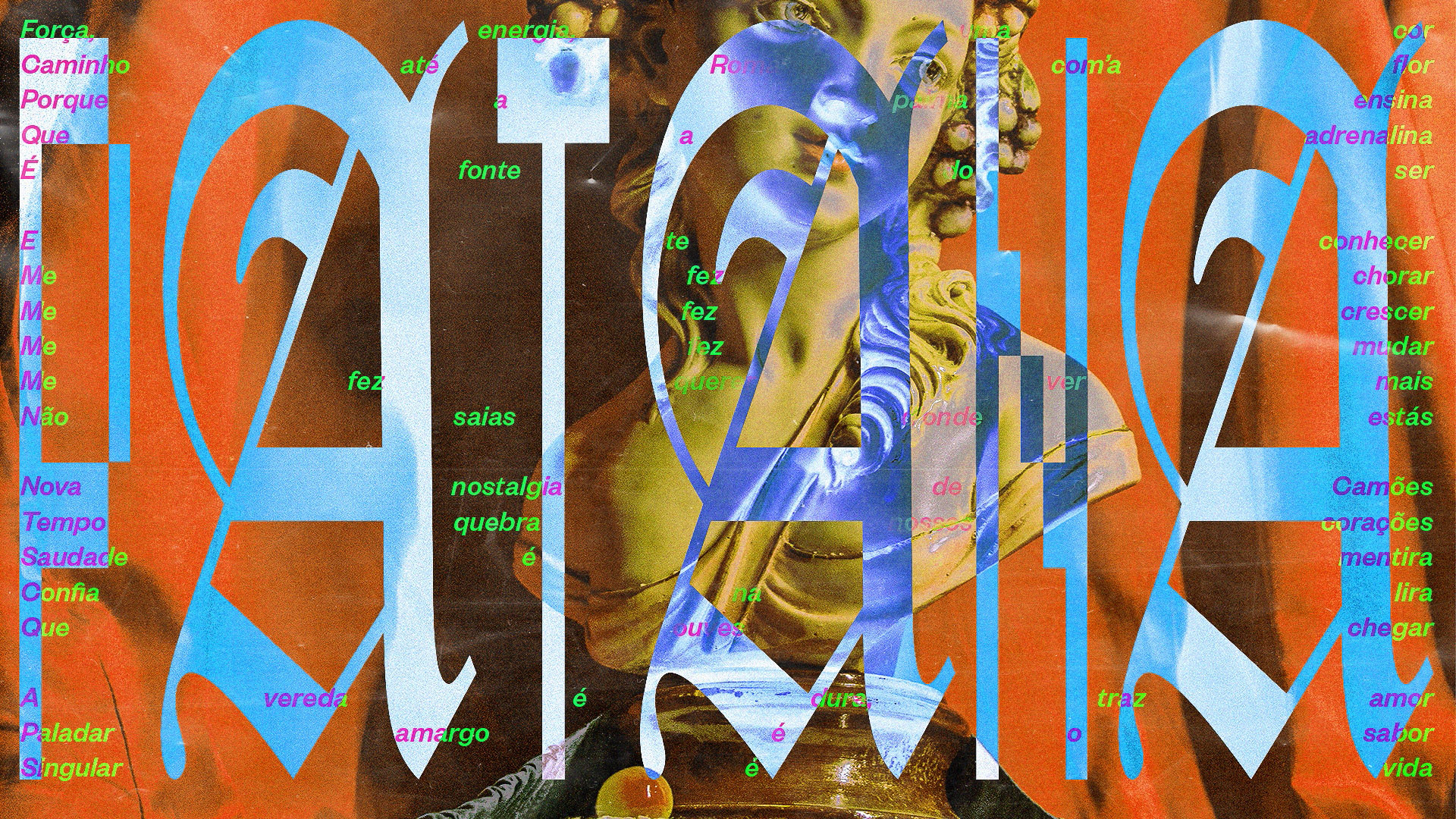
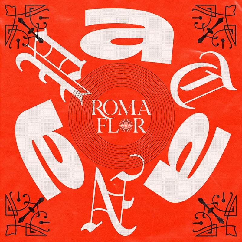
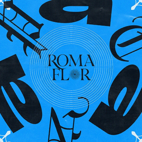
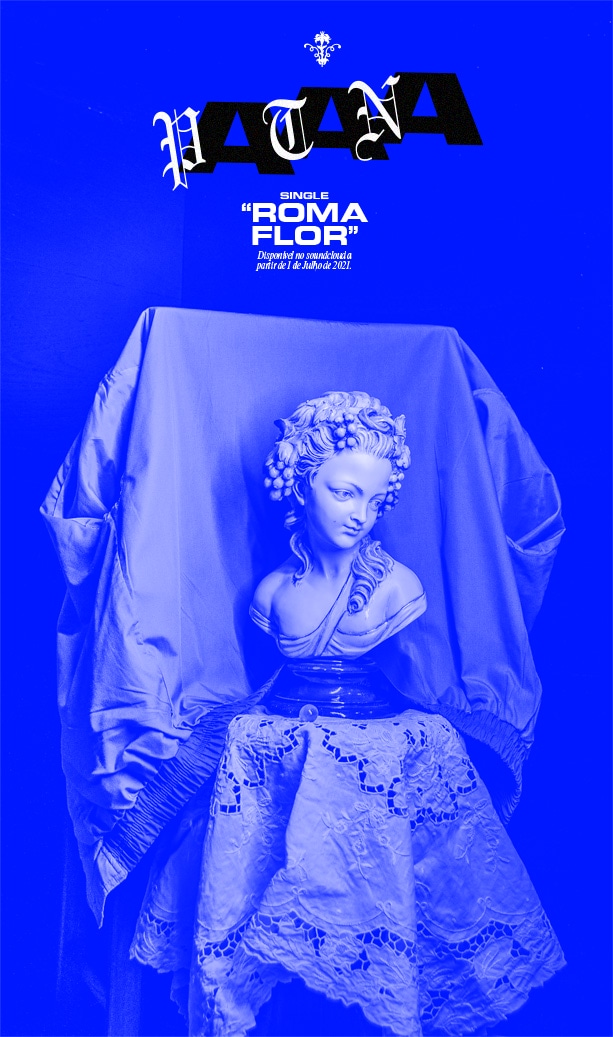
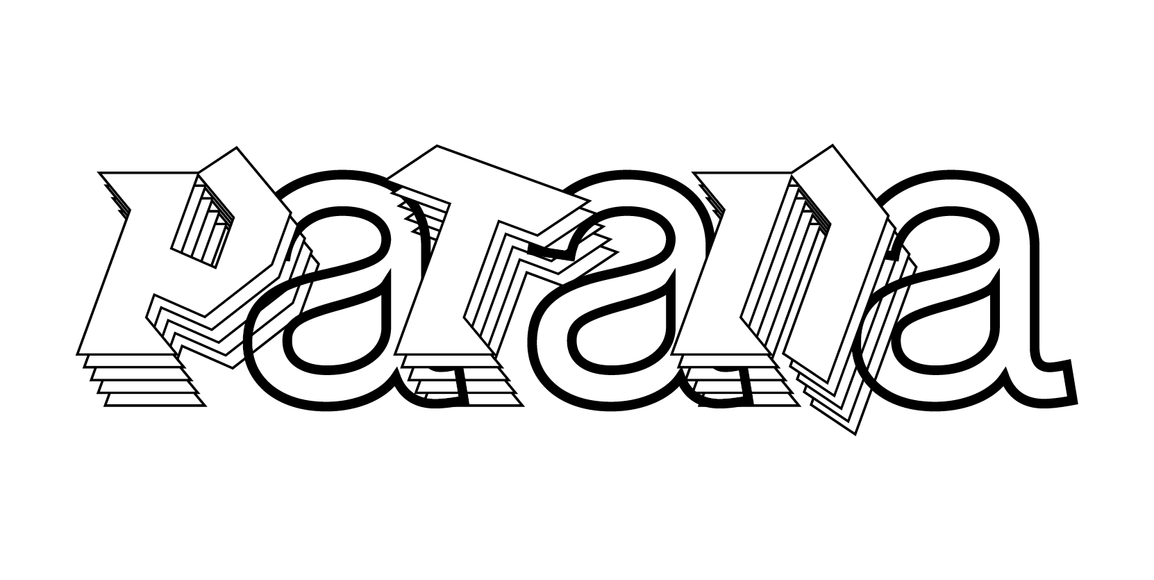
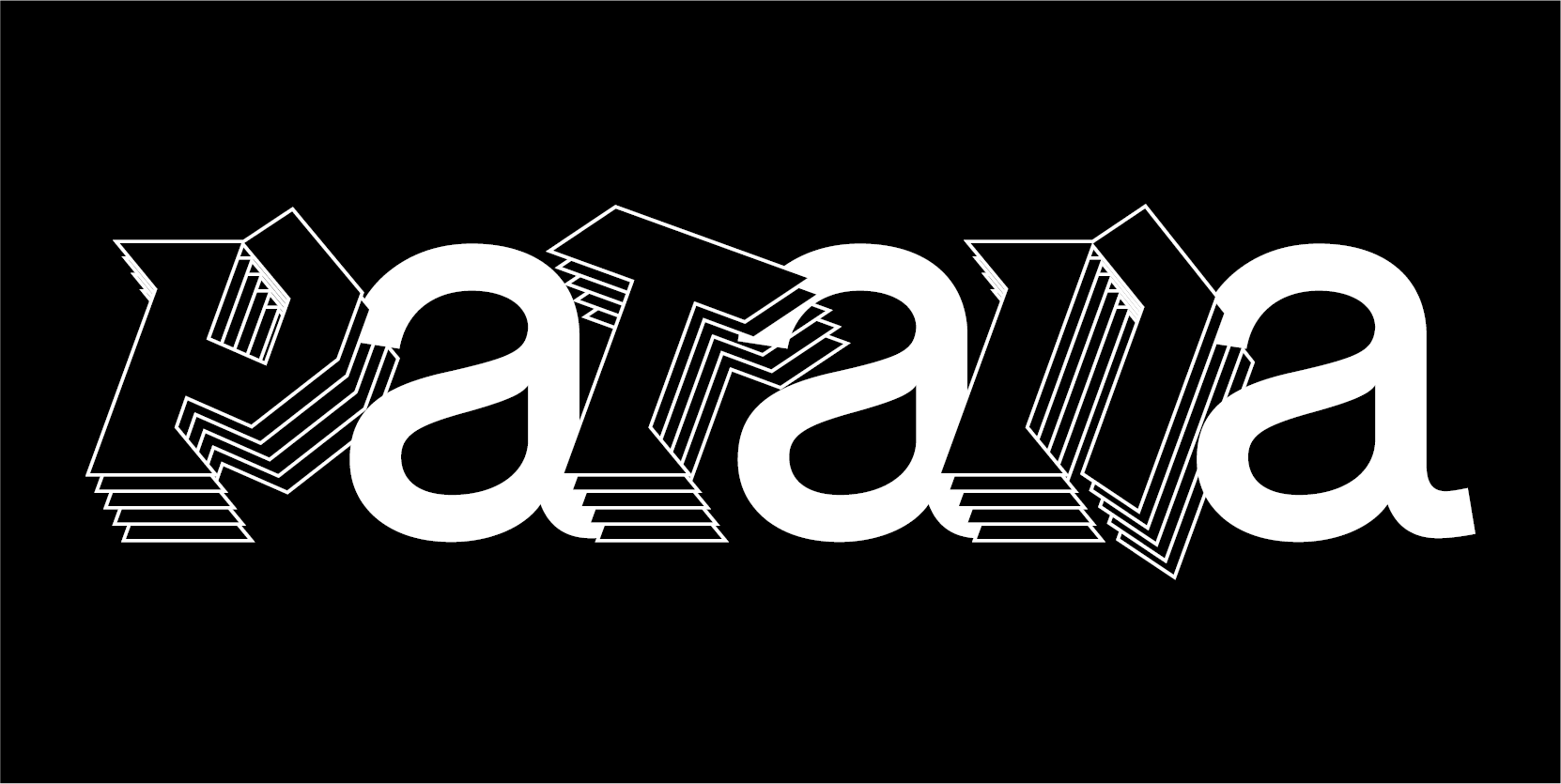
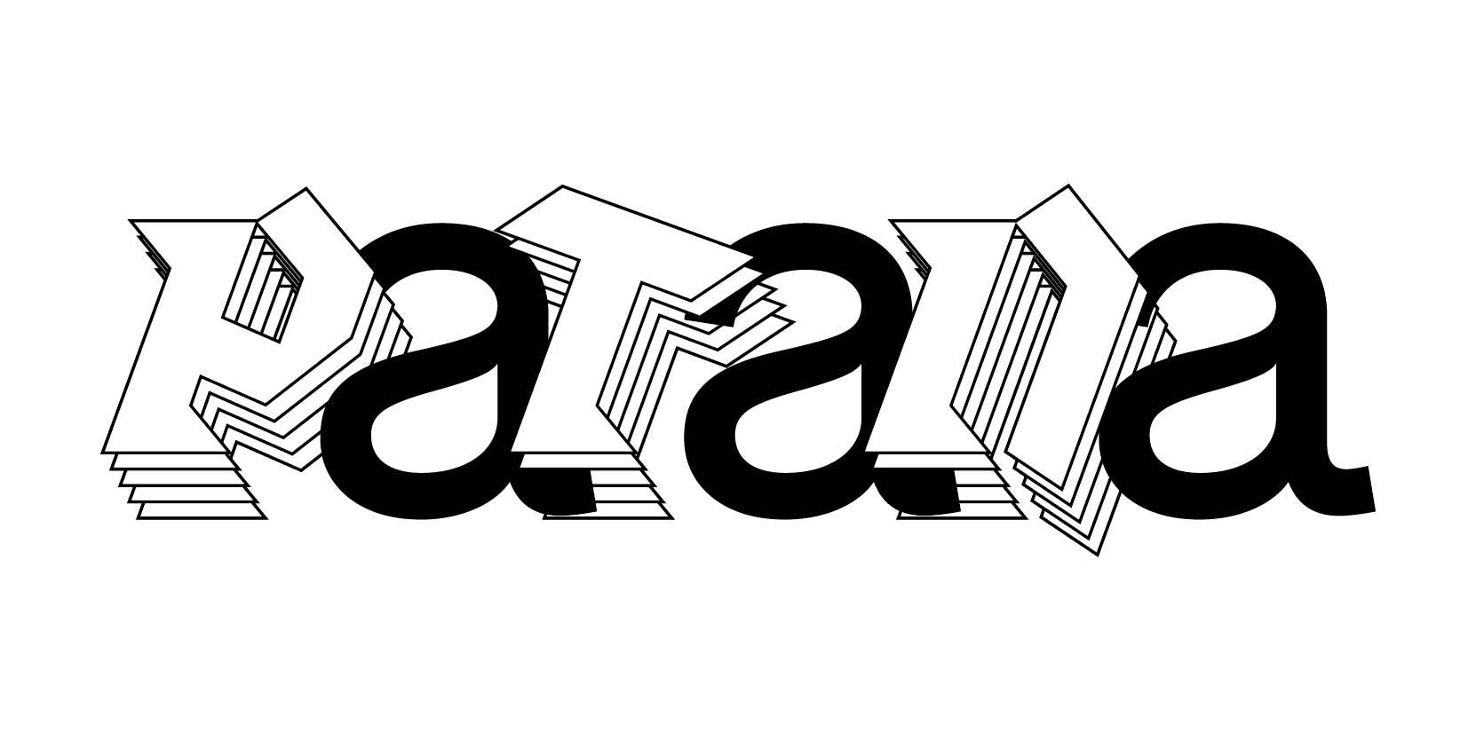
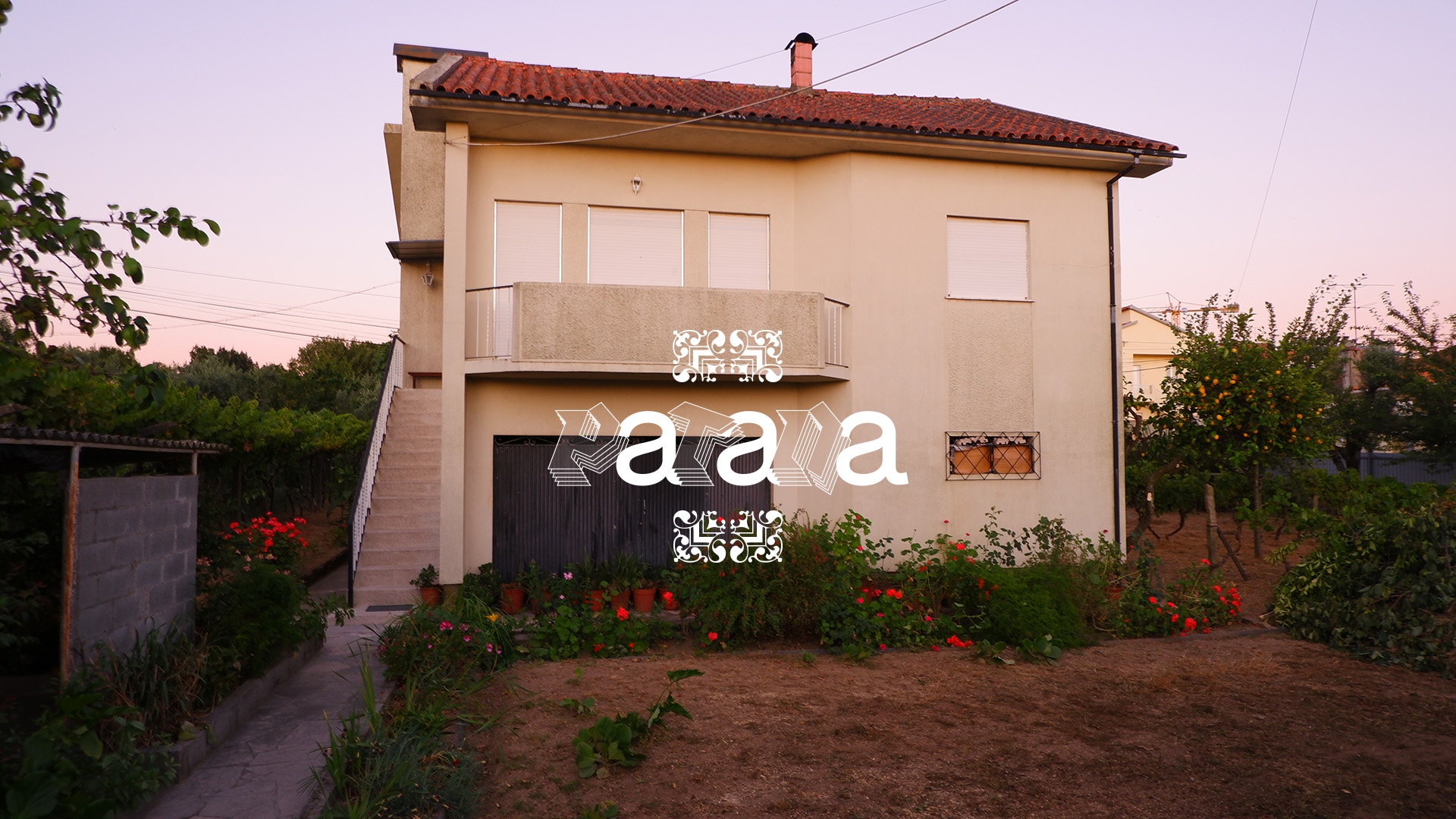
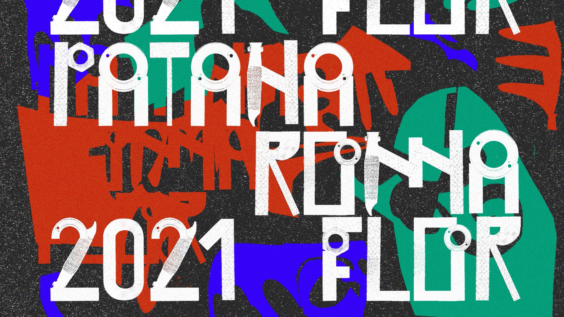
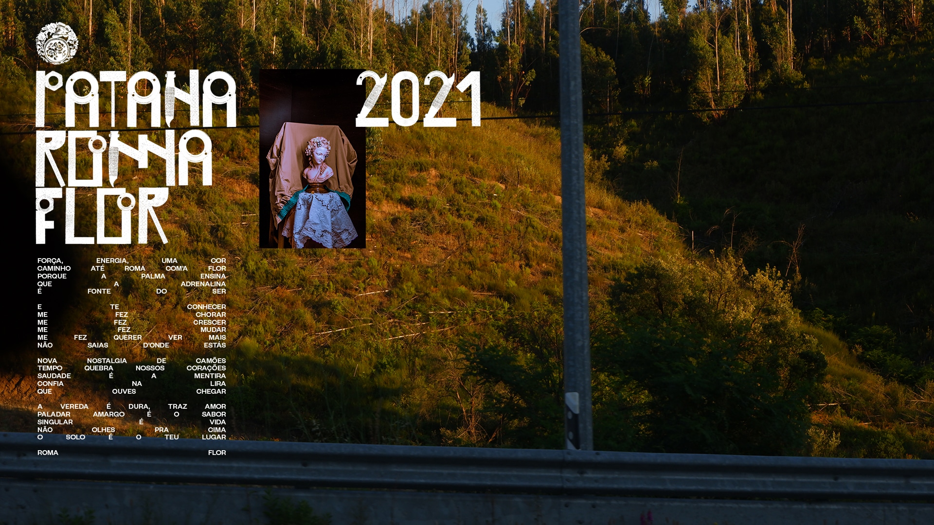
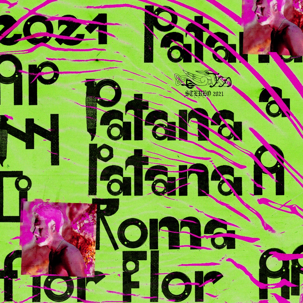
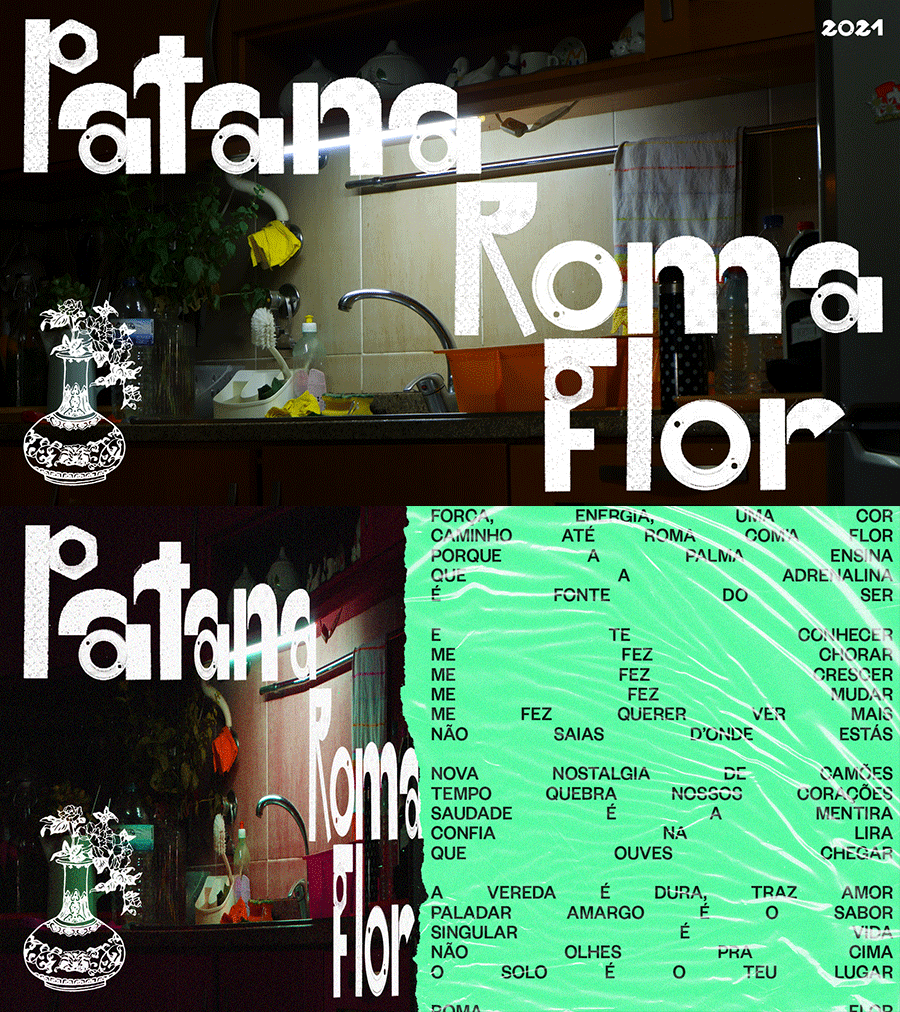
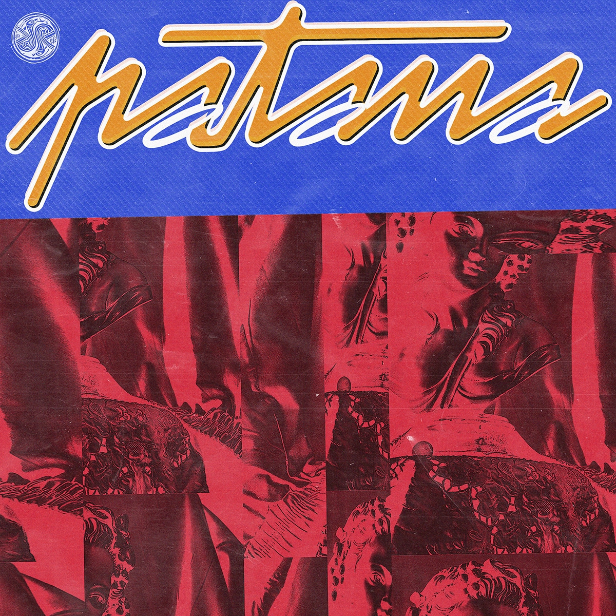
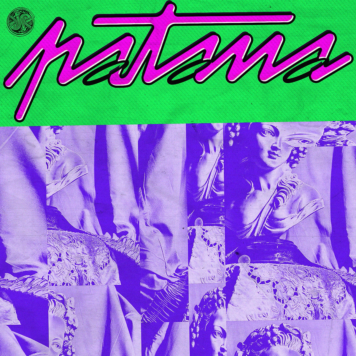
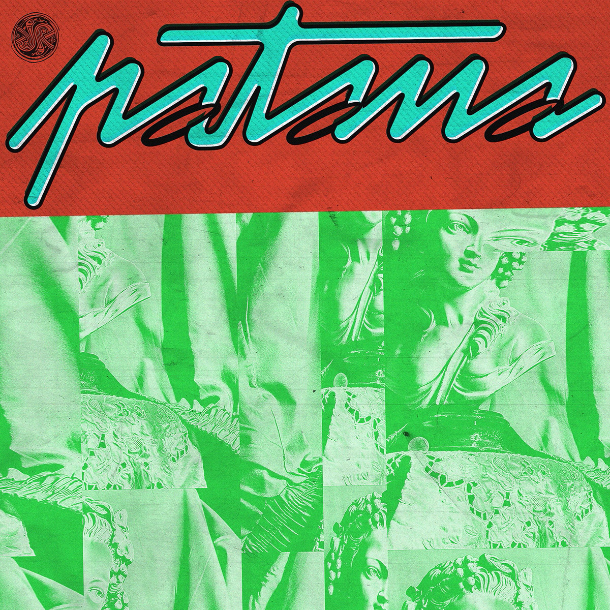
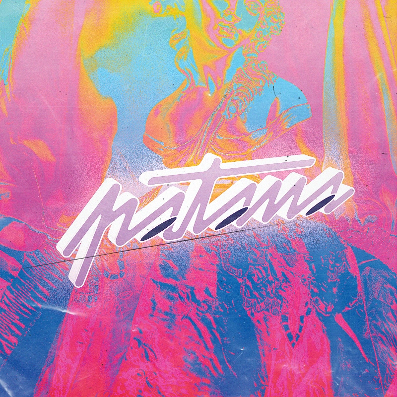
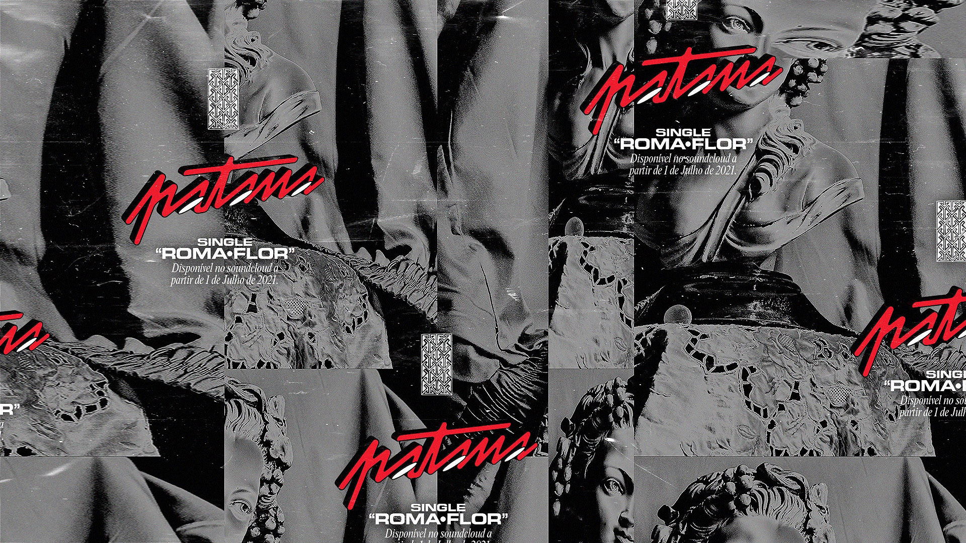
● This is the story of a project... that failed? In 2021, amid the hardships of successive mandatory lockdowns — which by then were nothing new — and some brutally difficult biographical events, I produced a curious piece of graphic exploration that I enjoy presenting. The musician Patana, author and producer of songs in a very personal R&B vein, was at that time looking for a visual line to accompany the release of his first closed song, «Rosa Flor». After having worked with another designer, with results below expectations, someone passed on my contact. I accepted, and for several weeks I only worked on it during breaks, with no guiding lines, opening new paths with each attempt. Now, any aspiring designer is taught from day one about the danger of this kind of practice: presenting many options to a client — as if it were a template customisation service or a very slow AI image generator... but this catalogue is what I delivered. The next step, given the clientʼs enthusiasm, would have been to find a synthesis among several proposals which, due to my inability and sudden unavailability, never saw the light of day. Fortunately, he found the best answer with the next contact he made.
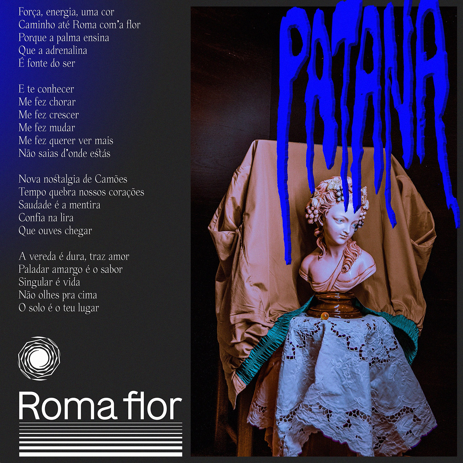
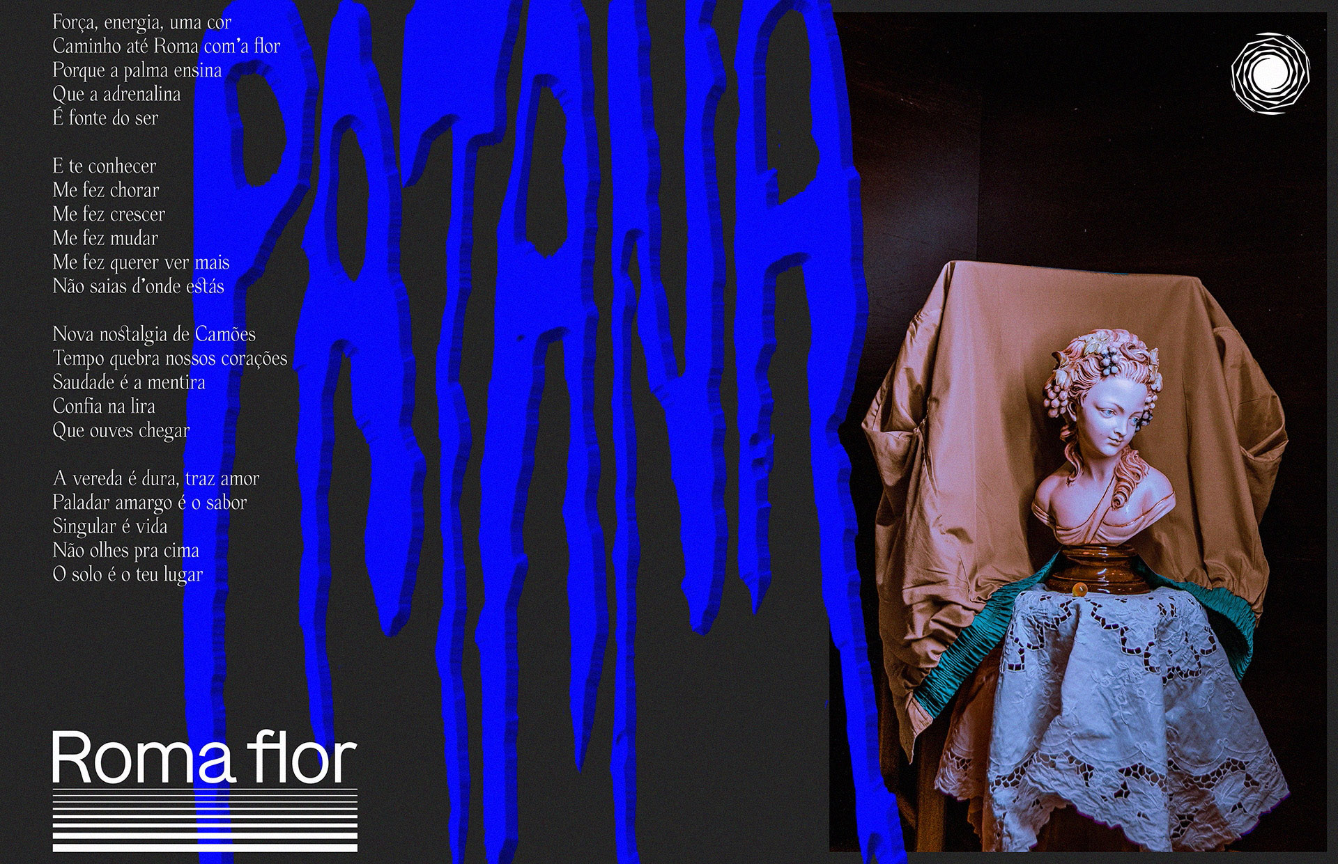
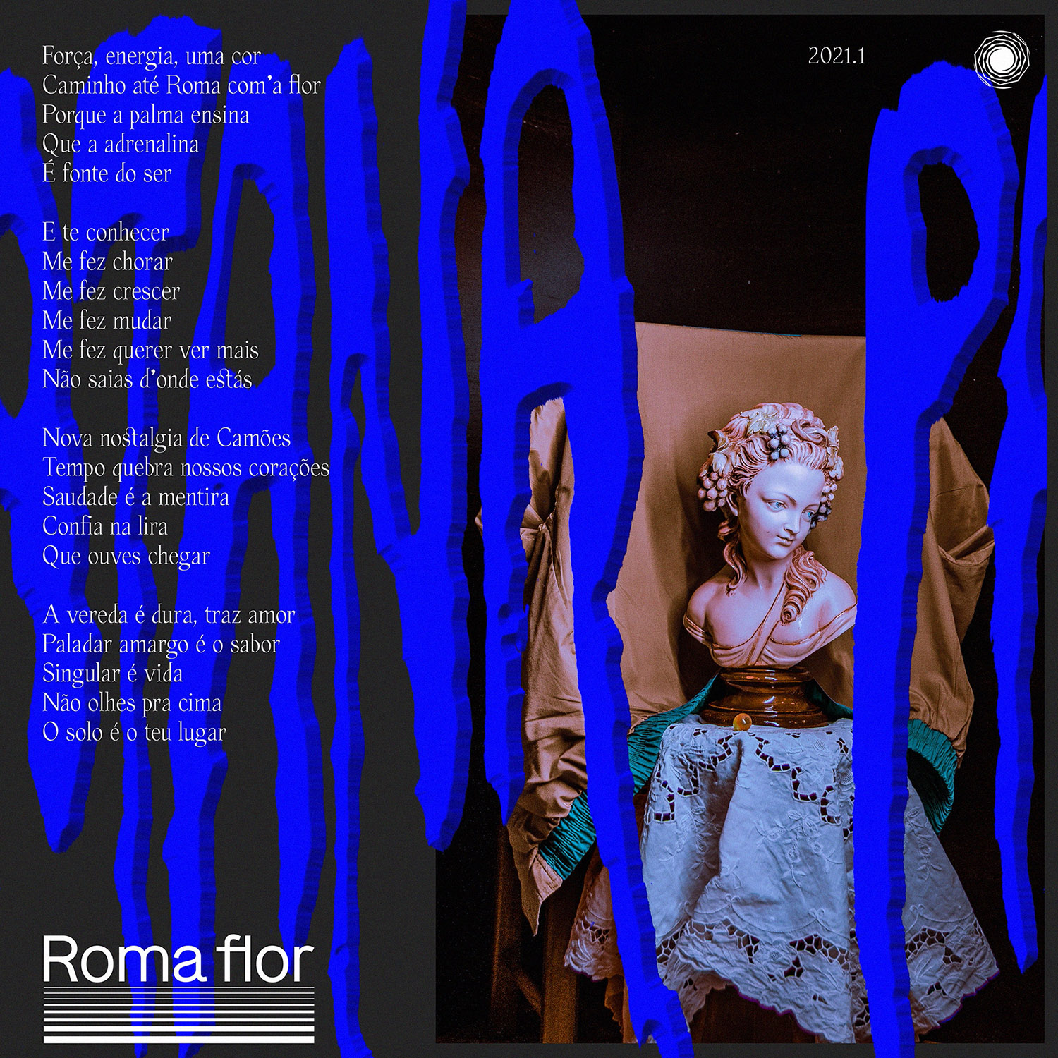
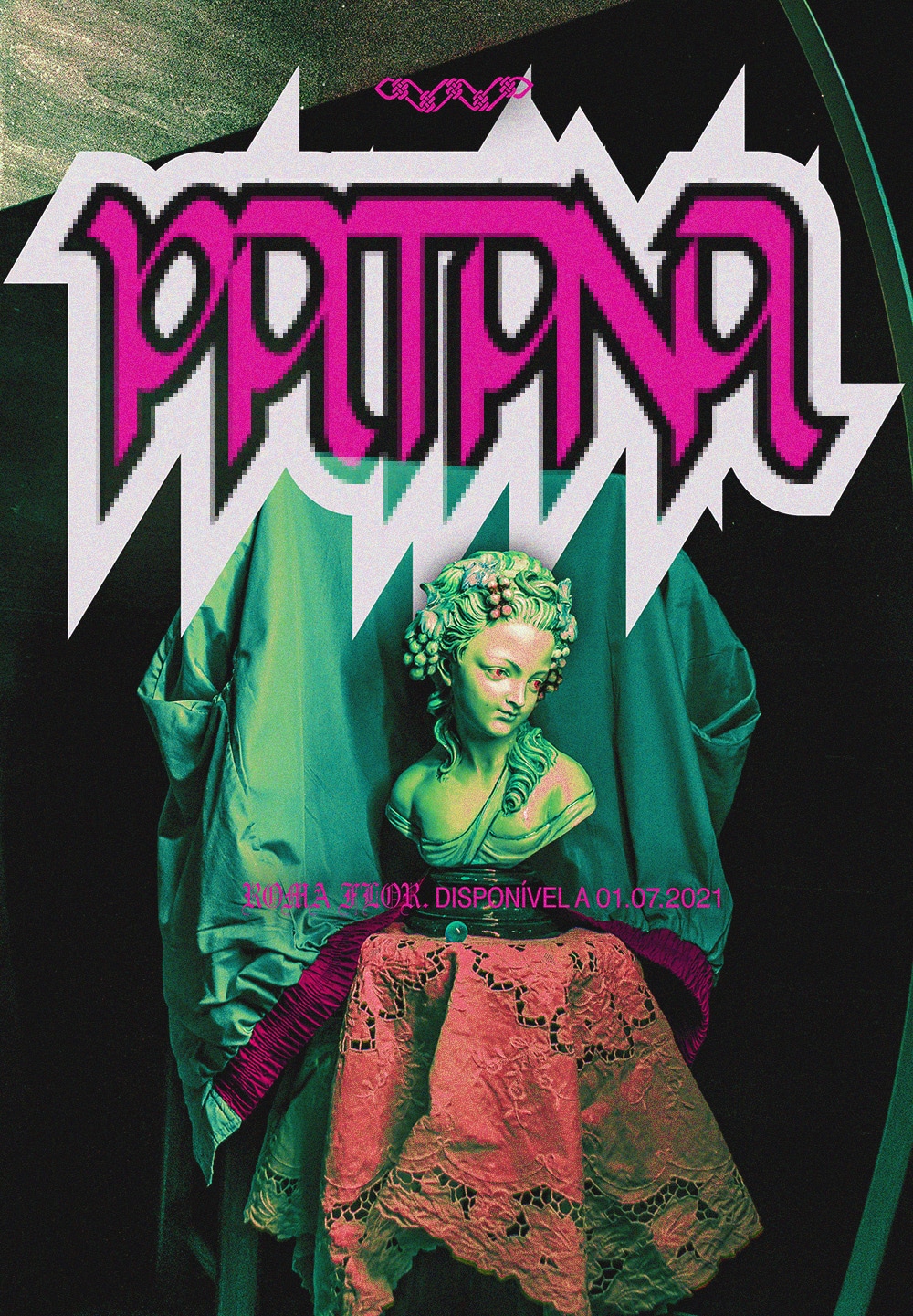
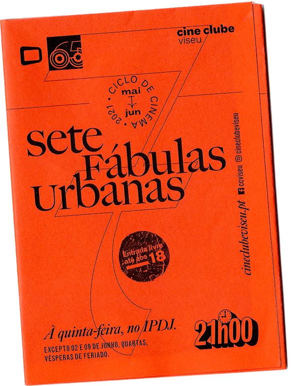
● For this exploration, we often worked with images provided by the client (photographs of a bust, among fabrics) and my own personal archive of collected materials. It was also an opportunity to experiment (sample) some experimental typographic projects from the Cooperative (mine and Pedrokasʼs).

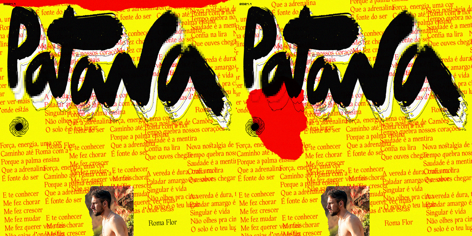
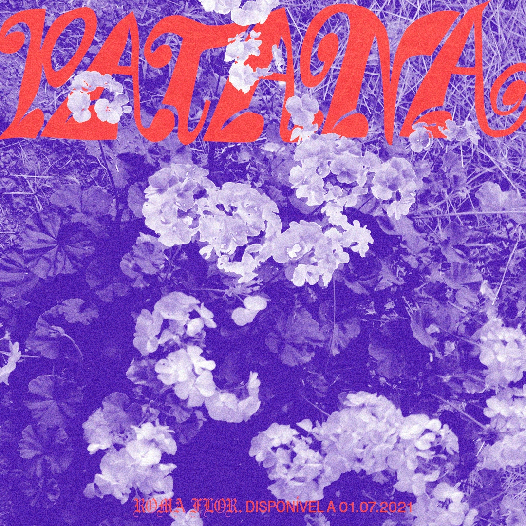
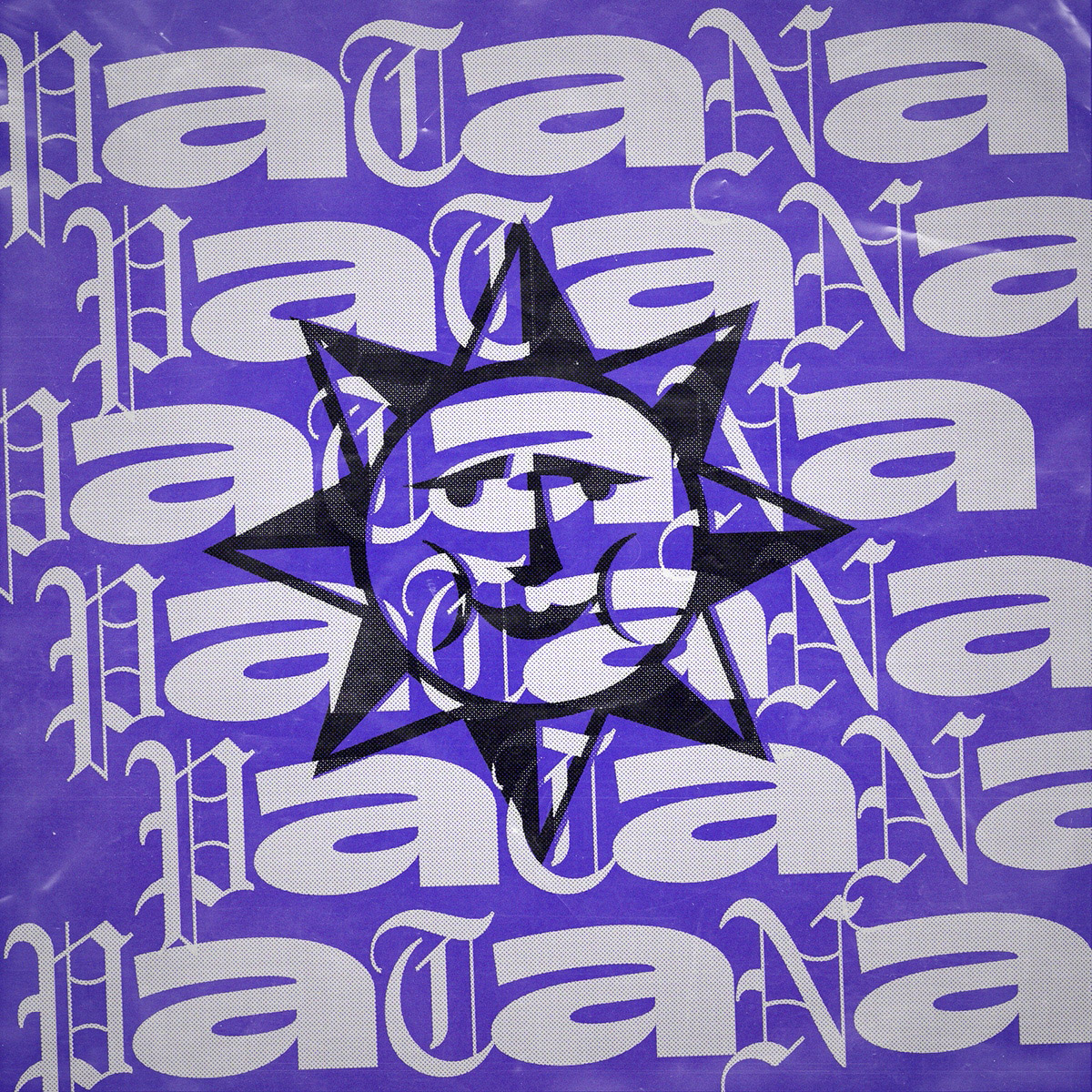
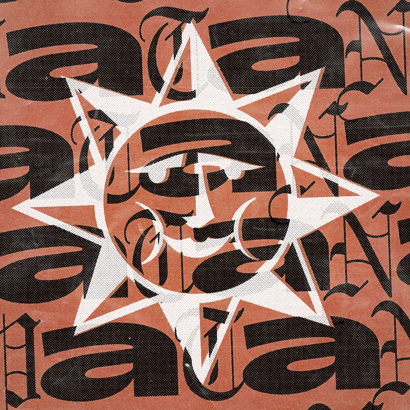
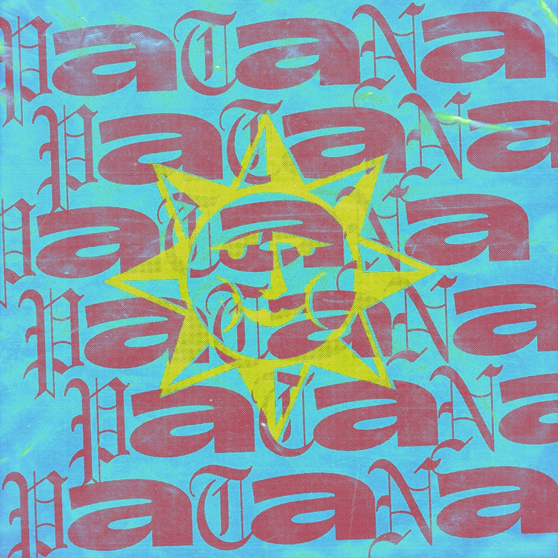
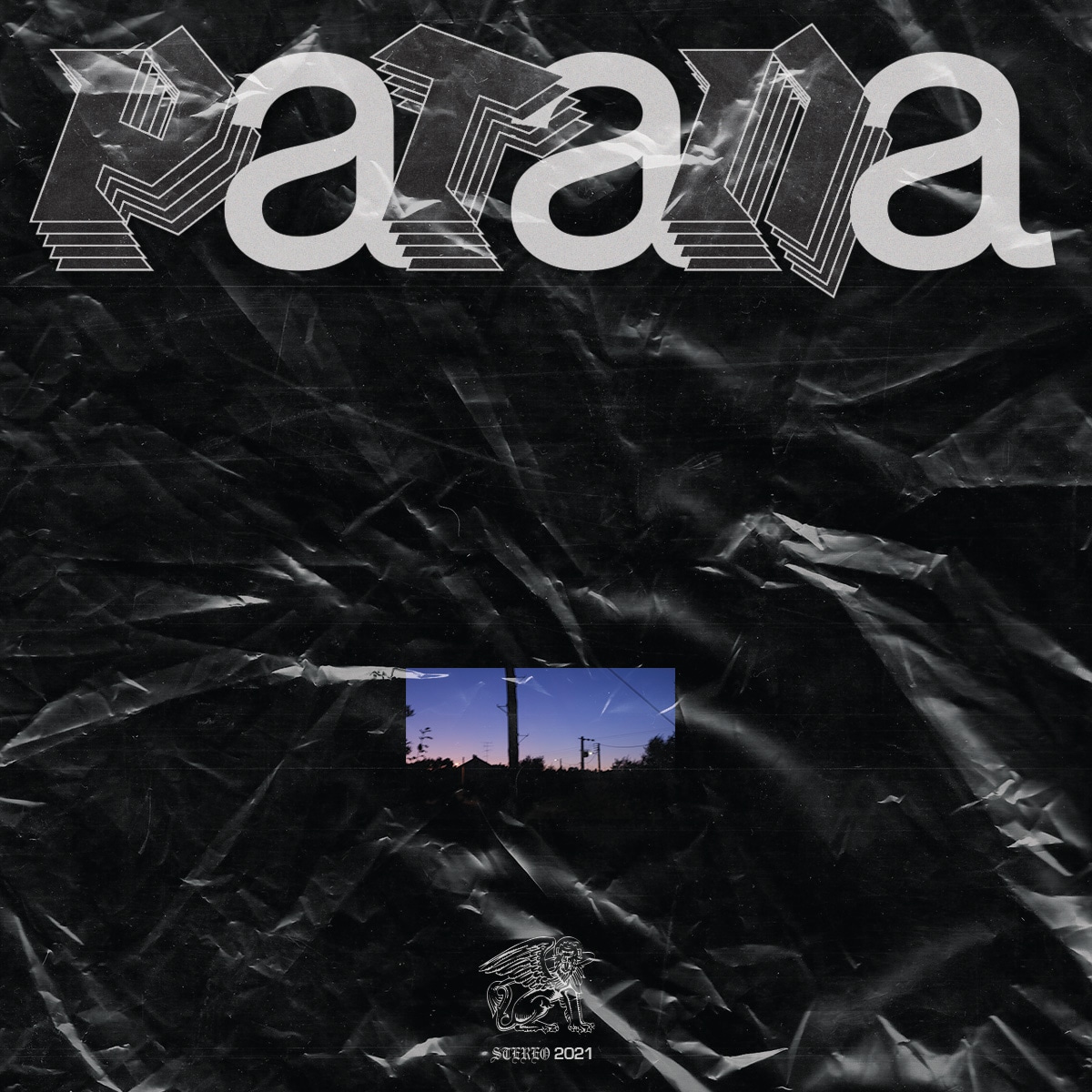
 Proposal catalogue cover
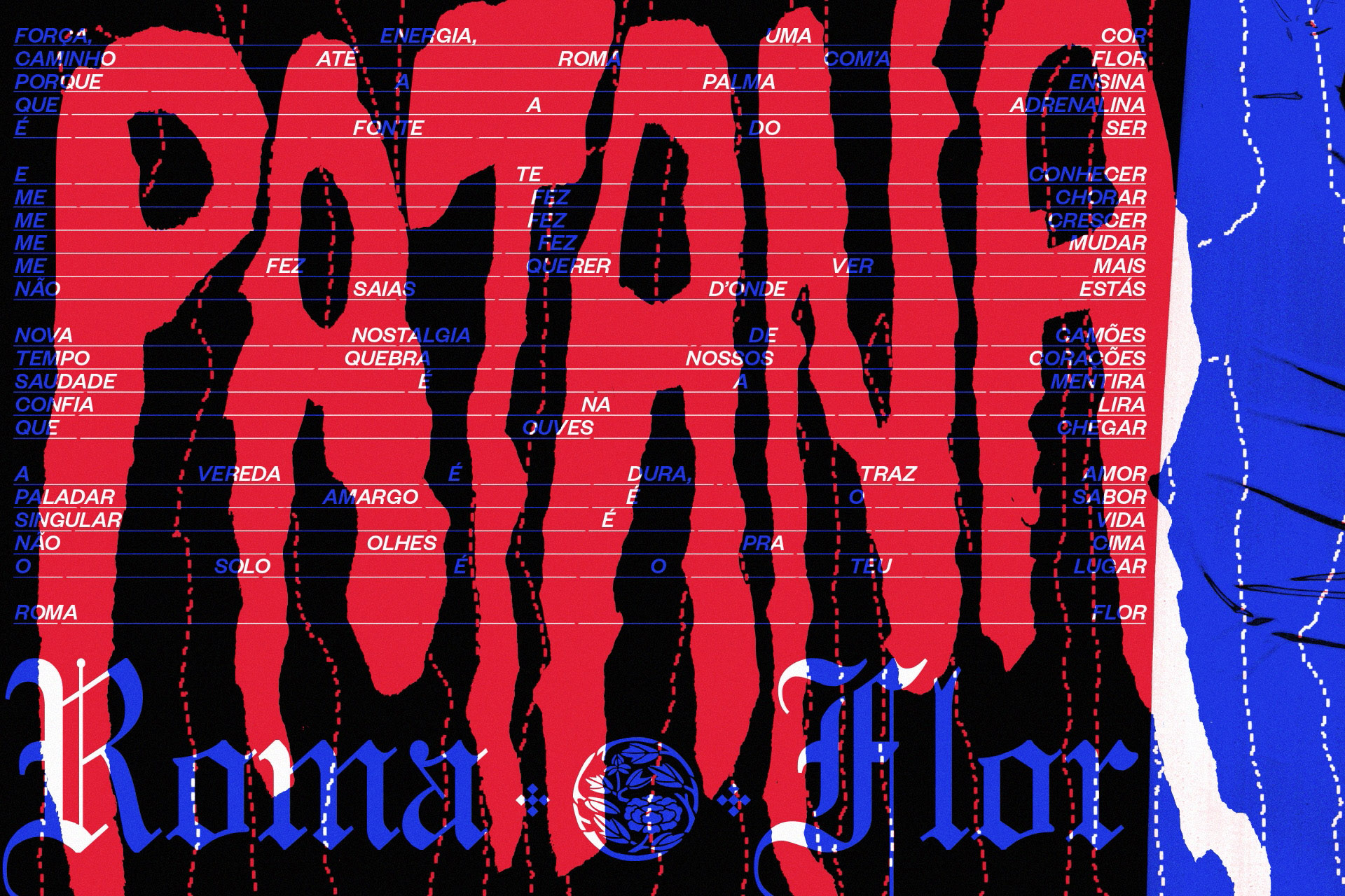
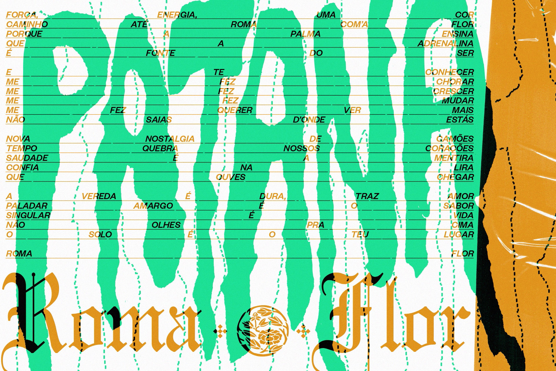
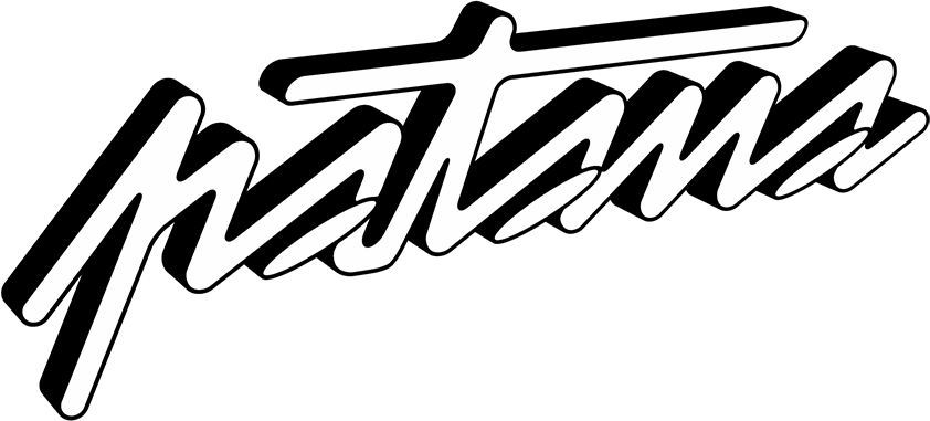
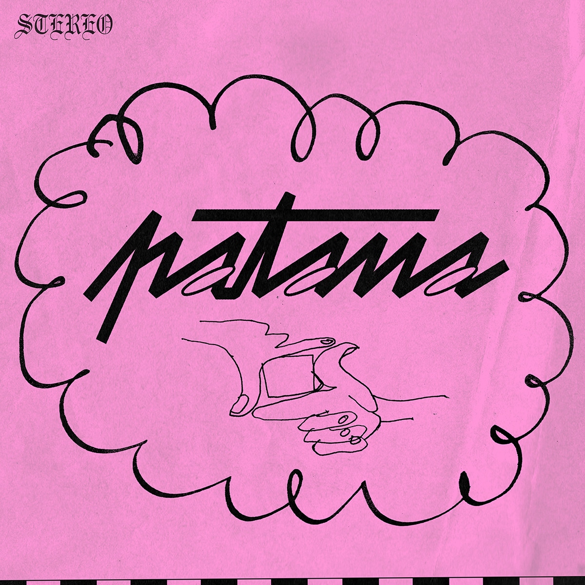
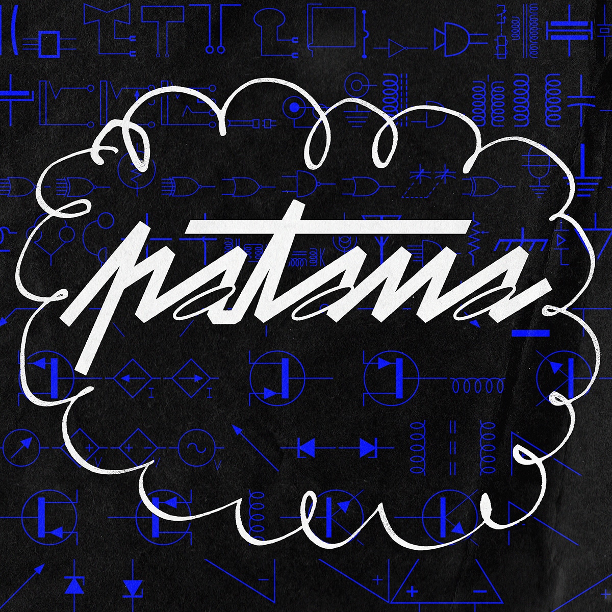
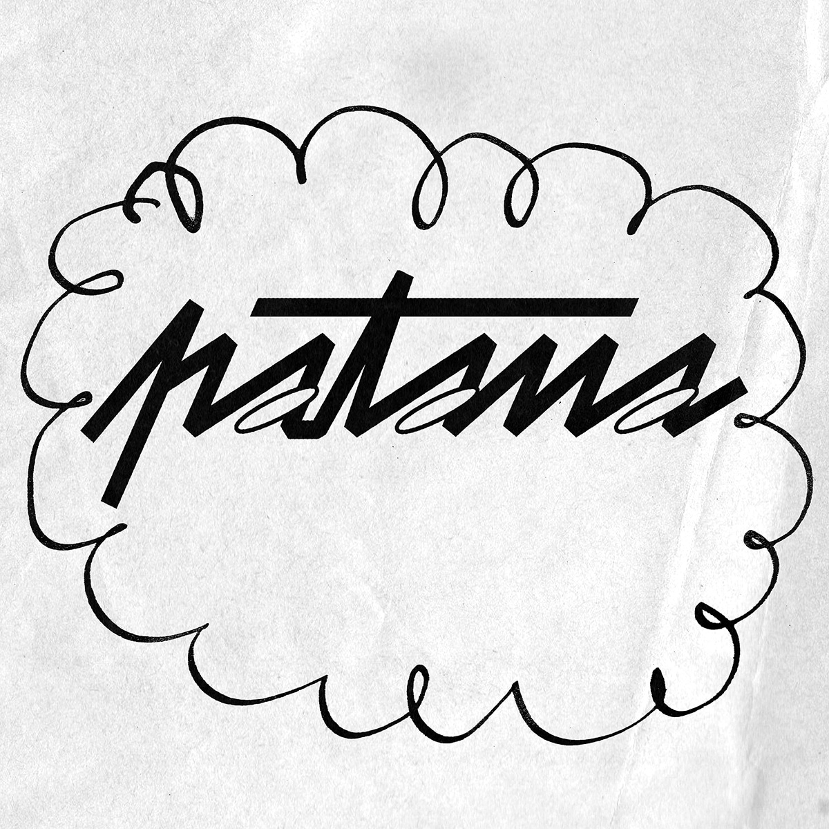
 Proposal: calligraphic lettering
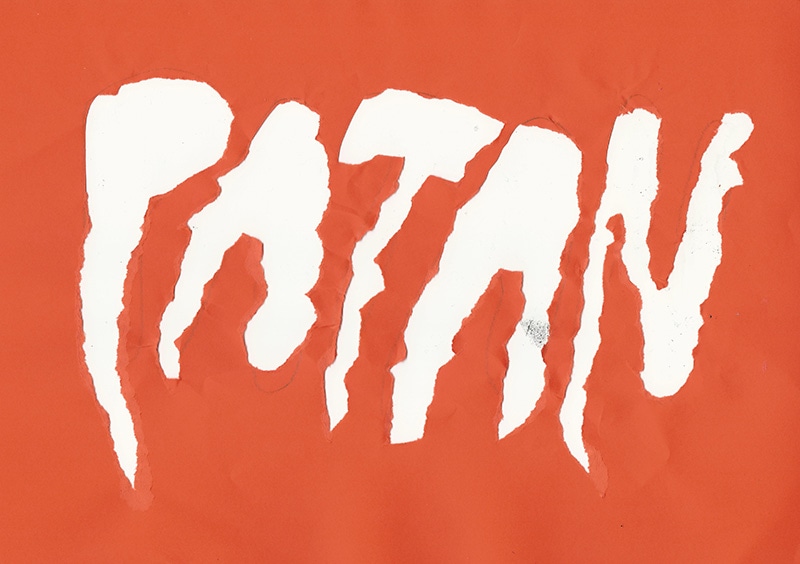
 Proposal: torn-paper lettering
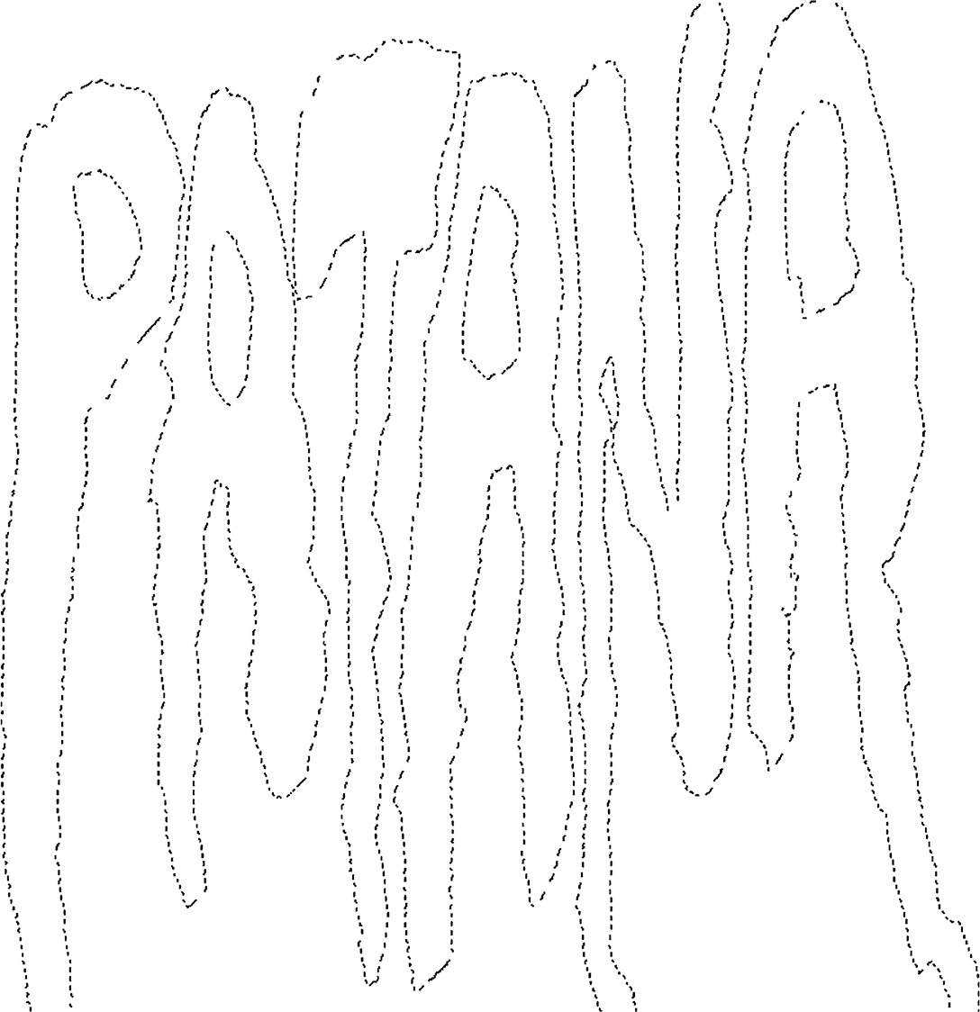
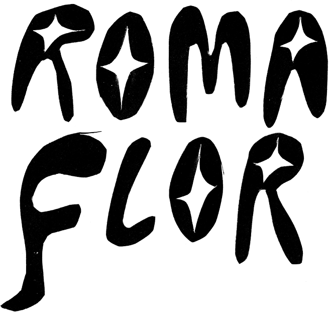
 Proposal: cut-out lettering
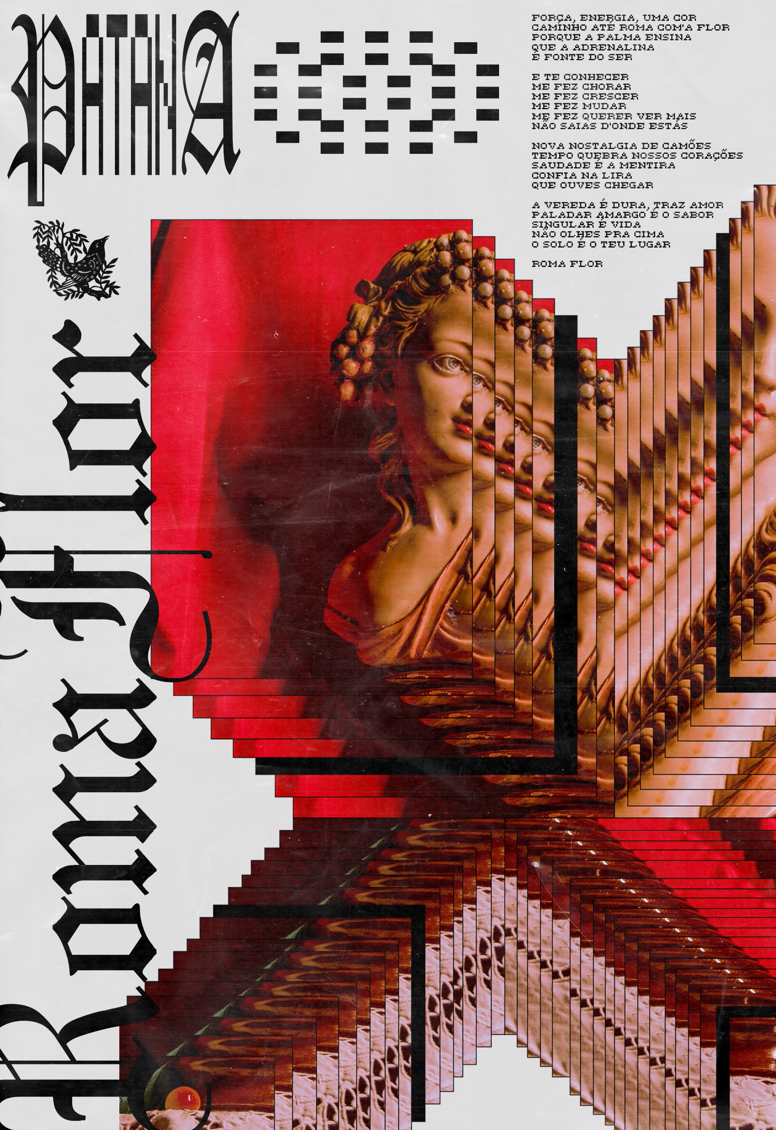
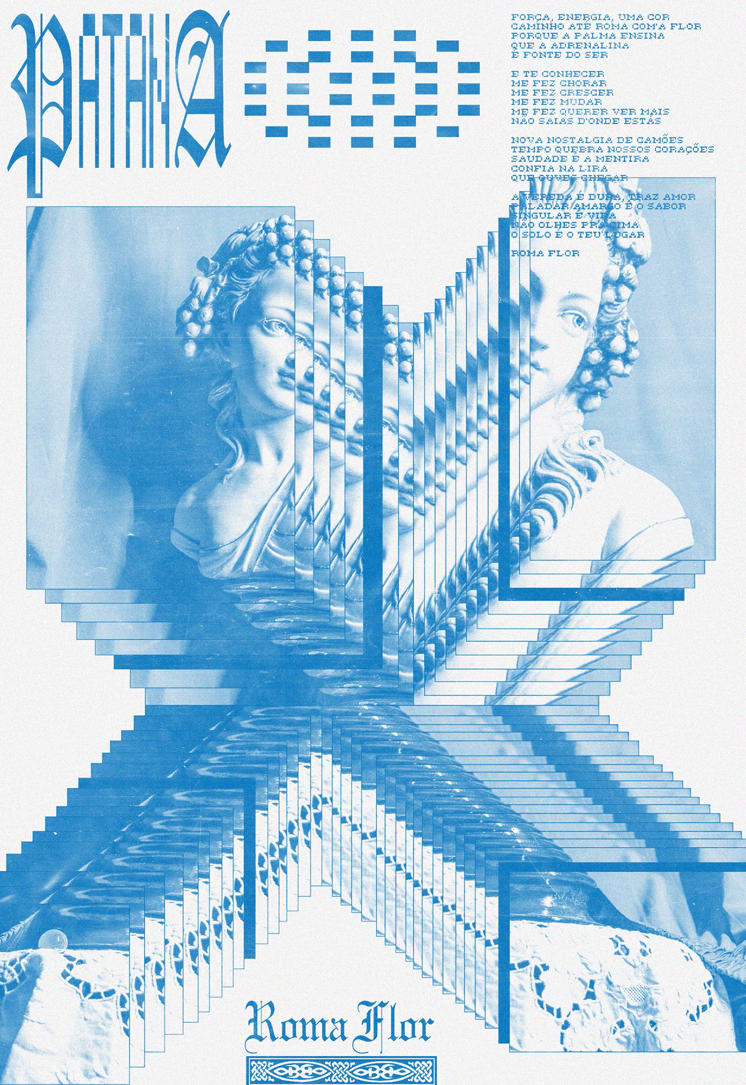
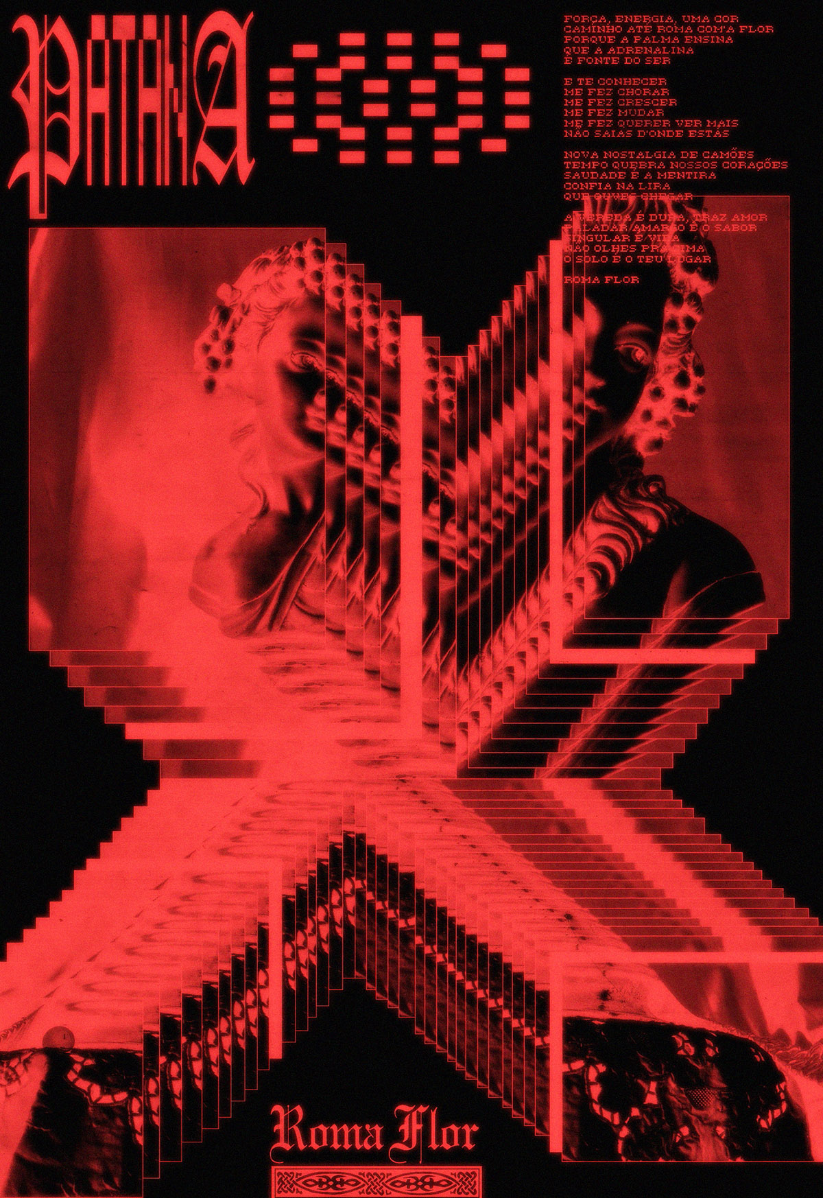
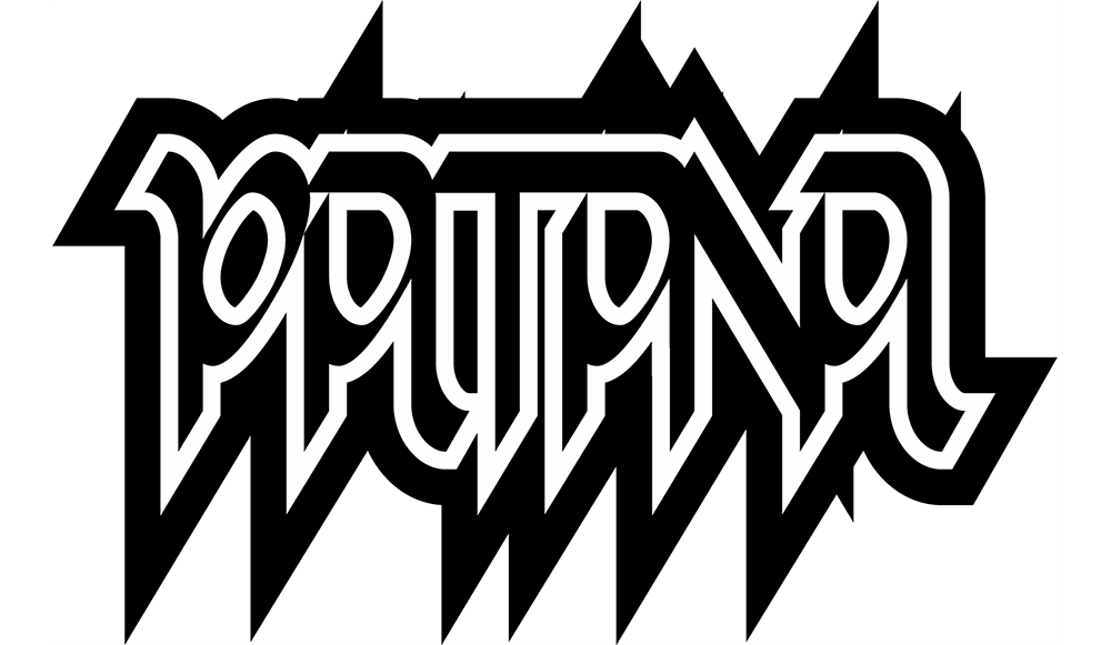
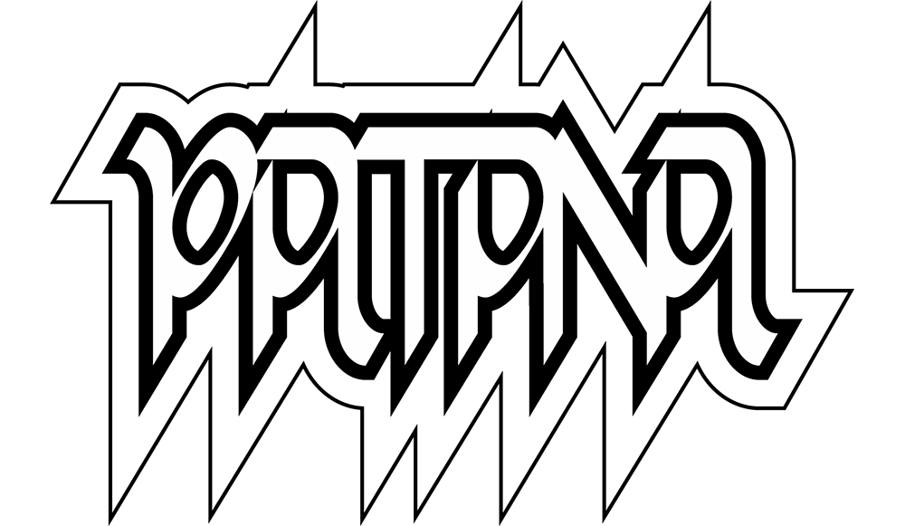
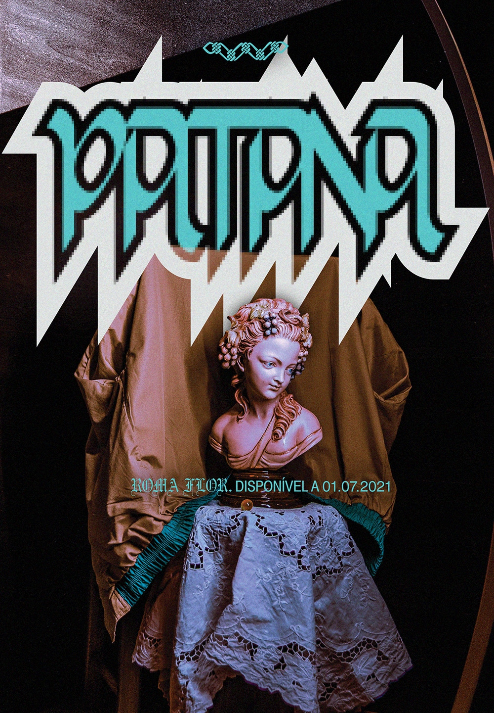
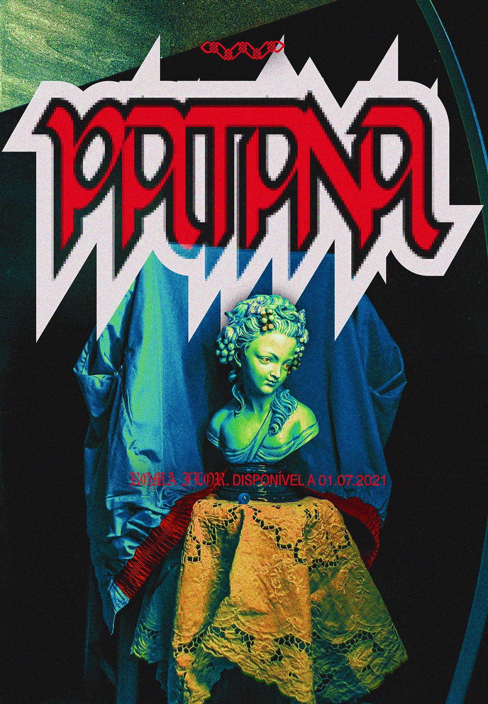
 Proposal: blackletter + pixel lettering
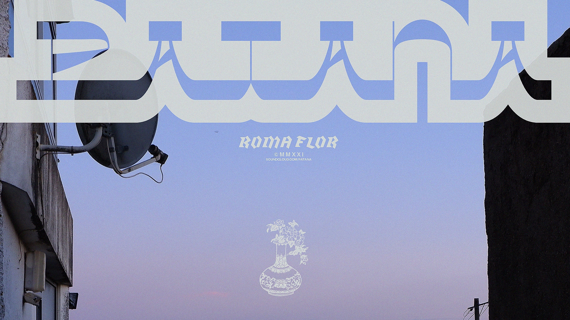
 Proposal: blackletter + Agrandir lettering
 Proposal: Klute + grotesk lettering
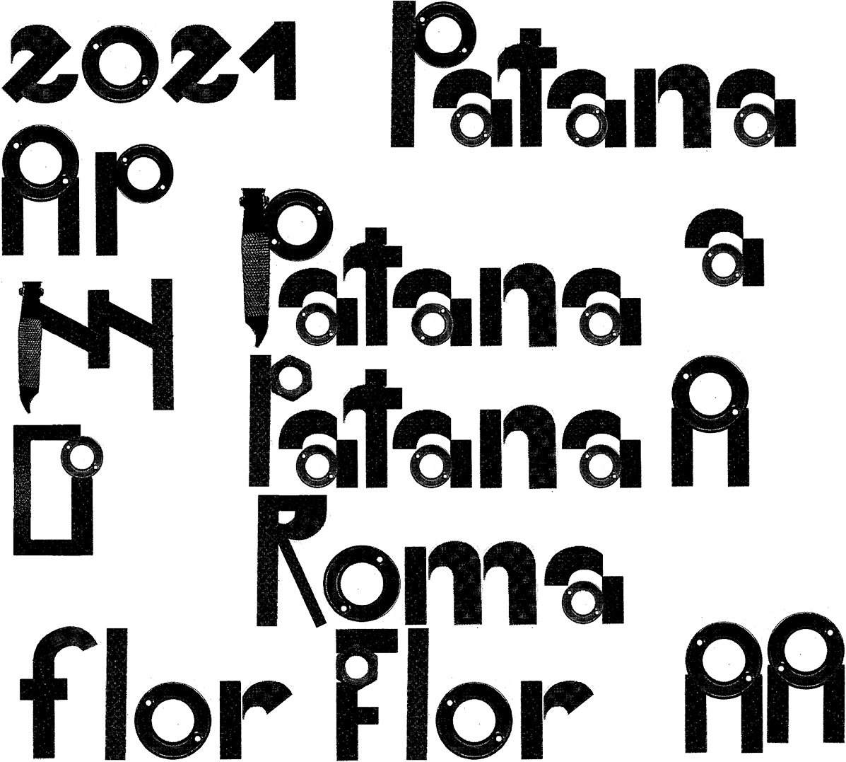
 Proposal: Diplomática characters, a font(?) of mine
 Proposal: Embala characters, a font by Pedrokas
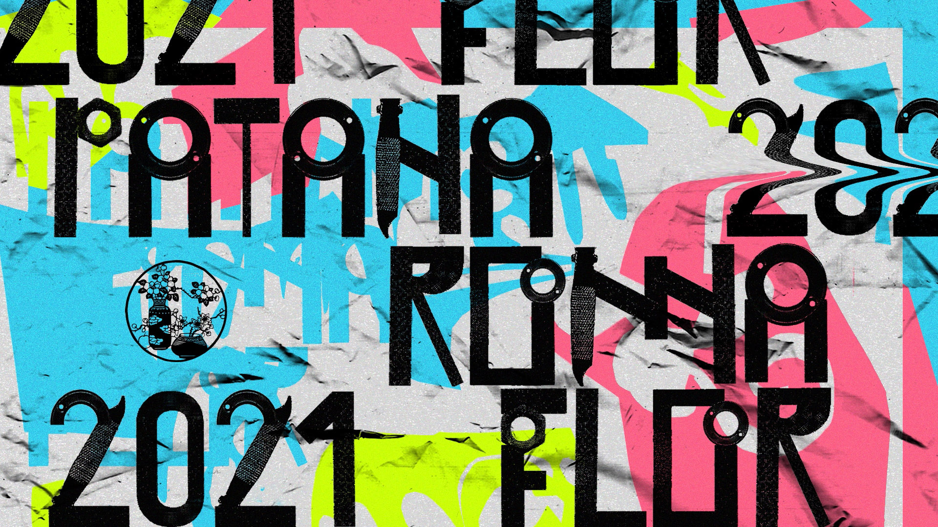
 Proposal: characters from the FFF de Fábrika project (Pedrokas)




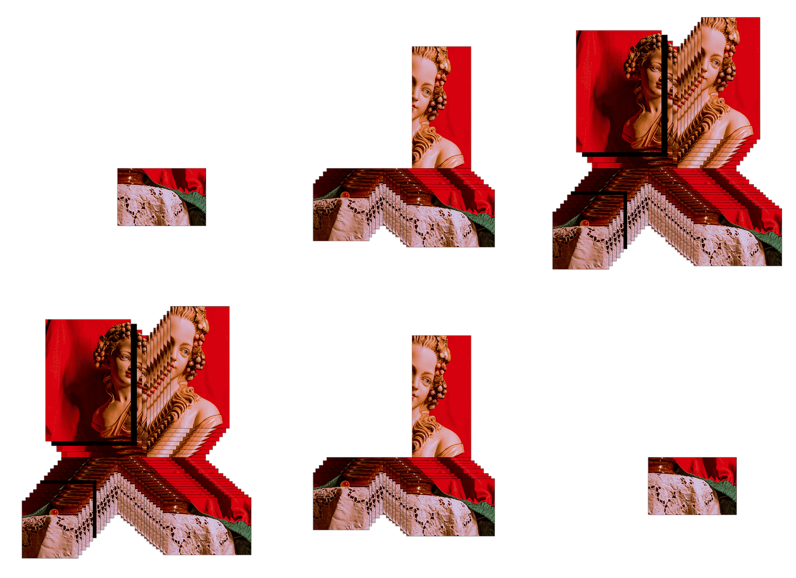
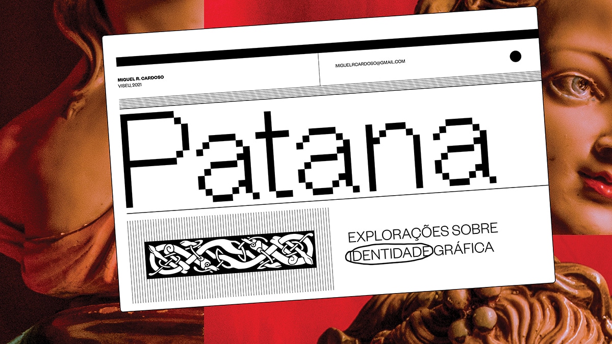
 Proposal catalogue cover