● The audience for building materials stores has changed. I remember the masculine, disorganised and dim atmosphere of a «technical» shop, as I knew it from trips with my father. Today, these stores are bright spaces, with attractive packaging, mock‑up environments and entire families browsing: they have become an extension of weekend consumer culture.
● To create a brand whose name (Casa Rebelo, Rebeloʼs house) was already decided, my starting point was precisely this: a family home (a family business) that welcomes families to build their houses. The second coordinate was the idea of a journey — between the dream and the completed project — symbolising Casa Rebeloʼs full offering, from products to know‑how. From this came the concept: «See you at home». In family slang, itʼs a warm welcome. Literally, itʼs a date set for the future, underlining the journey from the plan to the turnkey solution.
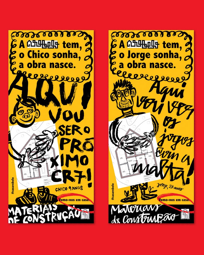
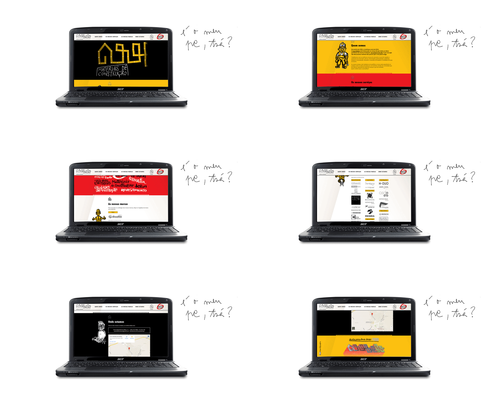
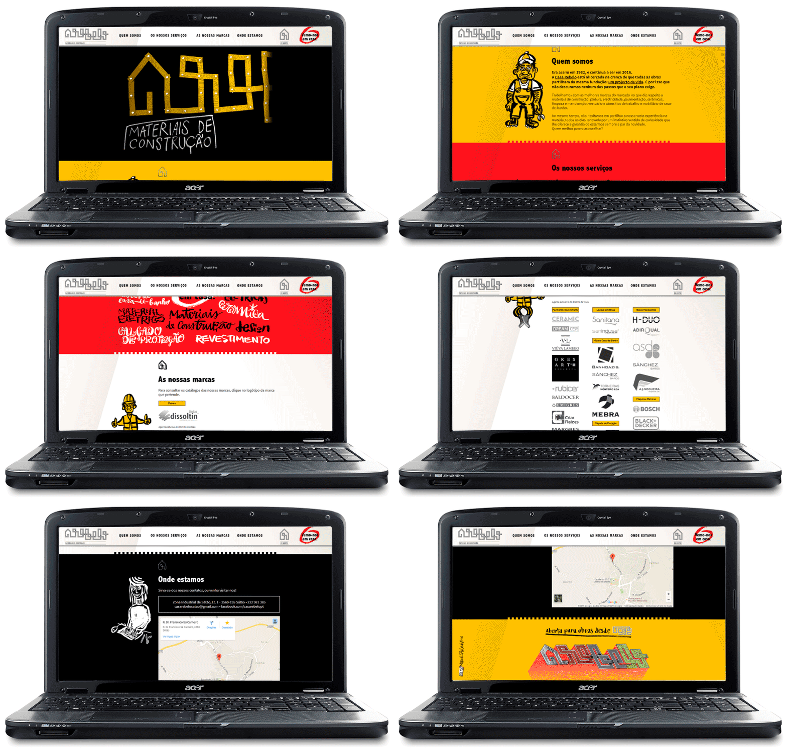
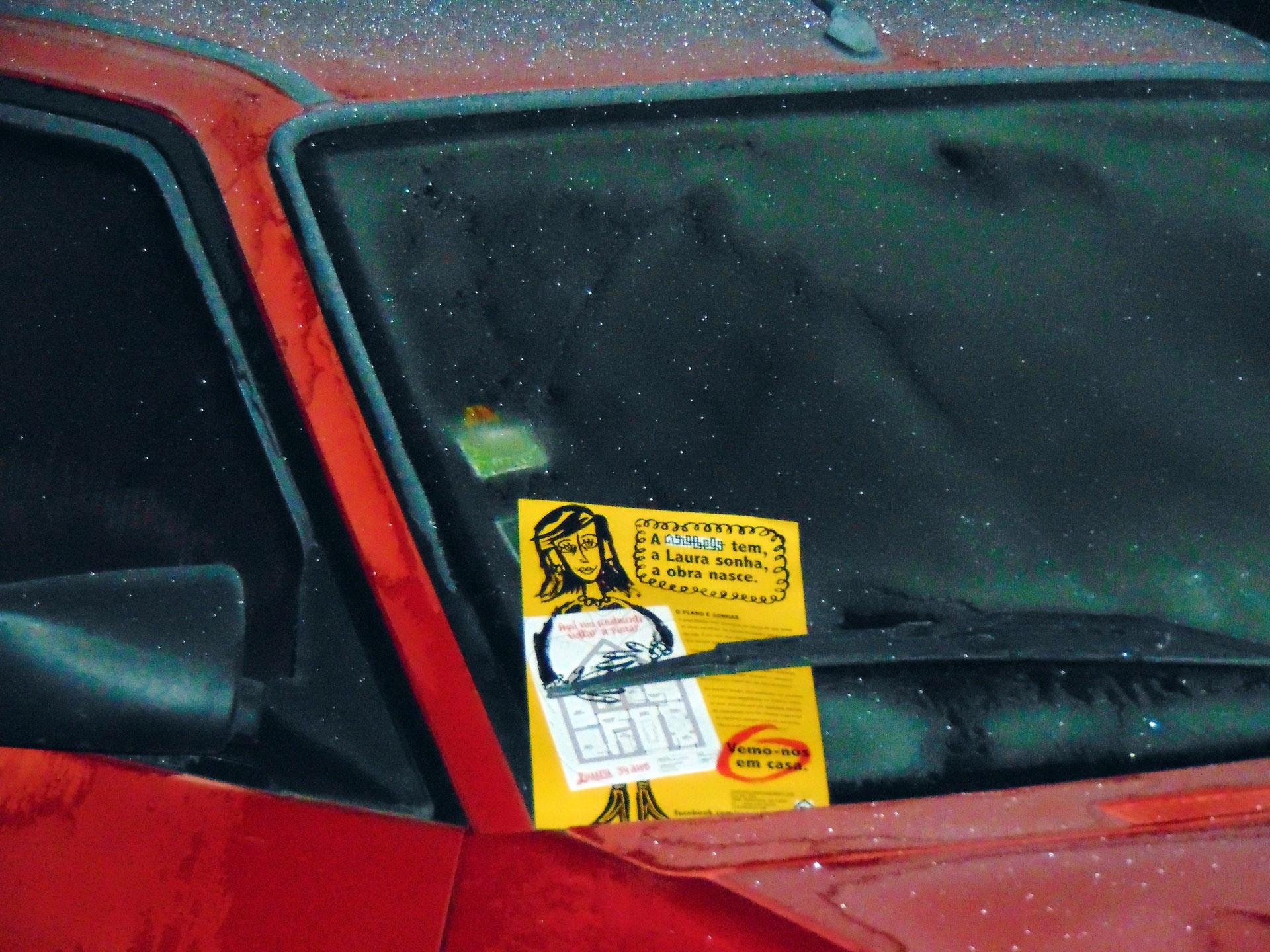
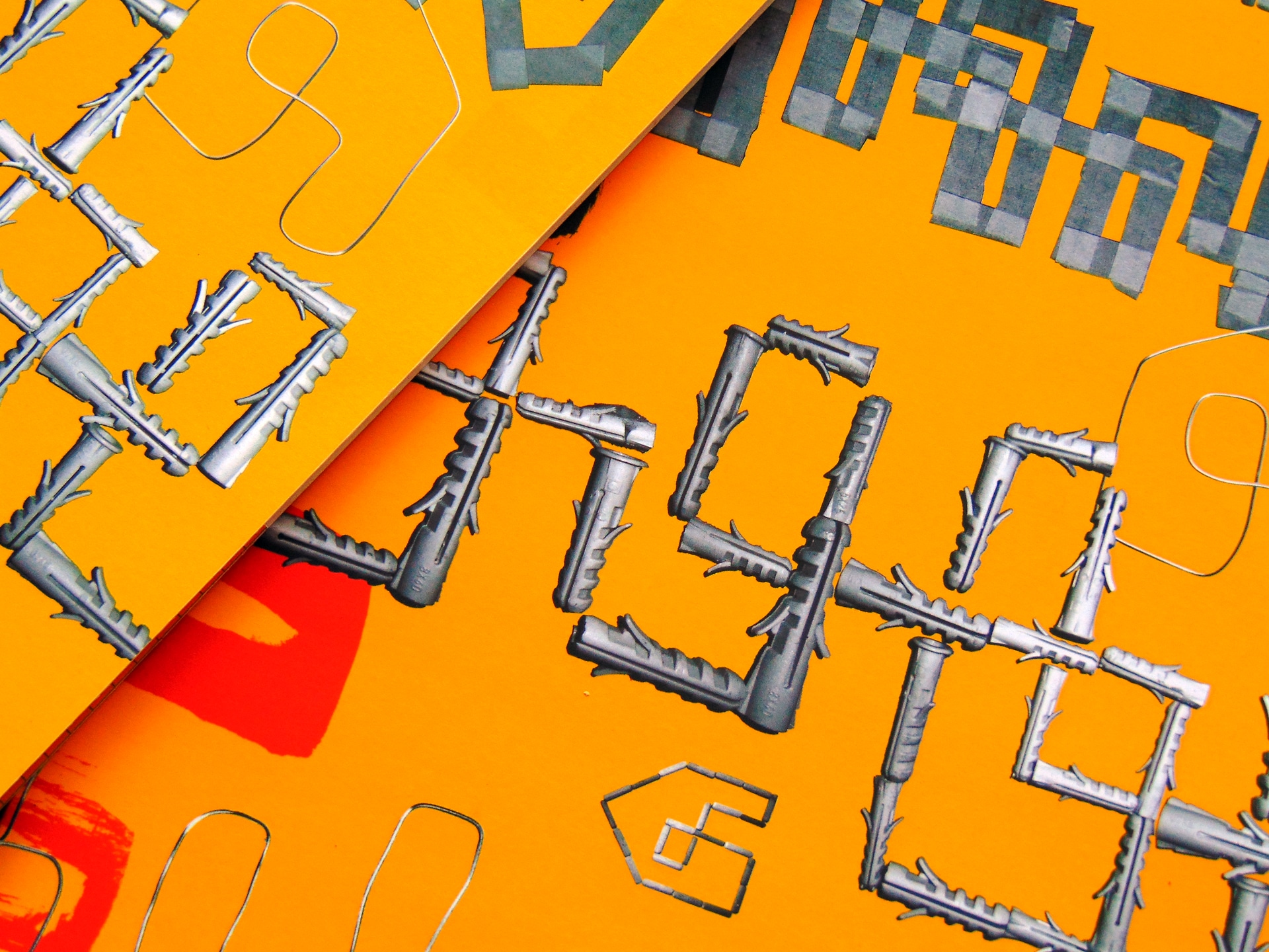
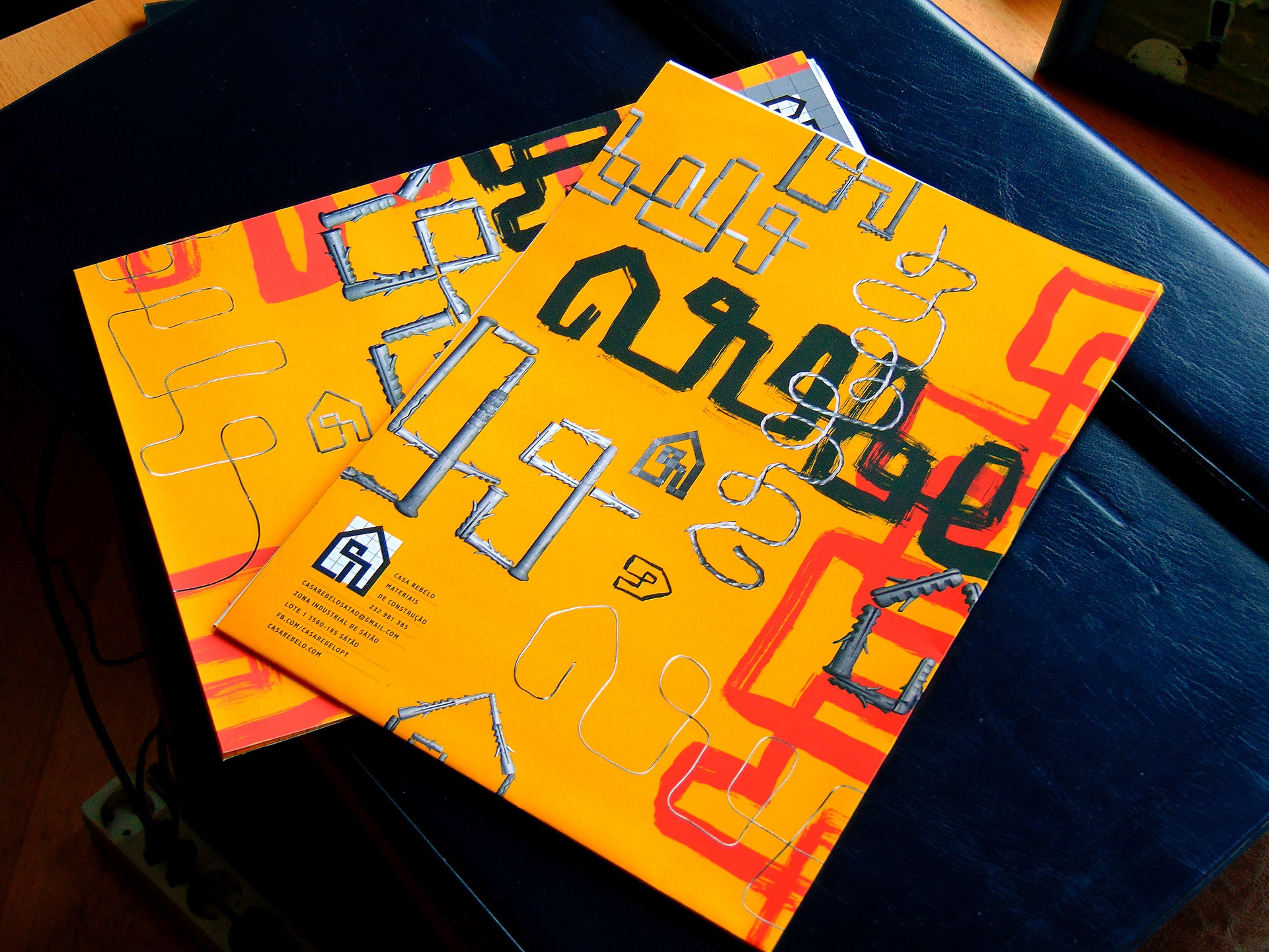
● Graphically, I balance visual codes from the sector (reds, yellows, technical drawing) with loose‑line illustrations, like the first brushstrokes on a wall. Friendly figures, representing the new audiences, tell their dreams — a language designed to thrive on social media. Among the proposals, I couldnʼt resist designing the typical wall calendar of traditional commerce. Itʼs a personal fascination and another fetish brought to life.

 Advertising flyer
 Sketches for a new logo
 Animated new logo
 Tagline "Vemo-nos em casa" (See you at home). Graphic environment
 Copy: brand introduction text
 Business card
 Envelope
 Letterhead
 Folder
 Graphic lexicon: blueprint







 How the brand presented itself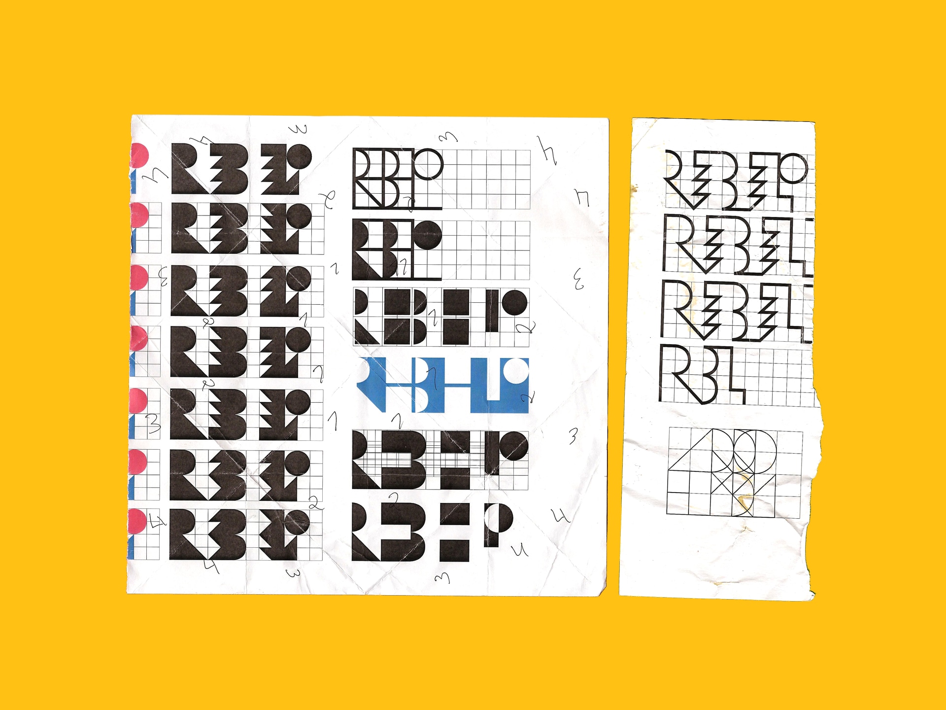
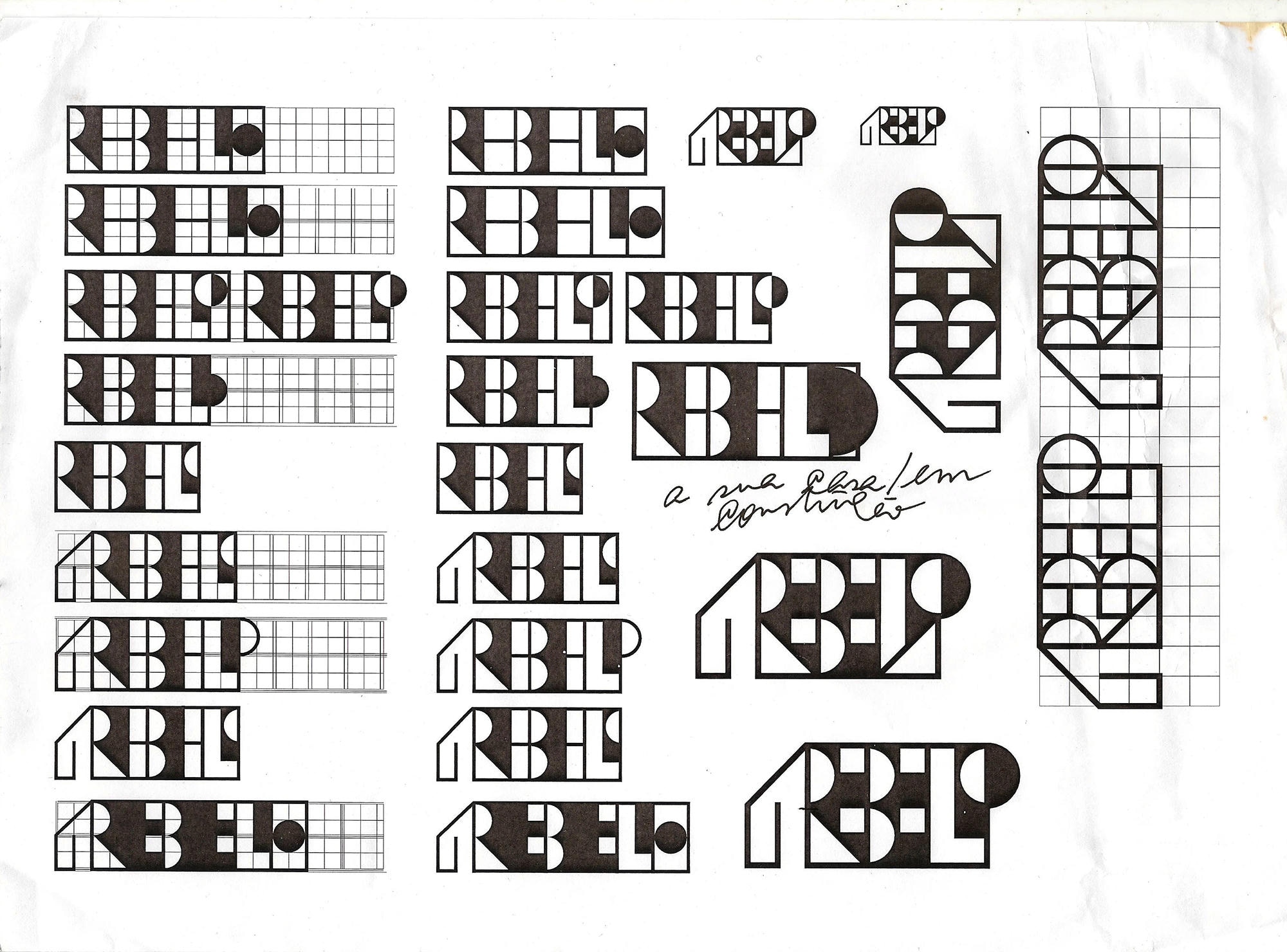
 Sketches for a new logo
 Animated new logo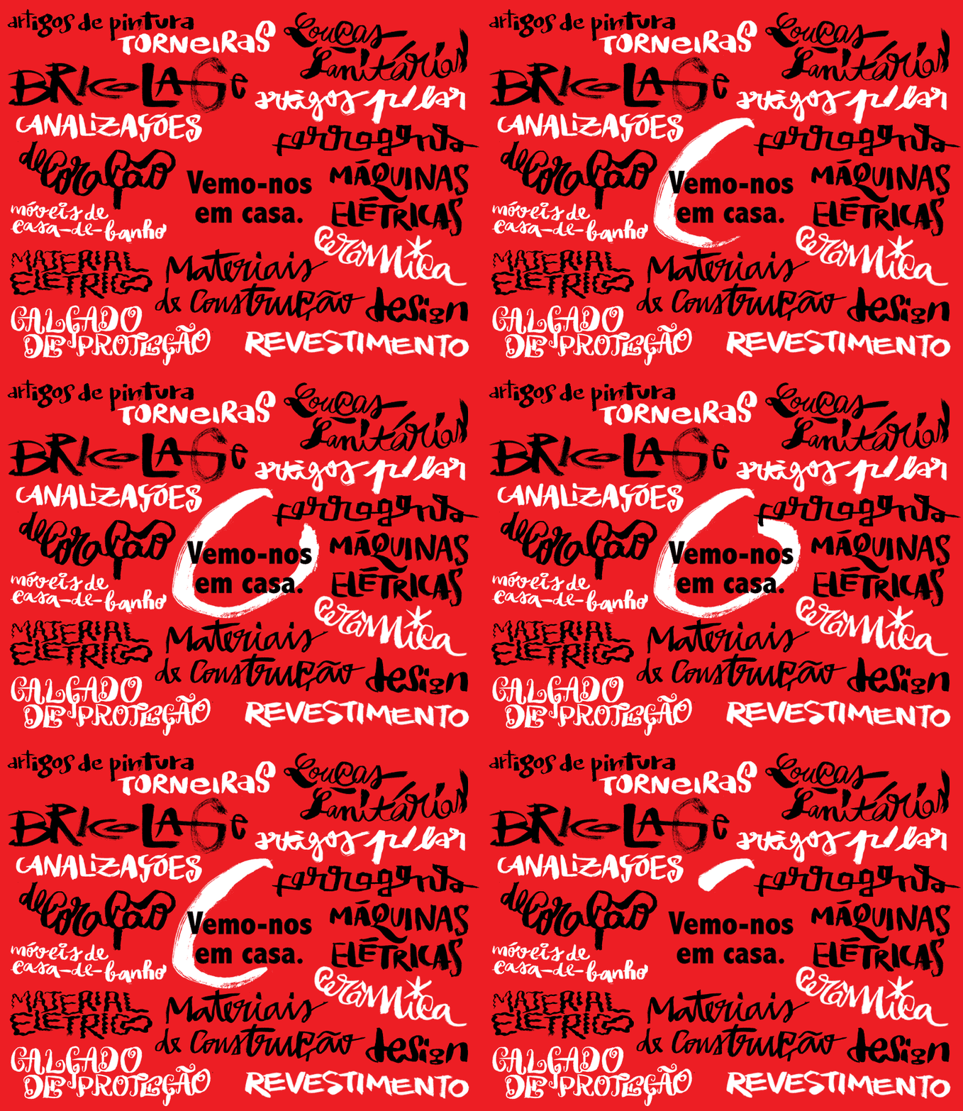
 Tagline "See you at home". Graphic environment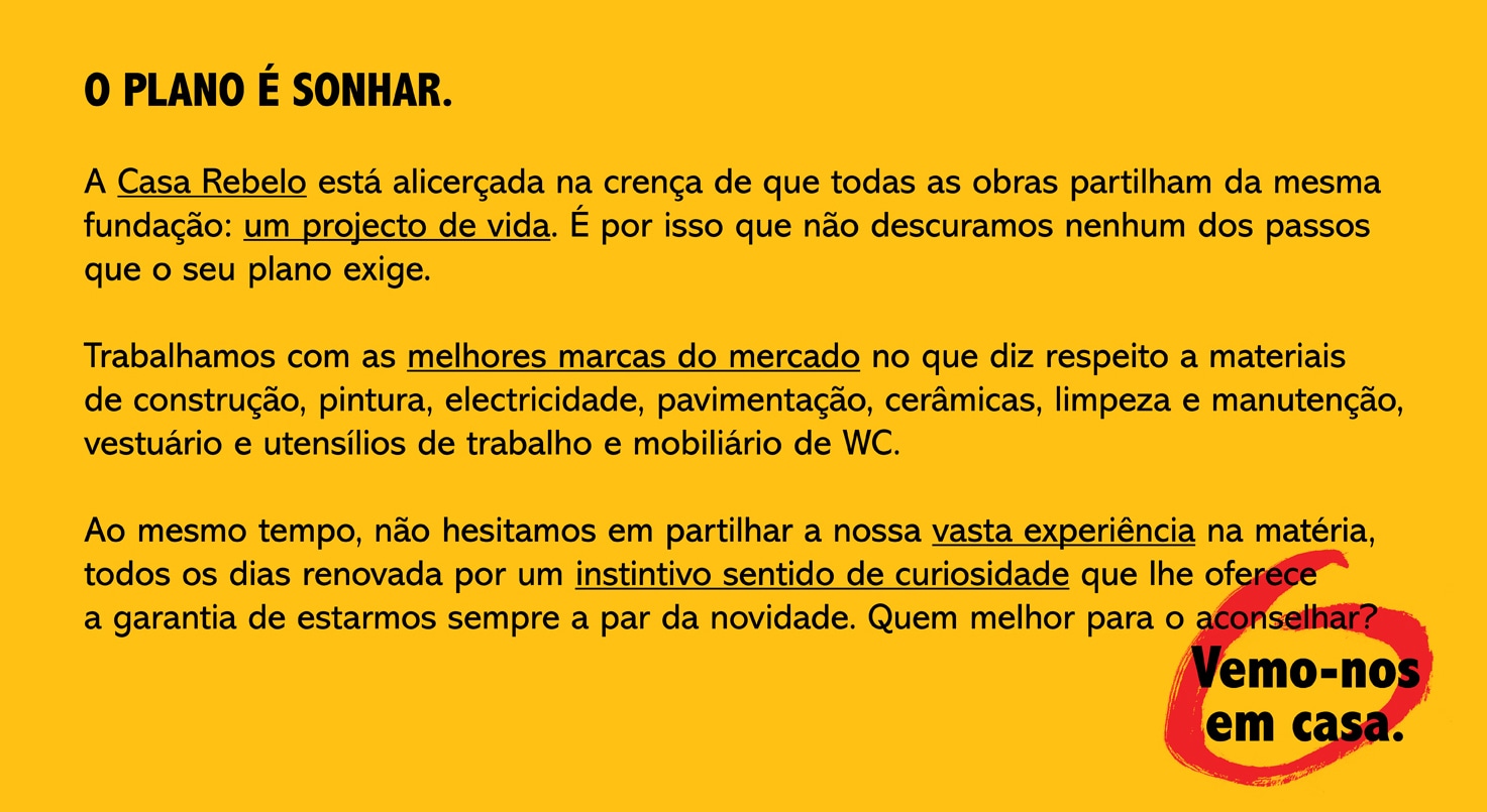
 Copy: brand introduction text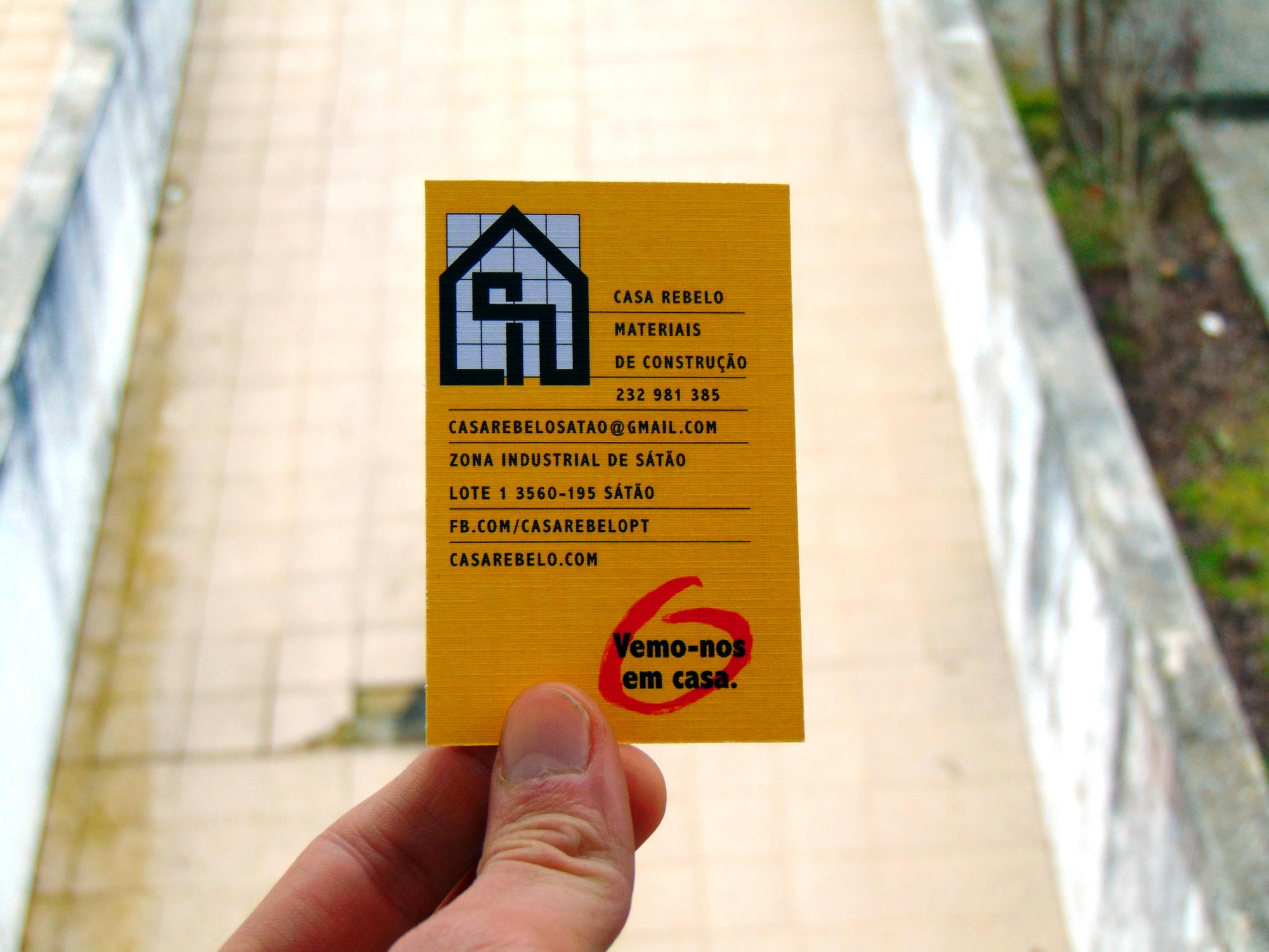
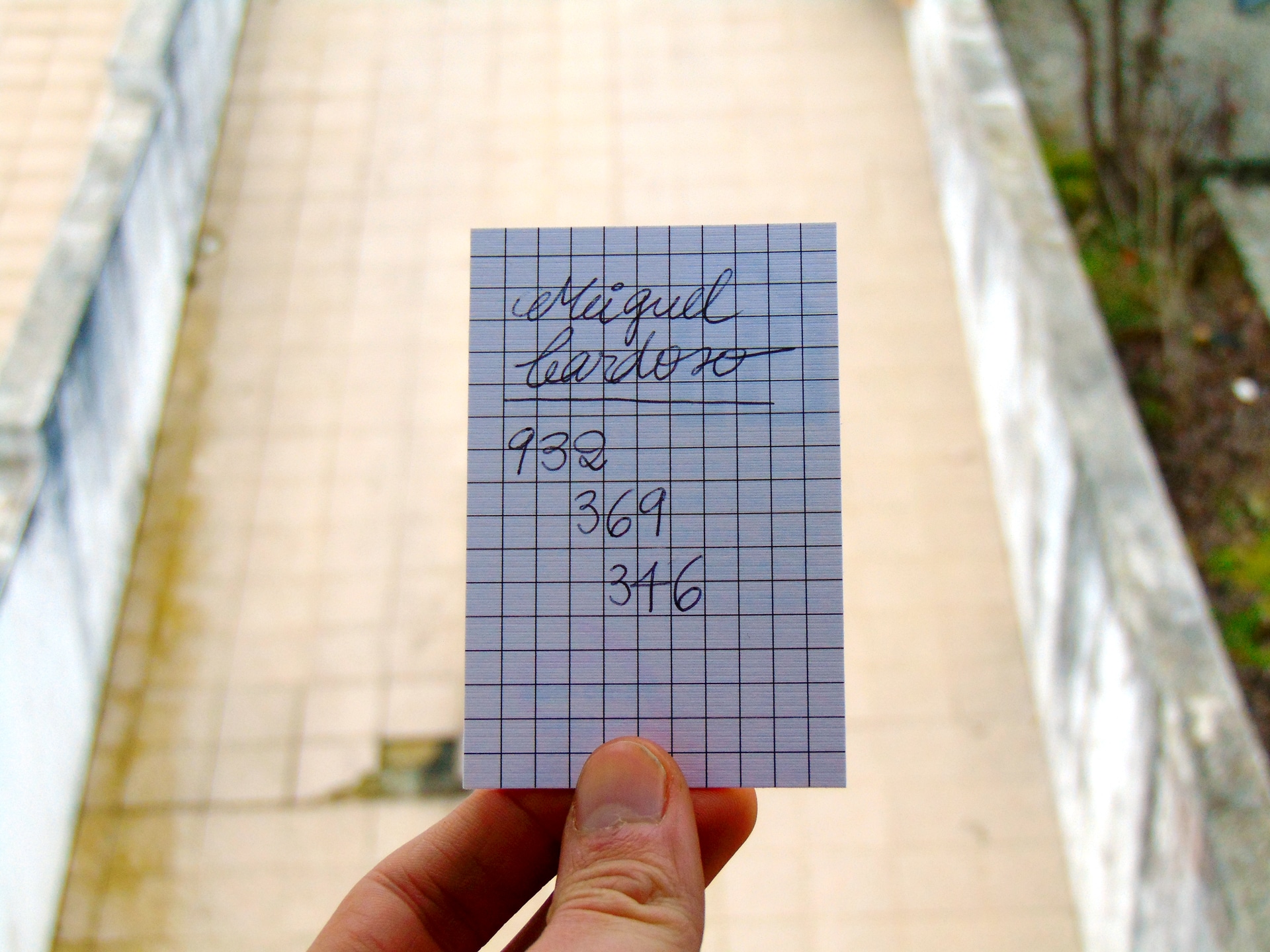
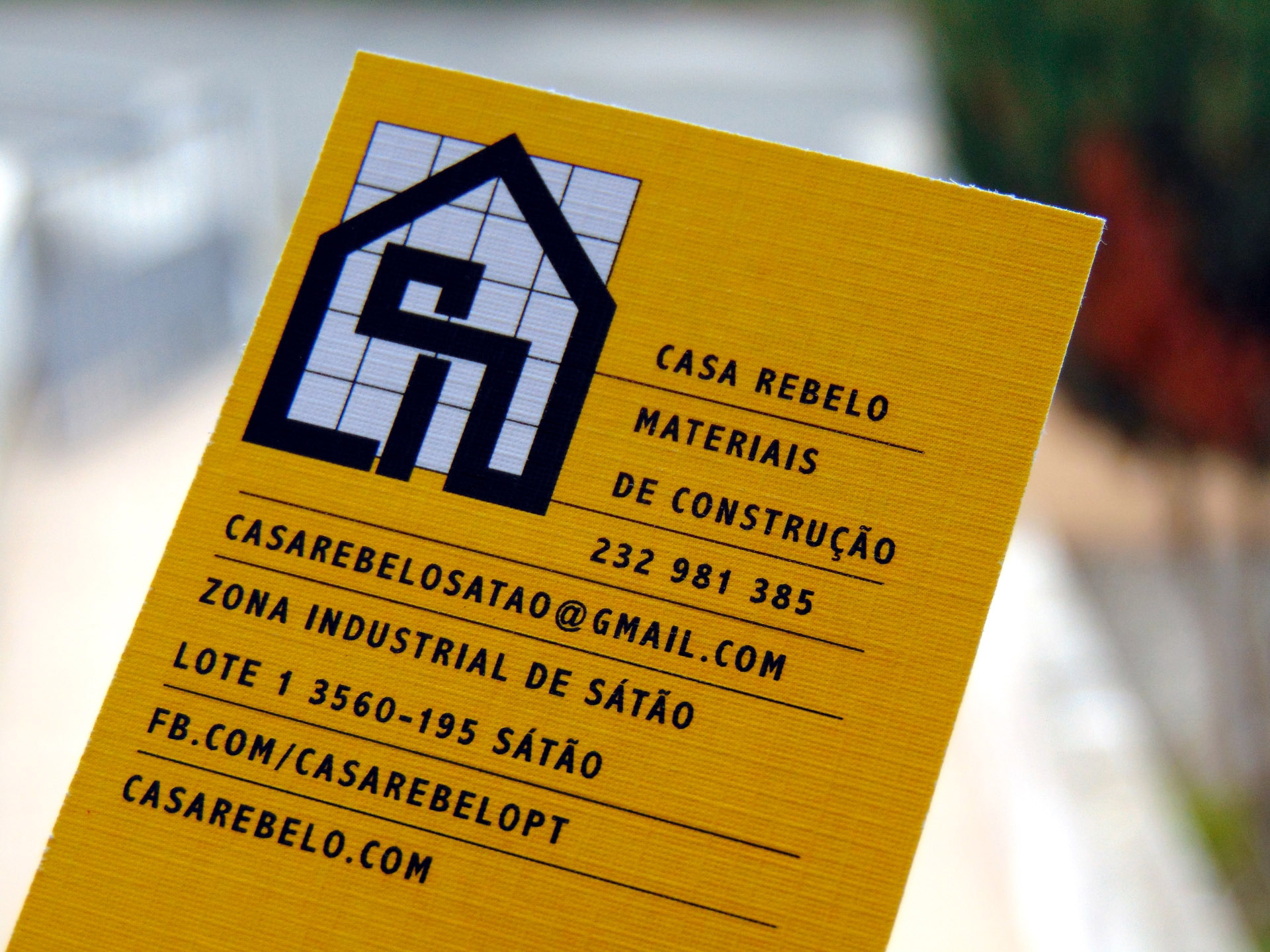
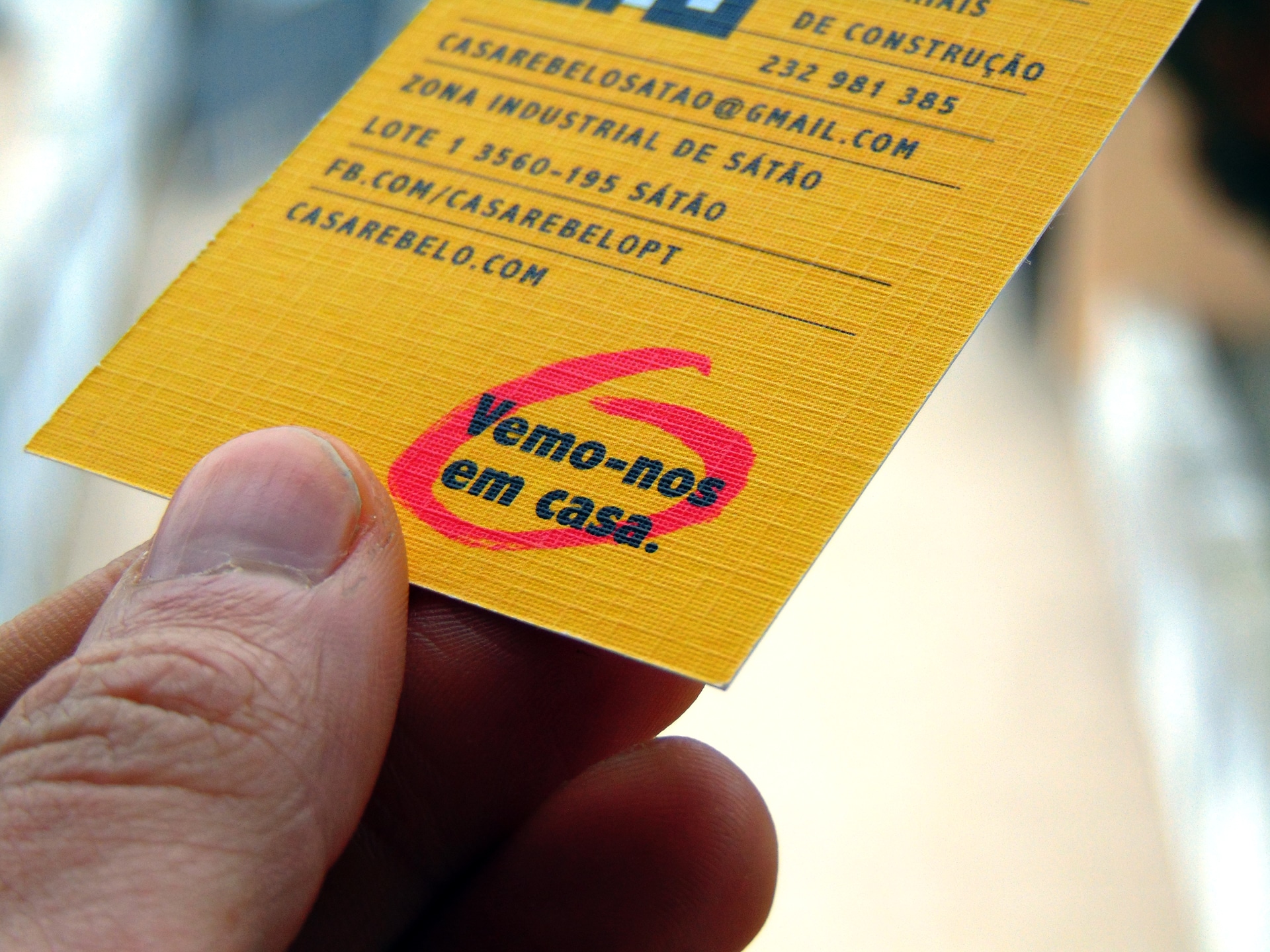
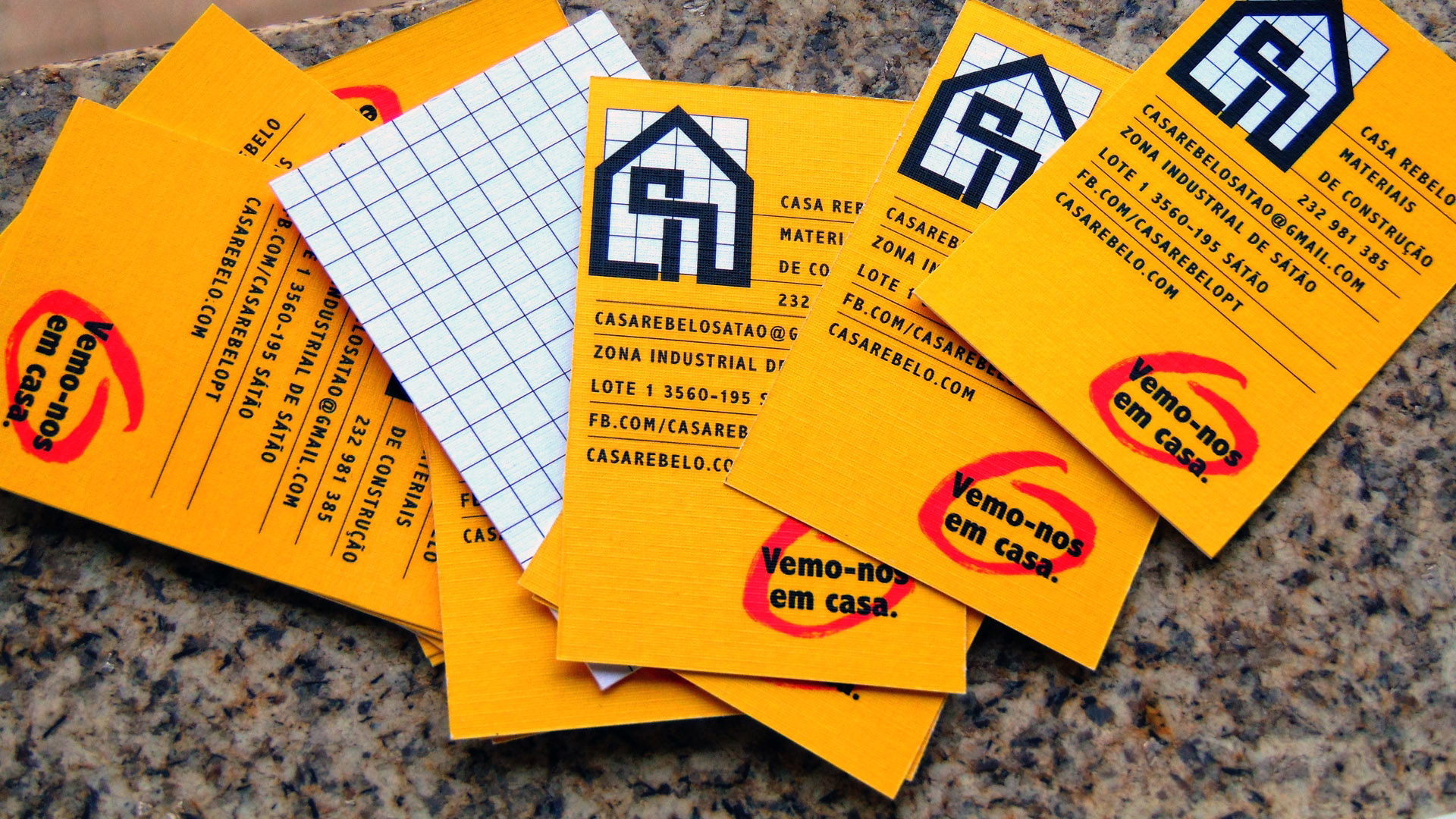
 Business card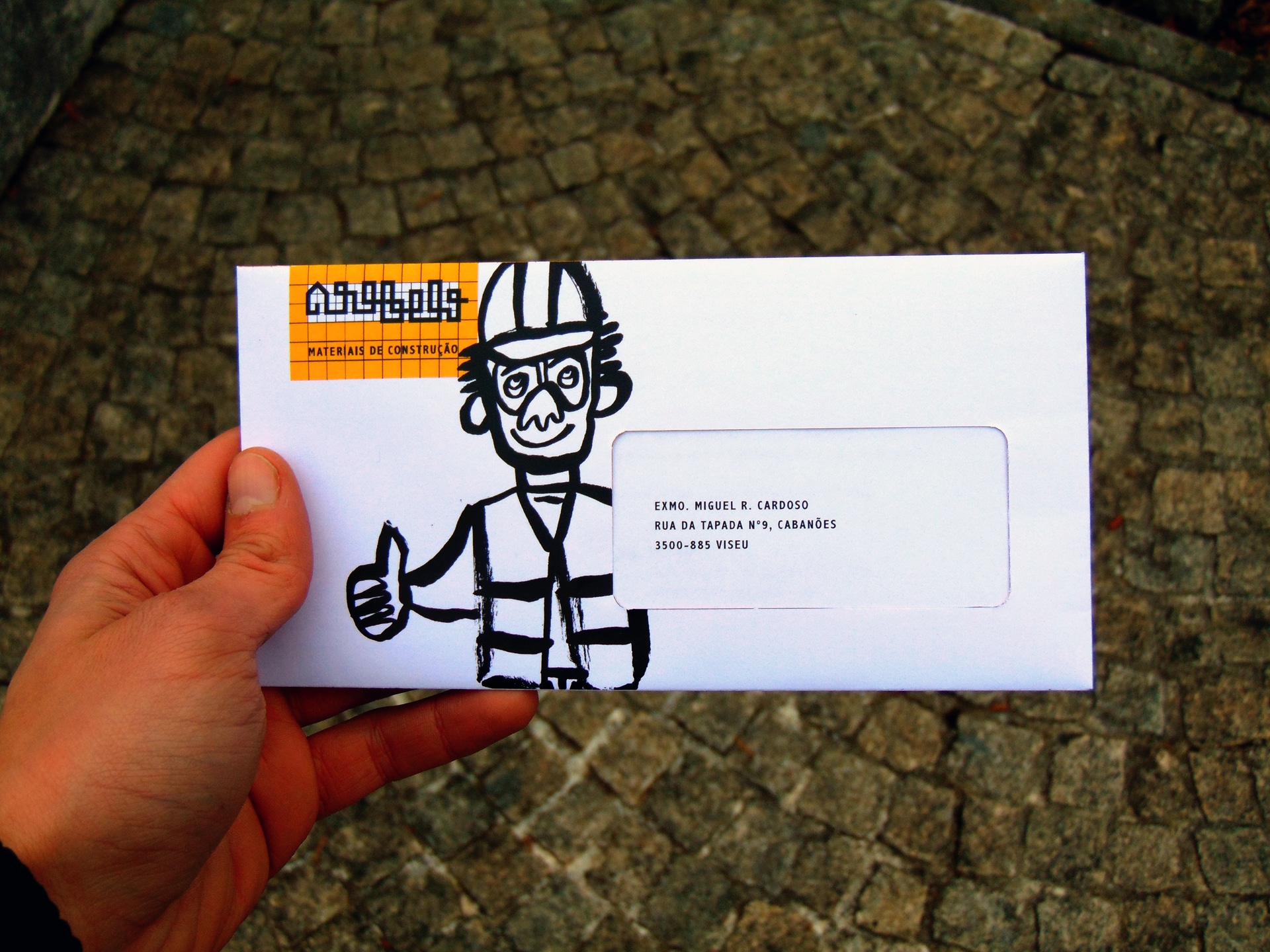
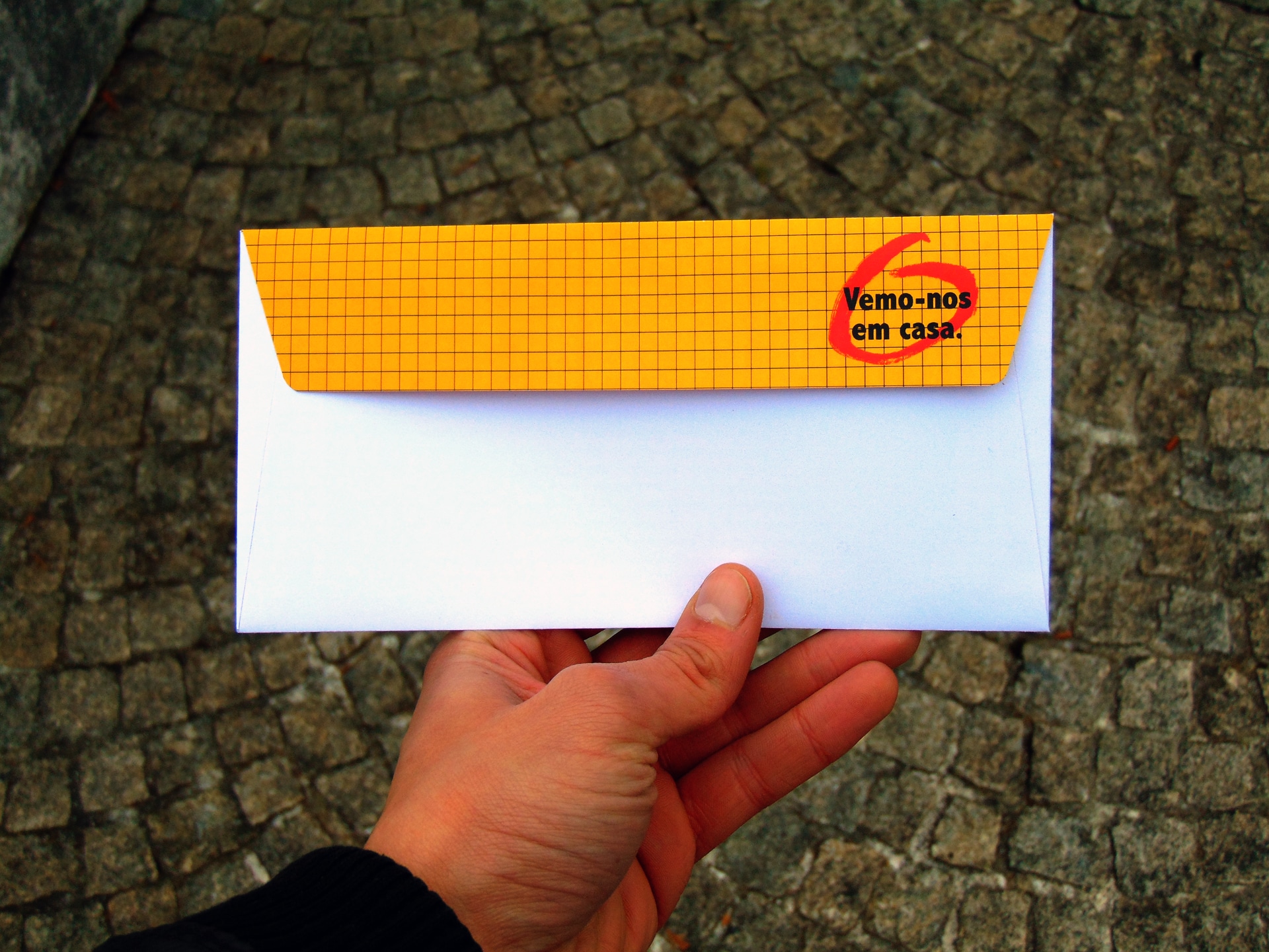
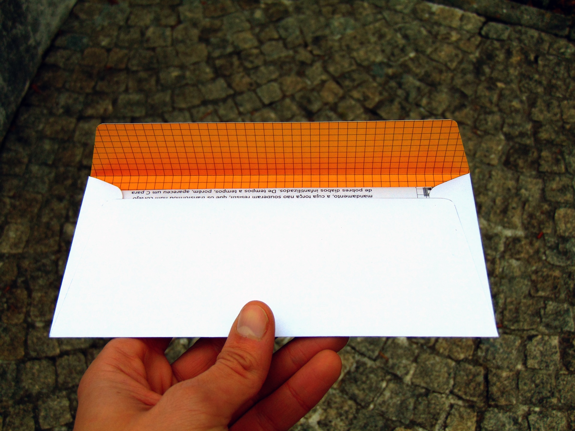
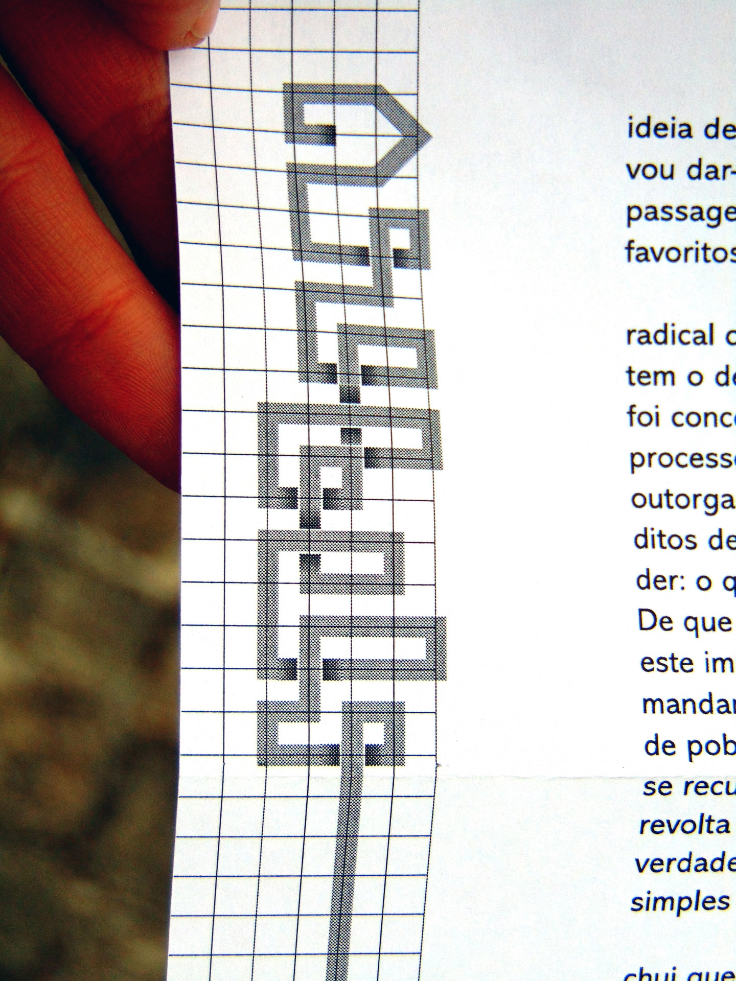
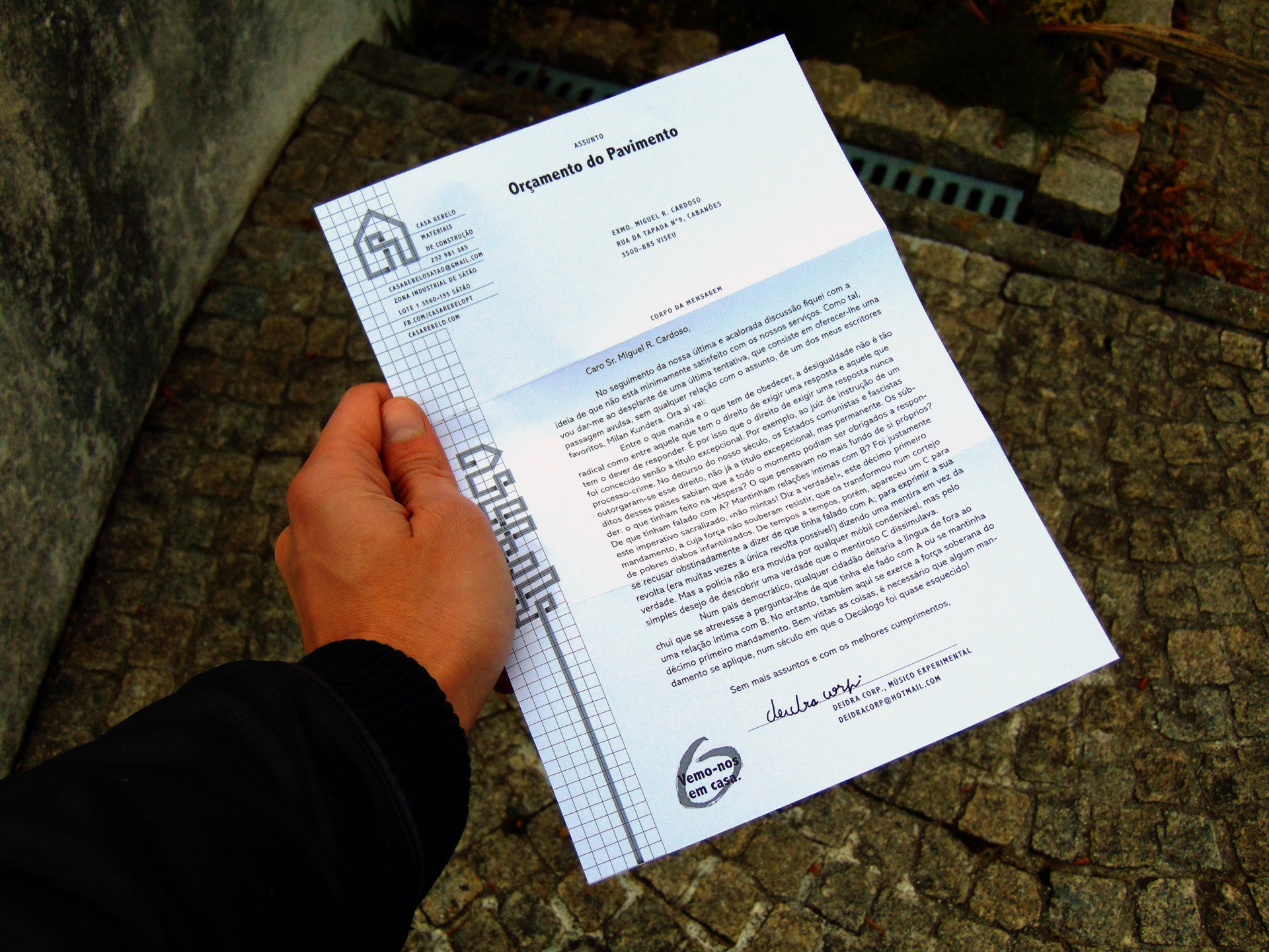
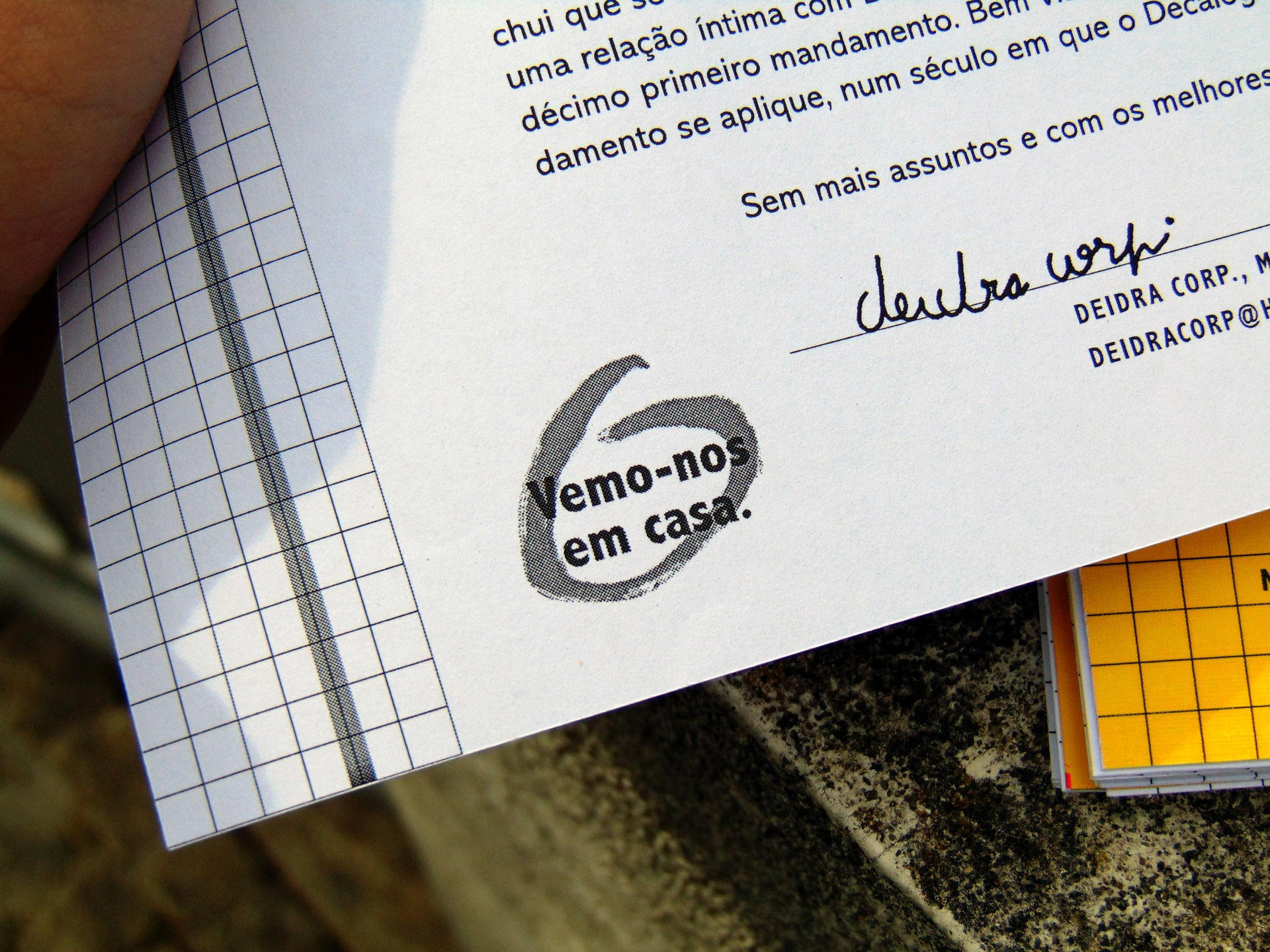
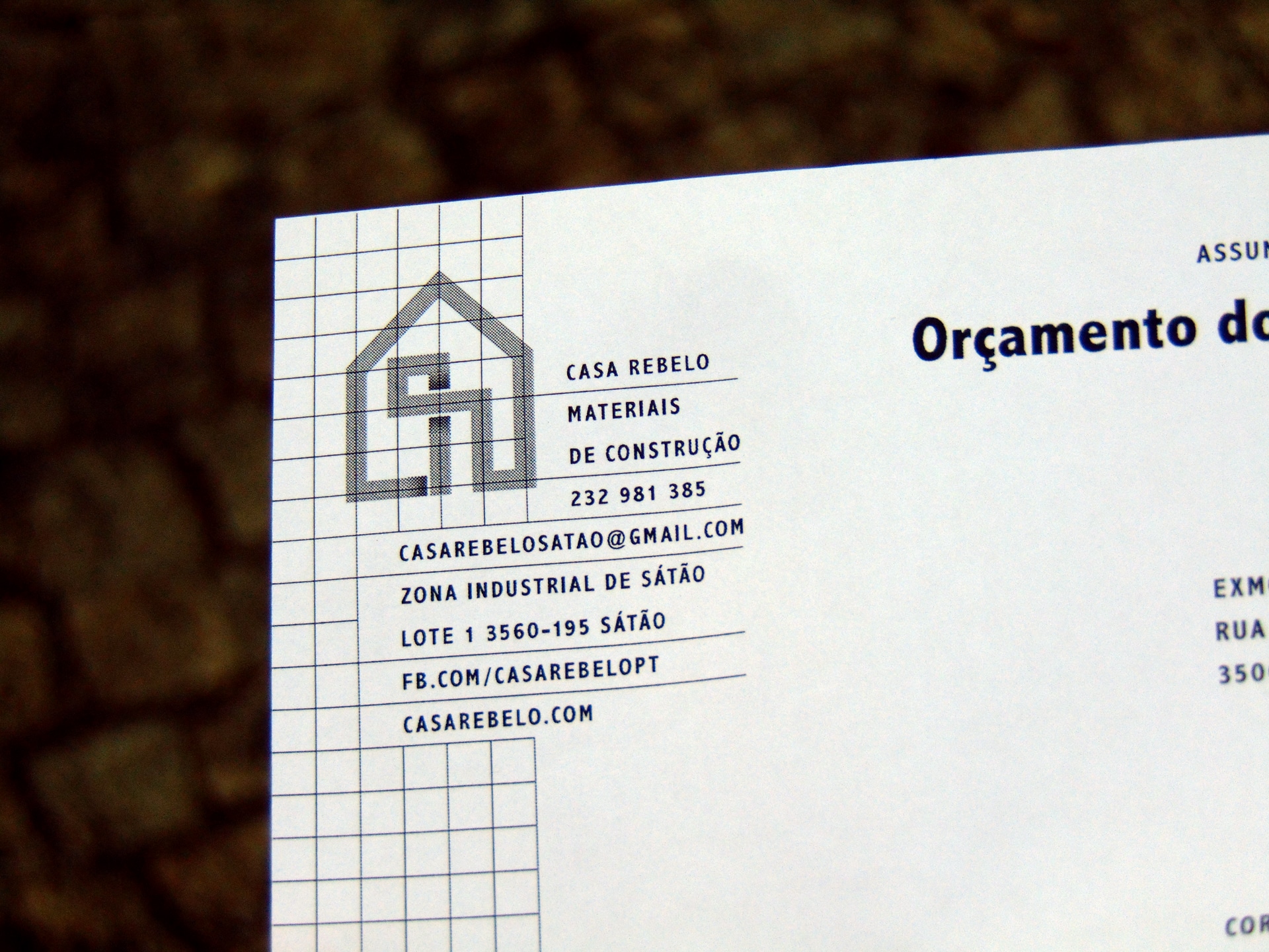
 Envelope and letterhead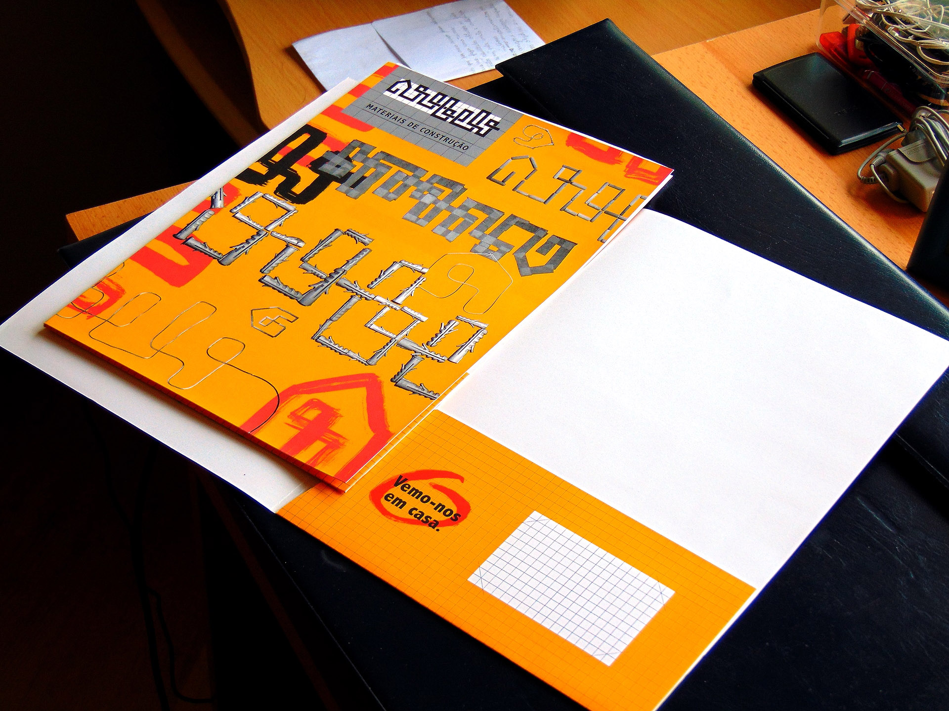
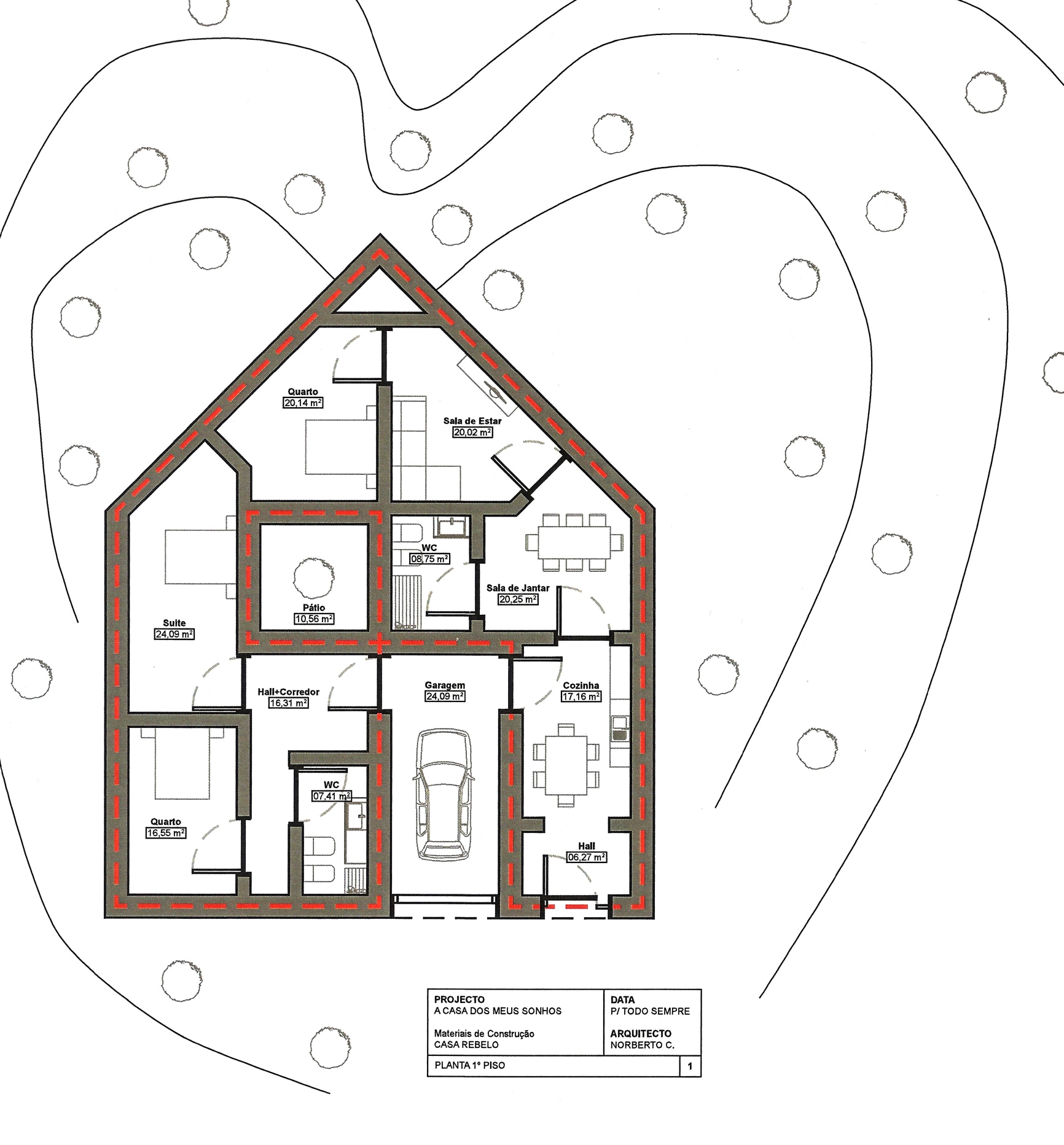
 Graphic lexicon: blueprint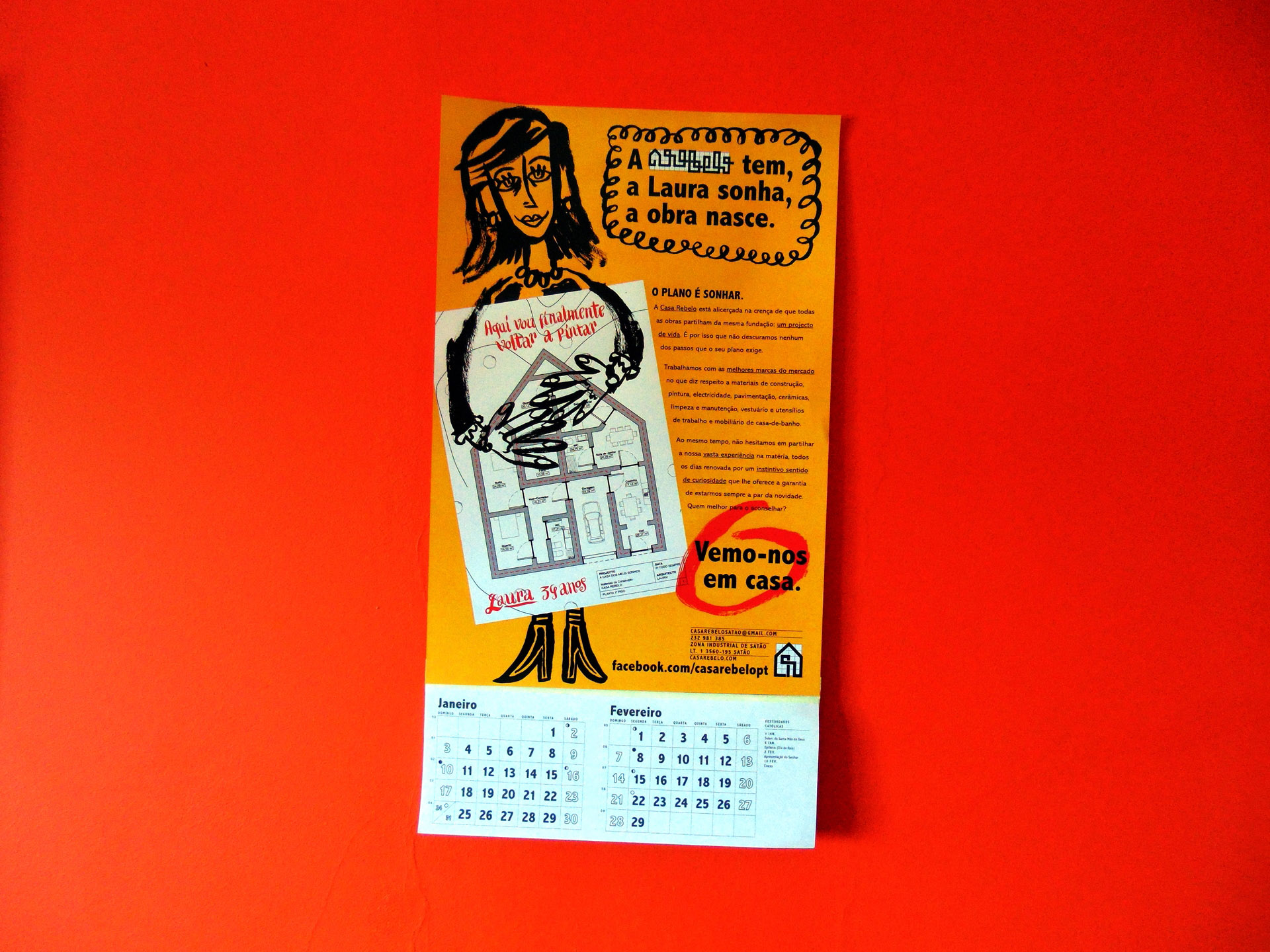
 Good ol' advertising calendar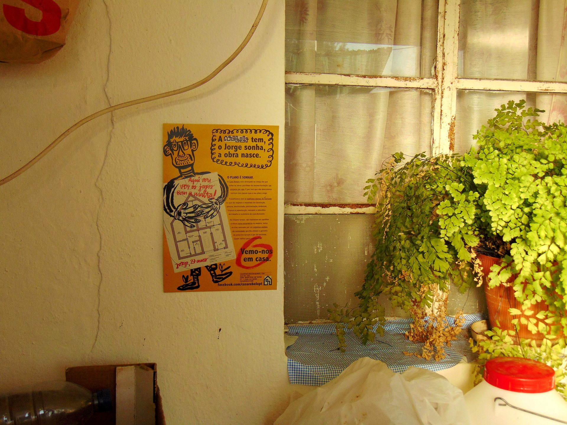
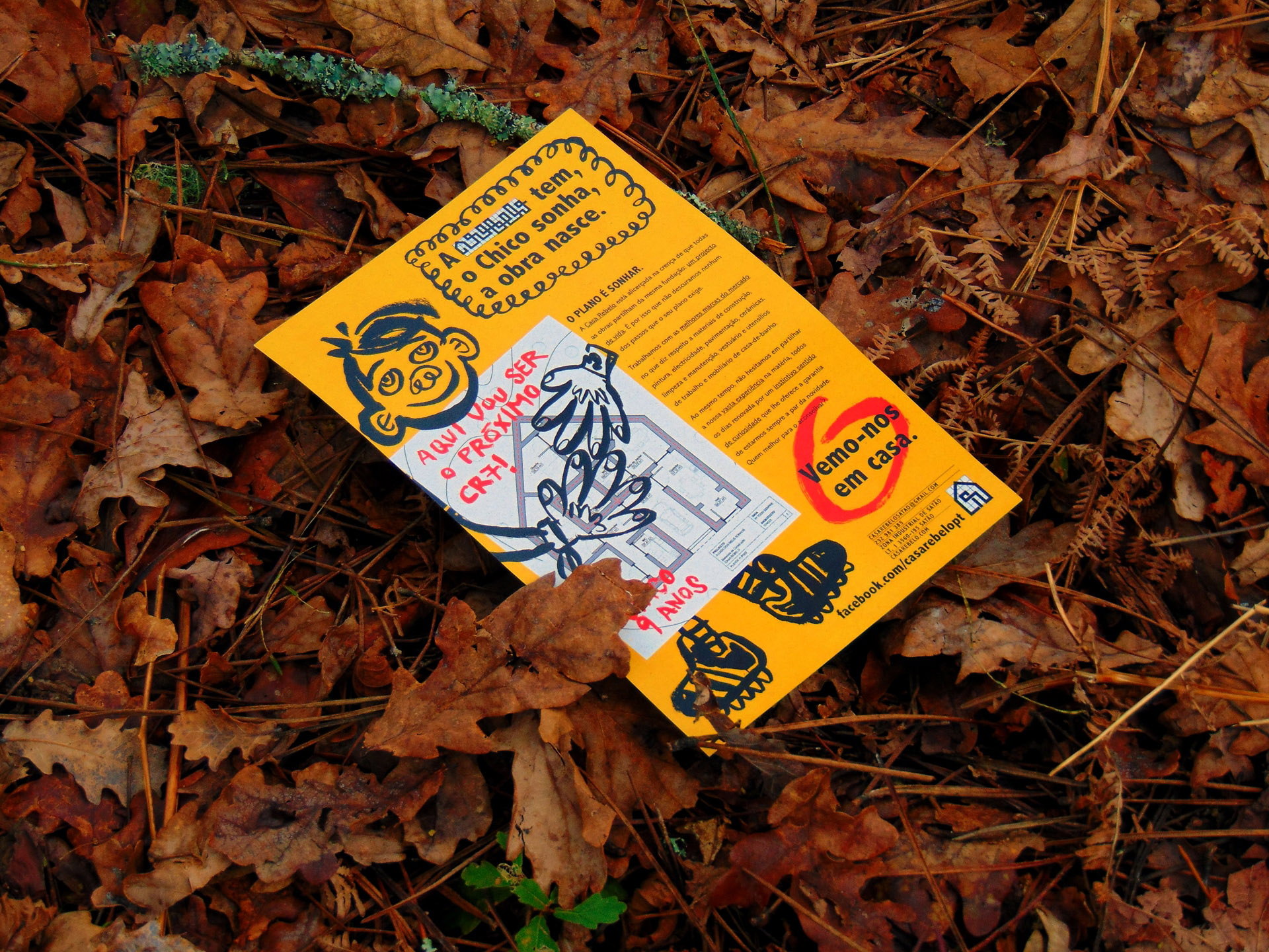
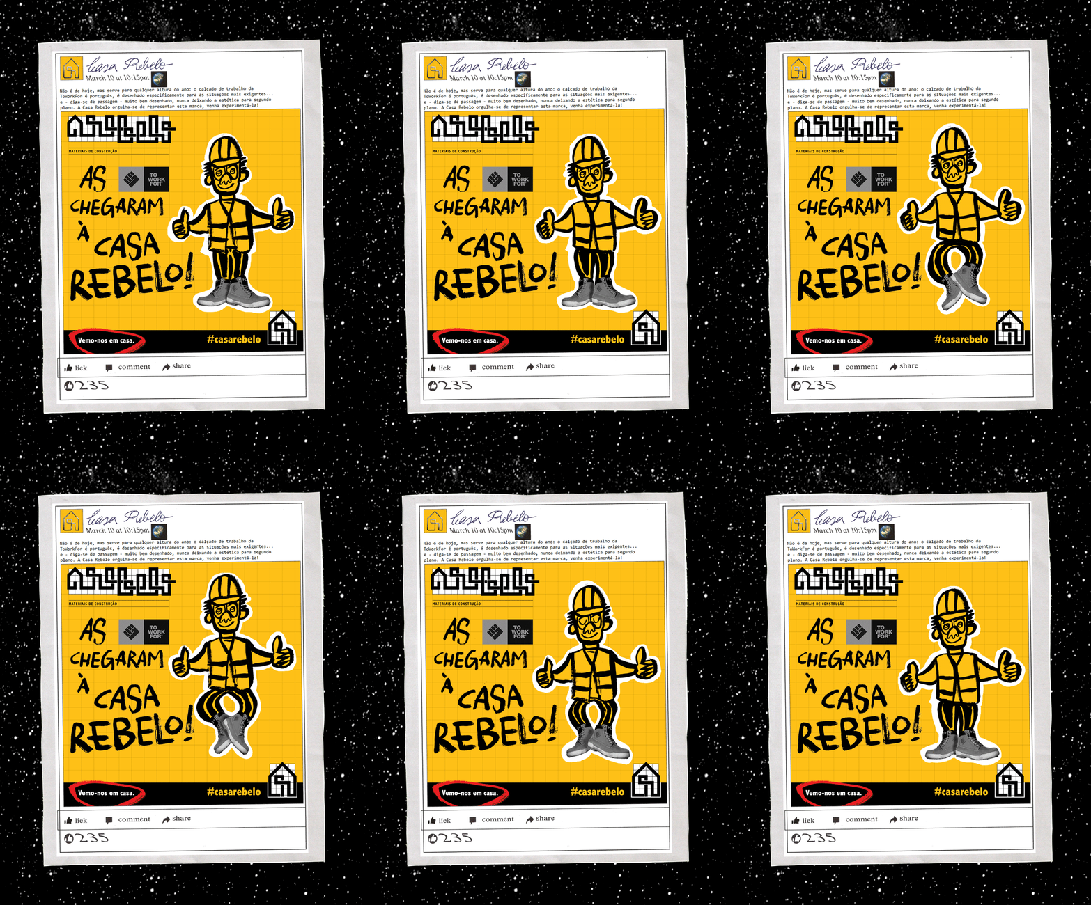
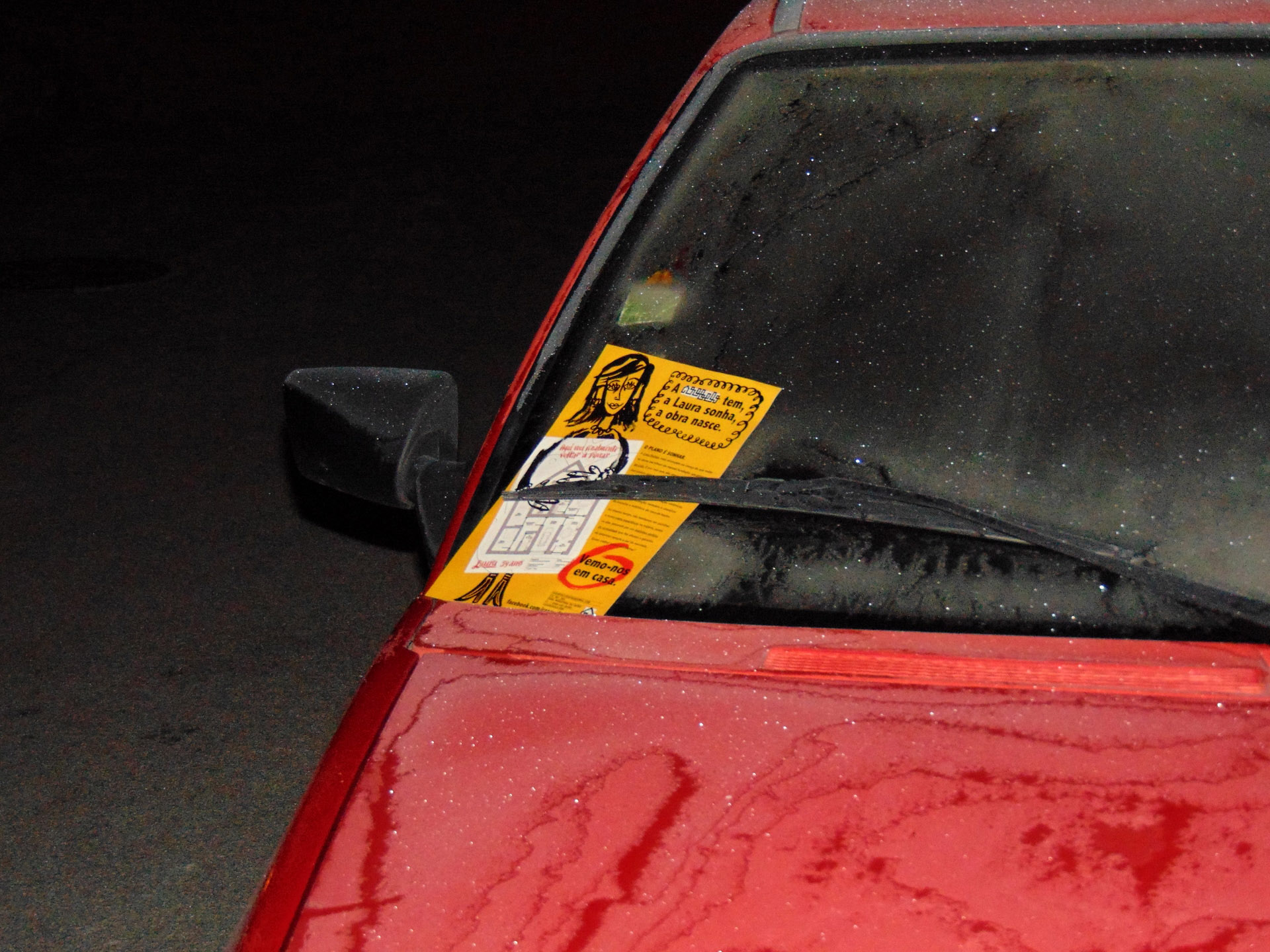
 Advertising posters: "Casa Rebelo provides, people dream, the project comes to life" series